Slimline

Just Us Girls #615 – Color Week & The Color BLUE

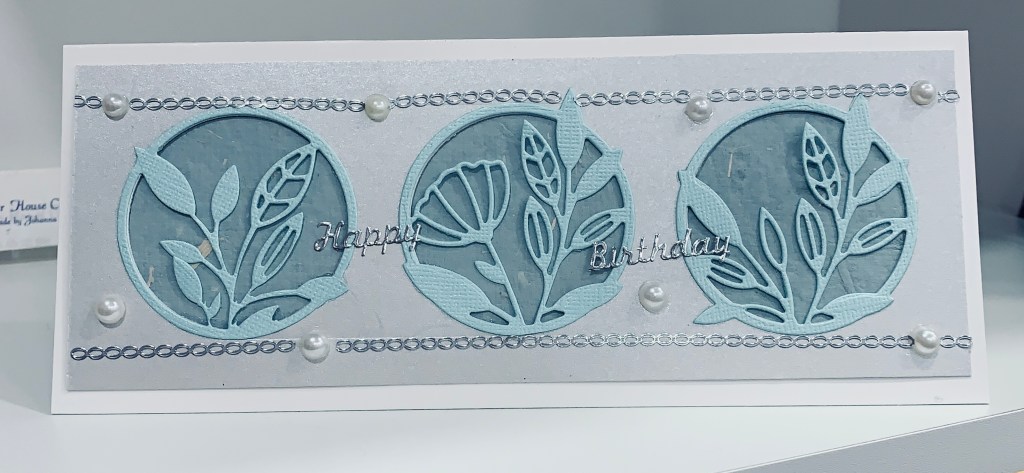
When doing the first card for the JUG’s challenge the idea for another popped into my mind. Then I also noticed the challenge at the Sisterhood of Crafters was a blue challenge so I created this card for both. Using the last piece of the shimmery blue CS I die cut the floral elements using a set from MFT called In Focus Floral frames as well as a slimline circle die from the same kit. In my scrap stash I found another piece of pale blue mulberry paper that has a slight silver tone to it so I used it for behind the circles die cut from the silver CS. I pieced in the floral elements. The silver CS is quite thick and I didn’t notice that the die had left marks in it until I had everything together so to cover the marks I added the silver chain border using stickers. I added the layer onto a white card front and then added some flat back pearls here and there. I also found silver happy birthday stickers so I used those on the top layer. This is a very soft pastel looking card and it looks better in R.L. than on the photo.

Sending Hugs

Just Us Girls #615 – Color Week

The pale blue layer is a leftover piece of CS that I’ve had for a while. It has a slight shimmer to it in R.L. and I’m a fan of subtle shimmer. I wondered if I could stamp on it and get a good impression so I tried using Versamark and it worked beautifully. Heat embossed in silver and the set I used is an old one I won, by Impressions by Stamping, called Sweet Aviary. I haven’t use this set much so figured it was about time I inked it more. I heat embossed a bird in white at the top and added the sentiment in black at the bottom. Sentiment is another one from my new Spellbinders set and again I like the font a lot. I cut the piece down and centered it on the card front. Added a few gems and avoided the temptation to add more to the card.

Just a Note …

WINTER BLUE

When making my previous post for a winter challenge I also had an idea for another card and this card is the result. It seems to be perfect for this, new to me, challenge too so I’m entering it. In going through my paper scraps file I found some precut pieces of cs that I had forgotten about. The cs is blue and I wondered what would happen if I stenciled different blues using a circle stencil directly on top of the blue card stock. This is what I ended up with and I quite like the look. At first I wasn’t sure what I was going to do with it and set it aside so I could finish up my other project. After searching through my stamp sets I found the windmill stamp, by Marianne Design, that I bought during a visit to my sister in the Netherlands. Windmills, Holland and blue fit together in my mind so I stamped the windmill, fussy cut it and popped it up on the bokeh layer. By the way, the bokeh layer worked out because I used Distress Oxides. Any other ink probably wouldn’t have worked over the top of the blue cs and I used several different blues as well. It took me a while to figure out which sentiment I wanted to use and in the end I used a new Spellbinders set, I got on sale at SSS, called Just a note sentiments and tag. In this case the sentiment wouldn’t work in the die and I didn’t want to do stamp surgery, so I used another Spellbinders die set called labels. I really like the font used for this stamp too I also stamped thank you from the same set on the inside. After adding this to the layer and then adding it to the card front, I set it aside as it needed something else and I wasn’t sure what until this morning. I remembered that I had some coloured flat back embellishments and the blue ones were perfect for finishing this card. I am happy with how this turned out and using coloured inks on coloured cs is a good idea too.

Wintery Trees

January Winter Challenge & Make the Cards Challenge #46

I believe this is the first time I’m entering into the Four Seasons challenge which is currently winter season but I did like the mood board and it inspired me to use a birch/aspen tree stencil. It was started yesterday and in the meantime a new note for the Make the Card challenge showed up so I decided to make the card fit both challenges. As mentioned I began with a stencil and I used VersaMark through the stencil and then heat embossed in white. Using Distress Oxides and various blues, I sponged over the piece until I got the coverage I desired. I wanted to add a pop of red so I took a stamp from the Bird Friends stamp set by the Cat’s Pajamas and I stamped one of the birds in red ink. Using a die from this set I cut him out and popped him up on the panel. From the same set I used the sentiment stamp, which to me suggests encouragement making it fit the make the card challenge, and once stamped I fussy cut it out. Not being happy with how it looked on the card front I added it to a red scrap and then fussy cut again leaving a thin border. As well I die cut one of the tiny birds from a SSS die set and added him. I quite like how this one turned out.

I Whale Always Love You

Challenge #22 – Sea and/or Sky

It has been quite a while since I entered a card into the Perfectly CAS challenge so I decided it was time to do so. I’ve had some new stamps, not yet inked, for quite a while and figured inking them was a good idea. Using a Kitchen Sinks multiple step stamping set, that I won in a challenge, called Isle of Big Bay Lake and also a Newton’s Nook set called Tides of Love I set about creating my card. First I inked up the water stamps using Distress inks, Tumbled Glass and Salty Ocean to get my ocean. While that was drying I stamped the whale and coloured him using a mix of Spectrum Noir grays, Sakura Glaze and Sakura glitter pens. I used the glaze pens all over him so he has some shine, but the camera doesn’t pick it up well. He was die cut with the matching dies from Newtons Nook and then I popped him up onto the water. Before I actually adhered him, I placed him in position so I could see where the sentiment should go and then stamped that first. I didn’t actually measure 1/3, but think it is about right for the rules. This may be a Valentines card but it can also work for a birthday too.

Mr. Santa

Peace On Earth Challenge #7

This challenge is great, because it means I get to make Christmas cards throughout the year and that means a head start on them. I also enjoy the mood boards as inspiration. My card is made up of some repurposed bits from other cards as well as uses my new stamp and die set from StampinUp. The background is obviously a snowflake EF and I attached the sparkly snow base cut from a store bought card. Then using a scrap piece of green card I stamped and cut out the larger trees. The small pointy trees were die cut from another store bought card that had a ton of sparkle on it. I wanted the sparkle and a bit of the design and it worked great. Santa is hand drawn using a Pinterest – how to draw a Santa instruction sheet. Then I coloured, fussy cut and popped him up on the front. To get clean edges I went around the cut marks with a black pen. I added some sparkle to his beard, hat and mustache using a Sakura pen. I’m no good at drawing but after a few tries I got this one right.

Inked Background Shaker

Just Us Girls Challenge #614 – Trend Week

Shakers aren’t my forte at the best of times, but this one almost became a complete disaster during the making. The inked piece was something I had done late last year and this bit was left over. I had been wondering how to use it and thought the MFT Birthday Centerpiece die cut would look good on top. I added some acetate to the back of the die cut thinking about a shaker style and then added the foam strips to the back. During this, I had forgotten I had an open bottle of glue sitting on my desk. Got distracted by a phone call and didn’t finish cleaning the nozzle so it was an accident waiting to happen. The next thing was that the bottle fell and glue spilled out into the shaker space I had created. Lots of curse words later I managed to clean up the mess and ensure that the acetate was fully clean before continuing. Thank goodness for a tip from a fellow stamper who had suggested that we buy a product called Un Du as this enabled me to clean it up properly. Thanks Lisa B. I added the shaker part to the inked part and then in turn added them to the card front. You can imagine my horror when I realized that the card front had a tiny mark at the top and of course the camera is merciless so I had to get very creative to cover up this mark. Fortunately I had a small MFT confetti die so I cut some teal cs and added them as embellishments on the card front. After all the other disasters I certainly wasn’t going to let a mark prevent me from using the card. The shaker bits inside the card are from SSS and came with the Unfrogettable kit. Decided to upload to the JUG’s challenge in spite of the card not being perfect.

Party Balloon Congrats

PP572 – A Theme Challenge from Ann & Party Balloons Challenge

This card evolved over several days. I had cut and scored the white layer ready to use but hadn’t quite decided on how I wanted to use it. Then while doing the previous upload balloon card I decided that one of the images in the SSS set Lifting Hearts would work. I stamped and die cut the image and added some extra to the back to give it more lift and stability before colouring it using my Xmas gift of Ohuhu skin tone pens received from my hubby. Although the glitter doesn’t show well the balloons are coloured using Sakura glitter pens and in R.L. look very pretty. Hopefully the group at Paper Players can see that it is glittered as it fits their current challenge. I die cut the hearts from the chocolate box wrap I had saved and added them as shown. They also have quite a shine to them. The sentiment comes from Itty Bitty Basics by MFT. This card would work well as a baby congrats but I liked that it fit the Double D 6th birthday celebration as well. I always find it fun when one card works for 2 challenges.

Balloon Fun

Party Balloons Challenge

Using a set of dies from MFT called Balloon stax, I cut 3 shapes out of paper scraps after which I added liquid glass to give some dimension. I did a few things backwards making this card. Firstly I should have chosen brighter papers for the balloons and I added the gloss before figuring to add some fun to the shapes. I decided to try to add the fun faces over the top of the gloss using an older SSS set. To my surprise it worked although I did go over the image with a pen to fill in a few places that were uneven. The smallest balloon I did by hand and am chuckling at my effort with the mouth. It looks like bat wings lol. Should have used a finer pen for this but too late to fix now. The background piece uses a stencil called sunrays and I inked it with Distress Oxide Ink in mustard seed letting it fade to the edges of the paper. I mounted this piece onto a scrap gold piece and in turn added to the card front. Positioned the balloons and drew in the strings before popping them up on foam tape for more dimension. The sentiment comes from another SSS set called Lifting Hearts. At first I wasn’t sure I liked this card but have since decided it is not bad. Am adding to the Double D challenge, but I’ve also got another one finished for this challenge too.

HI

Happy New Year # 32-Red and Purple

I recently replaced my old Big Shot with a Spellbinders Platinum 6. I’m happy with the change and this die was included with the purchase. I decided to use it and see what I could come up with using the colours from the challenge. The red paper, almost foil paper, is a chocolate box wrap that has a faint snowflake pattern on it. It was too nice to throw away so I cut it into 4 by 5″ pieces and used some of it to cut the floral piece. I cut it several times and glued them together as the paper is thin and I wanted it to be a bit more robust. The word Hi is cut from a scrap piece of the same card stock and then glued to the floral layer. I added the red layer to a white strip so it would stand out from the purple more. I’m happy with how it turned out and will likely use the card as a get well or thinking of you for someone needing a lift in spirits.