At the dollar store I found a vellum paper pad that had all sorts of pre stamped and foiled sentiments on it. The piece used here is from this pad. The coloured words are actually pink but look red in the photo and I think perhaps it changed slightly due to the yellow background. The blue striped paper is quite close to misty moonlight but again the photo has altered the tone slightly so it looks darker. All paper is from my stash and the resin heart is another dollar store purchase. I coloured this with Spectrum Noir markers before adding it to the card. Hopefully this works for the challenge even with the slight tone changes in the colours.
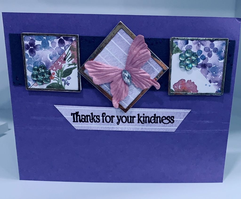
The gold frames used here were left over from a Christmas project and the DSP is from the poor cutting I did for earlier projects. Decided to cut up 2 of the triangular shapes and fit them behind the frames. The dark piece in the background has lovely sparkly swirls on it but they don’t show on the photo. It always surprises me how the camera can pick up every error in a project, but doesn’t pick up the shine or the sparkle. The butterfly is from my stash as are the small embellishments. Sentiment is from Joy Clair. Its a much nicer card in R.L. than it looks in this photo.
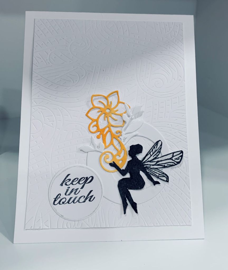
Having spent the last couple of days working on taxes etc., which is my least favourite job in the world, making a card for a challenge is a welcome relief. With a new texture plate from Hero Arts called lines and swirls I thought using it as a background for this design was a great idea. I had seen some lovely CAS cards on Pinterest so my idea incorporated some of what I had seen. Stamps used are from Joy Clair (sentiment) and the little fairy is from a GKD set that I’ve had for a while. In fact this little fairy has been in a container on my desk as she was initially a failed attempt some time ago and I managed to fix her so she could be used. I fussy cut her. I also use 2 circle dies from an infinity set from Hero Arts and I cut the smaller circle from the larger one deliberately off center. The little flower die cut is from Crafters Companion and came with my Gemini and the white leaves are fallouts from something else. I added some sparkle to the fairy wings and sat her in the circle with the flower in her hand. After adding the sentiment to the smaller circle I used the die as a template and added a sparkle border to the edges before gluing it on the left side of the larger circle. Hubby came in while I was taking the photograph and his reaction was Wow, so I’m well pleased.
Getting the right colours for this challenge was a challenge all by itself. I only have Distress Oxide inks for the most part, so I went searching through my papers and card stock to try to get the colours using those. My colour match chart doesn’t have these greens so they must be fairly new. Not sure I succeeded but it is as close as I could find. The heart was created using HeroArts infinity heart dies and I added one in white to the inside so I can write there. For the main heart I initially cut into the craft CS leaving just the top of the heart so it would fold. Then I cut a 2nd one from the Coral paper and added it on top. The elephant stamp is from one of those dollar store sets I mentioned in a previous post and I coloured it using a combination of pencils, Copic pens and Sakura Glaze. When colouring I tried to get him to look a bit like the crumb cake colour and painted his nails green. I fussy cut it and made a small slit so one envelope would fit into his trunk. The little envelope was stamped and fussy cut from the papers. Stamps (envelope, heart and sentiment) are from a small set by Kitchen Sink Stamps and is one I’ve found useful for a new home or moving card. I added the tiny heart in white to each envelope and also added some subtle glitter to the edge. A few embellishments finished it. The inspiration came from one of Angie’s recent posts, so thanks Angie.
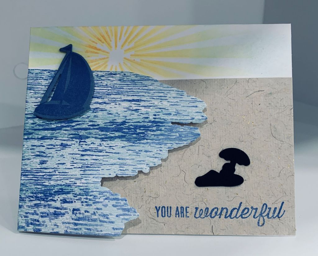
This is a second entry into this challenge and it is more a masculine friend card. The stamps used are from Kitchen Sink (layering ocean) and Hero Arts. When I received the Hero Arts kit, ages ago now, I had also requested some additional dies, but missed getting the matching stamp for the ocean shape die. I had to get creative and what I did was stamp the water on a larger piece of CS so I could use the die to cut it out. It doesn’t give the white surf that one would normally see at a beach but the shape is perfect nonetheless. For the beach I used some handmade paper that was in my stash. It has a subtle gold glitter to it so looks like sand without needing any enhancement. The sun rays used a stencil that I was given by someone. The sailboat was stamped and then die cut and the same with the silhouetted sunbather. This is a CASE of something Jennifer McGuire did with this kit.
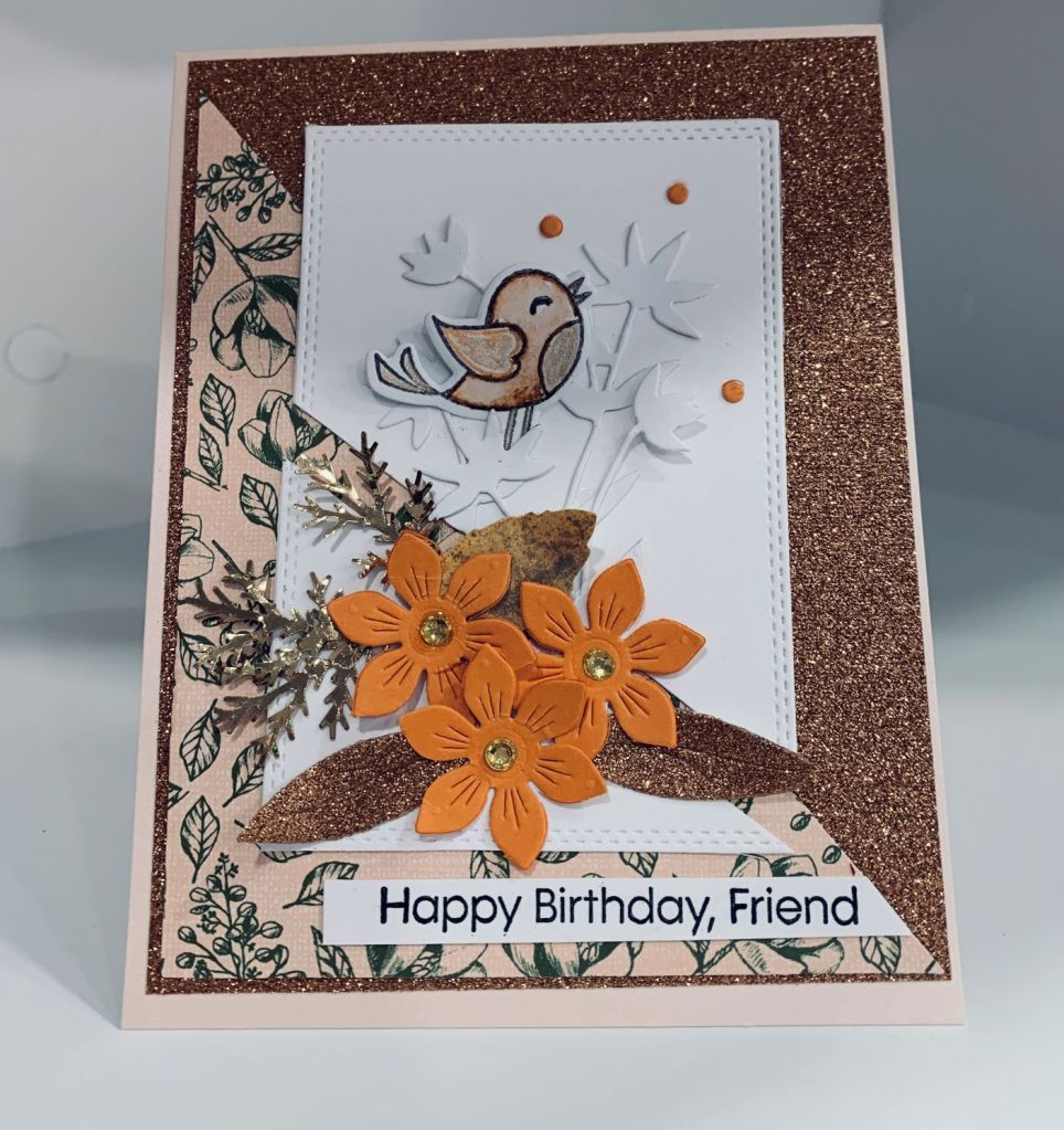
As mentioned in a previous post, I was trying to cut something on the diagonal and kept messing up the direction. Eventually I succeeded but in the meantime I had all these triangular shaped pieces. Yesterday I decided to use a few of them and this card is one that I came up with. As it happens it fits 2 challenges so I’m adding it to both. I found a design on Pinterest that I really liked and in a way I cased it but mine is quite different to the original. DSP is from StampinUp but the glitter background is actually washi tape from a pad I’ve had for quite a while. I used several dies for this card, but the white background leaves I can’t remember who made it. The little bird comes from an Easter/Spring set from GKD, the orange flowers and leaves are from GKD. The gold sprigs are a Martha Stewart punch and the sentiment is from MFT. The frame die is also from GKD. I played around quite a lot with placement of everything before gluing. Didn’t quite get the split white frame straight but its handmade and anyone wanting perfection is coming to the wrong place, haha. The little bird is coloured using Tombow markers and Sakura glitter pens and I used the center flower fallouts as embellishments. I like the end result which is always a bonus to me.
It doesn’t happen often but every once in a while I have an idea for one card that works with more than one challenge. This is one of those times. Using a black card base and some scrap red CS with an older die from Memory Box called Homespun hearts I cut two of the heart pieces. Then I scored diagonally across the black CS using a tent shaped design and the debossed side. First one I tried slipped so the lines went wonky and I’m finding scoring diagonally isn’t easy even with a diagonal board. I placed one of the die cut pieces and once happy with the look I glued it down. I cut the other die cut into bits and added the larger heart on top of the glued piece for more dimension and then added Nuvo Crystal Glaze on top. Gives it a nice shine and a bit more dimension. Some of the other hearts were added randomly. Using a set from Divinity Designs that has various small stamps suitable for Valentine’s Day I took two and stamped with Versamark onto a scrap piece of black which I then heat embossed in White. Didn’t dare to stamp directly to the card as I was worried I would mess it up. Once I added the sentiment I also added a few white flat back pearls to finish the card.
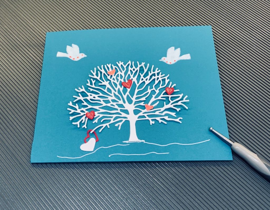
A week ago I was playing around and I die cut this white tree from Penny Black. In the end I didn’t use it, but when using a teal piece of CS for something else the tree ended up on top of it and I realized that it looked perfect for a wintery card. I also liked the stark white on the teal. The idea stayed in my mind, but I didn’t have time to do anything more until yesterday afternoon. Once I saw the February Anything goes mood board I decided to go ahead with the card and use some tiny red hearts to liven it up. These came from another die that had fallout hearts. I added them as you see and put a small amount of glitter on them. I used 2 different reds so there are some tone differences. When gluing the tree I only did a few sections and lifted up some of the branches to give some dimension. The birds come from a Birds & Blossoms set by Theresa Momber (GKD) and these were stamped in white. I added some white glaze on top, but they looked patchy and the camera is merciless, so I used a few red glitter dots to cover up the patchy bits. The grounding for the tree was done by hand with a white pen. I didn’t add a sentiment yet, and may only do so for the inside when I decide to give it to someone. I like having a choice as to how to use the card as it would work for Valentine’s Day, a love you theme or even a sympathy card.
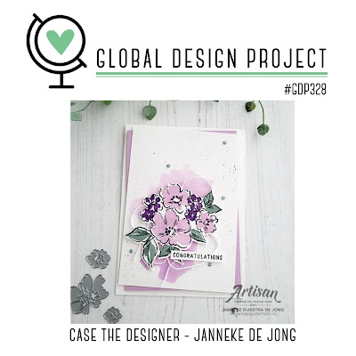
CASEing the designer is something I like to do and I really like the colours used in the inspiration photo so went with my version of those. I used a GKD stamp set called Birds and Blossoms 2 and chose the largest flower along with a smaller one and the leaves. The sentiment is from Joy Clair. I stamped the images using a Hero Arts black that doesn’t smudge if wet and then used some shimmery watercolour paints to colour them. Before that I masked off the large flower, added 2 smaller ones and the leaf sprig in 2 places. The leaf sprig was stamped in Bundled Sage Distress ink. When it was all dry I tapped some paint spatter over it. I added a few gems and then glued it to the angled background papers that I had already put on the card front. Papers from my stash, one is by StampinUp and the other from a 6×6 paper pad. The shimmer is very evident in R.L. but not on the photo unfortunately.