I Wish I Could …

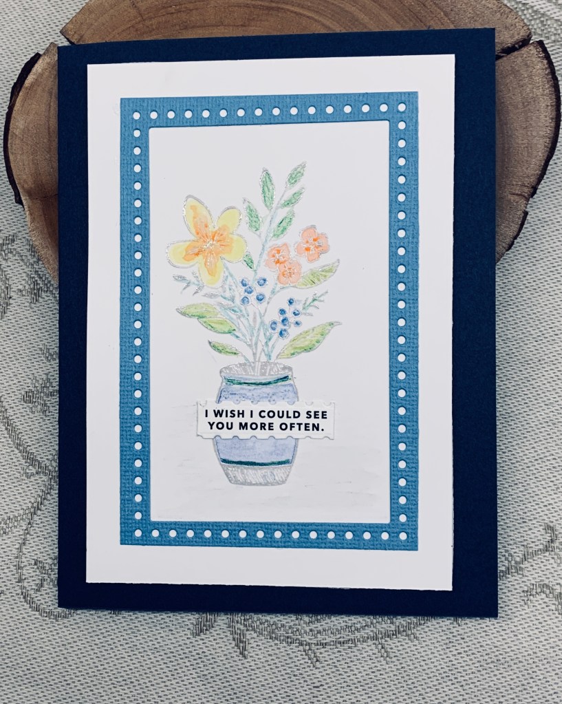
The challenge at Just Add Ink is all about incorporating a fancy edge. I love the new bundle set I bought from StampinUP called Everyday Details and I had this die cut frame left from a different project. Taking one of the stamps from the set I stamped in Lost Shadow ink and then heat set clear. Once cool I added pencils and a water brush to blend them but kept it fairly pastel so it stayed soft and pretty. I did ground the vase with a gray pencil, but the photo doesn’t pick it up. I added the frame and using a foam backing mounted it on the Navy card front. The sentiment is a cut apart, but now I’ve forgotten which company I got these from. I used a small border die to cut this one keeping it very small.

As I have a good friend who has health challenges, I don’t get to see her as often as I would like so I thought this card would be nice to send to her.

Just Add Ink #705…Fancy Edge!

We have glorious weather after a week of rain, so it is warm outside today. It is good to see the sunshine, but the risk of wildfires is still huge so any rain we get is welcomed by many.

Thanks for stopping by, it is appreciated as are any comments you leave for me.

nothing But Patterns

The challenge at Color Hues is to use Yellow and Blue and as is usual Stencil Fun is an anything goes so I came up with this creation. I have two new stencils from TCW one is called crazy waves and the other screen view. I did both on separate pieces but messed up a bit with the waves as the colours mixed a bit. I figured just cutting the edge off made it useable, but as the other piece accidentally placed behind it and I liked the look, both were used as you see here. Actually what I did was to cut the ends off the screen view and glue them to the wavy one which leaves me with a piece I can use on something else. I backed the layer with a yellow and mounted it all onto a navy card. Using my HeroArts infinity circle dies I cut the foiled sentiment from a cut apart set, and a slightly larger one in yellow and mounted them together over the top of a blue ribbon embellishment.

I shall be entering this into two challenges: Color Hues # 88 Blue and Yellow and https://stencilfun.blogspot.com/

Thanks for stopping by, your time is appreciated.

B is for Baking

Rolled up front.
Showing it unrolled, flap untucked flattening ready for mailing
fully open with space for personal message

Pamela has chosen the theme challenge here at MMM as B is for …. and as you can see I chose the theme of baking. As it happens one of my recent requests for cards was for Father’s Day and this is the 2nd card I’ve done in that vein. In this case my friend’s step father is into baking and cooking. As I don’t have any stamps in this theme I asked to borrow from a good friend, who was into StampinUp, and this card is made using one of her sets called Apron of Love, including dies. The sentiment, however is from CTMH. PP is from my stash.

On Instagram there was a card showing this fold by Purple Girl Crafts and fortunately she also created a YouTube video tutorial, which is what I followed. I did get a bit confused at one point, but kept going back to the video until I figured it out. I am beyond thrilled at how it turned out and am excited to deliver it, along with 3 other cards to the friend who requested them.

The trickiest part of this card was the scoring and folding but the look is so different that it was worth the fiddling. I die cut the images I wanted to use and added them as you see. On the inside I added a white piece for the personal message, although the video had PP there, with a message section on the back. I tried to keep the PP generic as it is for a man, but I can imagine this with pretty florals for a feminine version. Before returning the stamp set, my intention is to stamp all the images a couple of times as well as die cut them so I can keep them for later use.

We hope to see your cards in our gallery soon. Have fun being creative and thanks for stopping by. I appreciate all of you.

I Love Every-fin about you

Several things inspired this card. First the colours at Color Hues, second the masculine style at Sisterhood of Crafters, third the sketch at AAA and last, a use your scraps tutorial by Natasha Foote. I made a background piece using two different styles of blue and white scraps, one was striped and one polka dots but due to the additional circles the polka dots don’t really show. Anyway, I die cut the apertures using a scallop die set from Sizzix and added the background behind them. Then taking a die from a StampinUp set I die cut the smaller circles. The stamp set is from Newton’s nook with two other stamps coming from a GKD set. After stamping the images, I coloured them with pencils and some glitter Sakura pens and using a thin foam I added them to the center of the apertures. I quite like how this one turned out as it is effectively simple in design.

I shall enter it into the following challenges: Color Hues # 88 Blue and Yellow, https://thesisterhoodofcrafters.blogspot.com/, AAA Card Challenges #266: Sketch

Thanks for stopping by, your time is appreciated as are any comments you may leave me.

heels and handbags

Challenge number 226 is all about heels and handbags and as I’ve been in a fun fold mood lately, I took it literally and made a handbag. Having seen an image similar to this one on Pinterest I followed it to the link so I could have a closer look. There isn’t a tutorial, but the shape seemed simple enough so I made my own design getting a similar look. First I went searching for some PP that I thought would work and I found the heels. I resized it on my computer and printed onto some CS. Because the CS is light weight I added a second piece on the inside so the card is stronger. Taking a border die by Spellbinders and some PP, I cut the edge of the PP as you see. It was paper rather than CS so I folded it in half first and both sides are the same. Then I took a large circle die along with a slightly smaller one and die cut so I had a frame. This was folded in half and glued giving me a handle. To attach it, I measured where it would sit and made small slits in the border piece on the fold line. When the handle was pushed through I added glue to hold it all in place and then glued over the top of the bag on the fold line. Two small circle die cuts made the button. After showing it to my hubby, we discussed whether I should add a sentiment and his suggestion was to use something generic and curved in silver, so it is there but not obtrusive. As I have a set from a Spellbinder stamp club release that has all curved stamps I used the Celebrate one with VersaMark and then heat embossed in silver. In the future I can add other sentiments inside the card pertaining to which celebration I choose.

I’m actually quite pleased with the result and it wasn’t a difficult card to make. I honestly didn’t measure a thing, just eyeballed the angles and cut where I thought was right.

We look forward to seeing your interpretation of this challenge in our gallery. Have fun! Thanks for stopping by, it is appreciated.

Christmas Tree shaker

Last year I received a card with this circle image and I felt it was too nice to throw away. Because my hubby does a lot of his own framing he has two mat cutters and one does circles and ovals. The circle is a large one and I don’t have any dies this size so my hubby did the cutting for me. I decided to try turning it into a shaker card, a technique I don’t do very often. I used a protective film bag and added some PP to which I had added some die cut trees. These are from StampinUp and I used a white one and a mirror card one, and two small ones, with blue trim on them all. Once the piece was in the bag I added some tiny glitter stars and a few sequins then sealed it shut. After running tape around the edges I adhered it behind aperture and added the original circle over the top front. It looks better in person than on the photo as I found it very challenging to get a good photo of it. The sentiment is from the same set that goes with the trees.

I think it was a good idea to use the store bought piece this way and still use my own creativity to make the card mine. It fits the challenge at Peace on Earth so I’m adding it there.

Thanks for stopping by, I appreciate you all and also your comments.

Congratulation hearts

It is unlikely that I shall require a wedding card anytime soon, so initially I was a bit stumped. Although I do keep my cards handy, I don’t like to have too many that aren’t likely to be used and I already have at least five that are wedding or anniversary related. After thinking about it, I decided to make something that can be used more generically, but would still be appropriate for a wedding and I came up with this. I had seen a card with floating hearts some time ago and thought it was a great idea. At the time I didn’t make a note of the creator, but I believe I saw it on GKD’s Facebook group. The card began with me cutting 3 layers of the heart chain so I could stack them together and I used a SSS die for this. Once I had them glued I set it aside and continued with the rest. Using an unbranded rectangle set I die cut the aperture using a shimmer white CS. Then I used the same CS for the actual note card. It needed something behind the hearts so I took a stamp set I’ve had for a long time, all wedding related sentiments, and using just the Congratulations, I stamped it several times in Versamark and heat set in silver. The set is from My Sentiments Exactly Ltd. Using some tape I attached the heart strip across the frame cutting off any excess at the side. After adding 2 layers of foam tape around the frame I attached the entire piece to the card front. The little extra heart is there to cover up a few embossed lines that extended too far up the card front. Then I added the pearls from my stash at the corners and called it finished. It has more impact in reality than it does on the photo. I’m not a good photographer, but if I had to wait for my hubby to do it, the challenge would be over.

Thanks for stopping by, and I appreciate both your time and any comments you make. Have a great weekend everyone.

Metal Work

version number 1

After a surprise win at Seize the Birthday, I get to be a guest designer and have to say I am thrilled to be guesting for such a good challenge blog site. The challenge is about using Metallics and I took it literally and actually used a thin piece of copper metal to create my focal panels. I had enough of it to do 2 cards so version 2 will show up later in the post. The idea came from here and I basically followed the tutorial to create my own pieces. Using StazOn jet black I swiped the pieces and left them to dry overnight before embossing and I used a brown version after all the embossing was done. I chose a folder from Tim Holtz called Mechanics 3D and used 2 sections of it to make my impression into the metal. I also used another folder on the gold layer by Sizzix. My embossing powders were in gold, silver and a mix of copper and ultra thick and I heat embossed each one in between until I was happy with the end result. Although I like both, the preferred one is version number 1. My gold layer was a bit too gold so I toned it down some by swiping over it with a Distress brown ink and I edged it with the same ink and a copper pen. For anyone trying this technique, be careful with the metal, it gets hot and the edges can be sharp. My sentiment is a vertical greeting from GKD, probably one of my first purchases from her, and used often since I acquired it. Because I didn’t want to detract from the focal panel I used a very light embossing powder by Seth Apter called Ancient Amber. It shows up better in person than on the photo but it is there. My hubby is really intrigued with these cards and wants to photograph them. They are great as masculine cards, but I’m sure a woman would enjoy receiving one as well.

I’m really pleased with the end result and have some smaller pieces of metal to play with. I wonder if I can cut a butterfly from one? Probably have to do the cutting first so it doesn’t flatten out the impression of a folder.

version number 2

Thanks for stopping by. I hope you get to play with metallics and join in the fun at Seize the Birthday.

Vellum Butterflies

The dies I used here are two of the first ones I ever acquired. The butterfly has been used a lot, but the photo frame not so much. I don’t know which brand, but most likely Memory Box or Sizzix. Once I had cut the frames I used a patterned vellum and cut 6 butterflies and attached them together so they were doubled. The body was cut from an inked scrap to which I added some Stickles glitter. I used a sponge and some Tattered Rose and Seedless Preserves ink to add some colour to the frames after which I sprayed with my shimmer spray. Taking a piece of shimmer CS I ran it through using a StampinUp Sequins folder and then I added a little ink to the raised parts before adding it to the note card front. When the frames were dry, I added them on angles and then added the butterflies as you see. The sentiment is from Kokorosa. It is on my desk so being lazy and because I like the font too, I keep using it . I didn’t quite get my placement right with the frames because my hands are sore and I dropped one which of course ended upside down making a mess. It left me with no choice but to cover up the mess. I’m quite pleased with how this one turned out considering the oops.

I’m entering this into the following challenges:

May 11th 2024 Anything Goes With A Twist of Flowers Twist not taken.

Thanks for stopping by, your time is appreciated.

Hello, Hello, Hello!

This card began as an experiment as I tried something just out of curiosity. I knew I wanted flowers in teal and coral but I also wanted shine so I took a scrap piece of silver mirror CS and added alcohol inks in those colours to it. I also tried swiping inks and then adding heat embossing in clear but that was less successful. Anyway I took the Memory Box die called layered Periwinkle and cut the flowers. Spent a few minutes curling the petals before putting them together. While the glue was drying I cut the card base and layers and adhered together. The white layer was run through with an embossing folder that is like bubbles, but it was gifted and didn’t have any labels so I can’t attribute to any company. I die cut two frame circles and added them on top before gluing to the rest. I wasn’t happy with one embossed section so I added a small teal strip to hide what I didn’t like. Then I added the flowers as you see, with the center one being popped up on foam tape, along with a cut apart sentiment from Paper Rose. The flower centres have Trinity Stamp embellishments that pick up the colour they are placed upon. They look a bit like pearls but are not.

I honestly believe this is one of my better creations and I am really happy with how the experiment worked. Thanks for stopping by, I appreciate it very much.

My card will be added to the Color Hues challenge.