Purple and blue

Color Hues #75-Light Blue and Purple

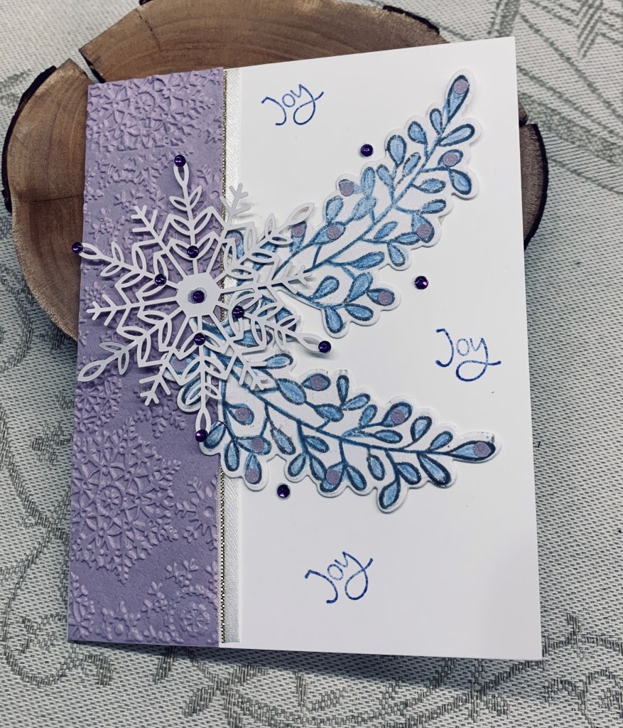
I almost missed this challenge, but remembered just in time. Taking a scrap piece of soft purple paper I dry embossed it with an old snowflake folder. I edged it with ribbon leaving only the gold edge showing from underneath and then added it to the card front. Using a Catherine Pooler stamp and die set I stamped 2 sets of leaves and die cut them. Then I used a Prisma Color light blue pencil for colouring the leaves and some tiny punched circles in purple for interest. After adding them as you see I included a StampinUp snowflake to which I added some purple gems. A few of the same scattered around the leaves and a repeat stamp of the word Joy (also a StampinUp product) and I considered the card complete.

This was a quick card to put together and one more done for my Christmas stash. Thanks for stopping by, I appreciate it.

sing

One of my stamp buddies made the suggestion of my repeating the card I did yesterday and make it into a birthday card so it would fit the challenge at Seize the Birthday. I thought about it, but as I still don’t like the original I decided to do something quite different and I’m really happy with this one.

After viewing a few examples of cards using neutrals, I had planned on another floral in a square shaped card. It used a piece of ribbon and that is the only thing I took and used, because when I went looking through my dies I found this music die, that I bought from Kokorosa, and hadn’t yet used. I die cut it and spent some time cleaning up the edges which seemed to have frayed a bit. Then I put it against a white background over the ribbon (from GKD), as you see here. Before I adhered it I stamped the sentiment (from Spellbinders) at the top in Versamark then heat set in gold. Using my new lowercase alphabet dies (from Scrapbook.com) I die cut the letters in gold. After some playing I liked how they looked going across the music notes so this is where they were glued.

I am really thrilled with how this card turned out. It seems to have an elegance to it and yet is quite simple too. Thanks for spending your valuable time with me today, it is appreciated.

neutrals

If I’m honest, I’m not sure I like this card but as often happens it may grow on me when I’ve acquired some distance from it. As with so many of my cards lately it morphed into something totally different than what I had in my head. It was intended for the challenge at Seize the Birthday but I’ve just realized that although the neutrals work, the sentiment does not so it is back to the drawing board for a card there. Keeping it totally neutral was a bit of a challenge, but I managed it and although the Four Seasons challenge is more about Thanksgiving it does fit the neutral of the lower left image, so I’m adding it there.

I ued a Gina K Design poinsettia stamp for the images and sentiment, but the background used a set for which I have no name. It is an older set and likely purchased at Michaels when I first started using stamps. I used Tea Dye ink on the background and initially for stamping the floral but I went over the poinsettia with a gold pen as there wasn’t enough definition. I added the sparkle spray to the flower aswell. Then I added a little Vintage photo ink around the edges of the flower and the panel. Sentiment was done in the same ink but I heat embossed it clear and fussy cut it.

Thanks for stopping by, it is appreciated.

merry christmas holly

Another card for the challenges here: Just Us Girls Challenge #704 – Color Week, Peace On Earth Challenge #51 anything goes, https://colorfuloptions.blogspot.com/ RED

When working on my last card post yesterday, I had a thought about this MFT die and decided to use it to create another card. I cut several layers with the final one being this red glitter CS. After gluing them together I added the piece to a vellum layer which in turn was added to the pale green CS. Using the Sizzix holly die I cut several in two different shades of green and added them around the word. Using a small Divinity Designs sentiment I stamped and cut out the word Christmas to add as you see. A few tiny gems for holly berries and it was finished.

Thanks for popping in again. I appreciate it a lot.

snow wishes

Supplies used to create this card come from various sources, an alphabet die from Scrapbook.com, a cover plate from Altenew, foliage from Sizzix, an unbranded cable die, and some tiny gems from my stash.

I die cut the letters several times and stacked the layers for dimension and some strength. Sprayed them with a sparkle spray and set aside to dry. I die cut the cable panel in a GKD CS, the foliage in 3 different greens and used the cover plate on the card front for a bit of interest behind the frame piece. Using a sparkle pen I also went over half the letters with the silvery sparkle for more definition. I put each layer together and then added the letters into the foliage keeping them slightly wonky. My original idea for this card wasn’t working so it morphed into what you see here. I quite like how it turned out and hope you do too.

At the suggestion from a commenter, I am adding this to the challenge at Peace On Earth Challenge #51.

Thanks for stopping by, it is appreciated as are any comments you leave.

lighting the way

Welcome to the new challenge at Make My Monday which is use light, (candles, Christmas lights, Lightbulbs etc.) so there is lots of scope here. My example uses a lantern die set from Divinity Designs and a sentiment from a new set I’ve just received from YNS.

Die cutting all the pieces was my first step and I chose scraps of CS to do this. Once I had all this ready I began to put the pieces together. For the lantern background I used a scrap piece of cream CS and added some yellow ink with a brush so it looks like the candle light. I used an infinity oval die set from Hero Arts to cut the gold oval. For the actual background I took a bluish/greenish coloured piece of vellum and added the snowflakes using a stencil from KaiserKraft and Lost Shadow ink. When I was about to add this over a white card base the snowflakes almost disappeared so instead I used black card base and I liked this much more. I added the sentiment and called it finished.

I am entering this card into the stencil challenge at https://stencilfun.blogspot.com/

Thanks for stopping by, it is appreciated.

stack the holidays

The recipe at As You See It is to use the following: Embossing folder, die cut, PP, Holiday theme, and ribbon or twine. For my card I used a new YNS stamp set that came with a matching die and I stamped both the critter image and the sentiment. Initially I thought to use both the PP and a white piece for the sentiment, but I wasn’t happy so in the end decided to stamp directly onto the PP and heat embossed it so it would stand out. The EB 3D folder is another new item that I got last week. It is by Sizzix and is called Sparkly Ornaments. I went over the embossing with a gold pigment ink and the CS I used is shimmer white. I coloured the image with watercolour pencils before die cutting it. The little gold twine bow is one I tied a while back when my hands were in the right shape. If I tried that today the air would be blue because my hands are refusing to cooperate right now. I added a small amount of glitter using a pen for some sparkle.

I quite like how the image is such fun, but the background is more elegant to view. Thanks for stopping by, you are appreciated, as are any comments you may leave.

colour scheme

This card should work for these 2 challenges so I shall be adding it to both AAA cards and Double D. Following the colours shown at AAA I stenciled a panel in 2 blues and 1 purple using a homemade stencil gifted to me quite a while ago. The die for the deer is an old one that I have no label for and the sentiment and Modern oval are from Spellbinders. Once I had inked up the background I die cut the card front. Before adding the background panel, I added a few spots of water and then the sparkle spray that I am currently enamored with. Using a scrap piece of gold paper I die cut the deer and went over it with a darker ink. I added some pencil colour to the neck and hip for more definition then added it as you see. The sentiment went at the bottom after I had inked the strip the same as the purple in the background.

Thanks for stopping by and I hope everyone is having a good day.

A swirl of colour

For a while, I’ve wanted to try an Eclipse card design but never got around to it. I’ve done something close but not exact. Natasha Foote did a tutorial that I watched doing some ink swiping and she turned one of her pieces into an Eclipse card. I liked it a lot and I also thought the swiping technique was an easy way to do a colour challenge, so here is my effort. My initial attempts at swiping weren’t that great although I can still use the pieces later. The one here was the best of several tries. I suspect that my issue is to do with my hands, which don’t always work as well as they used to so my pressure was off slightly, but I like the look nevertheless. I used three colours for swiping. I also inked up a small scrap piece with the two other colours. Basically I followed the tutorial for the sentiment which is a new MFT die I got on sale. I used an older Spellbinders decal edge die for the panel and inked that using a sponge to give it a bit of definition on the edge. I hadn’t intended to add the flowers, but there was a smudge I couldn’t remove so I used another Spellbinders set to cut them from the additional inked piece. I could have used a few gems but I liked the idea of using the flowers and the extra colours.

Doing this card was fun and it kept my mind busy yesterday when I was constantly going over the tragedy in my head. Making this stopped the brain movie for most of the day. Today is a much better day although the rain has been heavy for most of it.

Thanks for stopping by, it is appreciated more than you know.

Thankful fall

Challenge #211 as chosen by Lynda, is the theme of thank you/thankful/thanksgiving and we hope you will join us at Cardz 4Galz with your creations.

My card morphed as I was working on an idea partly because an edge I tried to create on my panel went badly wrong, which meant I had to cut the panel much smaller than intended. I began with a panel 4″ x 5 1/4″ in size and using Distress Oxide sprays I spritzed two colours over my piece and then added a few spots of Mica Spray on top. I wanted to use copper heat embossing around the edges but I dropped my embossing powder all over it making a huge mess. The mess was all over my cabinet top and inside the tray I use for embossing and took forever to clean up. I ended up cutting the panel down in size to get rid of the parts that were so ugly and used some infinity rectangle dies to cut a gold border and one similar in shade to the mica spray. I also die cut the center of the piece. After adding doubled up foam tape I attached the panel to the card front, added the blue/green frame around it and then added the die cut piece back inside. Using a small thankful die from a set by Gina K. I die cut the shadow in the blue/green mirror CS and the word in the gold attaching them together and then onto the card front as you see. The birds are from a very old Sizzix die and I sponged a bit of Tattered Rose along the breast and tails before adding them above and below the word. In the end not a bad card even though it wasn’t at all what I had in my head when I began.

Thanks for joining me today and I look forward to seeing your cards in the gallery.