bubble wrap background

I was supposed to go paddling in the Angel’s Abreast dragon boat today, but I’m not allowed and I can’t go to yoga tomorrow either. I woke up this morning with some issues at the tooth socket and after a visit to the dentist am now stuck at home instead of enjoying the outdoors. Fortunately the issue isn’t serious and the area is healing but my stitches aren’t holding as well as they should so I now have to be extra careful. Hopefully by the end of the week they can come out and I can go back to normal.

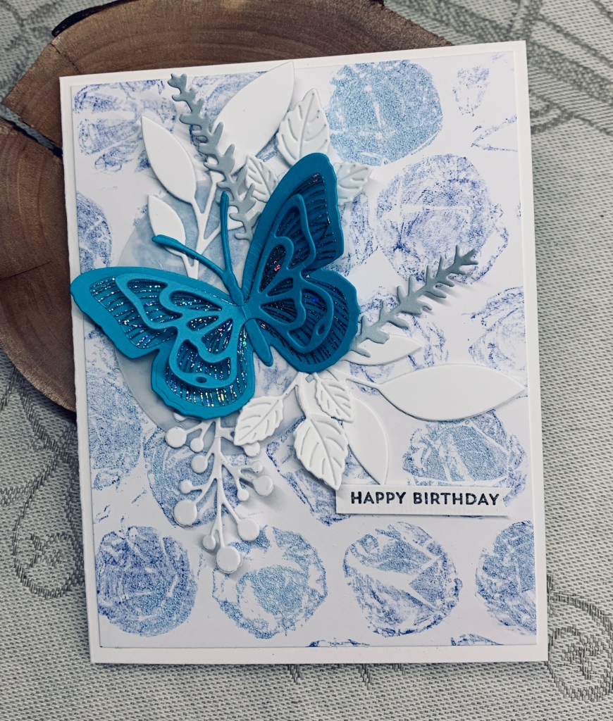
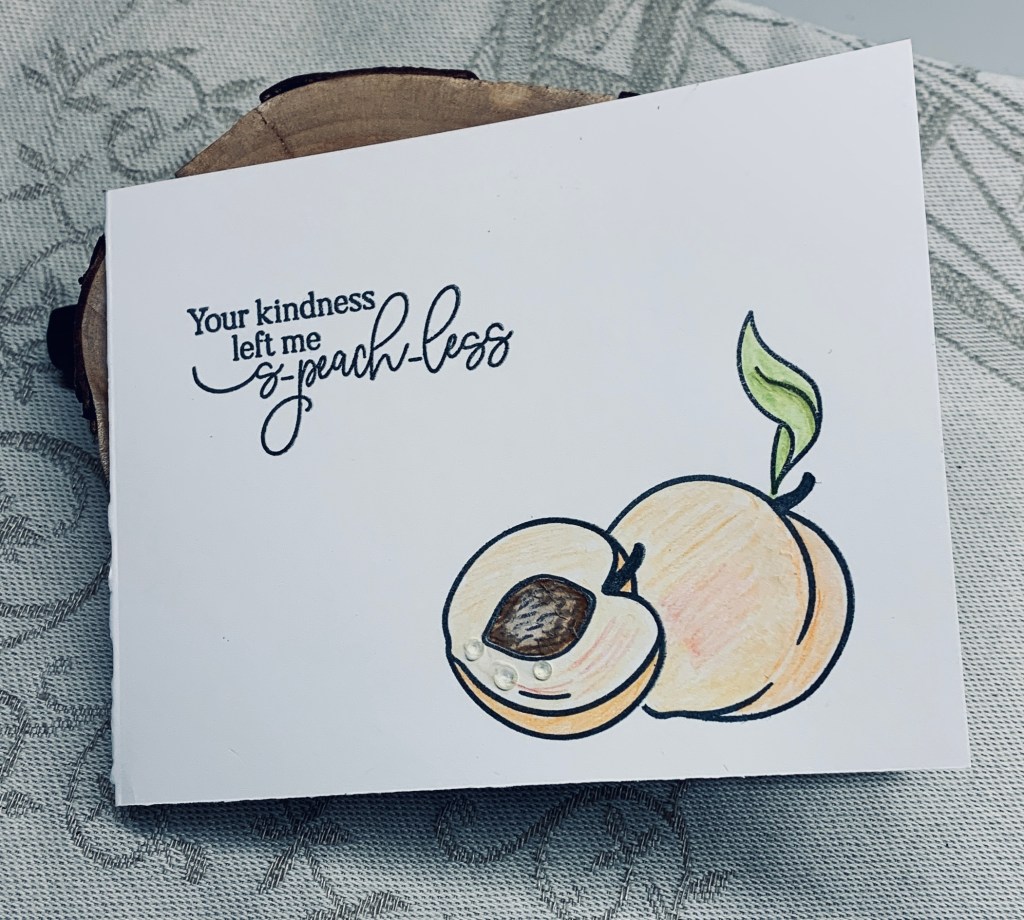
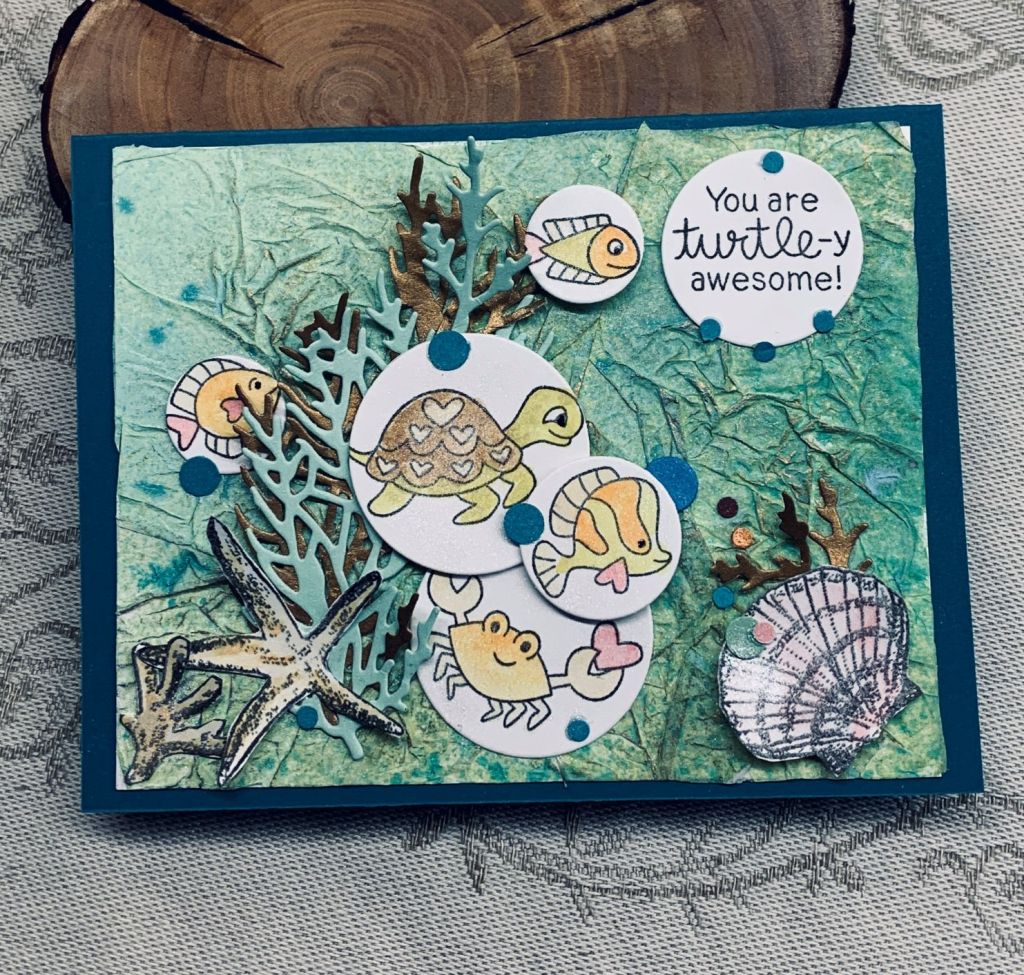
In the meantime I’m watching how to videos and making a card or two. I really like watching Natasha Foote and my post today features one of her techniques using bubble wrap. The challenge at Colorful Options called for blue and this is my take on both Natasha’s card and the challenge colours. I found a piece of the larger sized bubble wrap and followed along with the tutorial getting this background. I added a bit of blue embossing powder to the wet areas so a couple of my bubbles change colour slightly but the main colour used was Blueprint Sketch. I cheated a little bit as the butterfly is from a deconstructed card, received from a stamping buddy, as it was too pretty to discard. Thanks Gayle – it really is a lovely butterfly. Various dies were used for the foliage all cut from scraps of white CS and I added the pale gray blue Lavender stems as well. The sentiment is from an MFT set called Itty Bitty Basics and is one I go back to a lot because sometimes a tiny sentiment works best. The texture one gets from using bubble wrap creates a lovely and different background and it is fun to play with too. I really like how this card turned out and plan on doing more backgrounds using the technique.

Thanks for taking a look, it is appreciated. Hubby wants me to make a larger background for him to photograph. He turns them into textures for his photography projects. Maybe I’ll do that next and he can have fun too.

Love bubbly

Bubbly, flowers with love.

Since having my tooth extracted I haven’t felt in a creative mood, but I really did want to enter a few challenges if I could so yesterday this is what I came up with. It works for four challenges which I’ll link to at the end.

Although it is hard to see in the photo the background heart is embossed with a folder called Brocade by Craft Concepts. Die used is from Hero Arts infinity dies. The champagne bottles were cut using a die from Tattered Lace and some scrap CS. The word is from a set I got in Hobby Lobby when visiting a friend in the USA and the flowers are an unbranded die cut with a scrap piece of glitter paper.

It took me a while to decide on how to use the champagne bottles, but when I thought of the heart it all fell into place very easily. Lately I don’t seem to need wedding cards but the theme at JUG’s is weddings so I kept my card with the theme, but ensured it could be used for other events rather than have a specific wedding sentiment. The purple the Fourseasons challenge inspired the colour, A twist of floral on top of the embossed heart works for CYHTP and anything goes works for Crafting Happiness.

Considering my mood yesterday, I’m surprised at how this card turned out as I actually like it. Sometimes I don’t as you know.

Thanks for stopping by and I hope your Sunday is lovely. Our weather has turned hot and sunny and my garden is beginning to look beautiful.

Just Us Girls #679 – Word Week
May: 142 Anything Goes – Optional Flowers theme

a touch of japan

The other day I was digging around for a specific stamp and came across this one which I’ve had forever and only used a few times. I’ve been told that it is depiction of a famous Japanese painting. I remembered that the challenge at Shopping our Stash called for a woman, so with these 3 I guess I meet the criteria of the challenge.

My initial impression was so off that I canned it and began again. It has been so long since I used a larger wood block stamp that getting a good impression was a challenge on its own. In the end I went over the stamped image with a black fine tip pen because I couldn’t get the hair dark enough. It was stamped onto Bristol CS and then I coloured it. For the skin I used Ohuhu pens but the rest is done with pencils. Because my stamping wasn’t perfect I decided to make a black frame to cover up the poor frame lines of the stamp. The focal panel was added to the PP which is from StampinUP, and then onto the card front. Stamps are from Hampton Art and Stamps in Motion, (I don’t think they are in business anymore).

I had this card partially done on my desk for a few days, but got busy with other things. Having had my tooth extracted yesterday, I’m not allowed to do any gardening or vigorous exercise for a few days so today was the day to finish it. My pots are ready for plants finally, but as putting in the plants involves some bending I’ve decided to wait until Sunday to plant. It is also becoming very hot outside and the forecast is that the heat will continue, so I guess summer is here unofficially.

Thanks for stopping by and have a great weekend everyone.

S-peach-less

Fresh Picked Challenge

Its a bit early for peaches in my region, but I am looking forward to the fresh produce that will be starting to arrive, and peaches are one of the fruits I love.

I used a MayMay Made It stamp set called Just Peachy for my simple and very easy card. Some stamping using my Misti masking off the half peach to add the whole one, a bit of colouring, a sentiment and it was done. I used watercolour pencils and then added some tiny water drop embellishments for some dimension. I thought they made the peach look juicy. Its a good set for a thank you card and I like the play on word sentiment.

Our weather is becoming warmer by the day and the forecast is for some very hot days coming up. I’m glad we got our tanks filled as I suspect we shall be needing the water. My pot painting is complete and successful so we shall be setting them up with plants over the weekend. I guess my crafting will slow down so I can get out into the garden. Its a good thing I have a stash made so I can send birthdays as they come up.

Thanks for popping in, I appreciate it more than words can express.

happy bird-day

Two challenges with one card is always a huge bonus for me. At As You See It: Challenge #298 – New Stuff, and at Just Add Ink it was a mood board in colours that I love. Combining the two was fun.

My new stuff incorporates several items, one is the border die used on the glitter piece, two is the shape of the PP behind the birds, and three is the birds themselves. Its a new stamp set and only one bird had been inked until now. They came from Your Next Stamp as did the shaped die, and the border die is from Heffy Doodle. I had the PP in my stash and thought it would look good behind the birds. The little birds were stamped, heat embossed and coloured with watercolour pencils. I die cut them with Hero Arts infinity circles and added the scalloped circles underneath, cut with a Sissix set. Sentiment is from the same set as the birds and I heat embossed in white onto the purple paper. The little birds were initially stamped with Versamark and then clear embossed but they didn’t stand out enough so I went over them with a fine line pen. I’m surprised that I didn’t mess them up. The purple paper is a very rich colour but looks more black in the photo. Embellishments are from my stash.

I kind of like the end result, but it isn’t quite what I had in my head when I started. Thanks for popping in to look, it is appreciated.

Turtle-y awesome

THING 1: Trouble Maker

says, “National Mother Goose Day is an annual celebration held on May Day, May 1st. All of us have grown up listening to fairy tales and nursery rhymes as children.  Let’s take a trip down Memory Lane and recite or sing some of those nursery rhymes from childhood. 

I chose Once I Caught a Fish Alive for my rhyme. And as the stamped images have a couple of hearts in them, the card also fits the extra twist so it will go into the Heart’s Quest Challenge Blog #29 as well.

A while back I was playing with tissue paper backgrounds and I used this one as an ocean themed card because the background kind of reminded me of the sea. I crinkled the tissue paper, smoothed it a small amount and glued it to some light weight CS. When it was dry I added inks in greens and blue and when that was dry I used my finger to add a hint of gold on some of the raised wrinkles. The stamp set is from Newtons Nook for the sea life images but the shell and sea star are from other sets and were fussy cut. The leafy die cut is from Sissix, cut twice, once in green and once in a matt gold. The circles are all from HeroArts Infinity dies. Images are coloured with various Inktense pencils and a couple of Ohuhu pens. The tiny dots are all fall outs and I used them as embellishments. Mounted the panel onto a teal card front.

I have to say I had fun making this card and the end result pleases me. Hubby likes it too. Thanks for stopping by, I appreciate that you do.

Mother’s day

Our challenge at Cardz4galz is for a Mother’s Day card and I hope this inspires you to join us with your own creations. Generally I don’t make Mother’s Day cards these days, as my mom passed away a long time ago and so did my hubby’s mom, so I don’t have a reason to make them. But I do have a friend who asked me to make her mom a card so this is what I did for her.

The folder is an unbranded 3D one I’ve just acquired. It makes a lovely impression. I was playing around a bit with inks in the folder and initially didn’t get the ink onto the correct part of the folder so this piece came out with a slightly grungy background. I liked it although it wasn’t what I had planned, but I needed more colour so I used the same inks, but this time brushed the colour where I wanted it on the raised impression. The pink wasn’t quite pink enough so I went over it again with a darker ink and liked the result much more. I also wanted some shine so I dusted the entire panel with Perfect Pearl powder and spritzed a little mist to set it. After edging the panel with a black border I wound some thread around it and then glued it to the card front. The sentiment is from a very old CTMH label set and using Versamark I stamped the circle and the center. Then I heat embossed with Recollections Copper. Used a Hero Arts infinity die to cut the circle and added it as you see in the photo.

Because I was messing around with the folder I have several others ready to go for other cards. Thanks for taking a look and I always value your comments. Have a great day wherever you are.

Hot cup of winter wishes

How nice for me that I got one card to work for three challenges. Caffeinated Christmas Card Challenge #17 – Flowers, https://colorhuesthecolorchallenge.blogspot.com/, Anything Goes Embossing with a Twist of BABY (twist not taken).

The image is a digital one from a set that I believe I won, but could have been a purchase and I’ve had them for a while. I thought it was perfect for both the colour challenge and the caffeinated one and the addition of the Holly embossing panel makes it work for CYHTP. The little bird is from a new set by Your Next Stamp and the sentiment is from an MFT set, also mainly bird images.

Once I had sized the image on my computer I printed it onto thin CS and then fussy cut it. I spent some time using water colour pencils to colour in the florals and the bird, also fussy cut. The images are popped up on foam tape and I added a couple of musical notes to the sentiment. I debated adding some embellishments and decided not to for now. I can always add them later if I change my mind.

My literal thinking makes it a challenge for me to relate coffee to Christmas, but I think this one works nicely although I decided on a winter greeting rather than a Christmas one.

We currently have warm temperatures and sunshine so I am outside as much as possible making the most of it. I spent a couple of hours earlier adding undercoat to some large ceramic pots that I dislike the colour of. I’ve decided to make them black so the undercoat is the first step. Got 2 coats on as one was dry by the time I had done the other. We had thought to buy new ones slightly larger than these, but when we looked at costs decided it was ridiculous to spend that much. I had the bright idea (maybe) of painting the existing ones. We shall see if this works, but so far so good.

Have fun everyone and thanks for stopping by.

celebrate you

On one of our theatre trips to Vancouver we had dinner at our friends home before heading back to the ferry. She had napkins that featured these chickens and I thought they could be used on a card. I brought home a new napkin and did the usual separation of layers before adding it to some card stock using ModgePodge. When it was dry I fussy cut each chick and set them aside to be used as embellishments or, as is the case here, as the focal point for a card. Each chick had spots on the wings already and I enhanced them with Nuvo Crystal drops.

The card base was already done with the sentiment as I was unhappy with a card I had done sometime ago and decided to deconstruct it. The sentiment was already embossed in rose gold and one of the chickens has rose gold dots to match. The die is from Kokorosa and I cut the stripes in one piece and added them to the white layer. Actually this layer has a wash of blue over it to make it less stark. Once the chicks were on the layer it was added to the card front and I added a few Pops of Color dots near the beak of each chicken.

I am entering it into the Inkspirational Dots and Stripes challenge. This is the first card I’ve made since Monday, as one my friends was visiting from the mainland and I spent the last few days with her. Thanks for stopping by and have fun till next time.

knowledge shelf

A while back I made a series of pet sympathy cards for a friend who isn’t a fan of what is currently available in the shops. Although I did them as a favour with no expectation of anything in return, she decided to buy me some supplies. All except one were unbranded dies and stamps and this little book die is one of them.

I thought a shelf of books would be fun for a spines can be bright colours so are good for a colour challenge such as this one. I cut several so I could stack them for some dimension and I coloured them with a paintbrush and inks. The shelf they sit on is an MFT die from a recent kit. I lengthened it by gluing 2 side by side. I used a polka dot embossing folder on a scrap piece of CS and added a strip of green to it. Then I added it to the card front and added the focal image on top. The sentiment strip is from a pad by Tim Holtz – Idea-ology. I thought it was perfect for a book card and personally, most of what I know comes from reading and basic curiosity. A few embellishments finished the card nicely.

I know unbranded dies aren’t really the way to go as so many are outright copies of local artists, but when they are given as a gift one doesn’t comment and of course now I have them I am using them.