Sympathy Slimline

SOS471 – Make Mine A Tall One & Just Add Ink #604…Case Yourself!

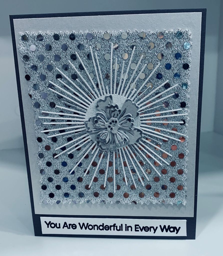
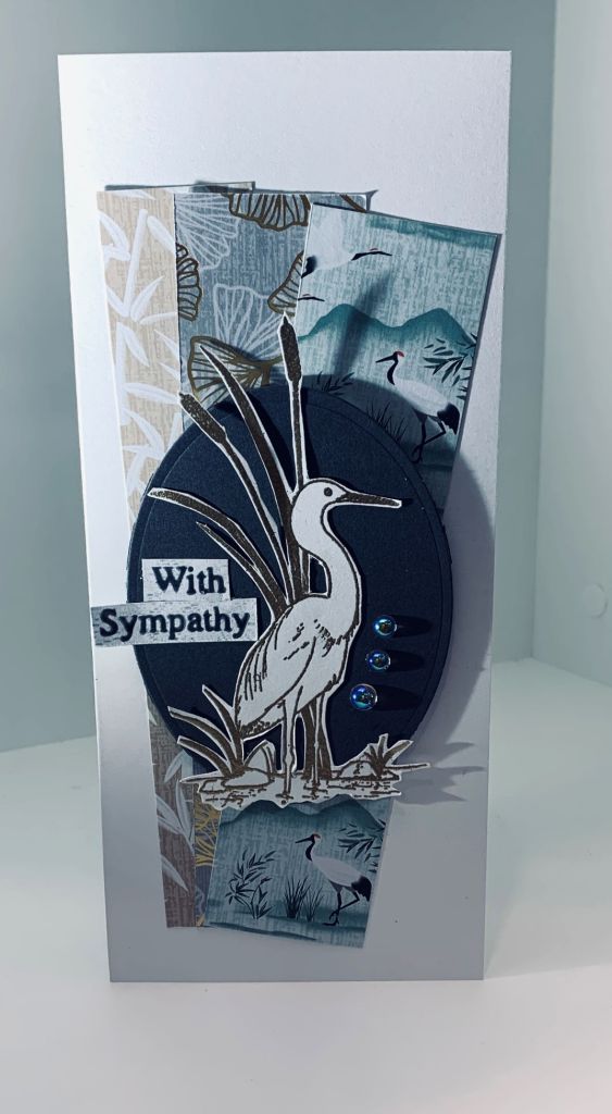
My close friend’s mother-in-law passed away quite suddenly and her family is devastated by the loss. I needed a sympathy card so chose to make one that would work for this challenge at Shopping our Stash. As well, it works for the Just Add Ink because it is a CASE of my previous card.

The papers are all from StampinUp, in this case instead of flowers being added I used an older stamp set from GKD called Wetlands and fussy cut the image once it was gold heat embossed. I added it to a dark gray oval which I then popped up on top of the papers. The bling is from my stash and the sentiment is from the same set but I cut it so it would fit as shown on the card. The light in my craft room is weird today so I ended up with some shadows on the photo and I don’t know about you, but I find doing a photo of a slimline is harder than with a regular size card. If I’m honest I’m not a big fan of slimline cards even though they fit into business envelopes. We are expecting rain later that may continue for a few days. Hopefully where you live the weather is a bit more spring like. Although it has warmed up a bit, it is still cooler than is usual for May. Thanks for looking.

No Layers

Game #215: NO layers + plant/grow/farm

As I don’t have that many stamp sets that may work for a farm style challenge such as this one at AAA, I did find a stamp of a farm animal so I used it for my card. After stamping the sheep I masked it so I could stamp the leaves above his head. All stamps come from GKD but different sets. I stamped the leaves and then again without reinking the stamp. I grounded the sheep with some grass. To colour him I used mainly Sakura Glaze pens and although it doesn’t show on the photo the white glaze pen show as circles which makes his body look like wool. Hope you enjoy your day. Thanks for sharing time with me.

The Recipe for Subtle Beauty

Challenge #275 – Recipe for Subtle Beauty

The challenge at ‘As You See It’ is a recipe this week and you have to have all the elements plus something beginning with B. My card features both blossoms and a butterfly so the B is covered twice. The rest was deciding on the design and putting it all together. I started with an embossed piece that I had been playing with yesterday. Its a new folder and I was having issues with the sandwich initially. The folder is from Spellbinders and is a slimline tile look. The piece I’ve used here is the best portion of one of my tries cut down to fit. I sponged over it gently in two yellows before using it. I die cut a half circle in the top layer piece and added the two pieces together. Then using a die from Memory Box called layered Impatiens I die cut quite a few flowers and leaves. Using a sponge I tapped two colours (pink and yellow) over the flowers until I was happy with the subtleness of it. Did the same with the leaves. After putting the flowers together I started to add them to the card front along with some leaves. Its so easy to follow the edge of the circle. The butterfly was cut with a Gemini die that came with the machine. For the shiny part of the recipe I chose to add some tiny gems to the center of the flowers. They are iridescent and are from Trinity Stamps. The body of the butterfly has some extremely small black gems that used to be on a sweater. When it wore out I removed quite a few to use on my cards. They are also shiny when they catch the light. For now I’m not adding a sentiment and will decide on that when I use the card.

Have a fun day and thanks for looking.

Slimline Floral

Just Us Girls #633 – Color Week

I don’t do many slimline cards, but the colour challenge at JUG’s this week seemed to lend itself to one. I got as close as I could to the colours although on the photo my tan piece looks a bit brown. In real life it is a real tan colour. To me the photo at JUG’s seems to have more of a sand or beige tone rather than tan but the computers never show true colours in my opinion. The coral was another challenge as I don’t have any CS that is in coral and when checking some swatches the closest I could get was this marbled PP that has a pinkish tone along with the darker coral. Inspiration for the design is from a card by Jean Okimoto see Here. The dies used are from Memory box and the bling is from Trinity Stamps. The sentiment is from Joy Clair and was stamped in Blueprint Sketch. Although this may not be exactly what the challenge is looking for, I am happy with how the card turned out and I’m sure any recipient will be pleased too. Have a great day everyone.

Two Patterned Papers

Make the Cards Challenge #55

For this card I chose two papers from StampinUp and cut them into 2″x2″ squares. I had seen a sketch design on Pinterest and decided to follow it somewhat although my card only uses 2 sets of squares and the sketch had 3. I backed the squares with 1/8″ larger gold squares and added them to the embossed layer. Embossing folder is a fairly thick one from SSS and it has been a struggle getting it through my Big Shot. In the end I created my own sandwich to get it to work. (thanks for the tip Golda). The little butterflies are the extras I had after my last post and I decided to use them here. I also added one sketchy flower in gold after I had added the sentiment. Sentiment from a Joy Claire set and I backed this with gold as well. I added some pink pops of color to the centers of the embossed flowers as well as body of butterflies. I’m really pleased with how this one turned out. Thanks for looking and I hope you are having a wonderful day.

Monochromatic Silvers and Grays

Monochromatic

One of my friends had a ton of small fabric samples from when she was in China and in a recent clear out she brought some of them to me. This piece sparkled and I wondered if it would work on a card. Obviously it did and here is what I made using it.

Having decided on the fabric I made the rest of the elements using grays and silvers. Taking some scrap pieces of a subtle silver CS I added the fabric to a larger piece and die cut the flower using another. Die used for the flower is from Memory Box called Layered Periwinkle. The burst die cut is from SSS and was cut using a textured gray scrap. This die is a great idea, but challenging to cut and I had to try a few times before it cut cleanly. I added it to the fabric layer and then carried on with assembling the flower. It needed a bit of additional colour to stand out so I used a gray Sakura Glaze pen around the edges of the petals and along the veins and that was just enough to make it work the way I wanted. The sentiment is from MFT and was heat embossed in black. I added the entire panel to a slate gray card front, and the photo doesn’t do it justice as it is quite stunning in R.L. Have a fun day everyone and thanks for taking a look.

A Cloud of Butterflies

http://www.global-design-project.com/

Having spent the morning doing a bit of weeding and making my hands hurt in the process, I didn’t think I would be able to do any crafting today. Somehow I managed it and this is my second card of the day. The butterflies are a die from SSS, that I’ve had forever and not really used so it was good to dig it out. I had a piece of CS leftover from a session of making an inked background and I cut the butterflies using this piece. Then I went over them with a small amount of opal blaze polish so they shine a lot in R.L. I also made a stencil from some acetate and I inked through this with blue print sketch, to get the initial image of the butterflies. When everything was dry I added the die cut butterflies on top of the stencil part making sure that the wings were free and could be pinched up. I added the piece onto some dark blue glitter paper from Scrapbook.com and then onto the navy card front. The pops of color were added to the bodies of the insects and a few more to embellish the layer a bit more. I haven’t decided how I wish to use the card yet so have left the sentiment for now. If I do this again, I shall paper piece and colour some of the butterflies into a thicker CS layer and then add the die cuts on top so I get more dimension. That said I quite like the way this turned out and hope you do too.

Neck of the Woods

Color Hues #41- Red and Aqua & PP591 – A Clean-and-Simple Challenge from Laurie

It is nice to create a card that should work for two challenges and I’m entering this into both the ColorHues and the Paper Players Challenges this week. For the images I used a stamp set from MFT called fox and friends and with a bit of masking here and there I stamped the houses. Once stamped I added some colour to the sky area and a faint amount of green to the lower portion. I stamped some clouds and added some white gel pen to them. Houses were coloured with Inktense pencils, dark Aquamarine and poppy red. The little fox was stamped, coloured and die cut and I added him to the top piece which was die cut with a scalloped rectangle unbranded die, before adding this layer to an aquamarine scrap piece and then onto the red card front. I almost forgot the sentiment and added it at the end using my Misti. This stamp set was originally a Christmas set so it is good to use it for something other than Christmas.

Floral Thanks

Anything Goes Embossing With A Twist of Flowers & SOS470 – Power of Pastels

The CYHTP challenge had a twist of flowers as part of the challenge and I realized during the making of the card that it also fit the Power of Pastels challenge so it is a 2nd entry into that challenge too.

There is a possibility that my card may not be correct for the challenge as I used a cover plate die by CUTplorations and dry embossed with it instead of using a folder. In the interest of being honest I thought it best to mention this fact. Once the piece was embossed I went over it with some sponges that had leftover colour on them and got this very soft pastel effect. I also added a few dots using my new Pops of Color to give more interest and depth. The pink band is a leftover piece of CS and I added the die cut sentiment which is from Gemini to the right edge. With a new Memory Box Layered Daisy die I cut the flower pieces in white and added a hint of Iced spruce to them before assembling. I also added some yellow pops of color to the flower center and popped it up on the left side. I quite like the result and it was an easy card to make. Enjoy your day and thanks for taking a look.

Welcome to my Garden

Just Us Girls Challenge #632 – Trend Week

Showing a different angle

This card was made by the request of a friend who wanted a special card for her mother’s birthday. Her mom loves gardening so I created a paper garden for her. There were several stamp sets used: StampinUp’s Petite Coccinelle, Joy Clair sentiment, GKD for the fairy, Hero Arts for a butterfly along with several unbranded flower dies, a tulip die and of course the Grand Cabinet die for the layers. The background butterfly PP is from StampinUP.

Once I had the layers cut in the two colours, I began to build the card. I used some plastic strips to give height to some of the elements and most of the colouring is done with a combination of Inktense pencils and Sakura glaze pens. Taking a photo of this card was a challenge and it looks a lot nicer in R.L. than it does on my blog post. It took quite a long time to make but was fun to do and my friend loved it as does her mom. Have a great day and thanks for looking.