Celebrate

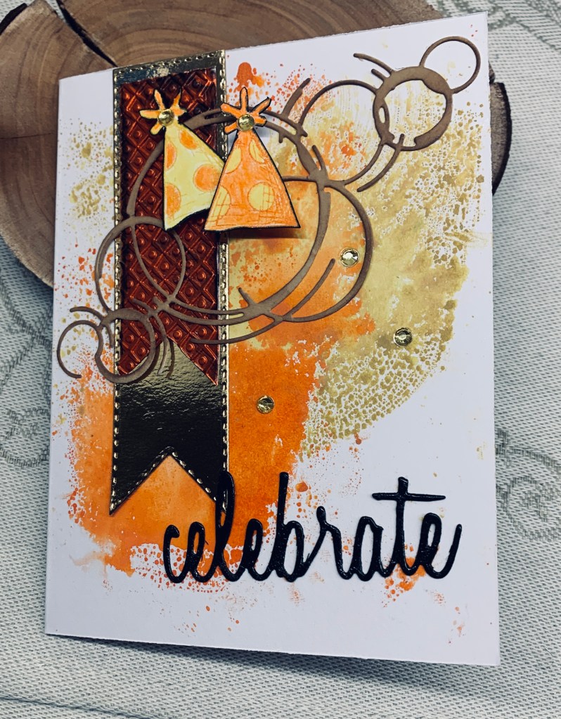
The newest challenge at Seize the Birthday #292-Celebrate, and they want us to use the word as part of our design. I’ve had a die set of words by Sizzix for a long time, so I pulled it out and first cut my word in black. Then I took an older die from Memory Box called Sketchy Rings and cut in a neutral Kraft type CS. My gold banner is done with an unbranded set and I overlay a scrap piece of embossed metal on top. For this I hand cut the banner bottom. Using a piece of plastic and some Distress Oxide inks I swiped the inks, spritzed with water and then schmooshed onto the white card front. I moved it around a bit until I was happy with coverage and then heat dried it. Once dry I added the banner and the rings. My word was dabbed into Versamark and then clear heat embossed for additional shine. An old Tim Holtz stamp set had the hats so I stamped two, coloured with pencils and a little water, then fussy cut. I edged them with a black pen so they would stand out a little more and used foam tape to pop them up as you see. A few gold embellishments finishes the card.

This card has turned out better than I expected and is very vibrant. My hubby thought it a good one which always boosts my ego. Thanks for stopping by, I truly appreciate that you do.

good friends

For a change, I let the pretty paper do the heavy lifting for this card. I found it yesterday when looking for another sheet for a different project and decided to use it with this leftover frame, cut with a die set from StampinUP. The little bird is a YNS stamp and I had him already fussy cut, in my bits and pieces box. He was coloured with pencils. The sentiment is from a Hampton Arts set.

After gluing the PP to the frame I set it aside so I could do the actual card front. I had the pink note card ready and I added the blue piece creating a split look. After adding the framed piece I stamped underneath in black and popped up the little bird at the side. I added a touch of glitter on the bird and called the card finished.

I quite like it and the simplicity of the design made it was quick and easy to do. I am entering it into the following challenge: Color Hues #95-Blue and Pink

Thanks so much for stopping by to take a look. It is appreciated as I know your time is precious.

live life …

At this time of year many challenges seem to have an Autumn theme and this card fits two of them. The PP is from StampinUp and was a gift to me. I hadn’t used much of it and decided it would make the perfect background for a fall card. Photo doesn’t do the paper justice as it is so vibrant in reality. I used another StampinUp product for my focal panel and die cut the rectangle before stamping the images. The stamp set is from YNR, now out of business, and I chose 3 of the leaf stamps and the smaller acorn for my design. I used Ground expresso to stamp the outlines and then heat embossed them before adding colour. Used Inktense pencils and a gold Sakura glitter pen for the tiny heart. When colour was dry I added a little Distress glaze to set it. I also sponged the edges of this layer. This piece was added using a foam panel with the sentiment being cut into 2 sections and added as you see. I’m quite happy with the end result and it is a card I can use for any occasion.

We have had a welcome deluge of rain since last night and it is very wet outside. A good day to be in my craft room and I have to get cracking on some Christmas cards soon. My good intentions to do them throughout the year hasn’t been consistent enough to make a huge difference to my stash.

Links to challenges: https://daranddiane.blogspot.com/ and https://shoppingourstash.blogspot.com/

Thanks for stopping by, your time is appreciated as are any comments you may leave me.

sorry for your loss

One of my yoga and coffee group ladies, lost her mother last week so I made this card for her. I used a Taylored Expression tree die for the focal layer and a StampinUp EF for the background section. After cutting my trees I added some lost shadow ink and before it was dry sprinkled a little silver embossing on top so it has more texture and a little shine. After adding some foam tape I set it aside so I could emboss the background on some StampinUp PP. This was then added this to the entire card front. The die cut was added and using a small piece of scrap card along with using a transfer from some rub-ons I have, I did the little bird. Then I fussy cut before popping it up on foam tape. I cut my circle with another StampinUp set and added the sentiment in Blueprint sketch ink. I also sponged the edges with the same ink.

I’m quite happy with the end result. It has a soft and subtle look that works for a sympathy card.

I’m adding this card to the current challenge at CYHTP although the option of adding fall colours hasn’t been taken.

on your birthday

Seize the Birthday #291-Stripes, This card almost didn’t get done, because I’ve spent the last 5 days battling what I believe is a reaction to some medication changes and it has been quite unpleasant. I had it partially started on my desk and there it has been until I completed it in the middle of last night. Couldn’t sleep so I gave up and decided to finish it. I’m not totally sure about it, but I’m not in the mood to change anything or to begin another one.

My artist friend gave me a scrap of photo canvas that I took a liking to. I love its texture and the subtle sheen. I wondered how it would take stamping and embossing and the results aren’t bad, but it a hard medium to stamp on. Using the Spellbinders Elegant diamond set I stamped the striped section using Versamark and then heat embossed it with a verdigris powder. Not quite perfect but not bad. I trimmed it to allow for a background layer which is done using a cut up poorly printed photo and I used a small piece of that to also cut the Ginko leaves. These are from Kokorosa. They were a bit paler than I wanted so I added some Inkagold paste using my finger. Doesn’t show up well in photo. I already had the background diamond in my stash cut a very long time ago and I added this before popping up the leaves on top. It adds just enough contrast to let the leaves be more visible. Added the sentiment from the same stamp set and glued all the layers together onto the card front.

I still have a small piece of the canvas left and I shall be playing to see how inks take to it at some point soon.

I really appreciate you spending time with me today and thanks a lot for any comments you may leave me.

key to the door

Pamela has chosen any Colouring medium for our new challenge here at cardz4galz. She will also be choosing the winners.

The background is from a cut up photograph that was printed on a silver paper. When I first did the die cut of the buildings I had another project in mind, but didn’t use it so it has been sitting on my desk for weeks. The buildings were cut using a new die from Kokorosa, and then I strategically cut the strip so I could stack them a little. I backed them with some mirror CS to give the look of light behind windows and used dimensionals on the shorter piece. Before that I coloured the buildings using watercolours, but wasn’t totally happy so added some Spectrum Noir markers over the top to get a deeper colour. My key is from a puffy sticker set. I used an alphabet die set from Scrapbook.com and hand printed the word new. Letters were die cut from a recent ‘use up’ my strips session and this piece was rather small for anything else, but worked well for letters.

Thanks for stopping by and any comments you leave are always appreciated. We hope to see your creations in our gallery soon.

Halloween hello

It is a sketch challenge at As You See It- Challenge #332 – Geometric Elements. I turned my card into a portrait rather than landscape and did one of my very few Halloween designs. The plaid oval is cut from another piece that I created using a Taylored Expressions plaid stencil set and Distress Oxide inks. I used a Hero Arts infinity die set and cut 2 more ovals each one slightly larger that the other. Once I had the 3 glued I set them aside so I could continue with the rest. My rust coloured pieces are actually a paint chip and I added this to my card front. Paint chips sometimes get whitish edges when cut and I decided to use a Spectrum Noir marker at the edges. I wasn’t happy so I added a gold pen line as well. My little witch is from an old GKD set that I fussy cut, embellishments from my stash, and the shadow word is from Creative Expressions. A very simple card but I quite like how it turned out.

Thanks for stopping by, I appreciate your time and any comments you may leave for me.

Patterned Paper hugs

Having seen Natasha Foote create a few cards using PP and something similar in design to the ones posted here, I decided to enter my card into the challenge at https://lovethoseprettypapers.blogspot.com/. I simply followed the example by Natasha, but added my own spin. In this case my PP panel is smaller and I wanted to have a border behind so I used some holographic paper to create one. My PP is from some freebies that came with a long ago crafting magazine, can’t even remember which one now. I used an unbranded rectangle die set to cut my finished panel. My sentiment is from a Creative Expressions set, and cord is from my stash.

My second card while similar to the first was cut with a die from Lawn Fawn and the word is cut using an MFT die. Embellishments from my stash.

The beauty of these papers is that they fit together well, no matter which side of the sheet one uses. I managed 3 cards out of my sheets.

Thanks for stopping by, I appreciate your time and any comments you may leave.

apple of my eye

Another card for the Sunflowers Challenge at DD. A while back I had been playing with the shape you see here and then never used it, as the card I was thinking about just wasn’t working. I set it aside thinking it would be used at some point. The PP is something I inked a while ago and again didn’t use but I liked how it looked as a partial background on this yellow note card. After adding the shaped piece using foam tape the card developed from there. Yesterday I stamped several sunflowers both larger and smaller but only used one of the larger ones. After adding a few details to these 3 small ones, I fussy cut around them. The apple stamp is from an old StampinUP set and again I had stamped it for another project but didn’t use it. I wondered if it would work as part of a harvest basket, decided it would and went from there. The sunflowers are all GKD stamps and I used foam tape so I had room to add leaves. Leaves are from an old die for which I didn’t keep the name, but suspect it would be either Spellbinders or Sizzix. The small die cut floral is from an unbranded die which I cut up and glued flat. I stamped and added the apple sentiment at the bottom. I did use a Sakura glitter pen over the words and it looks better in reality than on the photo. That said, I am not sure I like this card, but they often grow on me.

I really appreciate your comments and that you find time to stop by.

It’s hip to be square

For challenge #233 at Cardz 4 Galz, Debbie has chosen the theme of square and you can use squares or make a square card as I have done. My card measures 4 and 1/4 with smaller square layers on top. Basically I used all the scraps that I had sitting around. I used a stencil on one layer and added a half circle of the bright pattern paper so that the negative circle layer fit nicely on top. I edged the layer with more of the bright pattern paper and used a butterfly I made some time ago using Scrapbook.com dies. I also added a bit of yellow ink over the negative die piece to reduce the white.

It was a good feeling to use up all the small scraps I had sitting around and it was an easy card to make too.

Thanks for stopping by, your time is appreciated as are any comments you may leave for me.