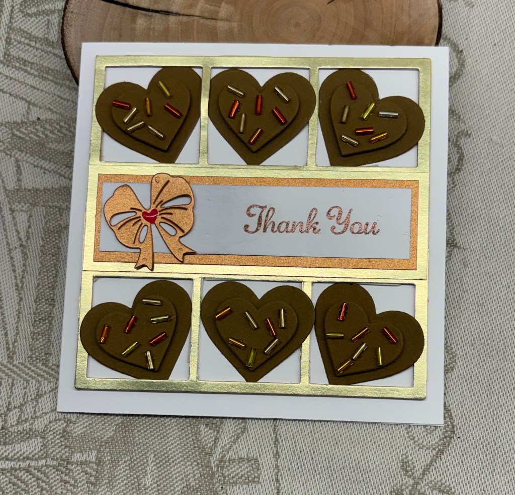
angel or imp

This card is part of a few I’ve made and uses paper from a CraftSmith paper pad and a very old wooden block stamp by Eureka Stamps. I’m quite sure they no longer exist, but the stamp was gifted to me and I find the image cute so I’ve kept it. An Angel with a slingshot is an amusing thought to my weird mind.

I wanted to try this style of fold as it works well for using PP and enabled me to make a few at the same time. I coloured the image using watercolour pencils and added some shine using Sakura pens. When it was dry I fussy cut the image and added it as you see. Behind the image fold is where I have my sentiment and a place to write a personal message.

Thanks for taking a look, I appreciate your time and any comments you may leave.

This fits the challenge at Inkspirational Challenge #353 – Designer’s Choice – SEEING STARS so I shall enter it there.

winter warmth

Whether my mojo is back or not, Christmas cards are my must do at the moment, so I’ve been busy creating at least 3 or more per day. This card was designed with the challenge at https://sundaystamps.blogspot.com/ in mind and I’ve used their colours as best I can. I had this Woodware stamp set on my desk so I stamped both ornament branches and clear heat set them, keeping this one for the challenge, while the other will be used elsewhere. I then coloured using mostly Copics and Sakura glitter pens. Alcohol pens are not my go to, so my skills leave a lot to be desired, but I am reasonably happy with how this one turned out.

I used some black and red CS to back my image before attaching to the card front.

Thanks for stopping by, I appreciate you, your time and any comments you leave for me.

Fall birthday

Seize The Birthday is asking for Favourite fall treats which leaves quite a lot of scope for your designs. As an invited guest DT I came up with this card.

As an Ex-Pat Brit, we didn’t have all the hoopla that is part of living here and I’ve never quite gotten used to the N. American way of celebrating it. Asking me what my favourite treat is, is a hard question for me to answer. I’m kind of boring, as I only like regular coffee, so all the flavours available aren’t something I would go for, and although I enjoy pumpkin pie, I can’t say I’m mad for it. Likely because of this I don’t have a lot in my stash that pertains to this theme. I do however enjoy the fall colours and seeing pumpkins stacked up in a store, or watching kids at a pumpkin patch, choosing the one they want to carve up as part of the upcoming Halloween fun.

All that to say making a card for this challenge was somewhat of a real challenge for me. In the end I chose to do a fall scene. I pulled out a Birch/Aspen tree stencil and added the blue sky and some grass to show between the trees. Then using a fine brush and some ink I shaded the actual trees with Lost Shadow and some Hickory smoke to give them some definition. My gate and the small topper are dies from Gummiapan and I stacked a bunch together to give the gate some dimension. I cut the topper in green as well as yellow and stacked them so that there was some green showing after I cut off some of the yellow bits I didn’t need. I also went around the wood edges with some ink, but the actual wood grain is from a dollar store paper pad. A Tim Holtz stencil was used for the pumpkins and I moved the stencil around to try to get a stack. Once it was dry I added some additional colour for definition and then fussy cut. After adding the main layer to the card base I placed the gate and the pumpkin stack where I felt they looked best and glued them down. The sentiment came from Hampton Arts and I used foam tape to get it to sit over the edge of the gate frame.

I’ve had a lot of fun being the guest designer here and there is one more to go before my stint is finished. I sure hope you have fun creating your own favourite fall treat cards. Thanks for stopping by, your time and any comments you leave are highly appreciated.

weird ferns

Halloween Colors Challenge is what Double D is asking for and I had to think a bit before settling on this design. I really didn’t want to create a Halloween card, but initially it was a challenge to decide on how to use the colours. It was tempting to CASE one of the designers, but I did this design instead.

After going through my stencils I pulled out this fern design but I honestly don’t know where the stencil came from. Most likely it is a Crafter’s Workshop brand. After adding the inks I also heat set it with clear powder. I inked up a white card front around the edges in orange and cut a dark green border around the fern piece before adding it to the card front. From a GKD set by Melanie Muenchinger I took the circle stamp and the sentiment. Cutting around it I added some foam tape to the back and adhered to the card.

I really must clean up my space as my desk looks like a bomb has gone off at the moment. Perhaps this mess is contributing to my ongoing small slump in inspiration? I found a small stamp in a weird place and now have to locate the set it belongs to. I think I know which one, but it requires some searching to be sure.

Thanks for stopping by, I appreciate it more than words can express.

Orange floral

The challenge at ASYI is a recipe Challenge #359 – Recipe for Autumn Florals and I came up with this card. I already had the stenciled piece in my stash. At the time I made it, I didn’t like it much so it was set aside.

Today I thought about creating an inked Ombre style background, but remembered I had this piece and decided to use it instead. I cut it down and added the die cut sparkly frame over the top. Then I used a word die with a shadow, cut the shadow from the same sparkle and added the word in black on top. The today word was stamped and fussy cut and added underneath. After stamping and die cutting my flower I added it to the corner along with a small fussy cut bud piece.

The recipe calls for flowers, check, a frame, check, shades of orange, check, a die or punched piece, check, and a Happy sentiment, check. My flower and the word today are from a GKD stamp set by Lisa Hetrick, the background are stencils from StampinUP, my frame is an Amazon unbranded set and the shadow word die are from Pink & Main.

I’m still not really inspired to create so I’m happy I got this and another card made today. I won’t call either of them my best work, but they aren’t totally horrible. I read somewhere that when mojo is lacking just making something is a way to get things going again and my hope is this will be true for me.

Thanks for stopping by, I appreciate you, your time and any comments you may leave for me.

fairy dreams

Challenge #261 as chosen by Debbie, is to make a card for a little girl. For me this was a challenge as I don’t have any children in my life so I’m not into making cards with them in mind. That said, I remember being very enamored with fairies when I was a little girl, so I decided to make a card incorporating them. The larger fairy is from Crafters Companion, while the smaller fairy and the sentiment came from an older set from GKD. Paper is from a pad and the dragonfly is a sticker. The larger fairy was stamped onto vellum with Versamark and then gold heat embossed, after which I fussy cut. The smaller fairy was stamped directly onto paper and heat embossed as was the sentiment. I added a feathered skirt to the larger fairy, just because I could.

I’m thinking of giving this card to my neighbor as she has female grandchildren who may like it. We hope you have fun making your own creations and look forward to seeing what you create in our gallery. Thanks for stopping by.

uncluttered

After a week of not really being in the mood to create, I finally had a small break through and these cards are the result. As the challenge at https://abcchristmaschallenge.blogspot.com/ is asking for uncluttered and/or vertical I decided that my card would work for the challenge. In addition, it works for another Christmas challenge at https://12monthsofchristmaslinkup.blogspot.com/. This one is an anything goes challenge. I’ve not entered here before and haven’t entered often at ABC either.

To make my cards, I used a lamp die by YNS, and an unbranded die set that includes wavy dies to make hills etc. My wreaths are cut from a scrap piece of last years PP and by cutting out the center I was able to hang it from the lamp post. The sentiment is from a Woodware set. I used a gold glitter pen on the lamp light. The little houses were bacled with some gold paper and my tiny trees are cut from a scraps. Using a Sakura glitter pen I added some lines to the hill tops and snowman as well as to the berries on the wreath. I felt the snow needed more so using a glue pen and super fine StampinUp glitter I was able to make it sparkle. The other two cards were done in a similar fashion only one has been sprayed and the other uses the super fine glitter. I quite like the simplicity of these cards and they are still flat enough to mail easily, if and when the service goes back to work. I think the postal strike has been a factor in my lack of mojo.

It is Thanksgiving here in Canada, and we are expecting guests later on. I’ve been preparing food for their 2 day stay since Friday. No turkey though, instead I’ve prepared a stuffed Pork roll and for tomorrow a lasagna. It took a while to put the rooms together as there is 4 people coming, all members of my hubby’s former photo club. Fortunately I am able to split the king bed into twins and after adding a camp cot to the other room they should be fine. After a deluge of rain yesterday, today is cold, sunny and extremely windy which means a porch full of leaves to clean up again.

Thanks for stopping by, I appreciate your time, and any comments you may leave.

shades of fall

After this long hot and dry summer it is a relief to be heading for some coolness and hopefully some rain. I’m sure I’m not alone in thinking this way, although for sure we will all eventually be longing for winter to be over.

Our current challenge is to use the shades of fall and our recipe is to use 3 colours, 2 images, 1 stenciled or dry embossed piece, with an optional Twisted Sister idea to use either a fall fruit or veggie. As well you can use the Twisted Sister thing 2 double dare, which is to participate in the TSOT sketch #681 and/or the alternate Pearly Sparkles challenge #112. Bear in mind the risk of backlinking so your entry isn’t disqualified.

My card doesn’t fit the sketch challenge at TSOT, but I did add a fruit to my project. In case anyone isn’t quite sure – an Acorn is considered to be both a fruit and a nut. In a way my card uses the spotlight technique as I stamped the images onto the layer first and then again on a separate piece so I could die cut. Because I used Distress Oxides to stamp I was able to heat set the images clear making it easier to colour them. At the same time I added the sentiment and heat embossed it too. I coloured each image exactly the same using more than 3 colours and I did this with both ink and water colour pencils. The stamp set is from YNS and has matching dies although I didn’t use them here. I wish the company was still in business as I noticed that the sentiment stamp has a slight fault that I didn’t realize was there when I purchased the set. When everything was dry I die cut 3 small circles using Infinity circles from Hero Arts, making sure the die was smaller than the main stamped image. After adding some foam tape I carefully attached the circles on top of the main images. I also used an alcohol marker to go around the edge of this layer for a bit more definition although it is glued flat. The dry embossed layer was done using a Sizzix Tim Holtz 3D foliage folder and I swiped inks over the raised parts in the same colours as used when colouring the images.

Thanks for joining me today, I appreciate you and your time. We look forward to seeing your creations for this challenge and above all hope you have fun creating.

harvest moon

I’ve been puzzling over the challenge at As You See It – Challenge #358 – My Favourite Autumn Things for a few days and eventually come up with this card. A few of my favourite things about fall are the Harvest moon, the crisp mornings and evenings, as well as beginning to see the skeleton shape of the trees. Lately I’m in a creative slump and have been avoiding my craft room except for keeping up with my duties as a DT.

Yesterday I saw a card by Frenchie Stamps that actually gave me an idea and I decided to CASE the design. I found some paper and created the base of my card, but when I created the die cut circle scene, I realized it didn’t work for the background part. After setting it aside, I decided that instead of doing the scene in miniature I would create it on a larger piece.

First I created a scrap piece I could use as a stencil to do the moon and I used the die cut as a mask, so I could ink the background fully. I also added a little brown and gray ink to the moon to make it look more realistic. Taking a Design by Rynn stencil I sponged through it with a gray ink to do my tree. Using another die cut circle, a sentiment and a leaf, from a Gina K set, I stamped the sentiment and then inked the circle some what to take away the starkness of the white. I used this to cover up a mark made during the inking of the background. After adding a few Nuvo Crystal Dots I stamped the leaf randomly three times and called the card complete.

Thanks for stopping by, I appreciate you and your time.

splish splash

The challenge this time is basically splashy – interpreted anyway you like – rain, puddles, swimming, bath time, splashy drinks or just getting splishy splashy with inks. That said if you create something that isn’t totally obvious do make a point of letting the team know what it is in your post.

As you can see, I’ve chosen bath time as my theme because I wanted to revisit a technique learned a long time ago and not used much since. First I decided on a square shape and cut my layers accordingly. Then taking the main background layer I scored it in both ways at half inch indrements giving a tile effect. I stamped a leafy branch silhouette image from Crafters Companion randomly in Broken China ink to created patterned tile look. Setting it aside to dry I proceeded to stamp and die cut the other elements from a Hero Arts stamp and die set. Before cutting them I coloured the images using a combination of alcohol markers, inks and pencils. I also added some Nuvo Glaze to the bubbles and the water edges. After die cutting I played around with placement and added different thicknesses of foam tape where needed, but it required something more so I traced and fussy cut a shelf shape, coloured it and popped it up to give it more dimension. I found an image on the Internet that had bathrobes hanging and cut one out after I added some colour. This too was popped up with foam tape. The sentiment is from the same set and I used it above the shelf after fussy cutting around it.

Although I liked the finished card, I felt the background leaves were too strong in colour, because I obviously forgot to stamp off when doing the images. I needed to find a fix and I settled on using white pigment ink and a water brush to soften the colour. It took several layers but it worked and because the leafy image wasn’t too defined I didn’t have to be too careful doing it either. I have to say my artist friend was really helpful in trying this as she suggested trying to lift some of the ink. The problem with her suggestion was that the card was already assembled and I wasn’t prepared to pull it apart. So instead we tested it out on some scrap before actually doing it on the card.

Thanks for joining me today, I appreciate you and your time. I had a lot of fun creating this card and look forward to seeing what you come up with in your own designs. Have fun creating.