Relaxation vibes

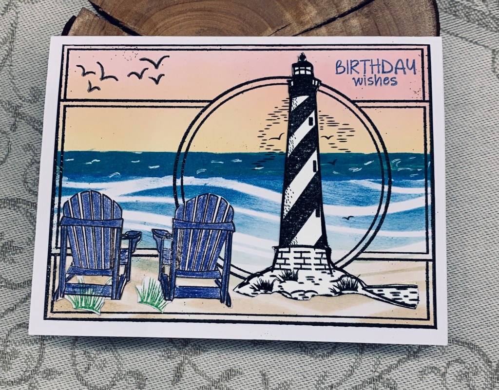
At first, I really wasn’t sure what I wanted to do for this challenge so I checked out a few different posts to give myself some ideas. I saw one idea using a frame that I quite liked so in a way I’ve CASE’d it with this card. Mine is, however, quite different because I didn’t have the same style of frame so using what I have became the mantra.

The stamps used are from a couple of older sets, the frame from GKD, the rest mainly from Inspired by Stamping, and the sentiment is from Kokorosa. I started by inking the the background and for this I used a wave stencil and distress oxides. I masked off the horizon line so I could sponge the sky and then promptly messed it up after I had removed the mask. These days I don’t get so fazed over a mistake and to fix it I added a second horizon line and made a wash of darker colour to cover the mistake. I quite like the cover up. The beach chairs were stamped, pencil coloured and fussy cut as was the lighthouse. Then I took the frame stamp and stamped it in Black Soot, added black embossing and heat set. Even though I had carefully dried the inks and used an anti static quite liberally I still have specks here and there. I decided to embrace them instead of fretting. I realized that fussy cutting the lighthouse with the little lines and birds wasn’t possible, so I figured out the position and stamped it directly onto the panel before adding the cut piece over the top. I added a few white lines on the darker section of the ocean so it looks more like waves, cut the panel down to the correct size and added it to the card front.

We tried to stay awake the other night, so we could see the Aurora Borealis but simply couldn’t do it. For night owls like our friends it is doable, but we are up so early in the morning that staying awake after 9pm is almost impossible. They got some great photos and seeing it in person remains on my bucket list. I’m sharing 3 of their photos here.

Thanks for stopping by, it is appreciated.

Recipe for Drama in Black and White

The recipe challenges at As You See It, always leave lots of scope for creativity and with this card, I think I can safely say my mojo is back. That said, I almost ruined things because I forgot the embossing part of the recipe which meant more creative thinking to find a work around. In the end I cut the focal panel down to a smaller size and built the background around it giving me a 5X7 card when finished.

I used a couple of punches and some scrap PP to do the inchies. Papers are from GKD and StampinUp. I backed them with a black layer and then a white one using a pen on the edge of the white squares so they would stand out more. After gluing them to the white layer I added the pops of orange die cuts. All from a Gemini Crafters Companion set. I cut one black sentiment and one orange so I could offset the word slightly for more impact.

The challenge here is that the photo doesn’t show the embossing on the black piece so the DT’s are going to have to take my word for the fact that it is there. I used a StampinUp/Sizzix folder called Simple Stripes with the lines going on the horizontal instead of vertical. Black doesn’t photograph well and in retrospect I should have probably gone over the lines with some white ink. My hands didn’t like the punches at all and when I tried to round the corners of the black piece it looked messy so I chose another punch that also added the curved cut outs you see. This cleaned up the edges a lot. Initially I thought about rounding the corners on the note card, but decided against it, mainly because my hands weren’t going to allow it. Instead I added some Nuvo drops in orange and found it interesting how the colour changes when they are added to black. The photo also makes the 2nd to top inchie look gray, but in reality it is very black.

I like the card and am happy that my mojo is back as it has been a somewhat challenging week. The arthritis has been a real nuisance and my left hand thumb went into spasm several times which was excruciating. It happened while at the physiotherapist and she was shocked to see what happened. In a way I’m glad she saw it, as it is hard to describe. It took her 10 minutes to get it to unlock and stay that way and I’m quietly trying not to freak out at the same time. Thankfully, things have settled a bit, although I am being extremely careful with my hands.

impressionistic

In my previous post I mentioned some backgrounds that my husband has created using his camera and photoshop. This card incorporates another of his pieces. We were at Butchart Gardens in Victoria to view the amazing tulip beds and we both loved this particular bed for the colour combinations. He did the photo and then used Photoshop to make it look like an impression era painting. It is so soft and pretty. I added a black border to the floral strip to make it pop a bit more before adding it to the card front. I had a few previously inked Memory Box flowers left so I added them along with a cut apart sentiment strip from Paper Rose. I added some pops of color dots to the flower centers and to the sentiment for added interest.

The challenge at Just Add Ink #701…Inspiration! has some pretty florals in the photo and I thought this card fit so I’m entering it there.

Thanks for stopping by, I appreciate it. I’m off to the garden in a minute as the day is glorious and it’s warm outside.

kaleidoscope colours

With my mojo missing for a few days, it has taken me forever to come up with an idea for the challenge at AAA. Fortunately, my recent little win, and a search through some dies enabled me to come up with a design. The Crafters Companion Floral Frame collection 2 part die gave me the cut out you see here. It had been so long since I used the die, I had to search for some samples. i turned the card into a 5″ square version. The sentiment stamp is from a Kokorosa set and my background is something my husband did. He took photos of different flowers and then in Photoshop altered the pictures until he got the look that he wanted. A local artist friend offered to print it for him on special art paper. It actually feels like a smooth version of water colour CS. They had some challenges with the new printer so a couple of tries didn’t quite work out. Rather than throw them away, he brought them to me and I am now using them as backgrounds for my own work. I have several pieces so you may see them show up here over time. Anyway the PP gave me a pretty wreath style that fits the sketch at AAA and I’m happy with the end result.

Thanks for stopping by, I appreciate your time and any comments you leave.

florals and dots

Challenge #225 is all about florals and has been chosen by Sue J. My card features some ovals that have been cut from a store bought card that was too pretty to throw away. My flower is one that was done last year and then not used at the time. The stamp is from a Penny Black set, but I’m not sure at the moment. I added some PP to the bottom half of my plum card base and then used some pink Pops of Color over the tiny dots in the pattern. My sentiment is a freebie from Natasha Foote and I went around the edge with a pink Spectrum Noir pen.

This was a quick and easy card to make and used up some odds and ends nicely.

We hope to see your examples in our gallery soon and hope you have fun playing in the challenge. Thanks for stopping by, it is appreciated.

ginko leaves

Lately I am finding I have no inspiration to craft, so just getting a card done feels like success, even if it isn’t a truly inspired design. I suspect that I’m a little over tired from all the dragon boat paddling, which I do enjoy, but find quite challenging on my body.

I’ve been wanting to use these Kokorosa Ginko leaf dies since I got them and decided that the colour didn’t have to be green and instead die cut them on some marbled paper from StampinUp. I used both sides to get a variation in the light and dark shades. For the background I used a GKD stamp that I curved as I stamped the Twisted Citron ink on a circle. The stamp gave me the streaks and lines I wanted but the circle was too big so I die cut it smaller before adding the leaves. I covered up the stems with another small circle before adding the sentiment, also Kokorosa. Before gluing down the leaves I sprayed them and the circle with a shimmer spray so they have a lovely sparkle that the photo doesn’t really show.

In going through my stash of scrap papers I found the background piece. It looks more bluish on the photo but is actually lighter and more Lilac in reality. The paper is almost like fabric and I have no idea where I got it from, but it does look nice here. Once it was the correct size I carefully added it to the shimmer card stock and then added the circle of leaves on top. A few tiny gems from my stash and I called it finished.

I am entering the card into the following two challenges:

https://colorhuesthecolorchallenge.blogspot.com & https://just-add-ink.blogspot.com

Thanks for stopping by, it is appreciated and I hope that your Sunday is going great wherever you may be.

Notes for mother’s day

Pamela has chosen a theme of Mother’s Day, Graduation or Babies, for our latest challenge at Cardz4Galz and she will also be choosing the winners.

I’ve been able to kill 2 birds with one stone with my example here, which of course pleases me. A friend commissioned quite a few cards for family members and this is the first one for her. This one is for someone musical.

Using a theme on a previous post, I die cut several circles from music note paper and edged them with various colours. Then I made the flowers by folding. Added green hearts at their bases and attached them to a leftover flourish stem. I dry embossed the background piece using a Tim Holtz folder and edged that with a green alcohol marker before attaching to the card front. Then I added the flourish flowers. Using two very old stamps from CTMH I stamped the sentiment and circle which were heat embossed. A few embellishment gems and I called it complete. I also added one leftover flower to the inside.

We hope to see your own creations in our gallery soon. Thanks for stopping by, it is appreciated as are any comments you leave for me.

The card is entered into the following challenges: Pretty Florals For Mom and Anything Goes Embossing with a Twist of FEMININE

Coffee and friends

AYSI has a challenge that helps us to use a colour we don’t usually choose in our card making. In my case browns are the most under used ink pads. I dislike it for home décor and in my cards, especially if it is the predominant colour. The challenge had me slightly stumped as I couldn’t think of how to make a card that I would be willing to actually send to anyone if it had a fair amount of brown in it. My hubby suggested using it in gradients as a background and I thought okay that is a start, so I took a stencil from TCW called mini Mondrian-esque and added different browns through it using a small brush. What next was in my head, when I remembered a new paper pack that I believe was a freebie from Scrapbook.com and is coffee related. I had also seen a Natasha Foote tutorial featuring this fold, which I’ve done before but it was a nice reminder to see the video. Taking a piece from the pack I cut it to a four inch square, marked the center and folded it as you see. This in turn led me to a YNS stamp set which is quite cute and I chose the image you see colouring it with Prisma pencils. I’m not a big fan of orange either but I used just a touch on the coffee cup to brighten it up. Foam tape for dimension and it was attached inside the frame. The sentiment piece is from the same PP pack and I fussy cut and added it underneath.

In the end I don’t mind the card, although it will never be a favourite. At least it is okay to use at some point and it does have some cuteness. I hope you like the card and thanks for stopping by. Your comments are always appreciated.

circles off the edge

I scored a card front incorrectly the other day and ended up with the fold in the wrong place. At the time I just did another one and set this piece aside thinking I would use it sooner or later. The latest challenge at Seize the Birthday helped me to use it sooner. It also helped me to use up some scraps of CS. Using a Memory Box die called Sketchy rings I die cut several so I could stack them together. I thought they would look okay hanging off the edge. Then I added the strips of CS on the back panel. As I didn’t plan this card, it evolved as I went along. Initially I wasn’t sure what to add to the front, but going through my stamps I found a wreath builder set from GKD and decided to stamp the circles as you see. I used the sentiment in one, and some leaves and hearts in another as well as a swirl along the side. Once the stamping was done I attached the sketchy rings as you see. The end result is better than I expected and I like that it is quite different as well.

We’ve had a good laugh at a squirrel that was hanging off the bird feeder earlier. He was a very determined little critter but couldn’t quite get inside the wire. Our dog went nuts so it was chased off quickly. Our dog’s mission in life is to rid the yard of squirrel’s and rabbits and it is a hoot to watch her chase after them. She even jumps up at the trees if the squirrel chitters at her. As fast as she is, it is never quite fast enough.

Thanks for stopping by, it is appreciated as are any comments you may leave for me.

Bananas

The sketch is for three stacked items and I decided to use a gifted stamp set by StampinUp for my entry. Using my Misti I stamped each image one on top of the other and then the sentiment to one side. Using watercolour pencils I coloured in the images but on the Monkey’s face I used a couple of Ohuhu pens and Sakura Glaze. I cut the panel down so it would leave a border on the card front and edged it with a brown pen. CS is from GKD. It took no time at all to make this card and I like the end result.

Thanks for stopping by, it is appreciated.