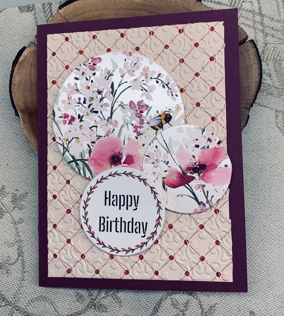
The soft pastels on the mood board at Inkspirational inspired my choosing to make this card. As well I had been wanting to try a technique shown by Natasha Foote. I didn’t have anything to make my own stamps out of, so I improvised by using the Mandala Maker stamps by GKD and then colouring in the centers using a waterbrush on the bigger blocks and masking the smaller ones so I could use a small detail brush. When happy and it was dry I added the floral stamp, which is from an Altenew set, as is the sentiment. I cut the panel down a little so I could mat it with the black and then it was added to the card front. A simple card but it is quite effective visually I think.
My last card for today. I was a bit shocked to see the time and that it is getting dark outside. I had better go and feed our dog, who is too polite to say I’ve forgotten her. Thanks for stopping by and I hope you are all warm and dry.
I quite liked this particular moodboard at Just at Ink, and it stayed in my mind after I first saw it. I thought that perhaps I might try doing a mixed media style card, but earlier I saw something on Instagram that I liked as well, so I decided to have a go at what I had seen. I know I’ve done something like this a long time ago, but I had forgotten the technique. I followed the upload to HeroArts blog to see how it was done and this is my version of what I saw, using colours from the moodboard as well as the shape in one of the photos. The tutorial used masking to keep the lines white but as I had no coloured hybrid inks I knew I wasn’t going to be able to mask well enough. Instead I used a Sakura Glaze white pen inside my debossed lines before I added any ink and this helped to keep them clean and white. I used a stamp from GKD Mandala Maker set and Blueprint Sketch ink and stamped the shape as centered in each section as possible so it looks as if the tiles have been matched, as they would be if this were being done by a tiler. I chose not to add more ink except around the edges. I made my counter by swiping Pumice stone ink directly to a piece of card stock giving it the look of granite, (I hope) and then I shaped this piece adding foam in the back for dimension. The images were fussy cut after I had stamped them, using the coffee set from GKD and I added some champagne heat embossing to these. The floral on the images is done with Cracked Pistachio. I stamped the sentiment from MFT onto a scrap piece and tucked it under the counter slightly. Added the wood panel underneath. My counter isn’t exactly as I would have liked it to be, but all in all I am happy with the end result.
We took our dog for a walk after a nice Sushi lunch, and got caught in a hail storm. We got rather cold and wet so I’m glad to be back in my warm craft room and have no plans to go out again for now. Thanks for stopping by, it is appreciated, as are any comments you leave.
For this creation and the challenge at Color Hues I used the Everyday Details stamp set from StampinUp and also the fancy die circles. I stamped and then coloured using Metallic pencils which gave me the soft look I was going for. The sentiment is from the same set and I cut it in half after I had stamped it. I had the PP strips on my desk and I added them as you see and then butted up the circle against them. The flat back pearls are from my stash and are bigger than I needed but all I had left. The really tiny ones have been used up. This is a simple card and I’m quite happy with how it turned out.
I was so involved in crafting I hadn’t looked out my window for several hours. It has been a cold and breezy day but suddenly I was surprised to see we have snow and its sticking. My hubby had planned to visit a photo club tonight but based on the weather has wisely chosen to stay home. If this continues getting up the hill later will be virtually impossible until they plow and that will only occur around 4am tonight. Safer to be at home.
Double D has a PP challenge and Just Add Ink a fancy fold and I was able to combine the two with this card. It started out as something entirely different, but my head simply couldn’t work out the cuts even after watching the tutorial 3 times and cutting more and more strips that didn’t work. Tutorial is one of MayMay Made It’s and can be found HERE. I did start trying the star but became so frustrated with myself that I found a work around that I could live with and not waste anymore paper. I wove everything and glued it all using the PP then I die cut it with a hexagon die from Crafters Companion. Cut a larger one in black and attached them together before adding them to the book fold card front. I had the idea of using more of the strips and combined them so I could use the smallest of the dies and they were also added to the front. Using up more of the scraps and taking the idea from the tutorial also added smaller pieces along the spine of my book fold. My sentiment is fussy cut and is white heat embossed and is from a Hampton Arts set. My hubby really likes the card. My mind says its okay but I suspect I am still comparing my initial idea with what I’ve now done. I may give this idea another try when my brain has forgotten the frustration. In the meantime it is being posted to the challenges.
Having been mulling over several ideas for this challenge I eventually settled on this card design. For some reason I had never put away this particular stamp set from Spellbinders and it seemed perfect to use Barn Door red Distress Oxide ink for stamping as it stays wet long enough to clear heat emboss. I stamped the sentiment at the same time in black and clear heat set that also. Then it was just a matter of deciding what to use in the center and I chose this heart bouquet using an unbranded die. I cut twice so I had enough to group as you see, but before I added them I used a 2 different Sakura reds glitter pen on each heart. To get the arrangement to sit properly I adhered them to the sentiment piece and trimmed off the extra length of the stems before popping it up on foam tape. A few tiny red embellishments partly added to cover up 2 small ink booboos and it was done.
Although I would prefer to be crafting, I have to do a chore I detest and have procrastinated on for a few weeks so being in my craft room is unlikely for the rest of today. At least it is sunny outside which is nice after the wind we had yesterday.
Thanks for stopping by, it is appreciated as are your comments when you leave them.
It is my turn to choose a theme and later the winners, for the current challenge and I chose a fun fold in any theme. This is my example, and here is a link to the tutorial if you want to make one of your own. https://www.youtube.com/watch?app=desktop&v=h4epDyjokTo I chose to make a masculine card using some PP that was given to me by my StampinUp friend. She also gave me some tool die cuts. Basically I followed the tutorial and can say it isn’t a hard card to make. However, make sure you get your scoring correct for the pointed fold. I didn’t and it took a while for me to fix it. The sentiment is a stamp from Hampton Arts.
Have fun with your own fun fold and I look forward to seeing you in the gallery. Thanks for stopping by, it is appreciated.
This is a challenge I haven’t played in for a while, although I used to play regularly. I liked the sketch and the die I used here is a new one from Kokorosa that I wanted to use. The sketch seemed to lend itself to using the die. My sentiment and hearts are from SSS. Once the paw strip was die cut I added it to a black background and put the sentiment along with the hearts in between the strips. A friend here is always looking for pet sympathy cards so I am making her another small set for her stash. She volunteers at a shelter so is involved with dogs all the time. In a few weeks I shall have the set ready for delivery when we next go to Victoria.
CYHTP has a challenge with the twist of using circle or squares In a way this card uses both, as it is a small square card with a die cut circle from StampinUp. The folder I used is an unbranded one and I used only a portion of it to fit behind the circle. I added some small fallouts underneath, but no sentiment as yet. I could have coloured the embossed piece but chose to keep this white on white, but I did add some perfect pearl powder to it, which never shows on camera. In reality it gives a subtle sheen. I made this card over a week ago, but decided to wait for a suitable challenge before posting it. I quite like the end result and I also like that it is fairly CAS. I do believe I am getting much better at CAS designs than in the past.
Thanks for stopping by and I hope you are enjoying your Sunday.
It is my turn to choose the theme for our new challenge here at Cardz 4 galz and I chose a seascape. I will also be choosing the winners for this challenge and am excited to see what you all come up with.
I began my card by swiping different blues onto a panel for the background and then I die cut the aperture on another panel using a Memory Box die. Using a Dina Wakeley stencil I added a touch of Tumbled Glass ink to the panel for the illusion of waves. I had some ephemera in a package so I chose some that I thought would look good in the scene I imagined. The mermaid was from an unbranded die that I cut twice and glued together for some stability. I cut another one from some copper glitter CS and cut the tail at the waist to add on top of the other. Ohuhu pens were used to colour her body, hair and shell and then I used a gold Sakura giitter pen in her hair and a silvery one on the shell. Some Pops of Color dots were added to her waist, tail and for a necklace. I made a hole in the anchor so I could add some twine to make a rope and this was added as you see. A fallout from another project became some seaweed in the background and an unused wave die cut was added behind the opening at the bottom. Using foam tape the top portion was added to the card front. I also added a few bubbles for added interest. For now I’ve chosen to leave off a sentiment. I’ll decide on that when I figure out who will be getting the card.
Thanks for stopping by and also for any comments you may leave. They are always appreciated. I look forward to seeing your creations in our gallery.
AAA Cards is an anything goes challenge this week and Sunday Stampsis a colour challenge. I think I’ve managed to combine the two into this card. I had the idea of embossing the die cut frame and adding some ink on top and it worked quite well, although the frame was quite thin and split slightly in one place. To seal it and reinforce the frame I added a 2nd one behind, which also gave it more dimension. Setting it to one side I took a piece of linen look CS and added the scored lines as you see. I then took an unbranded hollyhock die to which, once cut, I added distress oxides with a water brush. I used Hickory smoke on the frame and on the stems and a mix of Seedless Preserves and Dusty Concord on the flowers and buds. It wasn’t quite right in colour so I added more Hickory Smoke to darken it so it was closer to the colour swatch. I still needed one more colour so I used a punched flower as close as possible to the swatch underneath the buds and a raffia ribbon tied to the sentiment tag which is from MFT with the actual sentiment coming from Joy Clair. After adhering the panel to the white card I also added a few tiny pearls before calling it finished.