colour scheme

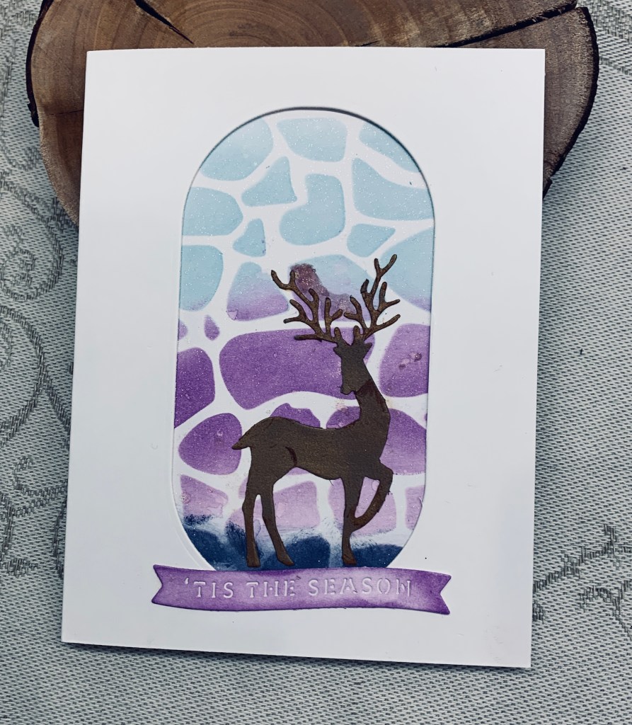
This card should work for these 2 challenges so I shall be adding it to both AAA cards and Double D. Following the colours shown at AAA I stenciled a panel in 2 blues and 1 purple using a homemade stencil gifted to me quite a while ago. The die for the deer is an old one that I have no label for and the sentiment and Modern oval are from Spellbinders. Once I had inked up the background I die cut the card front. Before adding the background panel, I added a few spots of water and then the sparkle spray that I am currently enamored with. Using a scrap piece of gold paper I die cut the deer and went over it with a darker ink. I added some pencil colour to the neck and hip for more definition then added it as you see. The sentiment went at the bottom after I had inked the strip the same as the purple in the background.

Thanks for stopping by and I hope everyone is having a good day.

A swirl of colour

For a while, I’ve wanted to try an Eclipse card design but never got around to it. I’ve done something close but not exact. Natasha Foote did a tutorial that I watched doing some ink swiping and she turned one of her pieces into an Eclipse card. I liked it a lot and I also thought the swiping technique was an easy way to do a colour challenge, so here is my effort. My initial attempts at swiping weren’t that great although I can still use the pieces later. The one here was the best of several tries. I suspect that my issue is to do with my hands, which don’t always work as well as they used to so my pressure was off slightly, but I like the look nevertheless. I used three colours for swiping. I also inked up a small scrap piece with the two other colours. Basically I followed the tutorial for the sentiment which is a new MFT die I got on sale. I used an older Spellbinders decal edge die for the panel and inked that using a sponge to give it a bit of definition on the edge. I hadn’t intended to add the flowers, but there was a smudge I couldn’t remove so I used another Spellbinders set to cut them from the additional inked piece. I could have used a few gems but I liked the idea of using the flowers and the extra colours.

Doing this card was fun and it kept my mind busy yesterday when I was constantly going over the tragedy in my head. Making this stopped the brain movie for most of the day. Today is a much better day although the rain has been heavy for most of it.

Thanks for stopping by, it is appreciated more than you know.

Thankful fall

Challenge #211 as chosen by Lynda, is the theme of thank you/thankful/thanksgiving and we hope you will join us at Cardz 4Galz with your creations.

My card morphed as I was working on an idea partly because an edge I tried to create on my panel went badly wrong, which meant I had to cut the panel much smaller than intended. I began with a panel 4″ x 5 1/4″ in size and using Distress Oxide sprays I spritzed two colours over my piece and then added a few spots of Mica Spray on top. I wanted to use copper heat embossing around the edges but I dropped my embossing powder all over it making a huge mess. The mess was all over my cabinet top and inside the tray I use for embossing and took forever to clean up. I ended up cutting the panel down in size to get rid of the parts that were so ugly and used some infinity rectangle dies to cut a gold border and one similar in shade to the mica spray. I also die cut the center of the piece. After adding doubled up foam tape I attached the panel to the card front, added the blue/green frame around it and then added the die cut piece back inside. Using a small thankful die from a set by Gina K. I die cut the shadow in the blue/green mirror CS and the word in the gold attaching them together and then onto the card front as you see. The birds are from a very old Sizzix die and I sponged a bit of Tattered Rose along the breast and tails before adding them above and below the word. In the end not a bad card even though it wasn’t at all what I had in my head when I began.

Thanks for joining me today and I look forward to seeing your cards in the gallery.

We all need a riesling …

When I saw this challenge yesterday my mind immediately thought wine. Earlier I pulled out a folder by Darice, called Swirly vines and embossed a pale green panel and a white circle. I went over panel with a green ink and using the debossed side of the circle added some Twisted Citron. The stamps are from a new YNS set that is quite a fun one and I stamped the glass onto white scrap CS then die cut. Used watercolour pencils to colour. Stamped the sentiment on another scrap piece and cut it the size I wanted. Set everything aside to go eat some lunch.

Before coming back to my craft room, a friend who was here finishing off the exterior paint touchups, came inside looking very shocked. He had just heard that a mutual old friend of ours, who had moved to Regina some years ago, had died along with 20 cats in a massive housefire. We don’t know any details of how or why, but you can imagine the shock. Needless to say, now I need a real drink!

To keep myself busy, I finished the card and decided to post it before going to do something else. My hubby is at our boat putting on the winter canvas and he is going to be equally shocked when I relay this news to him. James, the friend who died, was a very good vet, and saved our first dog’s life on my 40th birthday. We all missed him when he moved away, now we will miss him even more.

Thanks for stopping by.

love

A clean and simple card, that was actually easy to create which is always a bonus. I cut the word twice using an MFT die and inked Tumbled glass on one and Tattered rose on the other. While ink was still wet I heat embossed clear so they were shiny. Adhered them together slightly offsetting so both colours show. Die cut the circle using a die from YNS and I added 2 pieces of card stock in a pale pink and a blue to the back. Added the panel to the card front and then added the word. I quite like how it turned out and think I can use it for a few occasions although it would make a nice Welcome New Baby if I needed one.

Thanks for popping in to spend time with me today. I appreciate it a lot.

never stop dreaming

This dreamcatcher stamp is a dollar store purchase from summer last year. I stamped it onto some CS and heat embossed it with clear powder. Then I made a mask for it, and sponged colour all around using Tumbled Glass and Chipped Sapphire to create a night sky. Then it was sprayed with clear shimmer craft spray Sparkle by Imagine Crafts. When it was dry I added colour to the catcher with pencils, added more sky sponging in the center and more sparkle. The sentiment is from the set and I fussy cut around it, added foam tape and attached. As Seize the Birthday is always a birthday challenge I found a small stamp in a StampinUp set and added it at the top.

This turned out a lot better than I imagined it would and the sparkle is amazing. Thanks for stopping by and I hope you’ve enjoyed a good weekend.

hedgehugs

For this card I used a very old Lawn Fawn set and a Hero Arts infinity heart die. My original intention was to use a mask and ink the heart directly onto the card front, but my first attempt was a disaster in centering. Rather than waste the CS I cut it up, redid the heart and then fussy cut it so I could center it properly on another card front. Hedgehogs were done initially on vellum and inked from behind but they were too transparent for me to add the border stamp so I backed them with a scrap piece of shimmer CS. Florals were stamped using a border die from a dollar store set. I know why they are so inexpensive as the quality is basically silicone rather than the polymer stamps that craft companies use. Still they work for some cards. I coloured the flowers with pencils. It took a bit of finessing but I managed to use the sentiment without cutting it in half. The little hearts were stamped and a sparkle gelly roll pen was added in the centers.

Thanks for stopping by it is appreciated, as are any comments you may leave.

Stripes a little differently

When I saw this Natasha Foote tutorial recently, my immediate thought was this is a great way to do a colour challenge. The challenge at JUG’s has so many colours on the mood board so I decided that now was a perfect time to try the technique. My Tombow markers are old and getting a bit dry so one pen wasn’t giving me the best colour, but I managed to finish the stripes nevertheless. Of course, my effort isn’t as clean as Natasha’s, but practice makes perfect so the next time I give this a go, I’m sure I shall do a better job. It is a mini slimline card and uses some leaf stamps from a YNS set as well as a sentiment from a Catherine Pooler set. My first attempt at adding the vellum circle was pretty bad, so I pulled it off and did a new one. Couldn’t quite hide the foam tape underneath, but it isn’t too noticeable.

Thanks for stopping by, it is appreciated.

Happy Baaa’thday

Welcome to the new challenge at Make My Monday with the theme being Pun/Fun Sentiments. Recently I have been playing with this particular layout and I had these pieces left on my desk. I decided to use them here and added the rest using an Art Impressions stamp set that I find amusing. I love a lot of the A.I. sets and they often have punny sentiments to go with the images. I thought the sheep went with the circular spirals as they remind me of wool. Once I had stamped and coloured the image I die cut it and added two more die cuts behind for dimension and stability. She was coloured using a Prismacolor gray pencil, some Sakura Gelli roll pens and an Ohuhu pen for face and legs. I used 2 of the sentiments and bordered them with gold CS. I also stacked the one under the ewe so it was almost same thickness as the ewe. The ends were rounded by hand.

I had fun creating this card and hope you are amused by it as much as I am. Thanks for stopping by, it is appreciated. I hope to see your creations in our gallery and that you have fun participating.

Inks and leaves

I had inked a few backgrounds a while back and also had precut the main die cut panel when testing out a new die from YNS. The green panel looks very dark in the photo but is way more vibrant in reality. I decided to put them together today as my space is getting crowded with partially finished projects. The leaf I added from the corner is a new set from Catherine Pooler including dies and I added some additional interest to the leaves using a gold pen. The sentiment comes from another new set, this one from Altenew. I wasn’t sure if this would fit into a challenge but the one at The Card Concept seemed like a good one to enter so it will be linked there. I’m not 100% sure which style it fits into. It seems to me it is more Mixed Media, but there is also a lot of texture too.

I hope you have enjoyed a good weekend. Many thanks for stopping by.