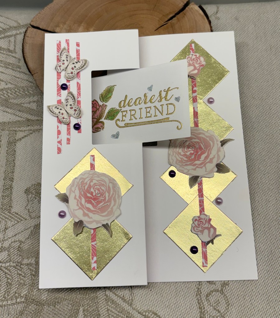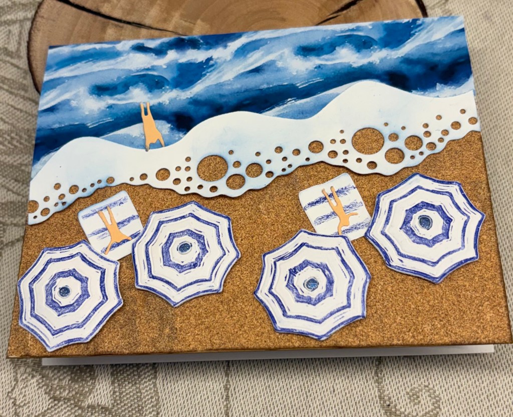
It always interests me to see where inspiration, especially my own, comes from. We were getting coffee at a local coffee shop and they had some thank you cards from customers displayed. One of them made me look twice and this is my idea based on that design. Seize the Birthday #330-One or More Numbers is the challenge it is intended for.
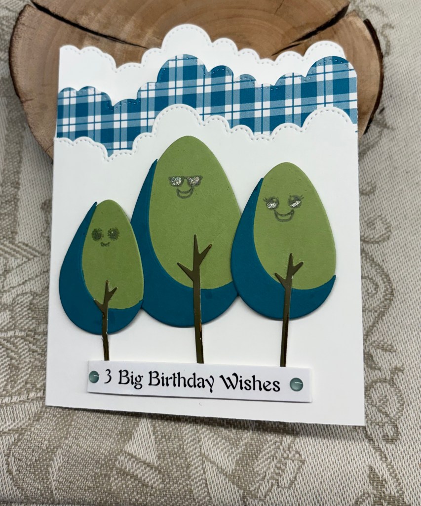
I have several new and unused products laying around and the trees on this card was one of them. It is an MFT die set that I got on sale. The cloud die is from a new unbranded set and the faces on the trees are from a MayMay Made It set, which I’ve had for ages and only used once or twice. I tried several ways to stamp a sentiment using a combination of different stamps and disliked them all. In the end I created it on my computer. All the paper and card stock is from my stash and I tried to keep the same colour tones in the shaded part of the trees as is on the gingham paper. I added two Waffle Flower, similar in tone green, enamel dots to the sentiment.
While searching for ideas on the Internet regarding wishes and trees I came across a book, intended for children, and it is a Traditional Folklore story about three trees. I tried to incorporate this into my sentiment but it would have been too long and too big, so I opted for what you see here. There are times when I wonder how we managed without the Internet?
Considering that I figured this design out without resorting to tutorials, I’m quite pleased with myself and I also like the end result. Thanks so much for stopping by, I appreciate you, your time and your comments.