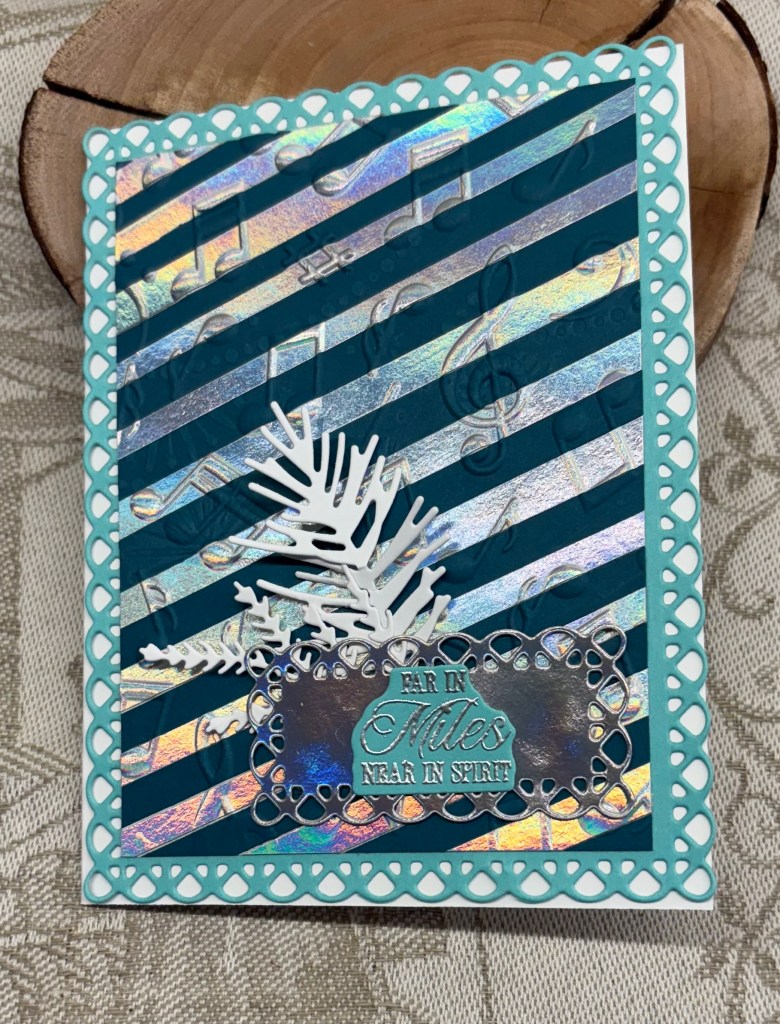
Having seen something similar to this on Pinterest, I wanted to try a version of my own, but I’m no painter. In the end I created a stencil, pulled out my trusty TomBow markers and came up with these. They were so easy to do that I made about five of them. I added some sparkle elements with a Sakura pen and filled in a few areas, then I took a gold pen and free handed the top of the ornament and the cord.
With another marker I went around the edge of the white CS before adding it to the card front. My sentiment is from a Woodware set. I never would have thought I’d be free handing this kind of thing, and I’m pleased with how they turned out. CAS and pretty at the same time.
I don’t believe I’ve entered into the Holly and Ivy Christmas challenge before, so this is being added to their current challenge.
Using a Kokorosa die, I created a series of these cards, all similar but not exactly the same. They are intended for the ladies in my yoga group.
Using a SSS EF I dry embossed some white CS and backed it with some PP before adding it to the card base. Once I had the pieces in place on the wine glass I glued it all together and added it on top. The sentiment comes from a GKD set I think, but as it was stamped a long time ago and stored, I can’t quite remember which set. I added a tiny amount of sparkle on the buttons and some small red gems.
Once I had all the pieces cut, the series was pretty easy to put together, and I created 8 in total. On some I used different EF but all were 3D folders. I really wish companies would standardize their folders as it would make things a lot easier to work out which plates to use to get the look we need. Some of the 3D ones are really hard to get through the machine.
a few of the others.
Thanks for spending time with me today, I really appreciate you and your time.
Our Cards4galz challenge has been chosen by Pamela, and she has a theme of colouring. Lots of scope with this challenge so I’m sure you will all enjoy playing.
In my case I decided to play with alcohol inks and crumpled kitchen foil. I adhered the foil to some heavyweight CS but I didn’t try to smooth it out as I wanted the texture. Then I picked out my colours and dropped them on top with some additional alcohol to move them around. This is what I ended up with. I wanted to die cut a leaf shape from this, which I used on an earlier post. The process of die cutting meant that the top part flattened somewhat, but I still liked it. I had a piece of schmoosed ink CS that I added behind the opening and then I attached the entire piece to a black note card. The sentiment is from GKD and the ribbon is from my stash. I added some colour to the sentiment piece to soften it as the white was too white.
A messy, but fun process and I liked the end result as the colours blended quite well. We hope to see your creations in our gallery and enjoy the creating process. Thanks for stopping by, I appreciate you and your time.
With my mojo mostly absent in recent weeks, I was so fed up that I headed to a craft store in the hopes of reviving it. While there I discovered this set of Spellbinder dies, promptly purchased it and made this card almost as soon as I got home.
My papers are from StampinUp and I added sparkle to the stars in the background. After cutting the pieces I attached them as you see and then added the snow people as you see. It was a bit fiddly putting them together but I was smart enough to keep the pieces in little cups so I didn’t lose any. Spellbinders thought of everything here, as they even had dies that work to cover the holes from the back. I would have added black paper anyway, but having them die cut made it so much easier. They also thought of adding a small mark where the noses should go.
I’ve managed to get quite a few cards done this past week, so I must count them to see where I am at. My aim today is to get all the labels done and the cards signed and into envelopes. Our mail is working (kind of) as they are back to doing rotational strikes so some items are getting through. I shall likely mail most of my cards as soon as they are ready in the hopes that they get through the system. Better too early than awfully late and people can put them aside until they are ready to deal with Christmas décor if they wish.
Thanks for stopping by to take a look. I appreciate your time and any comments you may leave.
Welcome to our latest challenge here at Double Trouble. Our recipe this time is a 3, 2, 1 recipe round and round. 3 circles, 2 images, 1 ribbon twine or cord. Twisted sister thing 3 is to include at least one bird. And of course playing in the TSOT Sketch #682 is another fun part of the challenge. It is optional though and you need to be aware of backlinking.
This is probably one of the easiest cards I’ve made recently because it was all in my bits and pieces box and all I really had to do was figure out placement. The only items that weren’t prepared was the background layer and the little bird, which is a die from Gummiapan. The floral images and leaves are from Memory box and I built the flowers and added them to the largest circle as you see. Then the other circles were added twisting them over and under the largest one. My circles are cut using Hero Arts Infinity dies with the dotted one from StampinUp. The word die is from a dollar store set and the little bow is something I tied using some leftover ribbon. When my hands are working properly I sometimes spend some time preparing small bows to have them ready for days when I can’t tie one.
The team looks forward to seeing your creations, using this recipe, in our gallery. Have fun creating, and thanks for joining me today.
Seize The Birthday is asking for Favourite fall treats which leaves quite a lot of scope for your designs. As an invited guest DT I came up with this card.
As an Ex-Pat Brit, we didn’t have all the hoopla that is part of living here and I’ve never quite gotten used to the N. American way of celebrating it. Asking me what my favourite treat is, is a hard question for me to answer. I’m kind of boring, as I only like regular coffee, so all the flavours available aren’t something I would go for, and although I enjoy pumpkin pie, I can’t say I’m mad for it. Likely because of this I don’t have a lot in my stash that pertains to this theme. I do however enjoy the fall colours and seeing pumpkins stacked up in a store, or watching kids at a pumpkin patch, choosing the one they want to carve up as part of the upcoming Halloween fun.
All that to say making a card for this challenge was somewhat of a real challenge for me. In the end I chose to do a fall scene. I pulled out a Birch/Aspen tree stencil and added the blue sky and some grass to show between the trees. Then using a fine brush and some ink I shaded the actual trees with Lost Shadow and some Hickory smoke to give them some definition. My gate and the small topper are dies from Gummiapan and I stacked a bunch together to give the gate some dimension. I cut the topper in green as well as yellow and stacked them so that there was some green showing after I cut off some of the yellow bits I didn’t need. I also went around the wood edges with some ink, but the actual wood grain is from a dollar store paper pad. A Tim Holtz stencil was used for the pumpkins and I moved the stencil around to try to get a stack. Once it was dry I added some additional colour for definition and then fussy cut. After adding the main layer to the card base I placed the gate and the pumpkin stack where I felt they looked best and glued them down. The sentiment came from Hampton Arts and I used foam tape to get it to sit over the edge of the gate frame.
I’ve had a lot of fun being the guest designer here and there is one more to go before my stint is finished. I sure hope you have fun creating your own favourite fall treat cards. Thanks for stopping by, your time and any comments you leave are highly appreciated.
Challenge #261 as chosen by Debbie, is to make a card for a little girl. For me this was a challenge as I don’t have any children in my life so I’m not into making cards with them in mind. That said, I remember being very enamored with fairies when I was a little girl, so I decided to make a card incorporating them. The larger fairy is from Crafters Companion, while the smaller fairy and the sentiment came from an older set from GKD. Paper is from a pad and the dragonfly is a sticker. The larger fairy was stamped onto vellum with Versamark and then gold heat embossed, after which I fussy cut. The smaller fairy was stamped directly onto paper and heat embossed as was the sentiment. I added a feathered skirt to the larger fairy, just because I could.
I’m thinking of giving this card to my neighbor as she has female grandchildren who may like it. We hope you have fun making your own creations and look forward to seeing what you create in our gallery. Thanks for stopping by.
After a week of not really being in the mood to create, I finally had a small break through and these cards are the result. As the challenge at https://abcchristmaschallenge.blogspot.com/ is asking for uncluttered and/or vertical I decided that my card would work for the challenge. In addition, it works for another Christmas challenge at https://12monthsofchristmaslinkup.blogspot.com/. This one is an anything goes challenge. I’ve not entered here before and haven’t entered often at ABC either.
To make my cards, I used a lamp die by YNS, and an unbranded die set that includes wavy dies to make hills etc. My wreaths are cut from a scrap piece of last years PP and by cutting out the center I was able to hang it from the lamp post. The sentiment is from a Woodware set. I used a gold glitter pen on the lamp light. The little houses were bacled with some gold paper and my tiny trees are cut from a scraps. Using a Sakura glitter pen I added some lines to the hill tops and snowman as well as to the berries on the wreath. I felt the snow needed more so using a glue pen and super fine StampinUp glitter I was able to make it sparkle. The other two cards were done in a similar fashion only one has been sprayed and the other uses the super fine glitter. I quite like the simplicity of these cards and they are still flat enough to mail easily, if and when the service goes back to work. I think the postal strike has been a factor in my lack of mojo.
It is Thanksgiving here in Canada, and we are expecting guests later on. I’ve been preparing food for their 2 day stay since Friday. No turkey though, instead I’ve prepared a stuffed Pork roll and for tomorrow a lasagna. It took a while to put the rooms together as there is 4 people coming, all members of my hubby’s former photo club. Fortunately I am able to split the king bed into twins and after adding a camp cot to the other room they should be fine. After a deluge of rain yesterday, today is cold, sunny and extremely windy which means a porch full of leaves to clean up again.
Thanks for stopping by, I appreciate your time, and any comments you may leave.
After this long hot and dry summer it is a relief to be heading for some coolness and hopefully some rain. I’m sure I’m not alone in thinking this way, although for sure we will all eventually be longing for winter to be over.
Our current challenge is to use the shades of fall and our recipe is to use 3 colours, 2 images, 1 stenciled or dry embossed piece, with an optional Twisted Sister idea to use either a fall fruit or veggie. As well you can use the Twisted Sister thing 2 double dare, which is to participate in the TSOT sketch #681 and/or the alternate Pearly Sparkles challenge #112. Bear in mind the risk of backlinking so your entry isn’t disqualified.
My card doesn’t fit the sketch challenge at TSOT, but I did add a fruit to my project. In case anyone isn’t quite sure – an Acorn is considered to be both a fruit and a nut. In a way my card uses the spotlight technique as I stamped the images onto the layer first and then again on a separate piece so I could die cut. Because I used Distress Oxides to stamp I was able to heat set the images clear making it easier to colour them. At the same time I added the sentiment and heat embossed it too. I coloured each image exactly the same using more than 3 colours and I did this with both ink and water colour pencils. The stamp set is from YNS and has matching dies although I didn’t use them here. I wish the company was still in business as I noticed that the sentiment stamp has a slight fault that I didn’t realize was there when I purchased the set. When everything was dry I die cut 3 small circles using Infinity circles from Hero Arts, making sure the die was smaller than the main stamped image. After adding some foam tape I carefully attached the circles on top of the main images. I also used an alcohol marker to go around the edge of this layer for a bit more definition although it is glued flat. The dry embossed layer was done using a Sizzix Tim Holtz 3D foliage folder and I swiped inks over the raised parts in the same colours as used when colouring the images.
Thanks for joining me today, I appreciate you and your time. We look forward to seeing your creations for this challenge and above all hope you have fun creating.
The challenge this time is basically splashy – interpreted anyway you like – rain, puddles, swimming, bath time, splashy drinks or just getting splishy splashy with inks. That said if you create something that isn’t totally obvious do make a point of letting the team know what it is in your post.
As you can see, I’ve chosen bath time as my theme because I wanted to revisit a technique learned a long time ago and not used much since. First I decided on a square shape and cut my layers accordingly. Then taking the main background layer I scored it in both ways at half inch indrements giving a tile effect. I stamped a leafy branch silhouette image from Crafters Companion randomly in Broken China ink to created patterned tile look. Setting it aside to dry I proceeded to stamp and die cut the other elements from a Hero Arts stamp and die set. Before cutting them I coloured the images using a combination of alcohol markers, inks and pencils. I also added some Nuvo Glaze to the bubbles and the water edges. After die cutting I played around with placement and added different thicknesses of foam tape where needed, but it required something more so I traced and fussy cut a shelf shape, coloured it and popped it up to give it more dimension. I found an image on the Internet that had bathrobes hanging and cut one out after I added some colour. This too was popped up with foam tape. The sentiment is from the same set and I used it above the shelf after fussy cutting around it.
Although I liked the finished card, I felt the background leaves were too strong in colour, because I obviously forgot to stamp off when doing the images. I needed to find a fix and I settled on using white pigment ink and a water brush to soften the colour. It took several layers but it worked and because the leafy image wasn’t too defined I didn’t have to be too careful doing it either. I have to say my artist friend was really helpful in trying this as she suggested trying to lift some of the ink. The problem with her suggestion was that the card was already assembled and I wasn’t prepared to pull it apart. So instead we tested it out on some scrap before actually doing it on the card.
Thanks for joining me today, I appreciate you and your time. I had a lot of fun creating this card and look forward to seeing what you come up with in your own designs. Have fun creating.