A Penguin Tree

My version
Where the idea came from.

At Christmas last year, we received the displayed Santa card from a friend in Japan. Japan often has amazing mass produced 3D style cards. I often keep cards like this and put them on display each year, but I kept this one to hand as I knew I wanted to try to make one.

The challenge for me was I had to stamp, colour and die cut 19 penguins to build a card, whereas the original was printed and then laser cut one section at a time making it easy to build. I had to figure out how to attach them together and be strong enough to stand up, as well as getting the box size and scoring correct. As anything to do with arithmetic or math is always an issue, it took 3 tries and help from my hubby before I got the box size and scoring right. I deliberately went with a larger base as I knew my penguins would be heavier than the original card is. I added a center piece to the box ready for the middle layer to be attached. The penguin and die come from a Divinity Design set. I stamped with VersaMark and heat set in black. Each were coloured with pencils, then die cut, then I divided them into the stacks required for each section. During the colouring process I had been thinking of how I could attach them knowing that the tallest stack would need some support. I ended up using some fairly stiff packaging plastic cut into strips, long enough to attach inside the back part of the box and provide support for the next row of penguins. The image was chosen for the light string they are holding and I glued each light string to the next one in rows while also adding some glue to the feet. Each layer was built the same way, although I only needed the stiff plastic strips for the back layer. When I looked a the back of each layer it looked messy so I cut another lot of shapes to glue behind each one making it look tidy and clean. My gluing ended up slightly crooked, but the basic shape was there and no real tree is uniform, and I decided it didn’t matter. The box base was covered in some scrap PP before I attached any of the layers and it all folds flat quite easily. My sentiment is also a Divinity Design stamp but from a different set.

Making this box card was a long process, but I enjoyed the experience and actually making it from scratch without any tutorials to follow helps me realize just how far I have come since I started making cards all those year ago. I probably won’t make another, due to how time consuming it was, but it was fun to try.

Thanks for stopping by, you and your time are appreciated.

The card will be entered into the following three challenges all relating to Christmas:

https://lilredwagon.blogspot.com

Peace on Earth Challenge #116

MLCCB #69 Anything Christmas Goes

My Heart is Full

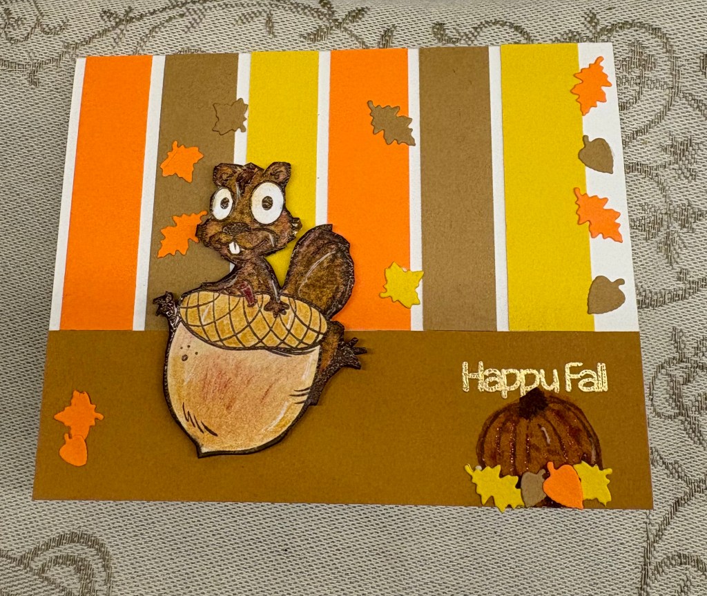
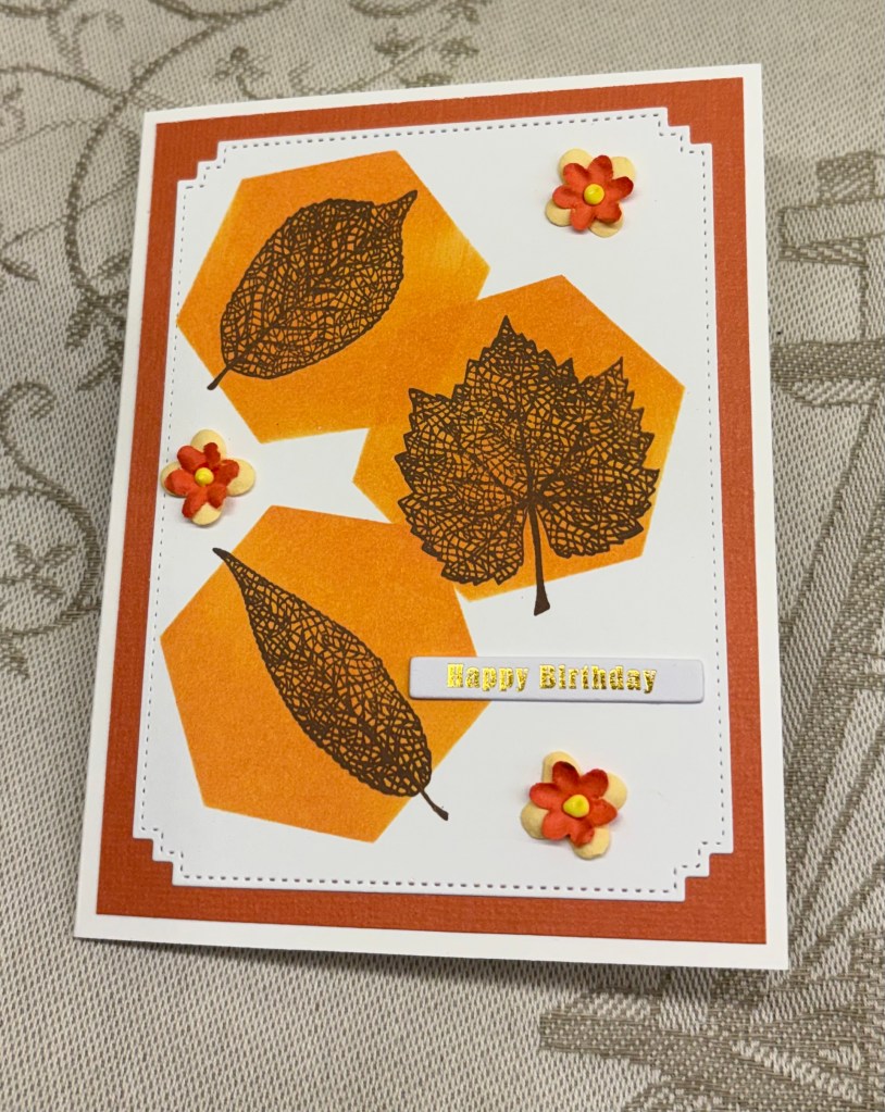
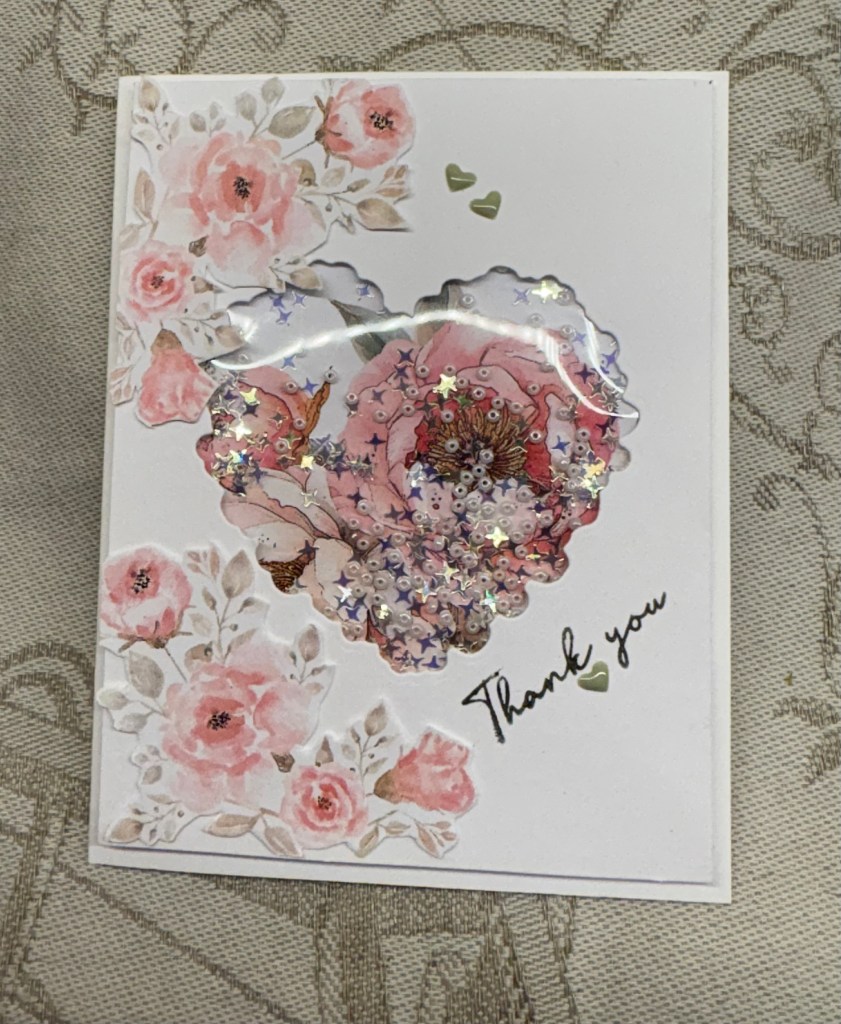
Not having spent a lot of time in my craft room recently, I am pleased in that I have managed to make a card that fits two challenges. The first one is – Challenge #377 – Recipe for Happy Yellow Flowers and the second – Seize the Birthday #331-Square Card & Non White Base.

The recipe at AYSI required a set of ingredients which I’ve achieved here and because I made it square with a yellow card base it works for Seize the Birthday quite easily. After cutting my base at 5.5″ square, I then cut a white piece at 4.5″ square and built the other coloured layers around it. The die cut used a Hero Arts infinity die and the actual sentiment is a circle freebie from Natasha Foote. I added some gold to the tiny hearts and used a thin foam tape behind.

For my main piece I used a homemade stencil, gifted to me by a stamping friend and added some yellow polka dots in two corners. While it was drying I searched for a floral piece that I liked and found a stamp set by GKD. I’m sure this is long discontinued and it was also before die cutting became popular so I had to resort to hand cutting, however I used a self healing board and a knife to do it after I had heat set and coloured it. I used pencils to colour and even chose a yellow green to add to the leaves. Using a thicker foam and before adhering the flowers, I played with it until I liked the placement. I added some enamel dots from YNS and from Waffle Flower in a few places.

As in many locations it has been quite hot and although we can keep our home fairly cool without an A/C it has been slightly uncomfortable at times. Today it is cooler although still nice and sunny. So far, Vancouver Island is coping with wildfires although there are several burning at the moment. The terrain in many places makes it almost impossible to get crews into and lightening has been the cause of at least four of them. My dragon boat team had a festival last weekend and although I didn’t take part in the racing, I was very involved in making the decor to follow the wild west theme of the festival. Without my hubby and our artist friend things wouldn’t have gone as well as they did so the decor worked well. My hubby even came to help with the set up. Because of this and also due to some small day trips we’ve done, crafting, except for the essentials, was ignored. I made sure to keep up with my DT commenting and also to create the next round of cards for the upcoming challenges, but anything else had to wait. I try hard to stay at least a month in advance creating sample cards for the challenges, but they are scheduled posts and only show up as the dates arrive.

I appreciate you stopping by. Stay cool if you can.

Three Wishes

It always interests me to see where inspiration, especially my own, comes from. We were getting coffee at a local coffee shop and they had some thank you cards from customers displayed. One of them made me look twice and this is my idea based on that design. Seize the Birthday #330-One or More Numbers is the challenge it is intended for.

I have several new and unused products laying around and the trees on this card was one of them. It is an MFT die set that I got on sale. The cloud die is from a new unbranded set and the faces on the trees are from a MayMay Made It set, which I’ve had for ages and only used once or twice. I tried several ways to stamp a sentiment using a combination of different stamps and disliked them all. In the end I created it on my computer. All the paper and card stock is from my stash and I tried to keep the same colour tones in the shaded part of the trees as is on the gingham paper. I added two Waffle Flower, similar in tone green, enamel dots to the sentiment.

While searching for ideas on the Internet regarding wishes and trees I came across a book, intended for children, and it is a Traditional Folklore story about three trees. I tried to incorporate this into my sentiment but it would have been too long and too big, so I opted for what you see here. There are times when I wonder how we managed without the Internet?

Considering that I figured this design out without resorting to tutorials, I’m quite pleased with myself and I also like the end result. Thanks so much for stopping by, I appreciate you, your time and your comments.

3-2-1 Recipe – “Its going to be a long day”

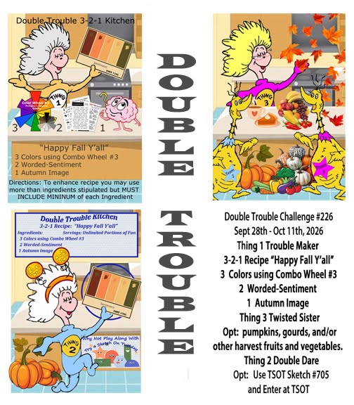
It is once again time for our Double Trouble Challenge #219 and your challenge is to make a slimline card, regular or mini. Recipe is: 3 – layers and the card base can be included, 2 images and 1 slimline. Thing 3, twisted sister is to add some sparkle or glitter and thing 2 is for you to use the sketch and enter it at TSOT #698. Be careful not to back link.

Quite some time ago and I can’t quite remember where, I saw an artist colour some images just using brush strokes with different colours. I decided I would give this a go myself and I created the cup panel where it languished on my desk as I couldn’t decide, first whether I liked it, and second how I might use it. The cup stamp is from Joy Clair. My effort isn’t terrible, but I now realize that the artist was using a special shaped brush which I don’t have. Funnily enough my hubby saw this and said he liked it, which helped me to use it.

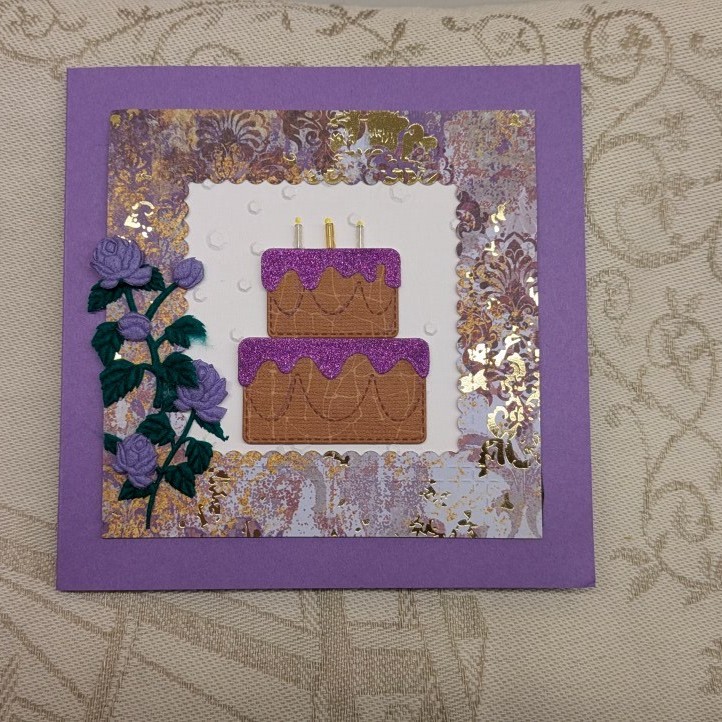
Anyway because this panel was already done, I decided it would make a decent slimline card. After cutting my card base I took some glitter CS and cut a piece for the front. Then I added the cup panel on top. Right there that gave me 3 layers plus the sparkle requirement. Then I cut another piece of white CS to the size I required for the bottom and stamped the sentiment heat embossing it for a bit more definition. Stamp set is from a dollar store brand Forever in Time and the cake image is from the same set. I stamped it, coloured with pencils and some Sakura glitter pens and then fussy cut, giving me my second image. If I don’t count the card front there are three layers but with the card front I now have four. Once this was added to the card front I called the card finished.

In the end I quite like the result, but without this challenge, I’m not sure I would have used the cup layer at all. Now it is your turn and we look forward to seeing your ideas and cards in our gallery. Have fun creating.

Thanks for stopping by, your time and comments are always appreciated.

Standing Out

One of my favourite challenge sites is As You See It, and this card is intended for Challenge #375 – Jungle Colour.

When I purchased this ephemera set a while back, I set it aside and then couldn’t find it. I found it the other day languishing in a drawer and cannot think how it got there. I also didn’t realize until going through the entire package that each envelope held parts of the same image as it was designed to be decoupaged together. I chose one of the hummingbirds that best used the colours in this challenge and built him using foam pieces between the layers. The sentiment is from the Weekender kit and I heat set it clear before using the matching die to cut it. The shaped pieces are a very old and hardly used set by either Sizzix or Spellbinders and my card stock is from StampinUp. It was recently found in a cupboard in my hubby’s studio. A friend had given me this CS before we moved to the island and I guess this was packed with some of his items and although I wondered what had happened to it, finding it 5 years later is funny.

I realized recently, that when I first began making cards, dies and clear stamps didn’t exist and I fussy cut everything, used clip art that I could alter on the computer and created other things to get what I wanted. I never did do well with the wooden block stamps although I used a few once in a while. Having family in The Netherlands and being able to visit them, I found a lot of crafty things at local markets and decoupage pages were among what I purchased. In those days I had to fussy cut each piece. Then dies started to become popular and I had no money for them or the machines necessary to use them. When I got my first machine I had no idea of what to do with much of it and although I purchased a few dies here and there I wasn’t skilled enough to figure out the best way to use what I had. As the Internet became more popular and more accessible I discovered a world I didn’t know existed and here we are today using it as a source for education, creative ideas and tutorials along with other stuff. I also have to give a shout out to Gina K. By accident I found StampTV and I learned so much from her and made a few stamping buddies along the way too. This creative community is amazing and I’m happy to be part of it.

Thanks so much for stopping by, I appreciate you and your time always.

Yellow and Black

It isn’t often that I really like a card I make, but this one I am truly happy with. So how did it come about and why I had to get really creative to make it?

Firstly it has been made for the latest challenge at Color Hues Challenge #135 – Yellow and Black. It uses dies from a StampinUp set, along with a larger die that I’ve had forever and think is from either Spellbinders or Sizzix. Acquired in the days when I didn’t think to keep the information. And it uses a sentiment from a Hero Arts set that was an included set in my latest Weekender kit.

I wanted to create a butterfly border, but didn’t have the right dies to do what I saw in my head. So instead I die cut the butterflies separately and added them as you see to the narrow yellow strips. To make them look as if they were die cut into the strip I coloured in the pattern attaching them to it. The hanging off piece picks up the black card front underneath. I used some black 1mm foam underneath and once they were attached to the card front, I started on the larger more ornate butterfly. Reversing the two colours I cut the background piece out of the yellow and the open frame piece from the black and attached them together. Taking the body die and some glossy gold CS I die cut the body and attached as you see. It was also popped up on a double up piece of foam so it floats above the others. The black embellishments are really old and from my stash. Once I had stamped the sentiment I embossed and heat set clear then I cut it into two so I could add it between the strips.

Yellow and black look pretty good together and I have to remember to use the combination more often. I guess using a strong yellow helps the visual impact a lot. Thanks so much for stopping by to take a look, I appreciate you and your time.

Huey Chameleon

I started this card mainly with Seize the Birthday in mind, but it sat on my desk for a couple of days because I didn’t have enough time to continue with it. In the meantime a second challenge began at CYHTP and I realized it would work for that too.

The printed acetate sheet is the last of a bunch I purchased many years ago because I thought they were pretty. Then I couldn’t think how to use them due to my lack of knowledge and skill. These days I wouldn’t have kept them so long unused.

The challenge at Seize the Birthday is to use acetate or vellum and the one at CYHTP is always an Embossing Folder, but with an optional twist. The twist this time is Boys to Men. My card fits both challenges, although I acknowledge that Huey would work for a woman as well.

Using my latest folder from Spellbinders and some watercolour CS I embossed the background and then used ink in two shades to add colour. I like the texture on the watercolour, it takes ink well and it seems to work great for these leaves. I wondered about adding dimension around the sides of the acetate, but it showed through too much so that idea was clearly not going to work. I already knew I was going to use the chameleon die set, and I set the acetate to one side giving me time to think about it and proceeded to cut and build Huey. Once he was built I took another 2 dies from a different set in this kit and cut the branch and the vine fronds.

I added Huey and the fronds to the branch and then placed him on the card front laying the acetate piece on top. Deciding this would work I glued him down and added a strip of scortape to the acetate at the top only. Using the sentiment and matching dies from the kit, I stamped the sentiment and heat set it clear. The It’s your Day was placed underneath the acetate at the top and the other part was added on top of the acetate at the bottom.

The card size is slightly larger than I would normally do, but I wanted to be sure the acetate would fit nicely and making an envelope for it is pretty easy. Although making Huey was time consuming, it wasn’t difficult and I was smart enough to print out the explanation for each piece which I’m keeping with the set. The hardest part of this card was taking the photo and it took several tries to get this one, which is still not that great. No matter where I put the card there was a light source that glared on the acetate, which is why you can’t see the entire sentiment at the top. All in all, I’m pleased with how this turned out and I have a few coloured stripes left to have the next Huey partially prepared.

Chellenges entered:

Thanks for stopping by, I appreciate both your time and any comments you may leave.

Bird of Paradise

Using my new kit from Spellbinders and thinking this particular die set would be perfect for a colour challenge, I set about creating this card for Sunday Stamps – SSC387 Garden Grandeur. I think I’ve managed to use all the colours in this card although only 3 are truly required.

There is quite a lot of fiddly work to create everything here and my shading of various pieces isn’t brilliant. It takes time and practice to get this 100% right, but I’m sure my next card will show improvement. I picked out the various colours from my scrap pieces and die cut what I wanted to use. Laying them all out on a sticky mat I tried to add the shading, but one of my inks was too dry and I don’t have a reinker for it so it didn’t go as well as I needed it to. Then I proceeded to build the bird of paradise flowers and added the stems to the various leaves. My background was embossed using the folder from the kit and because I used a textured CS the raised pieces ended up white. I went over them with some ink so they turned a light shade of pink. I played with placement until I had something I thought would work and glued everything in place. It needed a bit more so using another set from the kit I cut a few flowers and added them as you see. The sentiment is from Open Studio because I was too lazy to use one from the kit and the tiny opal embellishments came with kit and are exclusive to the Weekender. The embellishments are truly pretty at Spellbinders so I’m sure crafters will be asking for them. I also added some Nuvo Crystal glaze to the flower centers.

I think I will pick a day when my hands are not as painful and die cut all these pieces again so I can practice putting things together and get better shading results. Actually I may do this with the other sets as well. It will help me to create some of the other ideas I have floating in my head.

Thanks for stopping by, I appreciate you and your time.

Jungle Blooms

If I am honest, I’m not at all sure I like this card although as often happens it may grow on me. I’m not sure why I feel this way about it, maybe it’s the splatter or my less than stellar stenciling? Oh well, it’s an entry into a colour challenge – Color Hues # 134 Pink and Turquoise and I did my best.

To make it, I used a few dies from my Spellbinders Weekender kit, most of them coming from the Tiki Toucan set. The slatted arch is from Craft Addiction and the sentiment is another Spellbinders as is the die that cut it.

I used the stencil set from the kit, first time I’ve done any layering stenciling and although far from perfect, it’s not a bad effort. When the piece was dry I cut it a little smaller and then added to the pink card front. Before I added it I used a little of the Picket Fence splatter paint but I think I went a bit mad. The flowers and leaves were cut from bits and pieces of scrap CS in close tones of the colours after which I inked each of them to give more impact. I played around with placement before adhering anything and managed to wind the little hanging vine pieces in between the flowers without messing it all up. I stamped the Hello with VersaMark ink and heat embossed white, but now I think I should have done it in black as it would show a little better. Using some embellishments from my stash I added a few here and there.

Now that I have opened up all the different die and stamp sets, I am about to put them away properly. Already I found a die I used yesterday underneath my machine instead of with the set and if I delay any of this I could lose some of the small pieces. Thankfully I have magnets and envelopes to put them in so I can label and add the graphics that show what each set contains and how they layer.

Thanks for stopping by, I appreciate you and your time.

Untamed

My hubby gave me an early birthday gift, which allowed me to take part in the Weekender Retreat held by Spellbinders. This exclusive kit is an amazing one and I enjoyed the 15 hours of participation, although I didn’t actually create anything during the tutorials. I did this retreat last year and by accident my kit was late, meaning that I couldn’t prepare die cutting for the event. That experience made me realize that for me, it is better to watch, learn and create later. Therefore this year I made no attempt at homework and just watched to learn.

One of the things I noticed when reading some of the chat, was that so many participators seemed to get hung up on following exactly what the demonstrator showed that they forgot to be creative in their own way. Some even complained that the kit didn’t have all the colour card stock shown in the booklet. The booklet clearly states that not every thing used in the tutorials was available in the kit.

I already knew I wanted to create the jungle cat, but I also didn’t want to be cutting up my new and beautiful card stock to do it. So I went to my scrap envelopes and pulled out various bits to use. My cat uses a shiny dark brown background piece with a muted but metallic gold overlay and some cream shimmery scrap for the chest, stomach and face. I was just curious to see how he would turn out and I cut and put him together during a break between sessions. I was quite pleased with how he turned out. In the next break period I went searching for the leafy frame die which I thought was from Hero Arts, now part of the Spellbinders family, but is in fact from MFT. I decided to use this although I could have used quite a lot of dies from the kit and got something similar in design. Once it was cut I added some foam tape along the edges and underneath the leaves. The white of the foam tape was showing in a couple of places so I used a black sharpie and went around the edges that showed and then I attached it to the card front. With two dies from the kit I cut a cloud and the sun and added them behind the frame. And I had the little flowers made in a tray and decided to use them rather than cut others. These flowers come from last years Weekender kit and all I had to add was the flower centers which I did with enamel dots. The sentiment is from this years kit which includes the stamps and matching dies. Once I had this done all I needed to do was situate my Cheetah and foam dimension helped me get him to look good. A couple of tiny black gems for the eyes and the card was complete.

My card fits the masculine challenge at Inspirational – Challenge #368 – Word Prompt – For the Guys so I am entering it there.