just to say …

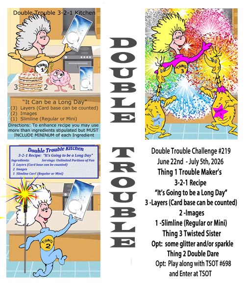
Welcome back to another challenge here at Double Trouble. Your recipe is to use 3 Colours from the No 3 primary colour wheel and the neutral wheel as well, 2 images and 1 sentiment. You may choose to add the dare from Twisted Sister and add a four footed animal and if you follow the sketch you may add your card to the TSOT challenge too. Be careful not to backlink if you choose to add it at TSOT.

My card incorporates more than 3 primary colours and several of the neutrals. I made my own section of PP by randomly stamping the fish bones in black, after which I added some colour using Sakura glaze pens. The second half strip is from a paper pack by GKD that I’ve had for a long time. I backed these pieces with a black layer and added it to the kraft card front.

After stamping my cats, all from the Crazy Cats by Tim Holtz, I coloured them using Prisma pencils and Gamsol. Then they were die cut using the matching dies from the set. I set them aside so I could work on the rest. I had these die cut circles left from a different project so I sponged colour using Distress Oxides 2 colours per circle. Once they were dry and I knew I liked them, I added the cats and fitted them to the other layers. Because I had already added the layers to the card front, I used a pencil mark on the two circles that overlapped and cut them on my Fiskars unit. My sentiment comes from a note pad by Hunky Dory that has pages of pre printed sentiments intended for the inside of cards. I’ve only just purchased this and it is handy as it has 120 Essential card inserts. The inside of this one says Many Happy Returns.

I’m happy with how this turned out and it was a fun one to create. We look forward to seeing your creations in our gallery and hope you have fun with the challenge.

Thanks for joining me today, I appreciate you and your time.

Beer Truck

There are some masculine birthdays coming in April so I used the sketch challenge found here, Challenge #368 – Floral Sketch Design. As the instructions said we can change the shape I chose a truck with beer barrels from a new unbranded set I’ve just gotten.

To begin, I wanted an interesting background so after sorting through some bits and pieces I found 2 inked backgrounds that I could cut up. I cut them into different size strips and glued them to some paper on the diagonal. Using a StampinUP die I cut this piece and glued it to a larger blue piece. This layer didn’t have a die that would give me the same edge as the striped layer, but I found a border die that I adapted to add the holes along the edge. The large background piece I distressed on the edges before adding to the card front. Then the other layers were added on top.

After stamping and heat embossing my truck and the barrels, I coloured them with Prisma pencils. Stamps and matching dies are from Amazon. Then I die cut my images and stacked other die cuts underneath for dimension. When they were dry I added some Nuvo Crystal drops to the windows of the truck, around the tires and to the lights. While this was drying I chose a sentiment from a Crafters Companion set, stamped and heat set it and then fussy cut. After placing the truck I chose to add the sentiment above it.

The friend for whom this is intended is a vintage car nut and he recently bought himself an amazing vintage truck. While my image is clearly not vintage, it is at least, a vehicle. He appreciates my cards and as a brilliant wood carver understands the work that goes into making them.

Thanks for joining me today. I always appreciate you and your time.

BOOK WORM

The mood board at Double D has some inspiring images and the challenge gives us choices. As you can see I chose books and a card design that looks like a book. Double D Books/Bookmark and/or Postal/Postage Challenge.

It took me a while to figure out which way I should go with this design. I knew I wanted a portrait orientation so after cutting a normal size card out of some Recollections CS I scored it at 3″ and again at 4.25″. Before gluing this section I went around the edges with a sponge and Vintage photo ink. I wasn’t quite sure about papers but I knew I wanted the book die cut, which I cut from an old hand painted card. I think this die is from Kokorosa, but it could be an unbranded one, I’m not sure. After searching through some paper scraps I came across this mulberry paper that I rather liked so I cut both the spine and the front cover using this. Then I remembered that I had these corner dies (not sure of brand) so I cut two from some Gold and added them as you see, using the fallouts on the spine. I also added some thin gold strips top and bottom. After playing around with the book die cut I found it was going to be more effective if I cut into sections. Once they were glued in place I used a fine gold pen around the edges and on the spines for more detail.

My original intention was to create my own sentiment/book title using the computer, but I also wanted a vertical sentiment on the spine. I used an old GKD set for this with Ground expresso ink and some clear heat embossing. In searching for this set I came across an Inkadoo set that was gifted to me and the word stamps were part of the set. Because I was stamping these as an afterthought I had to play with placement a little, but using the same ink and heat embossing I managed to get what I wanted. Fortunately the paper released the powder easily as I couldn’t prepare it as I normally would have. Having it stick only where I required was a blessing.

I’m someone who is rarely without a book in my hand, when I’m not crafting that is, so this design is right down my alley. I rather like how it turned out and it is just a little different in its design. Thanks for stopping by, you, your time and any comments are always appreciated.

decoupage wildlife

Welcome to the latest challenge here at cardz4galz. The theme for this one has been chosen by Debbie and she is asking for embossing – heat or dry.

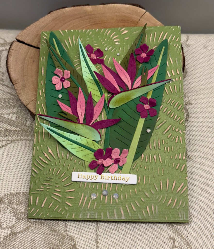
As you can see I have used both heat embossing – my gold sentiment, and a small dry embossed scrap piece underneath the green layer. The green layer was die cut with an unbranded set of dies and my decoupage is from a Crafters Companion kit. The small dots are from Pops of Color by Scrapbook.com. The sentiment stamp is from Hampton Art. The dry embossed layer is easier to see in person than on the photograph and the folder used is from Spellbinders.

Unfortunately this card may have to be hand delivered as the layers create bulk making it hard to mail.

Thanks for stopping by, your time and your comments are truly appreciated. We look forward to seeing your designs in our gallery and hope you have fun creating.

Mixed Media with Wings

For a while now, I’ve had the urge to make a mixed media card, most likely because I watched a video by Christine Stokes. She makes mostly CAS cards that are gorgeous and I like her style.

The latest challenge at Seize the Birthday is anything with wings and because I wanted to make a 2nd card for the Color Hues challenge I chose green and gold as my base colours.

First I started with a white base panel and using Bundled Sage, Mowed Lawn and Pine Needles Distress Oxides I inked up the panel. An old wooden block stamp was used to add some writing in a couple of places I had some pretty tissue paper lying around so I chose a couple of sections and using ModgePodge I added them as you see. I spattered some Nuvo Drops that I had watered down to get some additional gold on the background. Then using a new slatted oval die set from CraftAddictions I cut the middle sized oval and went around it with some gold. After adding some foam tape around the back I placed it on a slight angle. Using a Scrapbook.com butterfly die I cut a backing piece from gold and the patterned section from a Xmas card I saved. After adding the two together I cut a body from a more metallic gold and glued it on and then glued the butterfly to the slatted oval. I had a few fall outs from a previous session and I used them as more embellishments in several places. The sentiment is from an unbranded stamp set and I used a gold pen around the edges before gluing it down. I did darken the panel’s edges before gluing it to the card front.

Its too late now, but in retrospect I should have gone over the entire layer with some ModgePodge as this would have given it a bit of shine. As it stands the shine is just in one area.

I quite like the end result and hope that you do too. Thanks for stopping by, you and your time is appreciated.

Green and Gold Ocean Scene

Although I like the end result of this card, I’m uncertain as to whether the colour is more on the blue side than on the green. However, I did make it for the challenge at Color Hues #128-Green and Gold and will enter it regardless. I like Teal as a colour but I do think interpreting it, is a challenge by itself.

When searching for PP related to photography last month, I came across another design pad that was all about water so I bought it as well. I found this pattern in the pad and die cut it using an unbranded set. I did the same thing using one of the smaller dies and gold CS but only used the leftover piece for this card. With other bits of the gold CS I die cut the sea weeds using a Memory Box die. The tiny fish are from Gummiapan and the seahorse I can’t remember unfortunately. All the tiny gold bubbles are fallouts from the Memory Box die cut.

As I’m not sure how I shall use this card yet, I’ve decided to leave the sentiment for now.

My brain has been thinking about another design so I may create it and have it work for another entry here. Its a good day to be inside, because the lovely sunshine we were having is gone and we have a rainy day now.

Thanks for joining me today, I appreciate you stopping by.

hogs and kisses

Welcome to a new challenge here at Double Trouble. Our recipe this time is called ‘In with the old, out with the new.’ You need to have the following: 3 layers, the card base does not count, 2 colour choices from the #1 colour wheel and 1 image. Twisted sister says add a pig if you want to. And your double dare is to make it fit the TSOT sketch challenge and enter it there. Be careful not to backlink when you do enter this.

My card has more than 3 layers and uses patterned paper from SSS. I used a unbranded frame die negative space piece to surround my background paper and another unbranded die set to cut my other pieces. My papers actually have several of the colours from the colour wheel, but I opted to colour my image with Spectrum Noir markers in some of the colours too. My image and sentiment are from Divinity Designs and I used the matching die to cut the image out.

Foam tape was used around the frame before adding to the background which gives the card a 3D look. The sentiment piece was glued flat but I have the image piece on foam so it doesn’t sink on one side. I wasn’t sure about this card initially, but my hubby took a look as well as our artist friend and both gave their approval.

We look forward to seeing your cards in the gallery and hope you have a lot of fun creating them. Thanks for stopping by, I appreciate your time and any comments you leave.

As You See It Speed challenge

7 mins 23 seconds

How appropriate that the newest challenge at As you See it is asking for purple which as many of you know is my favourite colour, and this is one of my favourite challenge sites too. Challenge #367 – Lickedy Split Lavender.

After finding all I required to make the card, I started the clock and cut two same size panels for the card front. Using a new oval from a Craft Addiction die set, I cut the floral image from a new paper pad by Hunky Dory called Duo Designs. I simple couldn’t resist that paper when I saw it. Anyway I took part of the paper and moved the die around until I found the part that looked best and cut it. With a smaller die from the set I die cut the white oval.

The hardest part of making this card was actually the sentiment. I used a stamp from a Joy Clair set, but I had to mask off each word so I could stamp it as you see rather than as a straight line. Up till that point it had only taken me about 5 minutes to do the card. Of course when doing something in a hurry Murphy’s law says it won’t work and I ended up having to do the oval twice.

So my card took me 7 mins and 23 seconds to complete. Well within the 10 minute limit, but it still made my heart race a bit.

For a card made in a speed challenge, it has turned out better than I expected and I quite like it. I am supposed to be doing bookkeeping for the end of year accounting, but it is a job I hate. I was so fed up that instead, I took a break and made this card as well as creating 2 envelopes for cards ready to be mailed, but that were not a normal size. I’ll go back to the books tomorrow I guess.

Thanks for spending time with me today, it is appreciated.

Chocolates anyone

We are in need of a thank you card, and As You See It is asking for candy, so I decided to combine the need with the challenge.

I saw something briefly where a crafter was making paper chocolates and I thought what a good idea. Somehow I missed saving it, and of course when I went to look again, couldn’t find it. That said, my chocolates are roughly based on what I saw.

Using my Hero Arts Infinity dies and some scrap, chocolate coloured, CS I cut 6 hearts in 2 sizes. Using some foam tape I put those pieces together. Pulling out some very old embellishments that look like sprinkles I chose the colours I wanted and glued them on top.

I thought about making a heart chocolate box, but decided I preferred a square box so I used a window frame (no idea of the brand) to die cut my piece and added foam tape to the back for dimension. In retrospect, it would have been easier to die cut several layers and glue them together, but we live and learn and it is something to note for next time. After cutting a 5″x5″ card front I added the window piece to it and then I carefully added the chocolates, tucking them in as best I could. For my center and sentiment I die cut a gold piece that fit across the entire frame and added a smaller copper piece, it matches some of the sprinkle colours, and then cut another white piece for that. I stamped the words and using some copper coloured Recollections EB I heat set it. An unbranded bow die set was used to cut a bow in copper and to this I added a tiny StampinUp heart embellishment. The white piece was a bit too white so I used an inking sponge with Lost Shadow ink to soften it. All in all, I’m very pleased with the result and my hubby is thrilled as he is going to be giving it to our nurse practitioner when he sees her later this week. She deserves this thank you, as she was the one who did her due diligence and got him checked out. We feel that the outcome could have been an unwanted and serious heart attack as we had no idea that it was his heart giving him trouble.

We’ve had another dry day with a bit of sunshine, so were able to get outside and walk a little. It is good to be in the fresh air even if only for a short time. All of us, including the dog, need to lose some weight so once we are sure my hubby is completely stable, we will be concentrating on a diet plan.

Thanks for stopping by, I appreciate you, your time and any comments you may leave.

Rhapsody in Red, not a valentine

partly open card
closed card

The challenge is all about using reds and I decided on this design and papers for the As You See It, Challenge #365 – Rhapsody in Red. There is a recipe included so I ensured I got all the ingredients as well.

Firstly I chose my papers using a small paper pad from a dollar store. Having seen something like this on Pinterest that also had measurements and a tutorial, I took a closer look to see how best to proceed. The demonstrator explained her process and I followed it mostly, except that I wanted borders around my papers so changed it up a little bit. Once I had my strips ready I chose a neutral matte old gold card front and added them as you see. I die cut 2 hearts, one in white CS and one in Vellum using a set from Memory Box. Actually before I cut the vellum one I used a stamp from a Crafters Companion set already on my desk. I then stamped the floral sprig in Barn Door Distress Oxide and then heat embossed it with a clear powder. Once I was happy with it, I die cut it and attached it to the white one. I hope the vellum can be seen. I did try several coloured pieces behind it, but the white looked best. In my bits and pieces box I found a gold heat embossed sentiment which I fussy cut and added to the heart. And I also added a small bow. The heart is popped up on foam tape. The inside panel was stamped using a Hampton Arts set with Aged Mahogany ink, and I also added more red floral sprigs in a couple of places. The embellishments are from my stash and I used the bigger gems so they would show up more.

Thanks for spending time with me today. I appreciate that you stop by and also any comments you may leave.