one for each decade

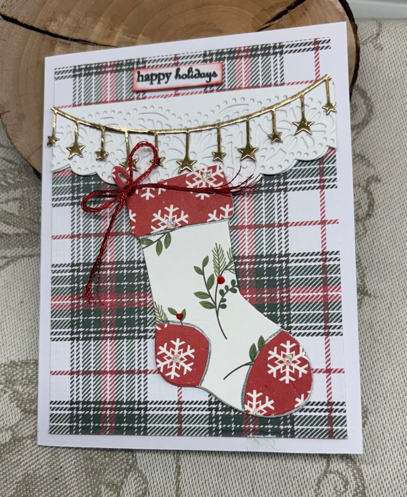
One of my aunts, is turning 90 soon, and I decided to make this card for her. As a bonus the card fits the current challenge at: The Sisterhood of Crafters – Strips and/or Dots. As you can see, the candles show both stripes and dots, but the PP also has them in its design.

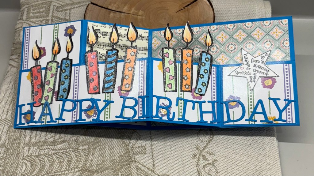
I did consider making a card that incorporated 90 candles, but discarded the idea due to the thickness and cost of mailing one that is oversize. So instead I used the double Z fold technique and added 9 candles to represent 9 decades. The stamp used is an old (very) Hero Arts wooden block and I found it isn’t stamping well so I shall be discarding it. That said I got a good enough impression to use for this card although I did have to use a sharpie to fill in edges. After stamping enough, along with a few extra just in case, I coloured them using pencils, Sakura Gelli roll pens and some Perfect Pearls for additional shine. Took a while to fussy cut, but cutting mostly straight lines isn’t hard.

Using some GKD CS, I had prepared my card base and added some PP, the music panel is from a napkin, the back panel is StampinUP DSP that had a shade of the same colour blue as the card base in the design and the other PP was gifted to me a long time ago and I think is from Michaels. The bottom is the Z fold strip after I had added the PP to it. Glued all the candles down as you see and checked the folding to ensure no errors. Of course I found a big one so a little bit of cursing was in order. I had to get very creative to fix it. What had happened was that I used both sides of the white CS to stamp the candles because the first try didn’t get good results. Figuring mistakes wouldn’t show once they were glued I stamped again on the other side. On a different design this this wouldn’t have been an issue, but I forgot that when the card is folded the backside of the candles shows and it was ugly. Fixing it required stamping another 6 candles onto white CS, fussy cutting and then adding them behind the glued ones. A little bit more cursing to get them glued, but it worked for the most part. I decided not to worry about perfection so while still not pretty, it’s a lot better than it was. If I do another card similar to this I will ensure that both sides of the stamped image are the same. My hands didn’t like the effort though and I’m paying for it now.

With a leftover piece of the blue CS I die cut the sentiment letters using a Scrapbook.com set of alphabet dies and glued them along the bottom deliberately skewing them slightly for a fun look. I felt it needed something on the last piece so I used a Forever in Time dollar store set, stamped the star and fussy cut it before adhering as you see. I’ve created a white piece for the back of the card so I can write a personal message, which will include an explanation for the quantity of candles.

All in all, I’m pleased with the end result and shall be mailing it tomorrow morning. Thanks for stopping by, your time and you are appreciated.

Sympathy window

Once again I needed a sympathy card, 5th one this month. As Double D Frames Challenge is looking for frames, I figured I might as well make a card that works for that as well as for the friend it is intended for. At the same time it gave me a chance to use part of a Spellbinders die set that came with my kit for the Weekender Retreat. I used just the window arch and interior piece, plus the steps, along with a Gummiapan floral as a small topper, sentiment is from GKD and the background is DSP from StampinUP. Florals were coloured with pencils and because I messed up I had to add an additional flower near the sentiment as well as a fussy cut bird from the DSP to disguise the mess. I guess experience in card making means that we know what to do when we make a mistake. I used my score board to get the lines behind the scene. In the end I quite like the result.

We have heat in a big way, and I am glad that where we live usually means we also have a breeze as it helps to keep the house cool. Down in the town it will be almost unbearable. Tomorrow my dragon boat team are racing in an area that will be even hotter and I am glad that I will not be participating. I tried one race last year, did not enjoy it and decided that racing is not for me. Practices I enjoy as there is less pressure and fortunately the team understand my limitations. My hands sometimes just won’t hold onto the paddle properly which is disastrous if in a race. And if any of you are wondering whether your scissors are sharp, just do what I did and have them slip when cutting something. My finger is now bandaged so I don’t get more blood on anything. All I was trying to do was to cut my sentiment stamp in half so I could use it differently and I didn’t notice that the points of the scissors were going to hit my finger. BooHoo!

Thanks for stopping by, I appreciate you, your time and any comments you may leave. Have a great weekend.

balance

prepared pieces ready to begin.

Well this almost turned into a disaster, but I coped and still had 3 seconds left on the clock when done. Why, you ask – its the ‘dreaded’ speed challenge at As You See It Challenge #349 – Rapid Water and of course when in a hurry, whatever can go wrong usually does. In this case my die didn’t cut properly and I had to repeat the process on another piece of CS. That will teach me to make sure my cutting plates are in good shape LOL. After I stamped the image I quickly coloured using Inktense pencils and a water pen and then fussy cut as best as possible. I also stamped the sentiment and fussy cut around that. Stamp set is an unbranded one and the quality is definitely not there so the sentiments don’t stamp really clear on the word edges. With the more expensive brand sets this is never an issue. Anyway once I had these pieces ready it was mainly an assembly of the parts. After a quick glance at the clock and a deep breath, I cut down the blue layer to fit over the top fold square card base and adhered it. Then I added the water layer and even used two of the fallouts to create a wider splash zone. In adding the yoga frog and the sentiment the glue point jammed so I didn’t get enough glue to stick them properly. Doesn’t show here and is an easy fix now I’m no longer in a hurry. The die used is from Memory Box and I’ve had it for a long time.

After I’ve improved it one of my yoga group will receive this sometime this year. I shall also give my glass mat a good clean in a minute. Actually my entire desk needs a good clean. I need a craft fairy to magically inventory my new supplies and put them away and then to clean my entire space.

Had a fun Friday evening and full day Saturday with the Spellbinder’s Weekend Retreat. The items in the kit are going to be fun to use. I could have crafted along with the designers, but chose not to as it was more relaxing to just view. Had I tried to craft along I think I would have gotten quite frustrated. As it was, I became exhausted and fell asleep in my chair. I only woke up when I almost fell out of the chair. At least it was done in my time zone. Some attendees were watching and crafting at ridiculous times of the day and night. Took me all of yesterday to stop being so tired. The entire event is available to watch at anytime so I can always watch again if I need to.

Thanks for spending time with me today. We have sunshine with a cold wind here but it is supposed to get quite warm this week. Wildfires are burning in other provinces and our hope is that they don’t start here. It is so sad for those affected.

Flipped over Christmas card

There is a sketch challenge at Sunday Stamps and this is my take on the challenge. It is the second one of two as I wasn’t 100% happy with my first try. I like this much better. I am adding the card at Peace on Earth as well.

I started with some silver metallic CS which I dry embossed with a SSS folder called Filigree snowflakes. To get the flip side I added a piece to the back and when properly attached scored the line for the fold. I wanted more depth, so I went over the piece with some ink and then heat set that with some WOW powder. It needed a bit more oomph, as my hubby would say, so I also spritzed some mica spray. I learned that mica sprayed embossed bits don’t stick well so it took some doing to get the fold to stick down. While waiting for it to dry I took an old GKD set and stamped the snow people using watercolour pencils and Stickles to colour them. After checking placement was what I wanted I glued them flat to the card front, after which I added the embossed panel. Using a die from GKD I cut two snowflakes in a blue CS, added some sparkle and attached them together before adding them to the folded corner. The sentiment is from a Divinity Designs set. A small blue gem completed the card.

Here is a photo of the first one, which is okay, but not quite what I envisioned.

Thanks for stopping by, I appreciate you and your time. Two more cards for my Christmas stash is nice to have. And I have a few other stamped images that I thought I might use for one of this style card so hopefully another couple will get done when I have time.

Happy Easter to all.

art deco step/easel card

Challenge #248, as chosen by me, here at https://cardz4galz.blogspot.com/ is all about Art Deco. I shall also be choosing the winners for this challenge.

Recently I purchased a new paper pad that has a lot of night sky designs as well as patterns that I’ve used here. It is a good quality pad, but still a little flimsy to use without a card base. That said the card design called for a card base that is bigger than any heavier stock I have so I used the PP on its own and reinforced it underneath in a few places with scraps. The easel part of the card wasn’t holding the steps up properly so I added a band underneath that holds them more securely.

The black art deco frames are a set by Altenew and don’t show up as much as I wanted them to because of the darker PP in the background. I jazzed up a few sections a little with a gold pen. The corners are done with stickers from my stash, I don’t use them that much these days but at least I remembered I had them. The swirly bits are from a Memory Box die and I cut 2 then cut them in half. The images are off the Internet and then jazzed up with sparkle pens. The smallest image on the front I fussy cut and just popped up. The middle one I die cut with a Hero Arts circle and the back panel I fussy cut around the lamps and the arch before popping up with foam tape.

The photo doesn’t do the card justice, as although it’s somewhat dark, it isn’t as dark as it appears here. My hubby likes the card, and I’m sure it will grow on me over time. Right now I’m not sure how I will use it but there is space on the back to write a message when the time comes.

Thanks for joining me today, and I hope to see some spectacular designs in our gallery. Have fun creating.

layered butterfly birthday

https://seizethebirthday.blogspot.com/ challenge #303, is requesting layers and this is what I came up with. I started with a 5 and one half square card front and layered a half size smaller pattern piece, then half size again with the pink sparkle layer. Next I used a darker pink scrap that I ensured would fit in the rotation and layered another pattern piece on that before gluing to the rest. It seems that right now I am fixated on my butterfly bundle from StampinUp as this is the 4th or 5th card I’ve done using it. Using up a scrap piece of pink vellum I die cut the lacy part of the butterfly and then layered this onto a regular piece of vellum. Before I attached the layers I decided the pink vellum needed to be brighter so using a Wow embossing pen I went over it, then used some glitter embossing powder before heat setting. I also went around the edge of the plain vellum with the pen and heat set the edge in gold. When I placed it onto the PP it still didn’t have enough presence so I added a bottom layer in gold metallic CS, which I also used to create the sentiment and the body of the butterfly. The sentiment is from Hampton Arts and I heat set this in black before die cutting. Added 2 pink embellishments from Studio G to the label. Not counting the card front, this became a 9 layer card, but fortunately it is still thin enough to mail easily. The PP is very old and is from Recollections. Because I store my papers in vinyl sleeves they seem to stay clean and don’t fade so I can use them even when old.

Thanks for joining me today, I appreciate you and your time. Its a dragon boat paddling event for me soon, so this is it for today’s crafting. I’m glad I managed one card.

linked together decorative

Having recently purchased these Decorative masks from StampinUp, they’ve been languishing on my desk waiting for me to use them and I finally got around to playing with them yesterday. For some reason the colours at As You See It were stuck in my head so this first piece was the result of using the first 3 masks and colours. I hadn’t planned on a second entry but as it works it will be added and it will also be added to the April 2025 Stencil Fun Challenge at Crazy is our Fame – Stencils are our game. Quite by accident it meets the pattern twist, which is fun for me. As I don’t do a lot of stenciling I wasn’t too sure if I liked the result at first. I had some fall outs on my desk from a previous project and thought I could use them but they kind of disappeared initially. After a bit of thinking I pulled out an Altenew stamp and die set and used one of the leaf stamps, which I stamped in green, and then heat embossed clear. After adding some foam tape to the back I placed it on the stenciled piece but didn’t like it much. More thinking and I cut a panel of vellum and then added the leaf to that. The fallouts were added on top and I attached it all to the stenciled piece. I stamped the sentiment, heat embossed that, then added it to a black piece and attached as you see. As I didn’t have the colour Peach Pie I used Tea Dye ink and edged the card front with it before adding the other piece on top. Stamped the sentiment in the same colour ink and heat embossed clear. The vellum mutes the background just enough for the rest to work and I’m happy with the solution.

For a card that I didn’t plan this turned out much better than I expected. I still have several other stenciled pieces to make into cards when I feel like it. Thanks for joining me today, your time and comments are appreciated.

Easter bunnies

The colour challenge and Just Add Ink made me want to make a card, the Easter theme at Double D and the usual anything goes at CYHTP ensured I combined my idea so the card would fit into the three challenges. In general I don’t do many of the holiday themed cards except for Christmas, but I do want to send a few Easter cards this year so I’ve completed a few. Using the colours from Just add Ink I created an Easter egg and decorated it. I first cut the egg shape by hand and then using some scrap strips of CS I inked colour to each strip. When it was dry I cut the fringe using scissors that are actually designed for cutting herbs. They are more useful in my craft room. After cutting off the excess I set it aside. I pulled out an old Easter set from GKD, and stamped the rabbit on some scrap that has rough finish similar to linen and used some Prisma pencils to colour it. I did use an alcohol pen for his ears, nose and cheeks and a white glaze pen for his tail. Using a blender pencil I smoothed out the colour but deliberately left it a bit rough so it looks like fur. After finding a pink piece of vellum I dry embossed it with this tulip folder. I added the egg and took a Doodlebug sticker of a rabbit head and added it behind the egg before fully sticking it down. Some additional stickers were added as a decoration and the sentiment, from the same set, was stamped, embossed and fussy cut as I wanted it to be stacked not side by side. The other rabbit is popped up on foam tape. The gray note card makes the pink vellum look slightly darker than it actually is.

As so often happens, I’ve already thought of an easier way to add the fringed elements to get a better edge line, but too late for this particular card. All in all I’m happy with the card.

Thanks for stopping by, your time and comments are appreciated.

new baby

My BFF has a new granddaughter so I made a card for her. The challenge at As You See It is a Recipe for a Pastel Celebration and it seemed ideal to combine the card with this challenge. Before I start these recipe challenges I write down the required elements lest I forget one and then cross them off as I go.

Corrected lampshade version. I simply couldn’t stand the harsh lines.

I was testing out a new StampinUP EF to ensure I had it the right way up and used the scrap pink piece for the test. Rather than waste it I added it to the card front as a background wallpaper for the rest. The window die is from Art Impressions and I backed it with some paper that looks like sky before popping it up as you see. Then I set about building the dresser to go beside the window. Basically I hand cut all of the pieces and glued them together. The sentiment is from MFT and was stamped in pink then heat embossed, after which, I rounded two of the corners before popping up with foam tape. The dresser drawers were also popped up with foam tape and I used two stickers from Doodlebug Design that I’ve had for quite a while. I used some valentine paper scraps to make a lamp shade and have the edge of a blanket falling from the drawer. To make the shade I used a scalloped circle die from Sizzix and then cut by hand. I wanted it to look pleated so I hand drew the lines, but it would have been better had I used a glitter pen as the black is a bit harsh. And the lamp base was a scrap that I’d saved and could finally use. Drawer pulls are gems from my stash. Twine is from my stash and I tied a small bow and hung from top of window adding the tiny heart that was a fallout from that space. Also used twine to look as if the butterfly is hanging.

Apart from the harsh lines I’m not unhappy with this card and I think my friend will love it even with a small mistake. Thanks so much for stopping by, you are appreciated more than you know.

Wishing you …

There is a collaboration between Inkspirational Challenge #334 – COLLABORATION with Color Hues Challenge #103 – RED AND PINK and Color Hues #103-Pink and Red Collaboration and as my hands are reasonable I decided to join in.

The products used are mainly new to me with couple of oldies along with them. Cake die cut is from Memory Box, Candles are GKD as is the sentiment, EF is by StampinUP and the label die is from Spellbinders.

Using some PP from my stash I die cut the cake and added the frosting. Added thin foam tape to the back of the both pieces. I embossed the pink background piece and used a matching red strip that I had from the same folder. These were then added to the card front. Once the label die cut was done I added some thicker foam tape to the back and placed it as you see. The cake was then added to this piece. I don’t have any small candle stamps or thin dies (have made a note to get some) so I used what I did have and cut the length off. Perhaps a little too big still, but I made it work. Added the sentiment after stamping and heat embossing.

It is a snowy weekend where I live and as the temperature drops the road is going to be icy. We are glad not to have to go anywhere until Tuesday. Thanks for stopping by, your time is appreciated.