Soft Spring Colours

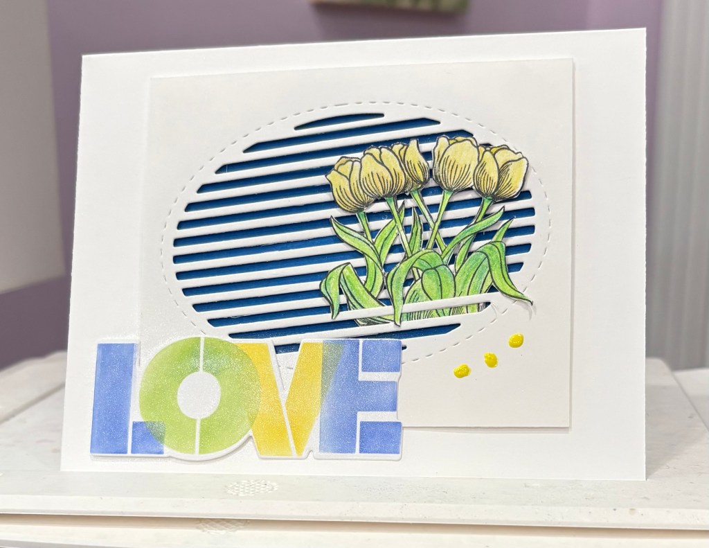
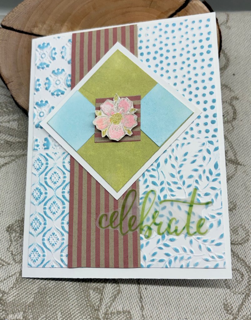
As You See It – Challenge #369 – Soft Spring Colours is a colour challenge this time and I’ve done my best to match them.

I started with the embossed layer using a Catherine Pooler/Sizzix folder. When done I went over the panel with Tumbled Glass ink and cut it down to the size I required. After some searching I located this stiped piece and added it as you see. Then I cut a square white piece and a smaller piece to go on top so that there would be a border showing. This piece I inked green and added them together. While it was drying I inked up another strip of white card in the blue and cut 2 small squares which I then added as you can see. With a small piece of the striped section I added that to join the 2 pieces together. With a stamp set from Inkadinkado I took a small floral, stamped it and heat set then fussy cut it. When that was done I added colour using Prisma pencils and a little bit of the green ink. This was popped up on the center striped square.

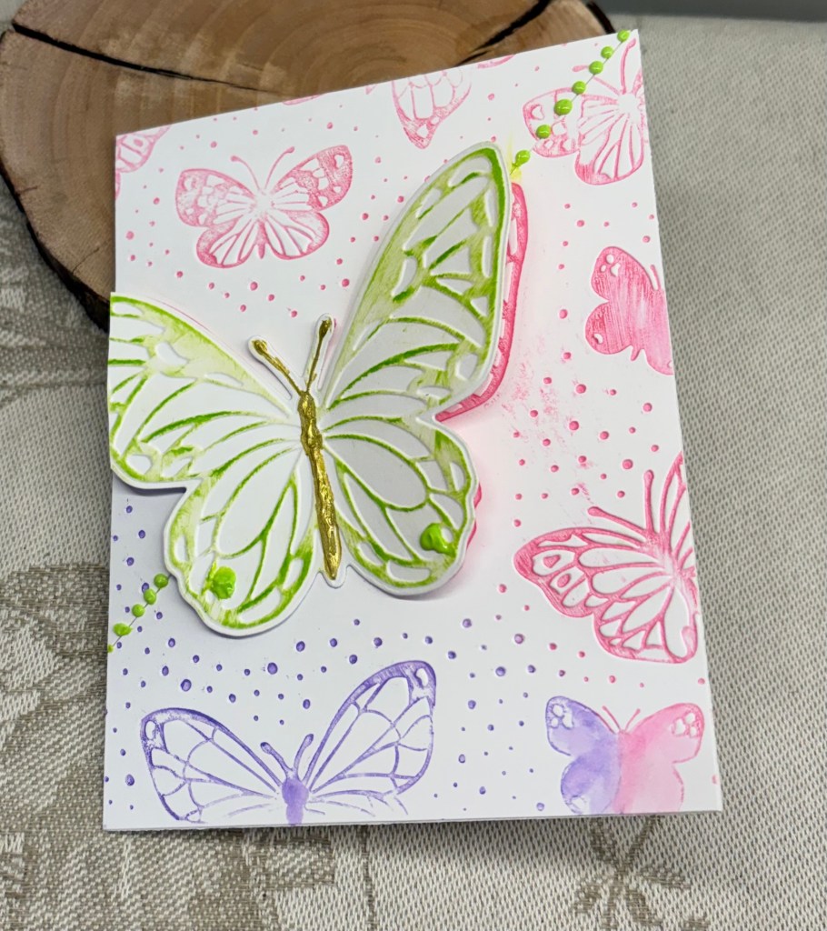
My sentiment was from some vellum sentiments I’ve had for a while and this one was beginning to curl so I decided I had better use it before it was too damaged to use at all.

I find it annoying when a photograph seems to change the colours on a card as appears to have happened here. The striped piece is actually a lot lighter in colour than it shows, but it looks much darker now. In fact the entire photo looks darker than it does in real life. I also think I should have used a different folder as this one is quite busy and I’m not sure about the card now. Oh well, it isn’t a disaster, just not quite what I imagined.

Thanks for stopping by, I appreciate that you do and also any comments you may leave for me.

First Grandchild Congrats

The current challenge at Shopping Our Stash is to make a card without white. My challenge was to make a new baby card for a dragon boat team member and hubby, who have the joyful experience of becoming a grandparents for the first time. Being able to combine what I needed with the challenge was a bonus.

Its funny how one can own a die for quite a number of years and not really use it, then in one week suddenly find uses for it. I had this MFT die set on my desk and the idea came to try to make a shaker card. (I’m generally not good at these, so rarely do them). As the baby is a boy I went with some blue DSP and cut the panel. I then backed it with some packaging plastic and adhered some of the letters that were sticking up a little too much. Using 3 of the confetti dies and some scrap glitter CS I die cut the confetti. After going around the congrats layer with some foam tape strips I added the confetti bits inside and used a scrap piece of silver CS to cover it all. This layer was then added to the card front. Taking a very old wooden block stamp, I scribbled some flesh coloured alcohol ink, let it dry, then stamped the baby on top, after which I fussy cut it. The safety pin and rocking horse are from a set made by a company called Little B. Don’t think they exist anymore as this is another set I’ve had for a very long time. I coloured the rocking horse with some Sakura gelly roll pens. Unfortunately the glitter CS confetti tends to clump together and it doesn’t shake freely so another lesson learned here. Told you making these isn’t one of my talents. The inside words were generated on my computer – Between the earth and the sky above, Nothing can match a Grandparent’s
LOVE.

I guess you could say, I truly shopped my stash to make this card. It is now in the mail and I hope they like it. Many thanks for stopping by, I appreciate you and your time.

just to say …

Welcome back to another challenge here at Double Trouble. Your recipe is to use 3 Colours from the No 3 primary colour wheel and the neutral wheel as well, 2 images and 1 sentiment. You may choose to add the dare from Twisted Sister and add a four footed animal and if you follow the sketch you may add your card to the TSOT challenge too. Be careful not to backlink if you choose to add it at TSOT.

My card incorporates more than 3 primary colours and several of the neutrals. I made my own section of PP by randomly stamping the fish bones in black, after which I added some colour using Sakura glaze pens. The second half strip is from a paper pack by GKD that I’ve had for a long time. I backed these pieces with a black layer and added it to the kraft card front.

After stamping my cats, all from the Crazy Cats by Tim Holtz, I coloured them using Prisma pencils and Gamsol. Then they were die cut using the matching dies from the set. I set them aside so I could work on the rest. I had these die cut circles left from a different project so I sponged colour using Distress Oxides 2 colours per circle. Once they were dry and I knew I liked them, I added the cats and fitted them to the other layers. Because I had already added the layers to the card front, I used a pencil mark on the two circles that overlapped and cut them on my Fiskars unit. My sentiment comes from a note pad by Hunky Dory that has pages of pre printed sentiments intended for the inside of cards. I’ve only just purchased this and it is handy as it has 120 Essential card inserts. The inside of this one says Many Happy Returns.

I’m happy with how this turned out and it was a fun one to create. We look forward to seeing your creations in our gallery and hope you have fun with the challenge.

Thanks for joining me today, I appreciate you and your time.

SPRING IS IN THE AIR

CAS has a colour challenge – Challenge #580 – Colour Challenge and this is what I came up with. I’m still learning ways to use these Craft Addiction slatted dies but am enjoying playing with them.

Having the Inkadoo stamp set still on my desk along with a new, as yet unused, stencil/die from Waffle Flower helped my process. After searching through all my paper scraps I finally found a piece large enough and in the right colour to fit behind the slatted section. At first I thought I would make a square card, but I didn’t measure the layer properly and because I didn’t want to waste the piece I’ve used it the way you see it here. I added some foam tape around the slatted piece and then added the blue background in behind it.

After stamping the tulips I coloured them with pencils and then fussy cut them even going into the crevices to take out the white bits. There is a little foam tape added behind the flower heads and I split the leaves slightly at the bottom so I could tuck everything into the slats but have the leaves drooping over the top a little. I also added a tiny amount of gold sparkle to the petals of the flowers on one side but it doesn’t show on the photo. After die cutting the word, I added the stencil and using inks I brushed in the colours. Using more foam tape I added the floral layer to the card front and then placed the word close to the bottom. Three Pop of Color dots from Scrapbook.com finished the card.

I had thought I might use a technique shown by Christine Stokes to add more dimension to the flowers, but I forgot. Hopefully I’ll remember the next time as it really makes a difference to the look. We are off to an art exhibition this afternoon, so I’m happy I’ve managed to get this posted.

In the meantime, thanks for stopping by. You and your time are appreciated.

BOOK WORM

The mood board at Double D has some inspiring images and the challenge gives us choices. As you can see I chose books and a card design that looks like a book. Double D Books/Bookmark and/or Postal/Postage Challenge.

It took me a while to figure out which way I should go with this design. I knew I wanted a portrait orientation so after cutting a normal size card out of some Recollections CS I scored it at 3″ and again at 4.25″. Before gluing this section I went around the edges with a sponge and Vintage photo ink. I wasn’t quite sure about papers but I knew I wanted the book die cut, which I cut from an old hand painted card. I think this die is from Kokorosa, but it could be an unbranded one, I’m not sure. After searching through some paper scraps I came across this mulberry paper that I rather liked so I cut both the spine and the front cover using this. Then I remembered that I had these corner dies (not sure of brand) so I cut two from some Gold and added them as you see, using the fallouts on the spine. I also added some thin gold strips top and bottom. After playing around with the book die cut I found it was going to be more effective if I cut into sections. Once they were glued in place I used a fine gold pen around the edges and on the spines for more detail.

My original intention was to create my own sentiment/book title using the computer, but I also wanted a vertical sentiment on the spine. I used an old GKD set for this with Ground expresso ink and some clear heat embossing. In searching for this set I came across an Inkadoo set that was gifted to me and the word stamps were part of the set. Because I was stamping these as an afterthought I had to play with placement a little, but using the same ink and heat embossing I managed to get what I wanted. Fortunately the paper released the powder easily as I couldn’t prepare it as I normally would have. Having it stick only where I required was a blessing.

I’m someone who is rarely without a book in my hand, when I’m not crafting that is, so this design is right down my alley. I rather like how it turned out and it is just a little different in its design. Thanks for stopping by, you, your time and any comments are always appreciated.

Mixed Media with Wings

For a while now, I’ve had the urge to make a mixed media card, most likely because I watched a video by Christine Stokes. She makes mostly CAS cards that are gorgeous and I like her style.

The latest challenge at Seize the Birthday is anything with wings and because I wanted to make a 2nd card for the Color Hues challenge I chose green and gold as my base colours.

First I started with a white base panel and using Bundled Sage, Mowed Lawn and Pine Needles Distress Oxides I inked up the panel. An old wooden block stamp was used to add some writing in a couple of places I had some pretty tissue paper lying around so I chose a couple of sections and using ModgePodge I added them as you see. I spattered some Nuvo Drops that I had watered down to get some additional gold on the background. Then using a new slatted oval die set from CraftAddictions I cut the middle sized oval and went around it with some gold. After adding some foam tape around the back I placed it on a slight angle. Using a Scrapbook.com butterfly die I cut a backing piece from gold and the patterned section from a Xmas card I saved. After adding the two together I cut a body from a more metallic gold and glued it on and then glued the butterfly to the slatted oval. I had a few fall outs from a previous session and I used them as more embellishments in several places. The sentiment is from an unbranded stamp set and I used a gold pen around the edges before gluing it down. I did darken the panel’s edges before gluing it to the card front.

Its too late now, but in retrospect I should have gone over the entire layer with some ModgePodge as this would have given it a bit of shine. As it stands the shine is just in one area.

I quite like the end result and hope that you do too. Thanks for stopping by, you and your time is appreciated.

hogs and kisses

Welcome to a new challenge here at Double Trouble. Our recipe this time is called ‘In with the old, out with the new.’ You need to have the following: 3 layers, the card base does not count, 2 colour choices from the #1 colour wheel and 1 image. Twisted sister says add a pig if you want to. And your double dare is to make it fit the TSOT sketch challenge and enter it there. Be careful not to backlink when you do enter this.

My card has more than 3 layers and uses patterned paper from SSS. I used a unbranded frame die negative space piece to surround my background paper and another unbranded die set to cut my other pieces. My papers actually have several of the colours from the colour wheel, but I opted to colour my image with Spectrum Noir markers in some of the colours too. My image and sentiment are from Divinity Designs and I used the matching die to cut the image out.

Foam tape was used around the frame before adding to the background which gives the card a 3D look. The sentiment piece was glued flat but I have the image piece on foam so it doesn’t sink on one side. I wasn’t sure about this card initially, but my hubby took a look as well as our artist friend and both gave their approval.

We look forward to seeing your cards in the gallery and hope you have a lot of fun creating them. Thanks for stopping by, I appreciate your time and any comments you leave.

butterflies galore

Welcome back to challenge #270 here at Cardz4galz and Helen has chosen the theme of Wings, (butterflies, fairies, birds etc. As you can see I went with butterflies and used a new StampinUP hybrid folder for my design. I went over the folder with 2 different ink colours and ran it through. I cut the panel diagonally and added them to the card front. Next time I’ll make sure the colours are more evenly spread in the folder but I still like how it looks. Using the die with the folder a second time, I ended up with the large butterfly and I used an ink cube over the raised parts to give it some colour. A gold pen for the body and some pops of color dots finished the card.

I’ve left off a sentiment for the time being as I’m not sure how I shall use the card. Its also a somewhat busy design and I’m not sure if a sentiment will look nice or be too much. I’ll cross that bridge later.

We look forward to seeing your designs in our gallery and hope you have a lot of fun creating.

Thanks for joining me today, you and your time are appreciated.

Little friends

After some sunny, although cold days, we are back to the milder temperatures and the rain so I’m in my craft room catching up on a few things and posting this card.

It is intended for the AAA Card Challenge #306: Follow Francesca’s Lead and this is my take on her card.

To make it, I used a stamp set from Crafters Companion that came in a kit, and some Gummiapan dies. I stamped the background using Lost Shadow Ink and the sentiment in Hickory Smoke. While the ink was drying I die cut the images and coloured them with watercolour pencils and a Sakura Glaze pen.

When everything was dry I glued the die cuts as you see them. I did debate whether anything else was needed, but CAS means lots of empty space, so I left it as is. Colouring such tiny images is challenging and I need more practice at it, but all in all, I’m happy with the end result.

Thanks for spending time with me today, I appreciate you and your time.

pink flower

Welcome back to the second challenge of the new year, here at cardz4galz, which is to add pink flowers. Challenge #268 has been chosen by Billie A and she will also choose the winners.

I wanted to keep my card simple so I chose a lacy look border die by Crafters Companion and die cut it. After attaching it to another layer I added the GKD ribbon and then attached the layer to the card front. The flower and foliage are from a Waffle Flower set. I die cut the pieces and then inked them using Distress inks and a sponge. I put the flower together and using a soft pad and a flower shaper I added some dimension to it before gluing it on top of the foliage. A few pink embellishments finished the card nicely and I’m happy with how it looks.

Thanks for spending time with me today. We look forward to seeing your creations in our gallery and hope you have fun making them.