Ten years of blogging and making challenges for likeminded crafters is to be celebrated. Double D is celebrating just that. Congratulations to both of you for the hard work you put into all the challenges you support.
Before I began, I had something other than this in mind, but I couldn’t find the set of dies I was looking for. In my search I found this very old and somewhat neglected layered die set from Spellbinders. As I was getting a bit frustrated in my search, I decided to use this and go with something different than what I had in my head. In the end I’m happy to have changed direction.
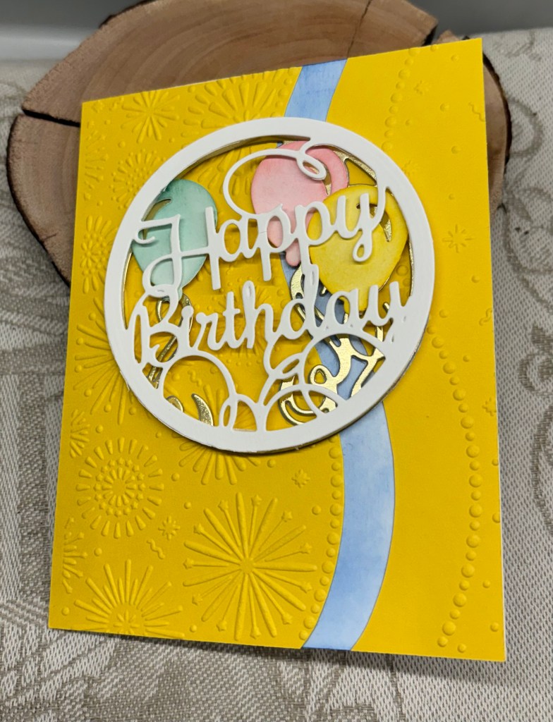
I cut the pieces I required once in gold but the rest in white CS. Using the gold as my base, I added the inked balloons that I had coloured using distress inks. I used some foam tape to lift them. Using a scrap piece of yellow and an EF from Gemini I dry embossed the piece. Then I carefully cut along one curved edge. Initially I was only going to use this section, but it didn’t look quite right so on impulse I laid down the other piece, which created a gap because of the cutting. This looked much better but the white gap was too stark so I added some blue ink before gluing down the yellow layers. Once I was happy with this I glued the balloon piece on top. The sentiment section was added with additional foam tape which creates a lot of dimension. After some debate I decided against adding an additional balloon or other embellishments as it looks busy enough as is.
Thanks for stopping by, I appreciate you and your time.