Seeing Double

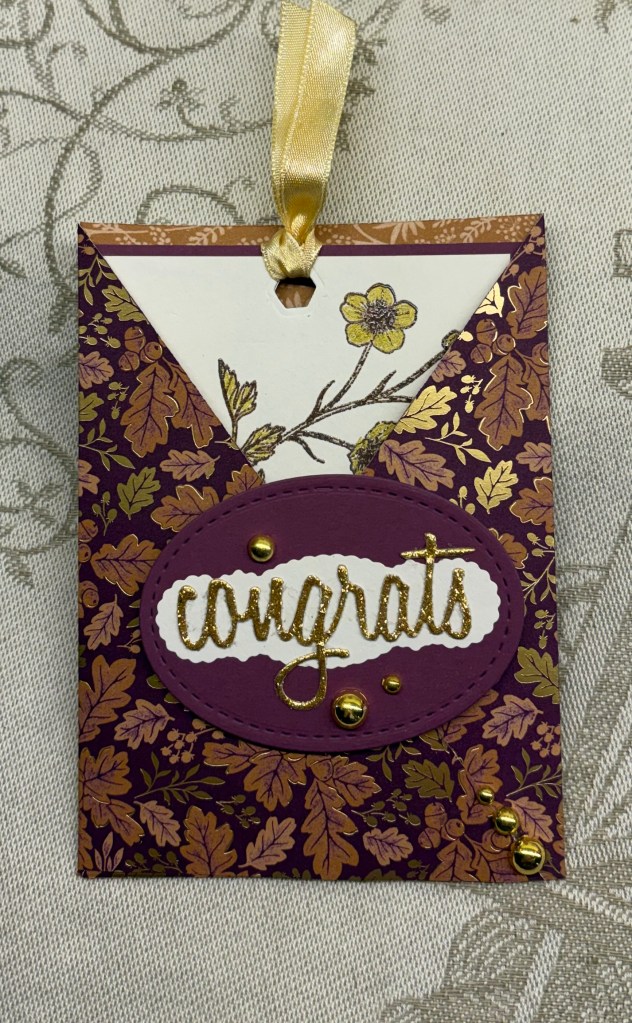
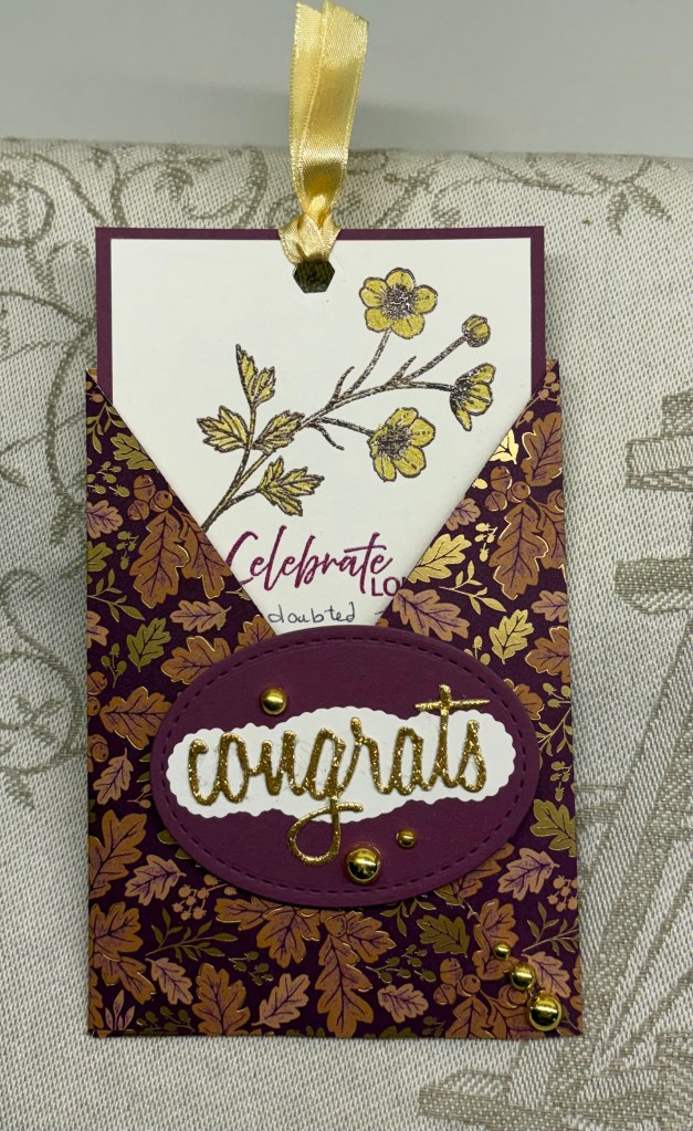
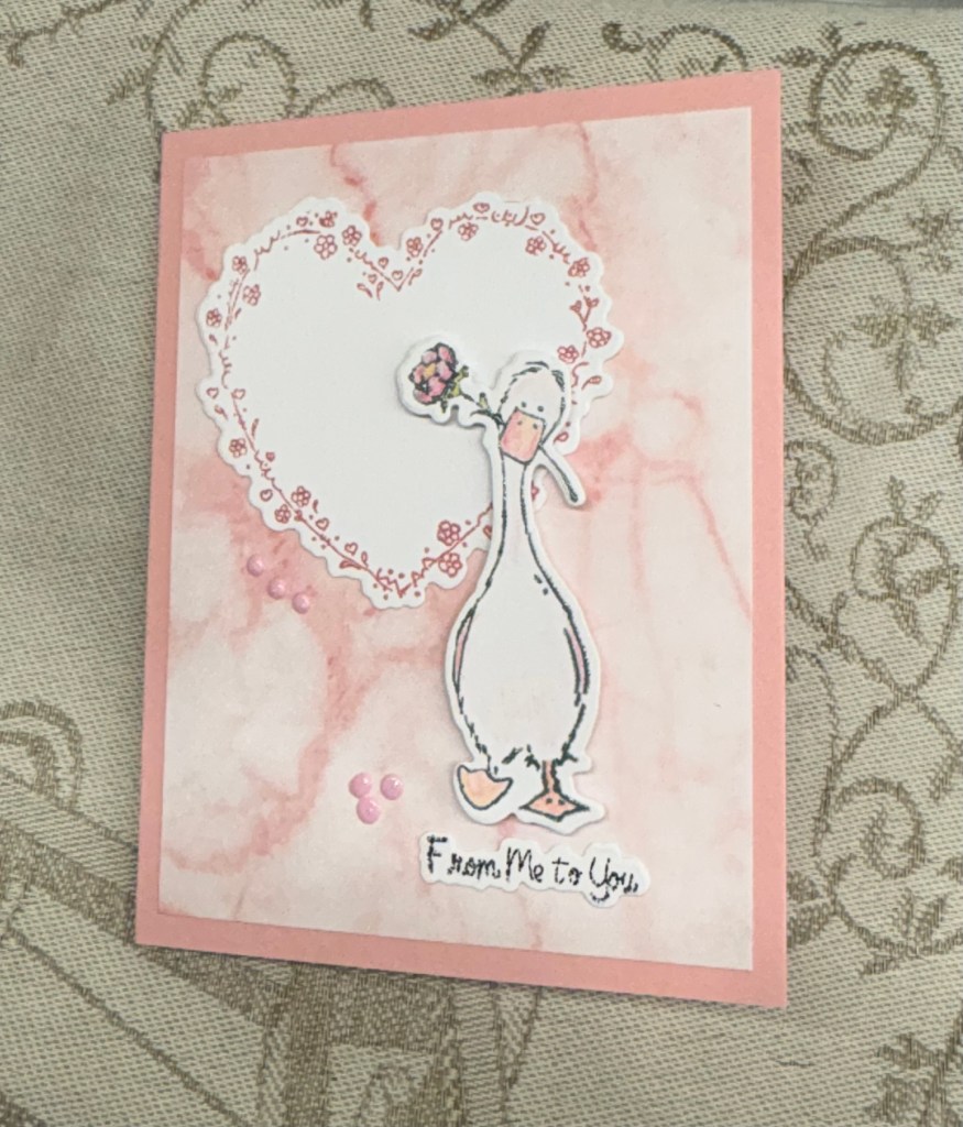
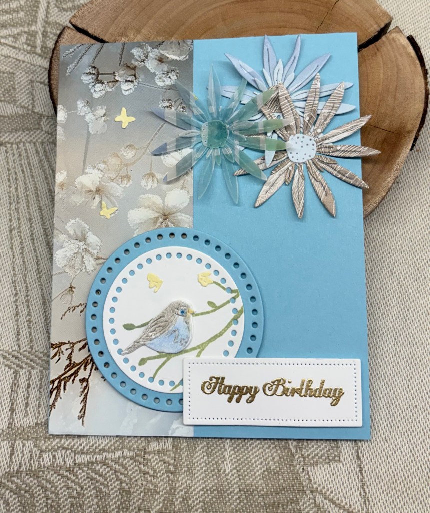
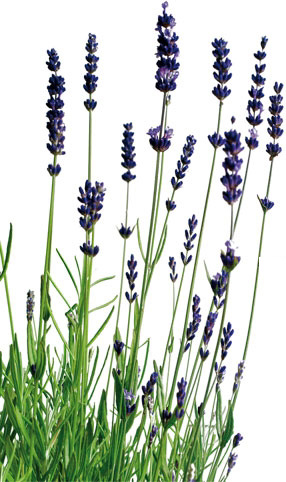
A while back, one of my Dragonboat paddling friends arrived at practice with a box of pre assembled craft items as a thank you gift to me. Until today I hadn’t tried to use any of them, but the flowers you see here work well on the latest challenge from Sunday Stamps.

The background PP is from a new paper pad I simply couldn’t resist buying and is by Crafter’s Companion. The lattice look die cuts are from a Spellbinders set that makes plaid if all 3 dies are used and the background for these was cut using a set from StampinUP. The oval sentiment die is from YNS I think and the sentiment is from Spellbinders which I heat set, and added foam dimension before adhering. The little hearts were leftovers and these are from an unbranded die set.

My original intention was to use another product purchased recently, but I can’t find it at the moment. I’ve been trying to tidy up a few things, but I’ve not managed to complete the task and I’m sure what I was looking for is buried temporarily. And the mess isn’t helped by a new kit from Spellbinders for their upcoming Weekender sessions. Its an early birthday gift from my hubby and I’ve unboxed the kit but haven’t put it in any order yet.

I’m grateful to complete a card this afternoon as my eyes are not focussing well after an eye check earlier today. Thanks for stopping by, I appreciate you and your time.

Beside the Sea Vacation Time

It seems a couple of challenge blogs have a water or beach type scene as their challenges at the moment. When I first created my post for the As You See It challenge, my original intention was to do something similar to this post, but my brain went in a totally different direction that day. In the meantime the Card Concept came up with a new challenge that was nautical in nature and my brain went back to this idea. I think my card fits into their Clean and Layered definition. And because I used a stamp set from GKD that I’ve had forever and not used in recent years, I dragged it out to use here and that qualifies the card for the challenge at The Neglected Stuff. Believe it or not, the sentiment stamp had never seen ink until today.

The small gold squares were leftover pieces from a post I did a while ago and my new Memory Box nested squares arrived the other day, so I chose one slightly smaller than these and using some scraps I die cut the next layer. I added them together and set aside while I did the next few steps. Taking a wave folder from StampinUp I embossed the white layer and cut it down so it was slightly smaller than the card front. Then I carefully added the squares doing my best to keep them centered and straight. Once ready I added it to the card front. Then using a few stamps from the set, I stamped the fish and star fish using Black Soot ink and heat embossed clear, doing the same with the sentiment. I coloured these images with Prisma pencils using an alcohol blending pen to smooth out the colours. Once fussy cut I added them as you see. I felt the fish needed a bit extra so I die cut some seaweed using another Memory Box die set. I matched the sentiment piece to the others using a scrap piece of the same gold CS. The tiny embellishments were added and the card was complete.

When taking the photograph I had some issues with how the light was on the card and I can see here that the embossing isn’t as visible in the picture as it is in reality. This 3D folder has quite a visual impact usually.

Thanks for spending time with me today, I appreciate that you take the time to look and comment.

Happy Circles

Welcome to our latest challenge at Cardz 4 Galz, and the challenge theme has been chosen by me. I will also choose the winners when the time comes. The theme is anything with circles.

I’ve always loved purple and gold/yellow together and as I also wanted a feminine style card these are the colours I chose. Starting with Hero Arts infinity circle dies and a silver patterned scrap piece of Purple CS I die cut 5 circles. With another slightly smaller die and gold scrap I cut another 5. My Scrapbook.com alphabet dies were located and I die cut the letters from some silver CS.

I went on the hunt for an old die that had the tailors dummy outline with the corset piece in the middle. I don’t know which company, but based on how long I’ve had it, I’m sure it is one of three, Spellbinders, Sizzix or Memory Box. The birthday word is from another ancient set by Sizzix. As you can see I used some yellow CS to cut these pieces. The tailors dummy piece was a bit too large for my purpose so I cut it down and used only a portion of the stand, adding the corset on top. I also dry embossed the corset piece so it has dimension and interest. I lost the point for the i in the word so I used a small StampinUP enamel heart instead. I used a ruler to ensure the larger circles were properly aligned as I glued them down and deliberately offset the gold ones on top just a bit.

Not a difficult card to make thankfully and now it is your turn. We look forward to seeing your creations in our gallery and above all, hope you have fun making them. Many thanks for stopping by, you are appreciated.

Fun Fold – Looks like an M Shape when Upright

closed and flat

Earlier in the week I was testing out a 3D folder to ensure which was the raised side versus the debossed side before I used the coloured card stock for the specific card I was working on. As the embossing was quite pretty on the test piece I decide I would use it in a project and this is what I came up with. I had seen a card like this on Pinterest and I followed it to Suestampfield.com where I could see her create it. I figured out the measurements, because paying for a tutorial in US dollars makes no sense to me, and this is my version of one of her examples. The folder is an unbranded one, the papers are all StampinUP as is the circle die cut. The sentiment die was a gift and I don’t know the brand, and the florals are decoupage that came in a kit by Crafters Companion. I had them put together for a while and decided this card would be a good way to use them.

These cards look complicated but they are actually much easier than we imagine and I enjoyed making this one. The back of the card is okay for writing a personal sentiment, but one could enhance it with some stamping if desired. This card fits into the current challenge at CYHTP and includes the twist of flowers.

Thanks for stopping by, you, your time and any comments you may leave are always appreciated.

Another Year Flies By

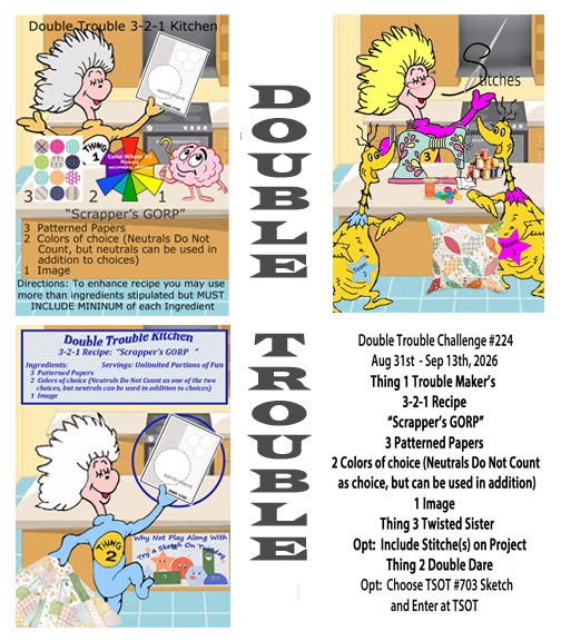
Let’s make this Air-mazing is the latest challenge here at Double Trouble #214. Our recipe is as follows: 3 Patterned and/or special papers, 2 colours from colour wheel #1, 1 image. And our twisted Sister is suggesting an optional flying element. The double dare is to use the sketch TSOT#693 and enter it there. Be careful not to backlink when posting to TSOT.

As you can see, my flying element is a kite from a StampinUP collection, as is my sentiment. I used a sky paper layer from a very old paper pad (it still comes in handy at times) and some holographic paper. As I don’t have dies that will cut a cloud shape in a line I used some shaped scissors. I could have free handed it but felt the scissors were best. Once the kite and tail were stamped I used a combination of Sakura glitter pens and Prisma pencils to colour it and did the tail stars in silver glitter. Believe it or not I did fussy cut these elements and then added them to the, also fussy cut, kite. I backed all this with foam tape to lift it off the sky and did the same to the clouds on each edge. I stamped the sentiment and heat set it with a multi coloured powder then added a small black layer behind before adding to the clouds.

It was at this point that I realized I had missed part of the recipe as there were only had 2 patterned papers and I really didn’t want to have to begin again, so some thinking was required. I settled on adding another layer of paper over a portion of the holographic section. I found this piece in a paper pad and added it flat at the top. In a way it wasn’t a bad idea as it has toned down the glare that comes from the shiny section but it wasn’t quite the look I had in my mind.

Thanks for stopping by to take a look. I appreciate you and your time. We hope to see your creations in our gallery and that you have fun making them.

Micky & Minnie Hello

Remember yesterday when I mentioned I tried 3 times with a design. I did come up with something I liked eventually but had the other 2 pieces sitting looking sad on my desk. As you know I hate wasting anything and knew I could redeem them somehow, and this is what I did.

The poorly stenciled piece was cut down to fit behind this embossed and die cut frame which redeemed most of it. The stamped image on the other card was ruined because I tried to add a frame around the card front after the image was there and it looked awful. What I did in the end was cut the image off – kept the scrap card left over to use somewhere eventually and then fussy cut around the Disney characters. I did another stamp and fussy cut of the mice, added them on top of the original pieces for more dimension. Then I took another stamp from the set and added the stars above their heads and the Hello at the corner.

Supplies used are: Spellbinders EF Postage Stamps with dies, Simple Stories Hello Magic stamps and a gifted homemade graphic style stencil. I scored the card front diagonally before adding the framed piece on top. In the end I think this turned out well and perhaps better than what I was originally thinking yesterday.

I am entering it into the CYHTP challenge and I believe Disney characters fits the optional twist of Kids. As well I shall enter it into the Stencil Fun March 2026 Challenge. Twist not taken.

We’ve gone from really cold wind and a lot of rain, to a balmy spring day where we didn’t even need a jacket to take the dog for a walk. Its supposed to heat up a lot for the next few days so I shall have to get into the garden before it becomes unmanageable. That will likely mean no crafting as I have to choose how I use my hands and gardening usually means pain for a few days.

Thanks for stopping by.

Up, Up and Away

Right now I seem to be on a creative roll after a few weeks of not being very motivated. Many reason’s for it, but I’m glad that my brain is once again coming up with ideas. I have quite a few PP scraps lying around and I wanted to use them. Having seen a card on Pinterest I thought it was a good idea and a way to use some of them.

Then I also noticed the challenge at Just Add Ink #781…Just Add Wings! and this card was born. I knew I had a stamp set with a plane, but had to do a bit of searching as I couldn’t remember which company it was. It is from CTMH which is now no more, but I do have a few sets from its early years. The sentiment, however, is from an old GKD set.

It took me a while to get the paper scraps the way I wanted them and I made a mistake at first when I tried to glue from the bottom to the top. Started over from the top down and glued the cut pieces as you see. They were cut using several dies, some from Spellbinders and some from Kokorosa. Once I had them together I added them to a white layer which I then cut down to fit on the card front. Before doing that I stamped the clouds and the sentiment. The little plane was done on a separate piece, coloured with a mix of Prisma pencils and Sakura gelli roll pens. After fussy cutting, I added dimension with foam and then went around the entire layer with a black pen after which I glued the panel to the card front. I was dismayed to realize that I had somehow gotten a large black smudge on the plane which would not come off. So more stamping, more colouring, more fussy cutting and then glued it over the original.

Another needed masculine style card ready and I’m quite pleased with myself and with it. LOL. My hubby was complimentary when he saw it. Many thanks for stopping by, I appreciate you and your time.

tent fold card

showing how it stands

Our artist friend has a birthday coming up soon and I really wanted to personalize a card for her. When I saw this style card on YouTube, I thought it would be perfect to make a painters easel and this is what I came up with. The tutorial is found HERE if you are interested. Our friend loves blue so my first thought was to use blue PP, then my second was realizing I don’t have any stamp sets with artist tools. She is also an award winning photographer so I thought about doing a card using that as a theme, but I’d done several of these for my hubby and wanted something different. In the end I looked online to see what I could find that would be useful and found a set by Globeland on Amazon. Cheap stamps but good enough for what I needed, but no matching dies so I fussy cut the images. And the order was delivered this morning which was perfect.

Making the card folds and decorating it wasn’t hard at all. I did, however, want something on the floating piece that would look as if someone was painting. It was then that I remembered some cards that came in my Weekender kit from last year. I found one that looked like a painting and cut it to size before adding to the panel. The sentiment is from Joy Clair and I’ve added a piece on the back for writing a personal note.

All in all I’m happy with how this one looks and of course I’ve learned a lot while making it, so the next one will be much simpler to do. I have two other artist friends and may do something similar for them when their birthdays are coming up.

I think this card works for the following challenge: V is for Volume (Dimension) at Alphabet challenge blog and it loosely follows the sketch challenge at Just Add Ink #779…Sketch even though it is a fun fold rather than a note card style.

Thanks for stopping by, I appreciate you and your time.

Chocolates anyone

We are in need of a thank you card, and As You See It is asking for candy, so I decided to combine the need with the challenge.

I saw something briefly where a crafter was making paper chocolates and I thought what a good idea. Somehow I missed saving it, and of course when I went to look again, couldn’t find it. That said, my chocolates are roughly based on what I saw.

Using my Hero Arts Infinity dies and some scrap, chocolate coloured, CS I cut 6 hearts in 2 sizes. Using some foam tape I put those pieces together. Pulling out some very old embellishments that look like sprinkles I chose the colours I wanted and glued them on top.

I thought about making a heart chocolate box, but decided I preferred a square box so I used a window frame (no idea of the brand) to die cut my piece and added foam tape to the back for dimension. In retrospect, it would have been easier to die cut several layers and glue them together, but we live and learn and it is something to note for next time. After cutting a 5″x5″ card front I added the window piece to it and then I carefully added the chocolates, tucking them in as best I could. For my center and sentiment I die cut a gold piece that fit across the entire frame and added a smaller copper piece, it matches some of the sprinkle colours, and then cut another white piece for that. I stamped the words and using some copper coloured Recollections EB I heat set it. An unbranded bow die set was used to cut a bow in copper and to this I added a tiny StampinUp heart embellishment. The white piece was a bit too white so I used an inking sponge with Lost Shadow ink to soften it. All in all, I’m very pleased with the result and my hubby is thrilled as he is going to be giving it to our nurse practitioner when he sees her later this week. She deserves this thank you, as she was the one who did her due diligence and got him checked out. We feel that the outcome could have been an unwanted and serious heart attack as we had no idea that it was his heart giving him trouble.

We’ve had another dry day with a bit of sunshine, so were able to get outside and walk a little. It is good to be in the fresh air even if only for a short time. All of us, including the dog, need to lose some weight so once we are sure my hubby is completely stable, we will be concentrating on a diet plan.

Thanks for stopping by, I appreciate you, your time and any comments you may leave.

Rhapsody in Red, not a valentine

partly open card
closed card

The challenge is all about using reds and I decided on this design and papers for the As You See It, Challenge #365 – Rhapsody in Red. There is a recipe included so I ensured I got all the ingredients as well.

Firstly I chose my papers using a small paper pad from a dollar store. Having seen something like this on Pinterest that also had measurements and a tutorial, I took a closer look to see how best to proceed. The demonstrator explained her process and I followed it mostly, except that I wanted borders around my papers so changed it up a little bit. Once I had my strips ready I chose a neutral matte old gold card front and added them as you see. I die cut 2 hearts, one in white CS and one in Vellum using a set from Memory Box. Actually before I cut the vellum one I used a stamp from a Crafters Companion set already on my desk. I then stamped the floral sprig in Barn Door Distress Oxide and then heat embossed it with a clear powder. Once I was happy with it, I die cut it and attached it to the white one. I hope the vellum can be seen. I did try several coloured pieces behind it, but the white looked best. In my bits and pieces box I found a gold heat embossed sentiment which I fussy cut and added to the heart. And I also added a small bow. The heart is popped up on foam tape. The inside panel was stamped using a Hampton Arts set with Aged Mahogany ink, and I also added more red floral sprigs in a couple of places. The embellishments are from my stash and I used the bigger gems so they would show up more.

Thanks for spending time with me today. I appreciate that you stop by and also any comments you may leave.