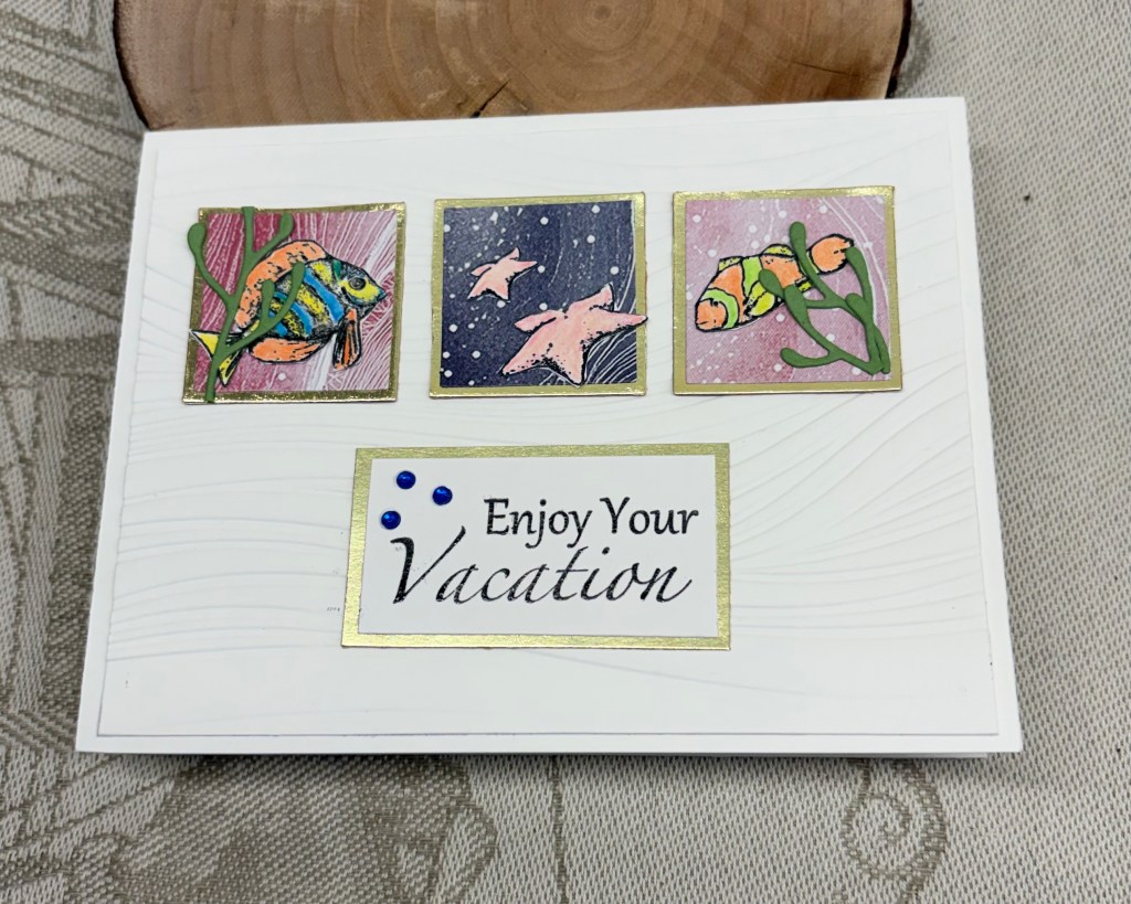
It seems a couple of challenge blogs have a water or beach type scene as their challenges at the moment. When I first created my post for the As You See It challenge, my original intention was to do something similar to this post, but my brain went in a totally different direction that day. In the meantime the Card Concept came up with a new challenge that was nautical in nature and my brain went back to this idea. I think my card fits into their Clean and Layered definition. And because I used a stamp set from GKD that I’ve had forever and not used in recent years, I dragged it out to use here and that qualifies the card for the challenge at The Neglected Stuff. Believe it or not, the sentiment stamp had never seen ink until today.
The small gold squares were leftover pieces from a post I did a while ago and my new Memory Box nested squares arrived the other day, so I chose one slightly smaller than these and using some scraps I die cut the next layer. I added them together and set aside while I did the next few steps. Taking a wave folder from StampinUp I embossed the white layer and cut it down so it was slightly smaller than the card front. Then I carefully added the squares doing my best to keep them centered and straight. Once ready I added it to the card front. Then using a few stamps from the set, I stamped the fish and star fish using Black Soot ink and heat embossed clear, doing the same with the sentiment. I coloured these images with Prisma pencils using an alcohol blending pen to smooth out the colours. Once fussy cut I added them as you see. I felt the fish needed a bit extra so I die cut some seaweed using another Memory Box die set. I matched the sentiment piece to the others using a scrap piece of the same gold CS. The tiny embellishments were added and the card was complete.
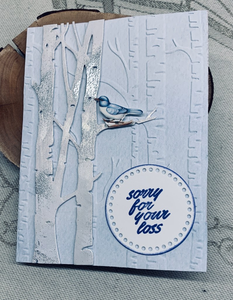
When taking the photograph I had some issues with how the light was on the card and I can see here that the embossing isn’t as visible in the picture as it is in reality. This 3D folder has quite a visual impact usually.
Thanks for spending time with me today, I appreciate that you take the time to look and comment.