
When I look at my photograph it appears as if the ink is more orange than peach and the bow and edges seem more pink. I don’t have an exact match for a peach colour, but I did my best nevertheless. I first dry embossed the Kraft panel with a folder by Craft Concepts called in bloom. I added the peach paper behind it so just a small border is visible and then attached it to the card front. Using a die set from StampinUp I cut the daffodils and leaves out of white CS and then added inks to give some colour. The butterfly is from the same set and the bow is a new unbranded die I’ve just received. Once I was happy with the placement I adhered it all as you see and then added the sentiment which is from Itty Bitty Basics by MFT. As I write this I realize I have forgotten to add three small gems that I had ready so they will be added after the fact as I’m too busy to redo the photo.
Thanks for stopping by!


Your daffodils are lovely and they look peach to me. Our daffodils around here are still hanging on in spite of the cold snap and the wind. Some of them are just the color of yours.
LikeLiked by 1 person
Thanks Judy. My daffodils are just starting but the weather is changing so I suspect I may lose some if it gets as cold as suggested. I may pick a few if it gets really cold and rainy. Having them in a vase for a short while brings pleasure if I can’t see them outside.
LikeLike
The embossed strip is a perfect background for the colourful daffodils. My mum’s favourite flower – you brought back happy memories…… xx
LikeLiked by 1 person
Some colors are just hard to photograph. I love your embossed strip with the peach just peaking out, and the daffodils are so bright and cheerful against the kraft paper
LikeLiked by 1 person
Many thanks Karen. I’m not sure why the post went weird and am not techie enough to fix it.
LikeLike
I’m glad my card brought back some nice memories. My mum is gone too and I no longer make Mothers Day cards unless requested by someone else. Thanks for the comments.
LikeLike
The last portion of my post was eliminated so . . . Thanks for joining us at Color Hues!
LikeLike
This is a fun card! It’s got dark, almost fall colors, but it’s got bright spring colors, as well. Great job!
LikeLiked by 1 person
Thanks Golda.
LikeLike
Lovely card for your color challenge. The layered daffofil dies are so pretty.
LikeLiked by 1 person
Thanks This was a good stamp and die set to buy last year and I’ve used it a reasonable amount since I got it. I just received a recent release from MFT so am looking forward to playing with it.
LikeLike
Johanna, I don’t want you to ever worry about getting the tones of colors just right at Color Hues, as long as you are in the ballpark you are good. As for your gorgeous daffodils…I now have to go see if I can find them as they are so pretty! Awesome card and always a pleasure having you in our gallery! Take care and happy crafting.
LikeLiked by 1 person
You are so kind and I appreciate it. Thanks for the nice comments.
LikeLike
I think we all struggle with getting card photos “just right” but not to worry! As Nancy said, as long as the colors are close, you are fine! Love the signs of spring on your card with the butterfly and the pretty die cut daffodils. Thank you so much for joining us for this challenge at Color Hues!
LikeLiked by 1 person
Thanks so much. I’m glad you like my entry.
LikeLike
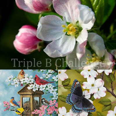
Well I think you did an awesome job … color matching or not! lol LOVE your overall design … just beautiful my friend! Thanks so much for joining in the fun at our newest adventure – Triple B challenge! Good Luck and we hope you’ll come back often.
Darlene
Triple B
DAR’S CRAFTY CREATIONS
LikeLike
Many thanks – I enjoy participating.
LikeLike
This is beautiful! I love the die cut layers and the embossed texture. And inking your white card stock to add color is impressive!
LikeLiked by 1 person
Many thanks. When I was checking the Internet for something else I came across a post explaining how these dies can be used. I had to chuckle as although I got some of it right I did miss a few things too. Not that anyone notices but it means that in future I will check other posts before assembling my flowers.
LikeLike