
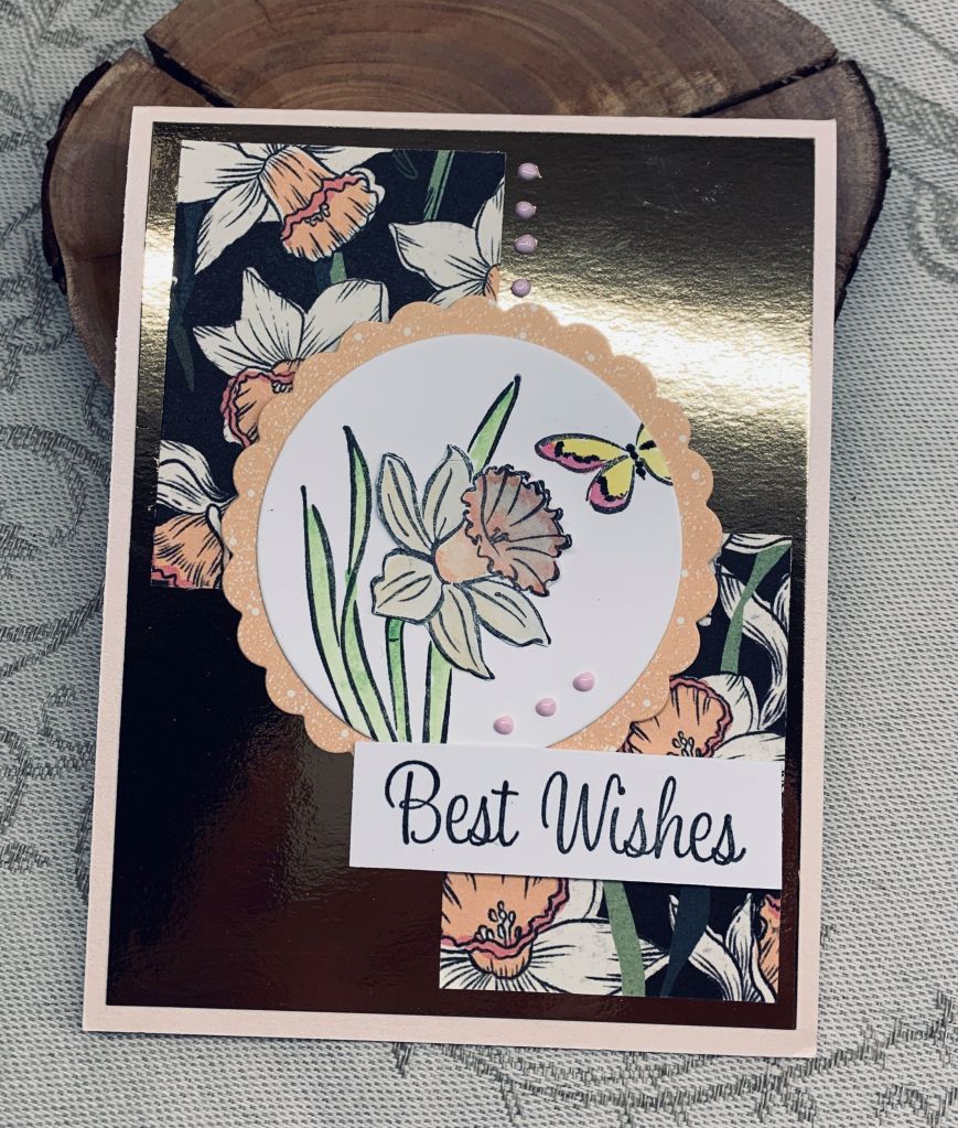

It took me ages to decide on what to do for this challenge and several ideas didn’t pan out at all. Not really in the right frame of mind for this particular one I guess. Anyway I eventually settled on using up some of my daffodil PP and added two pieces to the gold foil background. I had the die cut circle from other projects so using the daffodil daydream set from StampinUP I stamped the smaller of the two daffodil stamps along with a partial butterfly. I coloured in the flower and butterfly with Oxide inks and then messed up the center of the flower. After some colourful language I decided to re-stamp the flower, colour it and fussy cut it so I could add it over the top of the other one. I actually like it better so the error was, in a way, a good thing to do. To give the circle a bit of pizzazz I added some scalloped PP behind it that coordinates with the other PP. Once it was added to the card front I finished it with a few Pops of Color dots and a nice sentiment (from Hampton Art).
Thanks for taking a look and have a great day everyone.

Pretty card! I like the daffodils and they work perfect for the sketch.
LikeLiked by 1 person
Thanks. I am happy with it.
LikeLike
Pretty card, and your coloring looks great!
LikeLiked by 1 person
Thanks a lot, my colouring is improving but I’ll get there eventually.
LikeLike
Those paper panels compliment your stamped and coloured daffodil beautifully – it might have been a struggle, but I think you nailed it in the end! Thanks for playing with us over at As You See It this week!
LikeLiked by 1 person
I’m happy you like it even though I struggled a bit getting a result.
LikeLike
Very pretty. Perfect coloring of the daffodils.
LikeLiked by 1 person
Thanks Gerry.
LikeLike
This is beautiful, Johanna! The patterned paper over the foil gives an opulent look, but the pastel colours of the flowers lighten it up for the spring look! Over all it really works well! Thanks for getting sketchy with us at As You See It Challenges!
LikeLiked by 1 person
Many thanks. Even though it took me time to come up with a design I was happy with I enjoyed playing in the challenge.
LikeLike
I think this is gorgeous! I like the contrast of the ‘plain’ gold and the pretty dsp. The addition of the scalloped circle was genius as it formed a break from the busy (but extremely pretty) patterned paper and lets us focus on the lovely daffodil image. Thanks for playing along with us again at As You See It. It’s always a pleasure to see what you do.
LikeLiked by 1 person
Thanks so much. When DT’s give comments I really enjoy reading them as they often inspire me.
LikeLike
Good to know! I think that if people take the time to enter a challenge, they deserve to have us spend time responding to what they’ve done. 😀
LikeLike
Your daffodil is lovely as are the patterned papers. You did great with this different sketch challenge.
LikeLiked by 1 person
That PP is a challenge to use, but this sketch helped me a lot. It was a difficult one though as I couldn’t figure out what to do initially.
LikeLike
So pretty, Johanna – I had a tough time with this DSP – so dark! But your metallic panel really saves the day! Love your stamped daffy, too – gorgeous! Thanks so much for playing at As You See It!
LikeLiked by 1 person
I know exactly what you mean about the paper. I really like it but finding a way to use it without it being overwhelming was a challenge. Glad you like my effort.
LikeLike
Good to know! I think that if people take the time to enter a challenge, they deserve to have us spend time responding to what they’ve done. 😀
LikeLiked by 1 person
This is really pretty. I love your layers and all the shine behind.
LikeLike
Thanks Golda
LikeLike