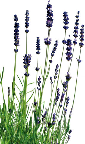

With purple in any shade being a favourite colour, it was a given that I would enter into this challenge. Recently I had been playing with a new unbranded 3D folder and I already had this card front embossed just waiting for me to decide what I wanted to do with it. I decided to colour the raised areas using purple inks and a pretty green. When I was happy with the amount of colour I let it dry and then added some shaded lilac to the background just to take away the bright white. With some purple Perfect Pearl powder I went over the flowers and the result was that the inks darkened and shimmered, as you can see on the photo. I really liked the result.
In my stash I found a piece of ribbon in a shade of purple and added it to the panel before I glued it to the green background. I wasn’t too sure about a sentiment, but in the end decided on the word Hi which I coloured with a Sakura gel pen and added Nuvo Chrystal on top for some shine and dimension. I let the word hang off the ribbon so it wouldn’t hide the flowers. The entire panel was then added to the card front. I thought about adding some other embellishments, but decided against it as the flowers are strong enough to stand on their own.
I have to say I’m quite pleased with this card. As this card works for the challenge at CYHTP as well as Color Hues, I’m adding it to both sites. Thanks for stopping by and have a great day.

Beautiful!! Purple is my favorite color.
LikeLiked by 1 person
Thanks, it is mine too.
LikeLike
Beautiful! Love the rich colored florals.
LikeLiked by 1 person
I’ve done a few using this folder already but one post won’t show up for a while yet because it is part of an upcoming challenge.
LikeLike
This is just so beautiful, Johanna! Thanks for sharing your talents with us at Color Hues. I am going to have to CASE this sometime soon!
LikeLiked by 1 person
Thanks. CASE away – it is fun to colour 3D folders and each come out differently even if the image is the same.
LikeLike
This is just stunning! Coloring embossing folders can be tricky, but you’ve done a fabulous job! I love all the delicate shading you did! Thanks for sharing with us at Color Hues!
LikeLiked by 1 person
Thanks so much. It took a while, but the result ends up being worth it.
LikeLike
You should be pleased with this card, Johanna, it’s awesome. The embossed images with the added color is stunning.
LikeLiked by 1 person
Just BEAUTIFUL my friend! Really shows off the embossing! Thanks so much for joining in the fun at our Can You Handle the Pressure challenge! Good Luck and we hope you’ll come back often.
Darlene
Can You Handle the Pressure
DAR’S CRAFTY CREATIONS
Triple B … OUR NEW CHALLENGE BLOG where it’s all about birds, butterflies & blooms.
LikeLike
Thanks so much. I enjoy participating.
LikeLike
I’ve done 3 of these so far and each one is different. I like the results on each. I do think adding Perfect Pearls is what makes the difference as it changes the colours slightly and makes them look richer.
LikeLike
Gorgeous! Love the ink you added to the embossed areas as well as to the background. Just the perfect amount of each.
LikeLike
Thanks.
LikeLike
How stunning, that deep purple is so gorgeous. I love how you attached that tag, very clever and creative!!! Lots of fabulous work here, thanks so much for playing along with us over at Can You Handle the Pressure. Hope we see you back again soon.
Judy~ CYHTP DT
LikeLiked by 1 person
Thanks Judy. It was fun to do and I enjoyed the process.
LikeLike
I just love this! Your colors and shading on the florals are gorgeous, made even better with the softness of the Perfect Pearls. This card is so elegant and beautifully done, Johanna! Thanks for making my colors shine at Color Hues!
LikeLike
Your comments have made my day and I’m really happy you like the card. Thanks.
LikeLike