
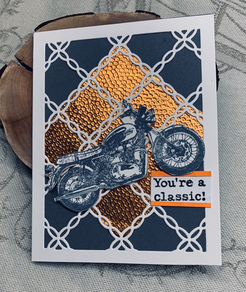
Although orange isn’t a colour I use very often it can be quite good at times. I needed a card for my BIL who loves motor bikes so I decided these colours would work for him as they are not too girly. The white die cut is from an unbranded die and the orange coppery embossed paper in the background is a leftover piece from so long ago I’m surprised it was still intact. I used a slate gray card base and Hickory Smoke ink to stamp the bike. I added a bit of silver pen here and there. Stamp set is classic motorcycles by Darkroom Door. Once it was dry I fussy cut around it before popping it on top using foam tape. Believe it or not the hardest part of this card was making the coppery paper fit the center of the die cut piece. It was awkward because the paper was a weird shape from use in a previous project.
I quite like the end result and think it is a decent masculine style card. Thanks for stopping by and enjoy your day.

Wonderful masculine card! I made a card recently with a motorcycle also. Fun when the person receiving it actually rides one.
LikeLiked by 1 person
Thanks Lisa. He used to ride all the time but illness stopped it altogether. A tragedy for him as he really misses it, but he is still interested in bikes and likes to look at them and discuss them.
LikeLike
What an AWESOME masculine card Johanna…your BIL is going to love it! You’ve used the challenge colors so perfectly and I really love how you did your background and the popped up motorcycle! Thanks so much for sharing with us at The Color Hues Challenge! Marcia (DT)
LikeLiked by 1 person
Many thanks. I’m glad you like it and I know he will too.
LikeLike
Awesome masculine card for a rider. Your choice of the cover die is perfect. It looks like chain links. The orange/copper embossed piece highlights the bike.
LikeLiked by 1 person
I liked that die and was happy to use it first time for this card. The pp behind it was already embossed and I love the colour and shine it has which is why I bought it and then kept it for so long.
LikeLike
Oh yes, this is an AWESOME masculine card. The coppery embossed piece and that die cut are a perfect background for a motorcycle.
LikeLiked by 1 person
That PP is so old and came in one of those paper packs of foiled papers that all had embossing or a design on the metallic part. I loved them and at the time had no idea that I could emboss my own. I think this is the very last piece with just a couple of small scraps left now.
LikeLike
This is a fun card, Johanna. I really like that background die cut and how you did the “copper” behind it.
LikeLiked by 1 person
I have to credit my hubby for the idea of putting the PP behind the die cut. I had it on my desk but wasn’t sure how to use it and he suggested cutting it to fit just a section of the die cut. I was so happy that I could make it fit.
LikeLiked by 1 person
Great masculine card design. Love your embossed copper panel, and you got it to fit perfectly!
LikeLiked by 1 person
Thanks so much.
LikeLike
Echoing the others: your card is masculine marvelous! What a wonderful, creative way to incorporate slate grey and orange. Your BIL will love this, as do I. Thank you for joining us at Colour Hues.
~carol
LikeLike
Thanks so much. You just made my day!
LikeLike