
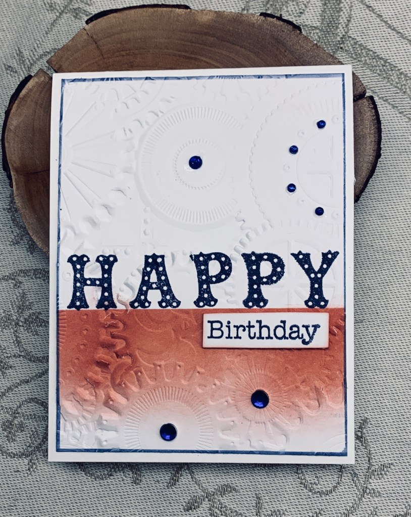

This is my take on something I’ve seen Natasha Foote do on a video I found at Pinterest. Initially I tried doing it using an alphabet die but I couldn’t make the letters fit how I wanted them to. They’ve been set aside to be used in another project. Maybe even a 2nd card for this challenge? Instead I found this older Recollections stamp set and used it. The other word is from a Hampton Arts set but I only used part of the stamp. My colours are as close as I can get as I don’t really have anything that could be classified as Merlot and instead used Aged Mahogany. I masked off a portion of the layer and sponged the colour on partially. Then I stamped the Happy with Chipped Sapphire ink. Once it was fully dry I ran it through the folder which is from Sizzix and called Mechanics 3D texture fades. The navy border was added after I had cut the piece down to the size I wanted and then the additional word was popped up on foam tape. A few embellishments and it was good to go.
I’m reasonably happy with this card although it went in a slightly different direction than planned. Thanks for popping in to take a look – it is appreciated.

You did a good job matching the Merlot color. Your card looks very masculine.
LikeLiked by 1 person
Thanks Lisa. Matching ink colours is always a challenge and I don’t want to have different brands around as I don’t have a place to put them.
LikeLiked by 1 person
Totally understand! The Merry Merlot color from SU is retired, so matching is the perfect way to go.
LikeLike
Very cool card. I the lettering on Happy. You did a good job on the Merlot.
LikeLiked by 1 person
thanks, that stamp set is unusual as the lettering is patterned.
LikeLike
That’s so different! I really like the blending and the colours work so well!
LikeLike
Thanks a lot.
LikeLiked by 1 person
Looks awesome with the partial merlot blending and separation of the colors. The swiss dotted HAPPY was a great way to add the second color.
LikeLiked by 1 person
Thanks a lot. That alphabet stamp set came with the pattern and has come in handy since I got it. I really must invest in some alphabet dies though. The one I have makes the letters just a bit too big for some designs and is a plate which means I waste a lot of CS just to get one word.
LikeLike
It’s a great masculine card, and I love the overall design of it! The gears embossing folder is wonderful, and I love the way you ink blended only the bottom portion. Thanks for joining us at Color Hues!
LikeLike
Thanks a lot. I need masculine cards at times and they can be more challenging than others.
LikeLike
What a FUN and festive birthday card, and I think your colors work perfectly for our color challenge!! And I can’t tell you how many of my cards end up so differently than how I first pictured it in my head…all part of the fun of creating! Thanks so much for sharing with us at The Color Hues Color Challenge!! Marcia (DT)
LikeLiked by 1 person
Many thanks. I had fun creating it.
LikeLike
Johanna, I love that you only colored the bottom of the EF which by the way is so cool. I love the HAPPY also. Fun card! Always a pleasure to see you in the gallery at Color Hues.
LikeLiked by 1 person
Thanks so much. It was an easy card in many ways and I enjoyed trying out something a bit different and new to me.
LikeLike
I love how you’ve used the embossing folder to create such texture! The sponged merlot looks great. It’s wonderful having you join us at Color Hues!
LikeLiked by 1 person
Many thanks. I love participating when I have the time to do so.
LikeLike
What a great idea to mask the colour to create the straight line for the aged mahogany. Love the letters xx
LikeLiked by 1 person
Thanks. I quite like watching Natasha Foote as she uses what she has and comes up with some creative ways of doing something. This is from one of her ideas.
LikeLike
This is a great card with those colors!
LikeLiked by 1 person
Very easy to do, once I figured out the Happy. Thanks.
LikeLike
Nice masculine card design.
LikeLike
Glad you like it, thank you.
LikeLike