
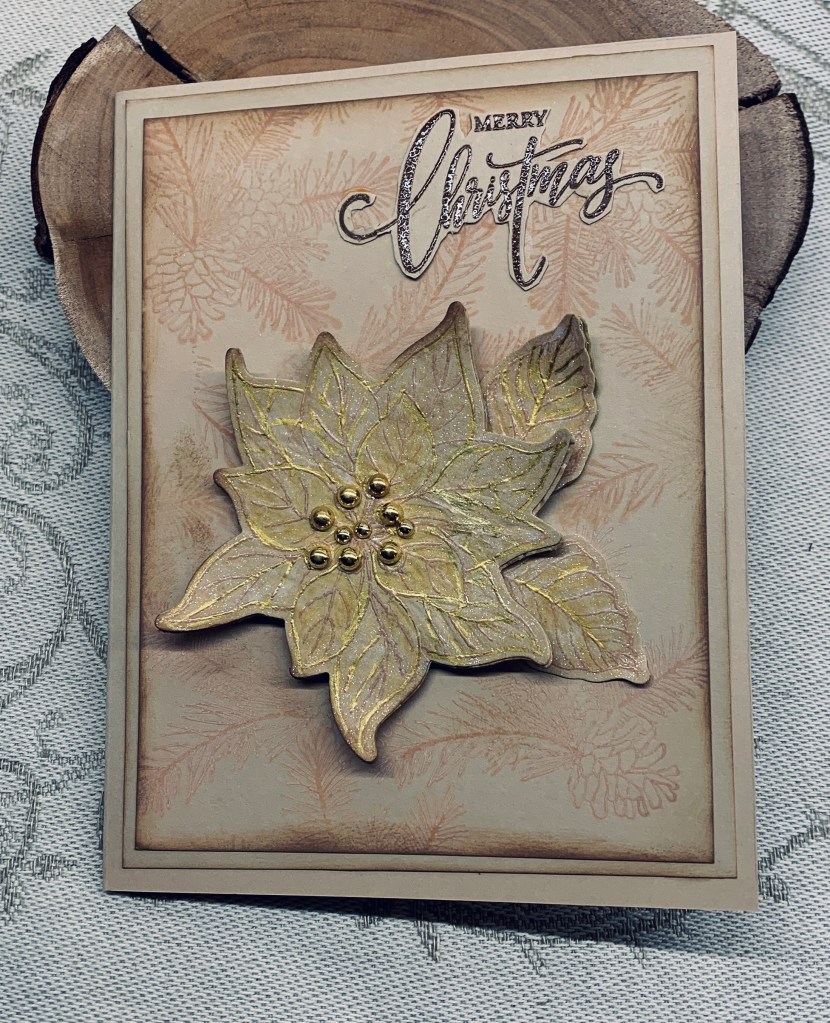
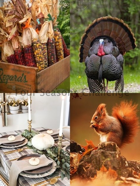
If I’m honest, I’m not sure I like this card but as often happens it may grow on me when I’ve acquired some distance from it. As with so many of my cards lately it morphed into something totally different than what I had in my head. It was intended for the challenge at Seize the Birthday but I’ve just realized that although the neutrals work, the sentiment does not so it is back to the drawing board for a card there. Keeping it totally neutral was a bit of a challenge, but I managed it and although the Four Seasons challenge is more about Thanksgiving it does fit the neutral of the lower left image, so I’m adding it there.
I ued a Gina K Design poinsettia stamp for the images and sentiment, but the background used a set for which I have no name. It is an older set and likely purchased at Michaels when I first started using stamps. I used Tea Dye ink on the background and initially for stamping the floral but I went over the poinsettia with a gold pen as there wasn’t enough definition. I added the sparkle spray to the flower aswell. Then I added a little Vintage photo ink around the edges of the flower and the panel. Sentiment was done in the same ink but I heat embossed it clear and fussy cut it.
Thanks for stopping by, it is appreciated.

Pretty card! Just make the same card and put a birthday greeting on it. It could go to someone whose birthday is in December.
LikeLiked by 1 person
That’s a good suggestion, thanks. Glad you like it. I’m still not sure I do.
LikeLiked by 1 person
Such gorgeous layers and textures on this beautiful card. Thank you for sharing with us at The Four Seasons Challenge.
LikeLiked by 1 person
Thanks a lot Karen.
LikeLike
Love the background! You could maybe make the poinsettia a slightly darker shade so there’s more contrast xx
LikeLiked by 1 person
Thanks Deborah. I still don’t like it that much but your suggestion is a good one.
LikeLiked by 1 person
Very pretty and elegant!
Thank you for joining our challenge at The Four Seasons!
Diane FS Co-Owner
{Nellies Nest}
{Four Seasons}
LikeLiked by 1 person
Thanks Diane.
LikeLike
Very pretty! I love the soft look of your card with the neutral colors and the pretty shine.
LikeLiked by 1 person
I’m glad others like this one, because I am not enamored with it at all.
LikeLike
Johanna, this is SO pretty. I like everything about it.
LikeLiked by 1 person
Thanks Gerry. A vote of confidence helps but I still don’t like it myself.
LikeLike
Johanna your work is so beautiful and creative! I love seeing your cards. xox
LikeLiked by 1 person
Thanks so much Julie.
LikeLike
I really like the background for your poinsetta and that you continued the color with your poinsettia and the layers of cardstock. I think it may be the sentiment that is throwing you off about not being totally satisfied with it.
LikeLiked by 1 person
I’m glad you like it. I’m not as unhappy with it as I was, but it won’t become one of my favourites that’s for sure.
LikeLike
It definitely fits the neutrals of that bottom left picture. I’m thinking a pop of color would make it better, like the white in the picture, or just brightness somewhere. The gold isn’t beautiful, but not quite enough of a pop. You might try putting the poinsettia on a white background done the same way as this one and doing either a colored or white poinsettia and putting it on this background and base. It’s a lovely card as is.
LikeLiked by 1 person
Thanks Golda. All your suggestions are good ones. I may deconstruct it and add something else before I actually use it for someone.
LikeLike
Beautiful! Thank you for sharing with us at The Four Seasons Challenge.
LikeLike
Thanks so much
LikeLike