
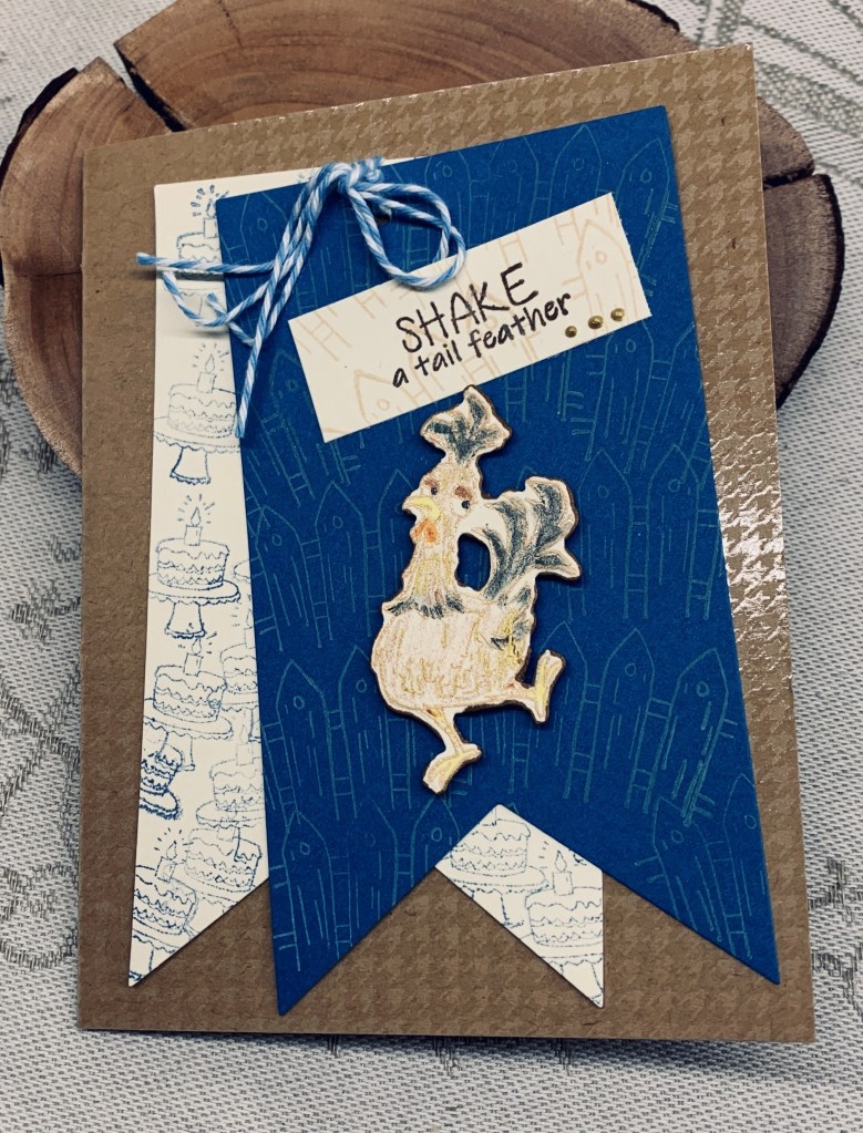
The challenge at Color Hues is to use cream and blue and I came up with this card. I used a Kokorosa stamp and die set along with a banner die set from StampinUP. I stamped each banner with 2 stamps from the set, the blue banner with Antique Linen for the fence and the cream one with Faded Jeans off stamping each time so that it was truly faded. I made a small hole at the top and threaded through my twine and then added both pieces to the darker card front. I left the twine as threads at one end as it reminded me of the tail feathers. My card front is cut from a very old CTMH piece of CS that I liked when held underneath the other layers. My chicken was stamped onto cream CS, added some clear heat embossing and then coloured it with pencils and gamsol. I probably should have used a darker outline for the stamping, but obviously I didn’t . It still works but in retrospect it may have looked better with a darker outline. I had made another banner yet wasn’t happy with it but a piece of it worked for doing the sentiment and I added some Nuvo drops to this as well. Also, I stamped Birthday wishes on the inside of the card.
Thanks for stopping by, it is appreciated more than you know.

Cute card. That chicken looks like it could really shake a tail feather. Love the brown houndstooth background.
LikeLiked by 1 person
Thanks Judy. For the challenge I’ve left it as is, but I found it a bit bland so I’ve just added another layer over the original so the chicken is much brighter.
LikeLike
Adorable — and a fun sentiment to go along with it!
LikeLiked by 1 person
Thanks. This is a new stamp set and I like both the images and the various sentiments that are part of it.
LikeLike
Cute chicken image and sentiment! Love the stamping you added to your banners.
LikeLiked by 1 person
Thanks a lot.
LikeLike
That’s brilliant! Love that chicken!
LikeLiked by 1 person
Thanks a lot.
LikeLiked by 1 person
How fun. Love the dancing chicken and stamping on the tags.
LikeLiked by 1 person
Thanks Gerry, the whole set is a fun one.
LikeLike
Your card for the Color Hues challenge turned out beautifully! The combination of cream and blue creates such a serene and elegant look. I love how you incorporated the Kokorosa stamp and die set along with the StampinUP banner die set, and the addition of the twine adds a charming touch reminiscent of tail feathers.
LikeLiked by 1 person
Thanks so much. I really appreciate your comments.
LikeLike
Super fun card and your chicken is a real shaking it up.
LikeLiked by 1 person
Thanks, I’m glad you like it. I’ve since added more colour to the chicken and like it better, but for the challenge it needed to be less conspicuous and in keeping with the chosen colours.
LikeLike
Love this card – those colours were very well used – and the stamping on each of the tags is a great idea. xx
LikeLiked by 1 person
Thanks Lynda.
LikeLike
what a fun card! Love the chicken! Thank you so much for playing along with us over at the Color Hues Challenge!
LikeLiked by 1 person
Thanks a lot.
LikeLike
Oh I love the chicken, it makes for such a fun card! You chose to most fabulous accent paper for your card. Thank you so much for sharing with us at the Color Hues!
LikeLiked by 1 person
Thanks so much
LikeLike