dragonfly sympathy

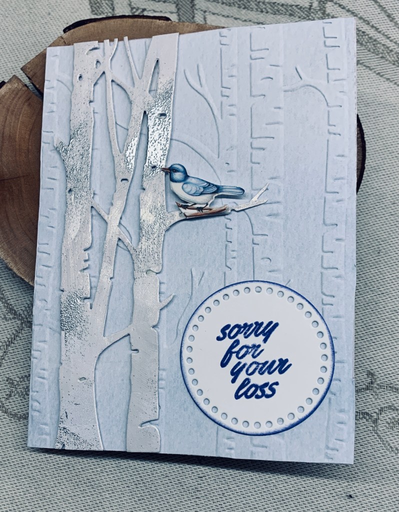
As I mentioned in a recent post, it seems as if I shall be making a few sympathy cards over the next few weeks. Several people we know are losing loved ones or are about to lose one. This card has been made for a club member of my hubby’s photo group as she lost her husband on Saturday after a long illness.

At Krafty Chicks it is an all occasion challenge at the moment so I shall add it there if I can get this post done in time.

I started with inking a small scrap piece of white CS and then die cutting the dragonfly from this piece. Die is from PaperRose. I cut a second one in black so I could offset the inked top one slightly for more definition. I also sprayed the inked piece with some sparkle. Using a Tim Holtz/Sizzix die set I cut the pattern into some blue CS and added it to the gray card front. I added some sparkle using a Sakura pen on the diamond shapes within the pattern. My sentiment is from GKD and once this was stamped and dry I glued the dragonfly leaving the wings free.

Thanks for spending time with me, and any comments you may leave are much appreciated.

Christmas trees

When making the background I posted the other day, I wondered what doing something similar would look like in blue and green so created this panel and set it aside. One would think I have ESP because yesterday I noticed the new challenge at As You See It – Challenge #333 – Almost Analogous is using 2 greens and a blue. Its a no brainer why I used the piece for this challenge. I chose the darker green ink for stamping the trees which come from a set by StampinUP called Whimsical Trees. Sentiment from the same set only I stamped it 3 times.

I added some blue dots to the smaller tree and some blue stars to the larger one before adding foam tape and then on to the inked panel. I quite like the end result although I think it looks nicer in reality than on the photo.

Thanks for stopping by, your time and comments are appreciated.

soft and neutral

The new challenge at Just Add Ink #721…Inspiration! has a lovely mood board with lots of neutrals and this is what I came up with. As I turned it into a Christmas card, I’m also adding it the the Peace on Earth Challenge #72 which is always anything goes or an optional theme. It is funny how colours change when being photographed. The poinsettias are stamped on a pale champagne colour which here looks more like gray and the cream leaves were touched with a little soft gold which looks a lot more yellow than in reality.

I started with a neutral dark beige CS that I dry embossed with a texture folder. I added a small amount of Versamark ink and some pearl powder so there is a little more texture and colour. I tore up some mulberry paper and glued both these pieces to the kraft card front. The poinsettia stamp is from a small Christmas set by GKD and I used the matching die to cut them. The cream leaves are from the same set. The gold foliage is scrap CS and a Martha Stewart punch and the bigger leaf is from an Altenew set and was heat embossed in champagne. I used some gold embellishments for the card centers to give extra sparkle and shine.

This card will be given to someone close by as it won’t mail well and certainly cannot be sent to the USA. Their rules have become close to impossible to comply with recently.

Thanks for taking a peek, it is appreciated.

Celebrate

The newest challenge at Seize the Birthday #292-Celebrate, and they want us to use the word as part of our design. I’ve had a die set of words by Sizzix for a long time, so I pulled it out and first cut my word in black. Then I took an older die from Memory Box called Sketchy Rings and cut in a neutral Kraft type CS. My gold banner is done with an unbranded set and I overlay a scrap piece of embossed metal on top. For this I hand cut the banner bottom. Using a piece of plastic and some Distress Oxide inks I swiped the inks, spritzed with water and then schmooshed onto the white card front. I moved it around a bit until I was happy with coverage and then heat dried it. Once dry I added the banner and the rings. My word was dabbed into Versamark and then clear heat embossed for additional shine. An old Tim Holtz stamp set had the hats so I stamped two, coloured with pencils and a little water, then fussy cut. I edged them with a black pen so they would stand out a little more and used foam tape to pop them up as you see. A few gold embellishments finishes the card.

This card has turned out better than I expected and is very vibrant. My hubby thought it a good one which always boosts my ego. Thanks for stopping by, I truly appreciate that you do.

good friends

For a change, I let the pretty paper do the heavy lifting for this card. I found it yesterday when looking for another sheet for a different project and decided to use it with this leftover frame, cut with a die set from StampinUP. The little bird is a YNS stamp and I had him already fussy cut, in my bits and pieces box. He was coloured with pencils. The sentiment is from a Hampton Arts set.

After gluing the PP to the frame I set it aside so I could do the actual card front. I had the pink note card ready and I added the blue piece creating a split look. After adding the framed piece I stamped underneath in black and popped up the little bird at the side. I added a touch of glitter on the bird and called the card finished.

I quite like it and the simplicity of the design made it was quick and easy to do. I am entering it into the following challenge: Color Hues #95-Blue and Pink

Thanks so much for stopping by to take a look. It is appreciated as I know your time is precious.

live life …

At this time of year many challenges seem to have an Autumn theme and this card fits two of them. The PP is from StampinUp and was a gift to me. I hadn’t used much of it and decided it would make the perfect background for a fall card. Photo doesn’t do the paper justice as it is so vibrant in reality. I used another StampinUp product for my focal panel and die cut the rectangle before stamping the images. The stamp set is from YNR, now out of business, and I chose 3 of the leaf stamps and the smaller acorn for my design. I used Ground expresso to stamp the outlines and then heat embossed them before adding colour. Used Inktense pencils and a gold Sakura glitter pen for the tiny heart. When colour was dry I added a little Distress glaze to set it. I also sponged the edges of this layer. This piece was added using a foam panel with the sentiment being cut into 2 sections and added as you see. I’m quite happy with the end result and it is a card I can use for any occasion.

We have had a welcome deluge of rain since last night and it is very wet outside. A good day to be in my craft room and I have to get cracking on some Christmas cards soon. My good intentions to do them throughout the year hasn’t been consistent enough to make a huge difference to my stash.

Links to challenges: https://daranddiane.blogspot.com/ and https://shoppingourstash.blogspot.com/

Thanks for stopping by, your time is appreciated as are any comments you may leave me.

sorry for your loss

One of my yoga and coffee group ladies, lost her mother last week so I made this card for her. I used a Taylored Expression tree die for the focal layer and a StampinUp EF for the background section. After cutting my trees I added some lost shadow ink and before it was dry sprinkled a little silver embossing on top so it has more texture and a little shine. After adding some foam tape I set it aside so I could emboss the background on some StampinUp PP. This was then added this to the entire card front. The die cut was added and using a small piece of scrap card along with using a transfer from some rub-ons I have, I did the little bird. Then I fussy cut before popping it up on foam tape. I cut my circle with another StampinUp set and added the sentiment in Blueprint sketch ink. I also sponged the edges with the same ink.

I’m quite happy with the end result. It has a soft and subtle look that works for a sympathy card.

I’m adding this card to the current challenge at CYHTP although the option of adding fall colours hasn’t been taken.

on your birthday

Seize the Birthday #291-Stripes, This card almost didn’t get done, because I’ve spent the last 5 days battling what I believe is a reaction to some medication changes and it has been quite unpleasant. I had it partially started on my desk and there it has been until I completed it in the middle of last night. Couldn’t sleep so I gave up and decided to finish it. I’m not totally sure about it, but I’m not in the mood to change anything or to begin another one.

My artist friend gave me a scrap of photo canvas that I took a liking to. I love its texture and the subtle sheen. I wondered how it would take stamping and embossing and the results aren’t bad, but it a hard medium to stamp on. Using the Spellbinders Elegant diamond set I stamped the striped section using Versamark and then heat embossed it with a verdigris powder. Not quite perfect but not bad. I trimmed it to allow for a background layer which is done using a cut up poorly printed photo and I used a small piece of that to also cut the Ginko leaves. These are from Kokorosa. They were a bit paler than I wanted so I added some Inkagold paste using my finger. Doesn’t show up well in photo. I already had the background diamond in my stash cut a very long time ago and I added this before popping up the leaves on top. It adds just enough contrast to let the leaves be more visible. Added the sentiment from the same stamp set and glued all the layers together onto the card front.

I still have a small piece of the canvas left and I shall be playing to see how inks take to it at some point soon.

I really appreciate you spending time with me today and thanks a lot for any comments you may leave me.

key to the door

Pamela has chosen any Colouring medium for our new challenge here at cardz4galz. She will also be choosing the winners.

The background is from a cut up photograph that was printed on a silver paper. When I first did the die cut of the buildings I had another project in mind, but didn’t use it so it has been sitting on my desk for weeks. The buildings were cut using a new die from Kokorosa, and then I strategically cut the strip so I could stack them a little. I backed them with some mirror CS to give the look of light behind windows and used dimensionals on the shorter piece. Before that I coloured the buildings using watercolours, but wasn’t totally happy so added some Spectrum Noir markers over the top to get a deeper colour. My key is from a puffy sticker set. I used an alphabet die set from Scrapbook.com and hand printed the word new. Letters were die cut from a recent ‘use up’ my strips session and this piece was rather small for anything else, but worked well for letters.

Thanks for stopping by and any comments you leave are always appreciated. We hope to see your creations in our gallery soon.

Halloween hello

It is a sketch challenge at As You See It- Challenge #332 – Geometric Elements. I turned my card into a portrait rather than landscape and did one of my very few Halloween designs. The plaid oval is cut from another piece that I created using a Taylored Expressions plaid stencil set and Distress Oxide inks. I used a Hero Arts infinity die set and cut 2 more ovals each one slightly larger that the other. Once I had the 3 glued I set them aside so I could continue with the rest. My rust coloured pieces are actually a paint chip and I added this to my card front. Paint chips sometimes get whitish edges when cut and I decided to use a Spectrum Noir marker at the edges. I wasn’t happy so I added a gold pen line as well. My little witch is from an old GKD set that I fussy cut, embellishments from my stash, and the shadow word is from Creative Expressions. A very simple card but I quite like how it turned out.

Thanks for stopping by, I appreciate your time and any comments you may leave for me.