Ombre

AAA Card Challenges #270: Sketch Ombre

My heart sister/friend has just received a diagnosis of breast cancer which on its own would be awful, but it comes in the wake of the death of her spouse. Its kind of like being hit on the head with a hammer. She saw the oncologist today so I will know more tomorrow, but as a cancer survivor I know exactly what is going on in her head and I am going to support her as much as I can.

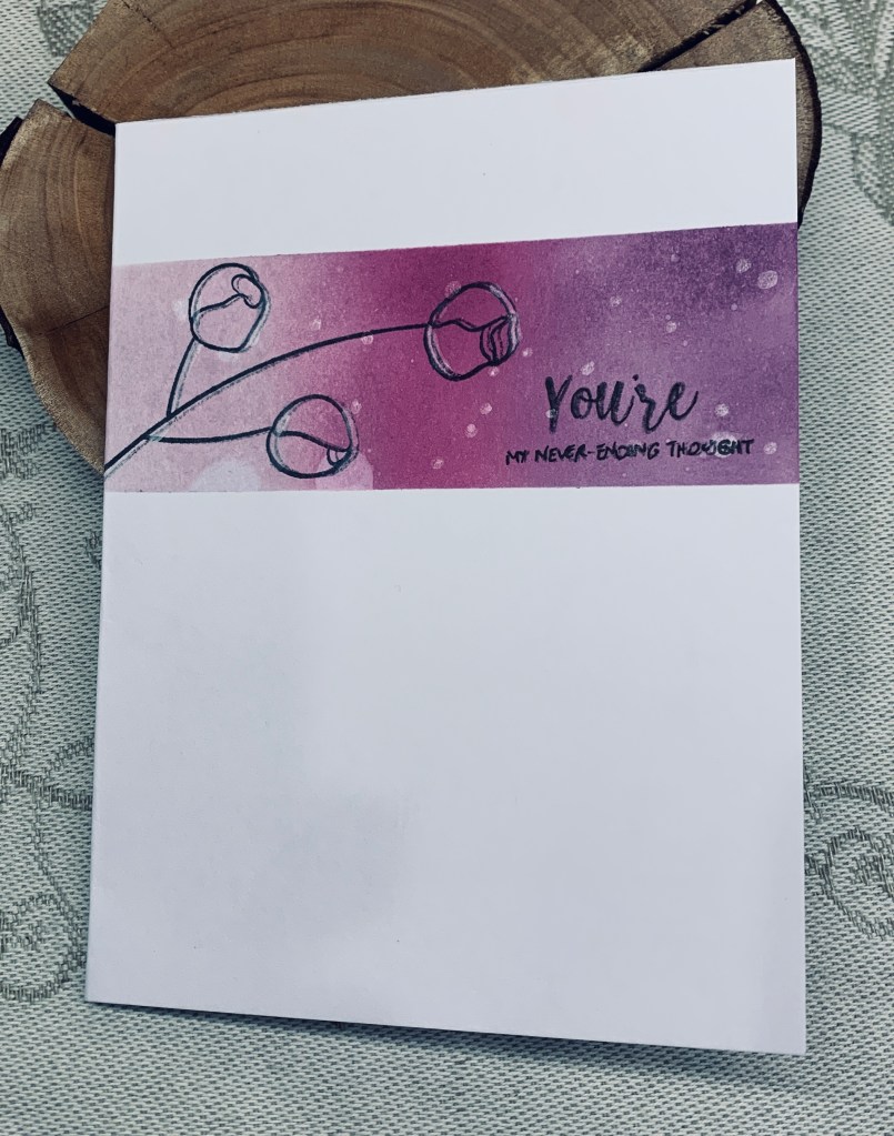
Initially this card was solely for the challenge, but then I realized that with the sentiment I’ve used, it is a perfect one to send to her. The inks used are Distress Oxides in Dusty Concord, Seedless Preserves and Milled Lavender. The card was masked off and then the inks were blended after which I splashed a small amount of water. Both sentiment and flower stamps come from an Altenew set called Inspirational Quotes. The floral sprig didn’t give me a good impression, (should have used the Misti) so I stamped it a second time but didn’t quite get it lined up. I kind of liked the extra line and defined it a bit more using a Posca pen. I also added a few more spots using the pen too. Ultimately, I’m pleased with how it turned out.

Thanks for stopping by, it is appreciated.

patterned papers

Yesterday I was fooling around with some bits and pieces and this card became the result. It is a rectangular floating technique card and uses up some photo strips and some PP that was actually a small gift bag that I cut up. Can’t waste anything purple, haha. The butterfly is something I made and didn’t use (still have one left) and is a gift set of dies from Scrapbook.com. My acetate was already cut into this shape so I went with it. Once I had added the strips I die cut the piece a bit smaller using one of the Everyday Detail dies from StampinUP and I cut a larger one to add behind it. This time I did the technique properly so it has dimension. Right now my favorite sentiment stamp seems to be the one that is currently on my desk.

There are currently three challenges that I think this card will work for, so I am entering it into all three.

Challenge #541 – Sketch – Both die cuts have a frame look so I believe this works for the challenge

Triple B July 2024 Challenge – Has some florals and the butterfly

Anything Goes Using Patterned Paper Challenge – First time entry but the strips and the paper seem to work for this.

Thanks for stopping by. I appreciate it and I also appreciate any comments you may leave.

cherry cupcake

A while back there was a challenge asking us to double stencil and I tried it with this background piece. It didn’t really work and I wasn’t sure I liked it so it was set aside until now. The current challenge at Seize the Birthday is about fruits and I figured that the cherries here fit the bill even though I’m still not sure I like the panel. What I did to make it look a little better, was to replace the stencil (took a bit of figuring) and use an opalescent stardust butter to add some shine to the cherries. When dry, I cut it down and added it to the card front. After die cutting the white circle using a StampinUp die, I stamped the cupcake image using a GKD set. Sentiment is also from GKD. I coloured the cupcake with metallic pencils, a couple of glitter pens and I also glittered the sentiment. I fussy cut the sentiment and then cut it in half so I could add it as you see.

This is definitely not one of my favourite creations, but it isn’t the worst either so I’m adding it to the challenge. Beauty is in the eye of the beholder so others may actually like it even if I don’t. At least the glitter shows up in the photo. Oop’s, I just found out I’ve missed the challenge by a few hours. Too bad.

Ironically, I spent yesterday evening pitting several pounds of cherries gifted by a neighbor. My hands today are a mess and painful due to the repetitive task.

Thanks for sharing your time with me today, it is appreciated.

sunny smiles

As you See It has a fill in the blank challenge (at the Beach) and I came up with this card. As a child in Britain, we didn’t go on holidays much as my parents didn’t have the money. But when they did have some extra cash we used to go to the Netherlands to visit family. My uncles used to take us to a local lake on hot days and they taught me to swim. It became something I was fairly good at and I continued to learn better techniques through school. These days, I no longer go swimming and sitting on a beach bores me to tears, much to my hubby’s chagrin. He would spend as many hours as possible on the beach and in the ocean, but we’ve learned to compromise so that each of us gets to do the things we like to do when on vacation. So I filled in the blank with swimming using these cute images from MVchifay Clear Stamps and dies. I stenciled a piece of blue CS using a stencil from Dina Wakley and Mermaid Lagoon ink. Then I die cut the ovals using Hero Arts infinity dies and added the die cut and coloured images on top. With another scrap piece of CS I embossed it with a Couture Creations Seascape folder, swiped it lightly with Lost Shadow ink. This was cut it into a 4 x 4″ square which I backed with a slightly larger piece of blue and then added it all to the card front. Taking the sentiment from the same set I stamped and die cut it adding some ink to the edges and center.

I’m kind of pleased with the end result and it wasn’t a challenging card to make either. As the card has an embossed panel I am adding it to the current challenge at CYHTP as well. As the hat is striped and the float is striped it fits nicely into this challenge I think.

Thanks for spending time with me today, it is appreciated.

Floral basket

This is my first post for several weeks, not counting the Shades of Blue card, which was a scheduled post. We’ve had guests, I was heavily involved in my dragon boating and with really nice weather I wasn’t too inclined to spend time indoors. Today is a downtime day for both of us, as we are quite tired after all the dashing about etc.

For me downtime, means craft time so I got busy and made this card. Double D’s moodboard is florals and baskets, and CYHTP is basically an anything goes as long an EF is used. The optional twist is stripes and or checks but I didn’t take that part of the challenge.

The folder I used is from Life Style Crafts, my basket used a stamp set I’ve had for a long time and not used very much. Don’t know why as it allows me to build several sizes of baskets with layering stamps. I won this set from Kitchen Sink stamps if I’m recalling correctly. I added a scrap piece of PP at the bottom of my embossed section and added the panel to the card front. The inked frame is a leftover from another project. After stamping my basket I fussy cut it and added foam tape before attaching on top. My flowers and leaves are built from two Memory Box sets using scraps from photos I cut up. Once they were arranged I added some flat back pearls. For now I’m not adding a sentiment as I’m uncertain as to how I shall be using it.

Thanks for stopping by, I really appreciate it.

shades of blue

It is my turn to choose the theme at Cardz4galz and I shall also be choosing the winners. Shades of blue is my challenge choice and I came up with a CAS baby card for a boy. I used a new die set called Everyday Details from StampinUp to create each layer in the different blues and attached them together. Then I took a small die set I’ve had forever from Little B called appropriately Bebe. I added the onesie and then used the safety pin die with some pale blue vellum to create the pins. The sentiment is from Joy Clair stamped in Blueprint Sketch.

A very simple card, but I like it and as our hairdresser is delivering soon, it may go to her if she has a boy. I’m preparing a girly one as well just in case. She didn’t want to know the sex beforehand.

Thanks for stopping by and I do hope we see your cards in our gallery soon. Good luck.

Good vibes Toucan

Challenge #327 – Primary Intensity is the colour challenge at As You See It and July 2024 Stencil Fun Challenge is about shades of blue although it is an anything goes challenge too. I chose this little Toucan and sentiment from YNS and used a technique shown by Natasha Foote to create my card. I’ve done this in the past, but it is nice to be reminded of techniques one doesn’t use often.

Basically once I had stamped the image and sentiment, I followed the tutorial to get the open section with the bird fitting in between. In trying to add some darker ink to the outline my hands slipped slightly so I ended up adding a line down the cut edge to hide the error. I used Oxide inks to add colour to the bird and then added some Nuvo Crystal drops to his eye and beak. Before adding the drops I added foam to the back of the panel so it would stand away from the stenciled section. Using a new stencil and a scrap piece of mineral paper I added the yellow ink. When it was dry I added the panel over the top so the stenciled part shows through the gap. This was then added to a white card front. I thought about adding some additional die cuts, but decided to keep it CAS.

After a very busy week with guests, I am glad to be back in my craft room for a while. Thanks for stopping by, I appreciate your time and any comments you may leave.

Make a Wish

With guests arriving this week, I have been trying to get the house in order and as much meal preparation as is possible, so we can spend time without me being constantly in the kitchen. I was getting fed up and decided I needed to take a break, so my craft room came to my rescue. I know I won’t spend much time in here after tomorrow so getting one card done makes me feel good.

The challenge at Seize the Birthday, is to include a star, and Peace on Earth is always an anything goes Christmas theme. Stars work for both and the sentiment I’ve used also works for a birthday or for Christmas. I started with the colours and used Distress Oxides in Evergreen Bough and Aged Mahogany. To get the circles I used a couple of plastic caps and inked them directly from the ink pad. Then I sponged the inks and added sparkle spray over a scrap piece so I could cut the stars. This was done using an infinity set from Hero Arts. I added them as you see along with the sentiment which is from a GKD set. Inking a card front to match the colours and some scrap card behind for dimension the focal panel was added. Using some star sequins, intended mainly for shaker cards, I added a few here and there for some additional shine.

This didn’t take long and allowed me to get a few minutes rest before I go back to my preparations. Fortunately most of the meal prep is done and tomorrow I will do a quick vacuum and dust as well as double check the rooms they will be using. My bed and breakfast expertise is coming into play even though these are friends and not customers. They won’t care, but I do, LOL!

Thanks for stopping by, I do appreciate you and any comments you may make.

you’re on fire

Our current #228 challenge here at Cardz4galz is to be inspired by a book. In my case, my card is inspired by the book titled, The Girl with the Dragon Tattoo.

One of my friends is rather fond of dragons and I thought making a card featuring one, would be something she would enjoy. My aim was helped by a card used by my Dragon Boat team to advertise the team. Initially I was going to use a Digi stamp, but I couldn’t find one I really liked so in the end I used a modern oval die from Spellbinders and die cut one of the cards. To give it some dimension I used scraps and die cut layers to add behind the image before adding it to a card front.

For my background I used Distress Oxides in Worn Lipstick, Old Paper, and Blueprint Sketch with a touch of Chipped sapphire on the edges. When it was dry I sprayed it with my shimmer spray so it sparkles. I made the sentiment myself on the computer and added a little leftover pink ink to soften the whiteness. The gems are from my stash.

I’m quite pleased with the result although I can see ways to improve it, should I do another. Thanks for stopping by and I do hope we see your creations in our gallery soon. Thanks too, for any comments you leave me.

People Go …

I have a pad of mineral paper from a while ago and haven’t used it nearly enough to make the expense worthwhile. I decided that today was a good day to try something based on the sketch at AAA. Three different inks were used through a butterfly stencil someone made and gifted to me. Ink colours are: Bundled Sage, Twisted Citron and Cracked Pistachio. I moved the stencil around a bit to increase the quantity of butterflies. Initially I tried doing it slightly differently, but it really didn’t look good, so I just turned the piece over and began again using the smaller butterfly section on the stencil. Then I stamped the leaf, an Altenew stamp as is the sentiment, but from two sets. The leaf imprint was a bit patchy and trying to go over it wasn’t possible so I decided to leave it as is. I kind of like it. I adhered this to the front of a note card and realized that mineral paper is thin enough for images to show from the other side. However, I like the hint of more butterflies behind and feel the card works just as well like this.

A lesson learned, is that inks on mineral paper take forever to dry and I may have to use something to seal it once I’m sure it won’t smudge. Alcohol inks work better than pigment or Oxides do. It is fun to try something new and using the paper meant I could keep the card looking like one layer even though it technically isn’t.

My last card today as it is time to get ready to go out with my hubby. Thanks for stopping by I really appreciate it.