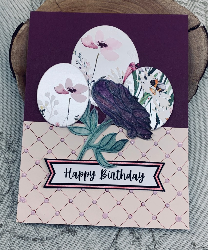
Challenge #225 is all about florals and has been chosen by Sue J. My card features some ovals that have been cut from a store bought card that was too pretty to throw away. My flower is one that was done last year and then not used at the time. The stamp is from a Penny Black set, but I’m not sure at the moment. I added some PP to the bottom half of my plum card base and then used some pink Pops of Color over the tiny dots in the pattern. My sentiment is a freebie from Natasha Foote and I went around the edge with a pink Spectrum Noir pen.
This was a quick and easy card to make and used up some odds and ends nicely.
We hope to see your examples in our gallery soon and hope you have fun playing in the challenge. Thanks for stopping by, it is appreciated.
Lately I am finding I have no inspiration to craft, so just getting a card done feels like success, even if it isn’t a truly inspired design. I suspect that I’m a little over tired from all the dragon boat paddling, which I do enjoy, but find quite challenging on my body.
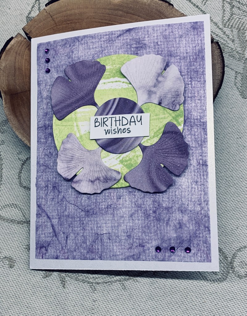
I’ve been wanting to use these Kokorosa Ginko leaf dies since I got them and decided that the colour didn’t have to be green and instead die cut them on some marbled paper from StampinUp. I used both sides to get a variation in the light and dark shades. For the background I used a GKD stamp that I curved as I stamped the Twisted Citron ink on a circle. The stamp gave me the streaks and lines I wanted but the circle was too big so I die cut it smaller before adding the leaves. I covered up the stems with another small circle before adding the sentiment, also Kokorosa. Before gluing down the leaves I sprayed them and the circle with a shimmer spray so they have a lovely sparkle that the photo doesn’t really show.
In going through my stash of scrap papers I found the background piece. It looks more bluish on the photo but is actually lighter and more Lilac in reality. The paper is almost like fabric and I have no idea where I got it from, but it does look nice here. Once it was the correct size I carefully added it to the shimmer card stock and then added the circle of leaves on top. A few tiny gems from my stash and I called it finished.
I am entering the card into the following two challenges:
Pamela has chosen a theme of Mother’s Day, Graduation or Babies, for our latest challenge at Cardz4Galz and she will also be choosing the winners.
I’ve been able to kill 2 birds with one stone with my example here, which of course pleases me. A friend commissioned quite a few cards for family members and this is the first one for her. This one is for someone musical.
Using a theme on a previous post, I die cut several circles from music note paper and edged them with various colours. Then I made the flowers by folding. Added green hearts at their bases and attached them to a leftover flourish stem. I dry embossed the background piece using a Tim Holtz folder and edged that with a green alcohol marker before attaching to the card front. Then I added the flourish flowers. Using two very old stamps from CTMH I stamped the sentiment and circle which were heat embossed. A few embellishment gems and I called it complete. I also added one leftover flower to the inside.
We hope to see your own creations in our gallery soon. Thanks for stopping by, it is appreciated as are any comments you leave for me.
AYSI has a challenge that helps us to use a colour we don’t usually choose in our card making. In my case browns are the most under used ink pads. I dislike it for home décor and in my cards, especially if it is the predominant colour. The challenge had me slightly stumped as I couldn’t think of how to make a card that I would be willing to actually send to anyone if it had a fair amount of brown in it. My hubby suggested using it in gradients as a background and I thought okay that is a start, so I took a stencil from TCW called mini Mondrian-esque and added different browns through it using a small brush. What next was in my head, when I remembered a new paper pack that I believe was a freebie from Scrapbook.com and is coffee related. I had also seen a Natasha Foote tutorial featuring this fold, which I’ve done before but it was a nice reminder to see the video. Taking a piece from the pack I cut it to a four inch square, marked the center and folded it as you see. This in turn led me to a YNS stamp set which is quite cute and I chose the image you see colouring it with Prisma pencils. I’m not a big fan of orange either but I used just a touch on the coffee cup to brighten it up. Foam tape for dimension and it was attached inside the frame. The sentiment piece is from the same PP pack and I fussy cut and added it underneath.
In the end I don’t mind the card, although it will never be a favourite. At least it is okay to use at some point and it does have some cuteness. I hope you like the card and thanks for stopping by. Your comments are always appreciated.
I scored a card front incorrectly the other day and ended up with the fold in the wrong place. At the time I just did another one and set this piece aside thinking I would use it sooner or later. The latest challenge at Seize the Birthday helped me to use it sooner. It also helped me to use up some scraps of CS. Using a Memory Box die called Sketchy rings I die cut several so I could stack them together. I thought they would look okay hanging off the edge. Then I added the strips of CS on the back panel. As I didn’t plan this card, it evolved as I went along. Initially I wasn’t sure what to add to the front, but going through my stamps I found a wreath builder set from GKD and decided to stamp the circles as you see. I used the sentiment in one, and some leaves and hearts in another as well as a swirl along the side. Once the stamping was done I attached the sketchy rings as you see. The end result is better than I expected and I like that it is quite different as well.
We’ve had a good laugh at a squirrel that was hanging off the bird feeder earlier. He was a very determined little critter but couldn’t quite get inside the wire. Our dog went nuts so it was chased off quickly. Our dog’s mission in life is to rid the yard of squirrel’s and rabbits and it is a hoot to watch her chase after them. She even jumps up at the trees if the squirrel chitters at her. As fast as she is, it is never quite fast enough.
Thanks for stopping by, it is appreciated as are any comments you may leave for me.
The sketch is for three stacked items and I decided to use a gifted stamp set by StampinUp for my entry. Using my Misti I stamped each image one on top of the other and then the sentiment to one side. Using watercolour pencils I coloured in the images but on the Monkey’s face I used a couple of Ohuhu pens and Sakura Glaze. I cut the panel down so it would leave a border on the card front and edged it with a brown pen. CS is from GKD. It took no time at all to make this card and I like the end result.
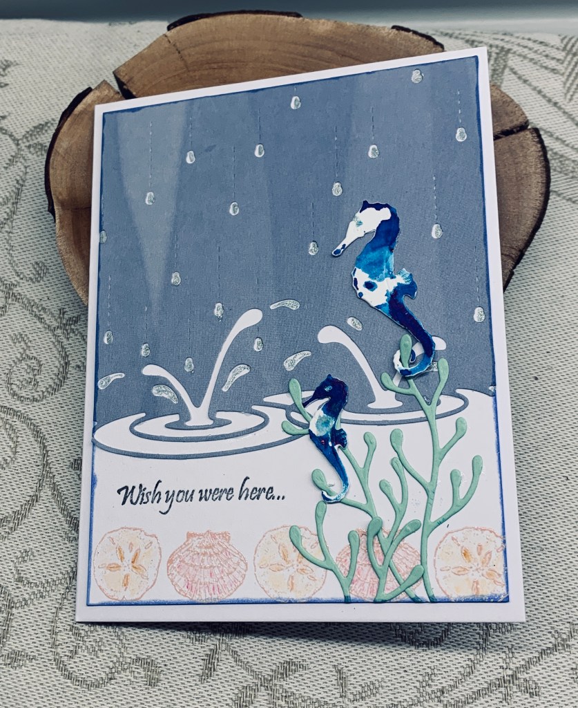
Double D have a water related card challenge this time around and I decided to use a die from Memory Box called Splashing Puddles that I’ve had a long time but not used nearly enough. I chose some scrap PP and die cut the background. Before attaching it to the card panel I added some shells at the bottom using a GKD border die in Tattered Rose ink and then heat embossed. I added some water colour pencils to give more colour but still kept it very pale. My sentiment is also from GKD. The seaweed is another from Memory Box and my little seahorses could be from them as well, but in the past I didn’t know enough to use labels when I got them.
The seahorses were die cut and then smooshed through some wet colour burst powder. After gluing down the seaweed I added the horses by twisting the weed through their tails and a dab of glue at the top. A little sparkle through the raindrops is all the embellishment I used. I forgot how little of the Colour Burst powder one needs so I’ve been mopping up the remainder and making a big mess everywhere. I’ll have a few scraps to use later because of this. Thank goodness for my glass mat.
I’m due to go paddling soon as it is a practice night. I’ll be exhausted afterwards but it is fun even so. Thanks for stopping by, it is appreciated.
The mood board at Inkspirational uses quite a few of these colours and I had the Memory Box flowers leftover from another project that I thought would look good. As well I had just received a new envelope die by Waffle Flower and I used the decorative flap section only for my background pieces. The leaves and sentiment are from Altenew. I had been playing with some ink smooshing and I mopped up all the excess ink onto a scrap of watercolour paper and left it to dry. When dry I die cut the two flaps and then using a paint chip from my scraps I also die cut the little grid sections. Glued these together and then popped them onto the card front with foam tape. After stamping the leaves with Bundled Sage ink I die cut them and then I played around with how best to add them before gluing them as you see here. The sentiment was added using foam tape. I thought about adding some additional embellishments but decided against it for now.
Thanks for stopping by, it is appreciated, as are any comments you leave for me.
It will be International Jazz Day soon and Caz has chosen an instrument, singer, dance etc. as the challenge theme here at MMM. As I need a card for a close male friend who plays classical guitar, I decided to make his card and have it work as a example for the challenge.
First I went searching for something related to guitars. My initial search was for something I could trace directly onto the music sheet but I wasn’t happy with the search results. Then I came across the line image you see here. I decided to change my idea and use this instead, so I downloaded it to my computer and resized it before printing. I added a few embellishments as you see as well as some black sparkle using a Spectrum Noir pen. Then I cut down a music sheet for my background and attached it to the card front. My sentiment is a freebie from Natasha Foote. I am pretty pleased with how this turned out. It is a good masculine card and perfect for anyone musical. I think my friend will also love it.
Thanks for stopping by and for any comments you may leave. I hope to see your creations in our gallery soon.
The past week has been crazy busy with various activities that took me away from my craft room so today I am catching up on a few challenges that I like to participate in. At As You See It they have a colour palette and I decided to do a background in the closest match colours I have. I added ink to my glass mat and spritzed it before smooching my paper through it. This is the result although the yellow ink disappeared a bit. In retrospect it may have been better to use one ink at a time drying in between so I need to keep that in mind for future work. I also spritzed it with a sparkle spray so it glitters in light. Using an old GKD stamp set, I stamped the cherry blossom and clear heat embossed. On a separate piece I stamped the bird and made him look a bit like an Evening Grosbeak which are black and yellow. When fussy cut I added some foam dots and placed as you see. The sentiment is from a Hampton Ars set and was originally supposed to be stamped direct to the card. As I was trying to open the ink, my hands just let go and it landed upside down right on top of my card. A juicy pad created lines where I didn’t want them and wouldn’t erase out. I had to get really creative to hide the mess and while not totally a success it is mostly hidden. I stamped the sentiment onto a scrap piece and fussy cut around it so I could place it strategically to cover the lines and the ribbon was another effort to cover up the marks. I backed the focal panel with a gold piece and then added it to the yellow card front. In the end the card is quite pretty and I’m not unhappy with it all in all.