bubbles

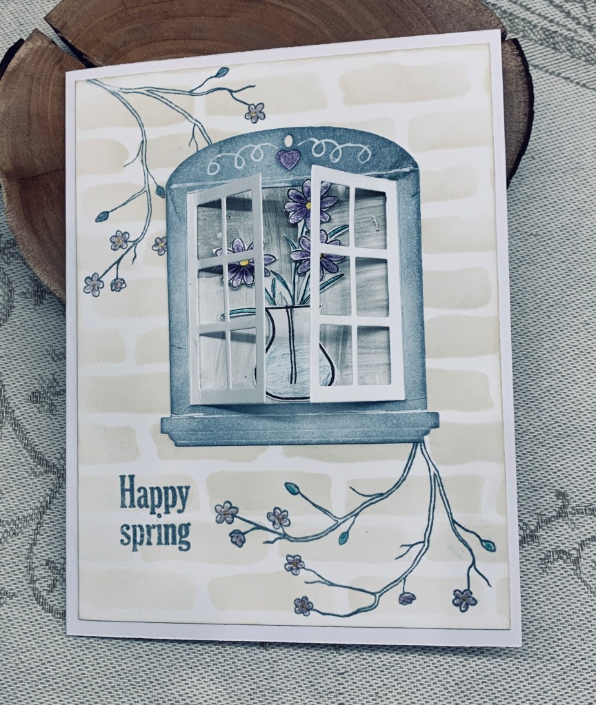
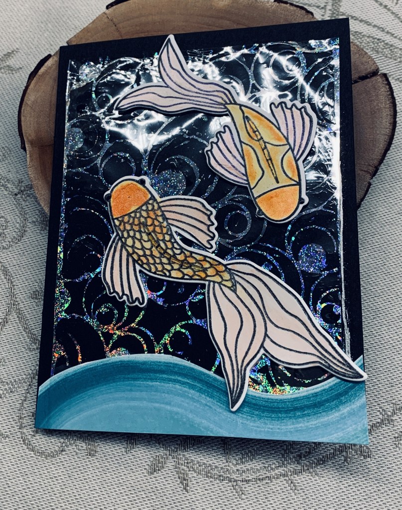
Yesterday I made a few backgrounds using stencils and some foil. Actually, I initially used a new to me 3D glue by Sizzix and a stencil from the Crafter’s workshop as I wanted to try foiling my design. While my stencils were out I picked a few others and inked some designs the normal way. Once the 3D glue had dried I took a piece of holographic foil added it on top and ran it all through my Platinum. The result was great and the piece I’ve used here is the negative leftover. The challenge at Shopping our Stash is round and round or circle and dots and I thought this stencil was perfect for this challenge.

I wondered what it would look like added to the black CS, decided I liked it and added glue where it doesn’t show through. Once that was done I left it as I had no idea what design I would add. My hubby took me for lunch today, and the little café had a fish clock on the wall. A lightbulb in my head went off and I remembered this stamp set from Catherine Pooler I haven’t used in a while. I also remembered I had one swiped inked piece left over that I didn’t like when I did it but thought it would work if I cut it along the curves. My foiled piece wasn’t quite centered on the card front so the inked curve covers that up as well as grounding my fish. Once I had my fish stamped, I used some shimmer watercolours to paint them and when dry I die cut using the matching dies. Using foam tape I added them as you see but decided against a sentiment for the time being.

When I showed it to my hubby his reaction was very gratifying and gave me confidence that it looked good. The camera picked up the some flare from the negative piece unfortunately. I guess you could say that I truly shopped my stash making this card.

Thanks for stopping by, it is appreciated, as are any comments you leave me.

christmas lights

The entire theme on the mood board is green and you can’t get greener than trees at Christmas. The stencil I’ve used here is a new one and has been on my desk since purchasing in early January. It is from Simple Stories and I chose to use various green inks as I was stenciling. I cut it to size then mounted onto the plaid background which in turn was added to the note card. The tree was stamped and die cut using a bundle from StampinUp and the stars and baubles are part of this set. The sentiment is from Spellbinders. I popped up the tree and sentiment with foam tape and added a scrap of wood grain PP for the tree trunk.

I began this card prior to our weekend away and am fortunate to get it finished and into the challenge at Peace on Earth before it ends.

Thanks for stopping by, and also for any comments you may leave. They are appreciated.

Spring flowers

Meg has chosen Spring flowers as the theme for our new challenge here at MMM. In my mind yellow says spring so I chose a new stamp from StampinUp called Everyday Details and some dies that came with the bundle. Initially I began by stamping and colouring the image using a combination of Prisma pencils and some alcohol pens. I trimmed the panel to size and added the detailed edge using two of the dies after which I added it to a layer of PP also from StampinUp and a black layer under that. Before adding the entire piece to the yellow card front, I took another of the dies and added the detail along the side and bottom. The foiled sentiment is from Paper Rose but I cut it apart and added the other section inside the card.

I can hardly wait for spring and see signs of it in my garden, but it is slow in arriving. Thanks for stopping by and I look forward to seeing your cards in our gallery at MMM.

use some green

Billie has challenged us to use some green on our new challenge here at Cardz4galz. My card has been inspired by a project seen on Instagram by Sheri Gilson and an idea demonstrated by Natasha Foote except that she used a pen and some doodling and I used a stencil.

I began with some CS and using VersaMark ink and a leaf stamp from Catherine Pooler I stamped the leaf several times. Heat embossed in Gold and then when cool I took a handmade gifted to me stencil and added the tiny stars inside the leaves using Peeled Paint Distress Oxide ink. After adding some clear heat embossing I proceeded to brush some colour over the panel using Mowed Lawn Oxide ink. When I was happy I cut the panel to the size and then went around the edges with the same ink to darken them. I had messed up the bottom stamped leaf as it moved in my Misti so the torn vellum helped me to hide the error. The sentiment is from some foiled sentiments from Paper Rose and the green pearls are from my stash. I’m quite happy with how this one turned out, which is always a bonus as often I’m not keen on a result.

Thanks for stopping by and I hope I see some of your creations in our gallery soon.

sketch in greens

As mentioned in my previous post necessity meant I needed to get cards to work for more than one challenge. We have house guests arriving tomorrow and later in the week we are heading over to the mainland so time is short for me at the moment. The sketch challenge at Sunday Stamps and the colour challenge at Colorful Options seemed to work together and this card is the result. I chose various papers that are all shades of green along with Forest Moss ink on the die cut. Following the sketch I cut the background from an old paper pad from SSS, the longer plaid piece is actually printed vellum a dollar store purchase and the flags are from a scrap piece also from an old pad. These look a bit more blue in the photo but they are in fact a very light green. The leaf and sentiment are from a Catherine Pooler set and I die cut the sentiment using an MFT die. I edged the strip with some green ink and tied a small bow in a darker green as you see. I debated adding some tiny gems but decided against it. I can always change my mind when using the card later.

Can you believe after weeks of no issues with our heat, suddenly we are back to problems? Of course this has to occur just before guests arrive and on a cold temperature day. The technician is here trying to fix it and will have to come back tomorrow as he thinks he has to replace the circuit board. Fortunately he has one in stock but not close enough to go and come back this afternoon. My hubby thinks we are jinxed and I’m wondering if we have a ghost in the house that we weren’t told about – LOL.

Thanks for stopping by, I am now going to do what is needed for the accountant – SIGH!

easter blessings

This week is heading up to be a very busy one so I’ve had to get creative and get cards done that will work for more than one challenge. Fortunately, I’ve achieved that goal with this card as it works for both AAA and Color Hues. AAA is always CAS but this time is also a sketch and the colors at Color Hues are green and turquoise. I chose a couple of old GKD stamp sets and fooled around with placement before actually stamping. I used Hickory Smoke for the outline so it wouldn’t be too stark and then Prisma pencils to colour everything. The little bird is an old favourite of mine and I used two different shades of turquoise for him I also used a Spectrum Noir blending pen to blend the colours. The photograph doesn’t show the transition between colours well unfortunately.

Hubby and our dog are now home so I guess I had better go and put some lunch out. He is always hungry LOL. After lunch I shall have to stop crafting for today so I can finish the bookkeeping for the accountant. My most hated chore is bookkeeping at tax time.

Thanks for stopping by, you are appreciated as are any comments you may leave.

Welcoming window

When I began this card, I didn’t really have a full idea in my head, but I did know I wanted to use this window die from Art Impressions. The card evolved by itself, as sometimes happens for me. Once it was die cut I masked off the shutters so I could ink around the actual frame and for this I used Speckled Egg ink. When it was dry I added a white gel pen into the embossed lines so they would show up more. I found a piece of PP that I thought would work behind the frame and added this and then I ensured the shutters would open . Taking an old GKD set called Vogue vases I stamped the vase and the flowers on a scrap piece and once coloured, fussy cut them. Pencils were my colouring medium. I placed my flowers behind the vase but did add the stems by stamping them lightly so they look as if coming from the vase. This was then added to the window. On another piece of CS I took a brick wall stencil and gently inked so the bricks would show using Iced Spruce. I cut this down to the correct size, but it needed something more so I took the cherry blossom stamp from the set and stamped as you see. This I coloured with metallic pencils. The window was added and from another old GKD set I took the sentiment and stamped that as you see. Added it to the note card and decided it was complete.

Not having children my husband and I often don’t bother with many of the holidays, except for Christmas and of course birthdays. That said when I home hosted ESL students, we would do something for them so they could understand the holiday. All that to say that Easter is more about spring for me and while I appreciate the meaning behind Easter, I am not into any formal religion. We are off to a live play this afternoon, so I’m happy I completed the card before it is time to leave.

Thanks for stopping by and also for any comments you may leave.

pretty blocks

The soft pastels on the mood board at Inkspirational inspired my choosing to make this card. As well I had been wanting to try a technique shown by Natasha Foote. I didn’t have anything to make my own stamps out of, so I improvised by using the Mandala Maker stamps by GKD and then colouring in the centers using a waterbrush on the bigger blocks and masking the smaller ones so I could use a small detail brush. When happy and it was dry I added the floral stamp, which is from an Altenew set, as is the sentiment. I cut the panel down a little so I could mat it with the black and then it was added to the card front. A simple card but it is quite effective visually I think.

My last card for today. I was a bit shocked to see the time and that it is getting dark outside. I had better go and feed our dog, who is too polite to say I’ve forgotten her. Thanks for stopping by and I hope you are all warm and dry.

coffee time

I quite liked this particular moodboard at Just at Ink, and it stayed in my mind after I first saw it. I thought that perhaps I might try doing a mixed media style card, but earlier I saw something on Instagram that I liked as well, so I decided to have a go at what I had seen. I know I’ve done something like this a long time ago, but I had forgotten the technique. I followed the upload to HeroArts blog to see how it was done and this is my version of what I saw, using colours from the moodboard as well as the shape in one of the photos. The tutorial used masking to keep the lines white but as I had no coloured hybrid inks I knew I wasn’t going to be able to mask well enough. Instead I used a Sakura Glaze white pen inside my debossed lines before I added any ink and this helped to keep them clean and white. I used a stamp from GKD Mandala Maker set and Blueprint Sketch ink and stamped the shape as centered in each section as possible so it looks as if the tiles have been matched, as they would be if this were being done by a tiler. I chose not to add more ink except around the edges. I made my counter by swiping Pumice stone ink directly to a piece of card stock giving it the look of granite, (I hope) and then I shaped this piece adding foam in the back for dimension. The images were fussy cut after I had stamped them, using the coffee set from GKD and I added some champagne heat embossing to these. The floral on the images is done with Cracked Pistachio. I stamped the sentiment from MFT onto a scrap piece and tucked it under the counter slightly. Added the wood panel underneath. My counter isn’t exactly as I would have liked it to be, but all in all I am happy with the end result.

We took our dog for a walk after a nice Sushi lunch, and got caught in a hail storm. We got rather cold and wet so I’m glad to be back in my warm craft room and have no plans to go out again for now. Thanks for stopping by, it is appreciated, as are any comments you leave.

everyday

For this creation and the challenge at Color Hues I used the Everyday Details stamp set from StampinUp and also the fancy die circles. I stamped and then coloured using Metallic pencils which gave me the soft look I was going for. The sentiment is from the same set and I cut it in half after I had stamped it. I had the PP strips on my desk and I added them as you see and then butted up the circle against them. The flat back pearls are from my stash and are bigger than I needed but all I had left. The really tiny ones have been used up. This is a simple card and I’m quite happy with how it turned out.

I was so involved in crafting I hadn’t looked out my window for several hours. It has been a cold and breezy day but suddenly I was surprised to see we have snow and its sticking. My hubby had planned to visit a photo club tonight but based on the weather has wisely chosen to stay home. If this continues getting up the hill later will be virtually impossible until they plow and that will only occur around 4am tonight. Safer to be at home.

Thanks for stopping by.