christmas in july

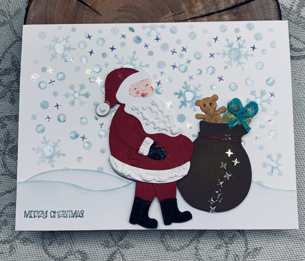
One of my friends often haunts flea markets and garage sales. Recently she found a few early dies by Sizzix and she promptly purchased them so she could give them to me. I know they are very early ones because they have a layer of felt over the plates which they don’t do anymore. Anyway this little Santa and sack are one of the die sets. As you can see today I tested out the dies and put them together. Then I had to decide how to use the result. After playing around a bit I decided to use a stencil by Warm Wishes and added the background. I also added a little Perfect Pearls using a water brush so there was some shine. An unbranded village set gave me the snowy slope which I shaded just a little with the sponge. The sentiment is from a Divinity Designs set and is used a lot especially when I want something very small. I added some Cosmic Shimmer fluffy stuff to the Santa and some tiny stars to the sack and sky.

Some of these gifted dies are the long narrow kind and I no longer have the plates for that size die so I don’t get an entire cut although they can still be used.

Thanks for popping in to look and I hope you are having a decent week.

three shapes

Using Hexagon dies I cut three shapes with one being slightly larger than the other two. Using some stamps from a GKD set called Mandala Maker, I stamped onto each shape and then coloured them in using watercolour pencils and a Sakura Glaze black pen. I went around the edge of each shape with an alcohol black pen and glued them to the card front as you see. I added 2 strips of leftover dry embossed CS leaving enough space to add the sentiment which is from a SSS preprinted set.

This card was inspired by several made by Deborah as well as the guest designer at JUG’s. I’m quite happy with the result and the stamped shapes remind me of eyes in a funny kind of way.

Thanks for stopping by, it is appreciated.

Cruising by

With the nautical theme at CYHTP, the travel theme at Inkspirational and an anything goes birthday at https://stencilfun.blogspot.com/ this card works for all 3 challenges. I can’t say it was planned that way initially but it evolved into this.

The EB is an older one from Couture Creations, the stencil and stamp are from Hero Arts and my sentiment is computer generated as I didn’t have what I wanted in my stash. First I did the embossing on a piece of watercolour CS and then I cut it down so it wouldn’t be too big although it is still bigger than a A2 card. I thought I could create a scene in the center but wasn’t sure exactly how until I remembered this stencil. I masked off all the embossed areas and then placed the stencil and sponged through it using inks that were still on the sponges. Then I stamped the sailboat several times to get a decent impression. The seagulls are from Inspired by Stamping and I use this little stamp a lot. I went over the porthole screws with some silver and also did the outer edge the same way. The little screws in each corner had silver added on top of the ink as masking them off was way too fiddly to do. After adding the entire panel to a card front made from Bristol CS I considered it finished.

I’m actually quite pleased with the end result and it is a good way to use this particular folder too. We may see some rain according to the forecast and by the look of the sky it could be an accurate one. We pray for some as it would help things a lot right now.

Thanks for taking a look, it is appreciated.

be like a feather

The hummingbirds feeding at our feeders are an endless source of amusement and fascination. So much so, that I’ve been researching more about the birds. Cornell has some really interesting information and earlier this week I was reading about their feathers and how they make them iridescent. They are amazing little birds and because I have feathers on my mind the challenge at As You See It ensured that I would use feathers somehow in my design. This is what I came up with. I think I’ve managed the colours and I discovered that even though my Inka Gold paste have become dry, if I scrape them and add a bit of water they can still be used. Initially I used some scrap watercolour CS and I sprayed it with a combination of blue and red mica stains. While I liked the result and shine, it didn’t feel quite right so this is where I used the Inka Gold pastes over the top to get a more intense colour. I used dies from Spellbinders to cut them out. The wood grain piece is a wood grain card stock that I went over with some gray and then added it to the Kraft card front. Feathers were popped up with foam tape. Sentiment is from a GKD set and considering the hummingbirds it seemed perfect for the card. I’ve left it pretty CAS but think it needs some bling? What do you think?

I hope you are not suffering in the excessive heat that is portrayed on the evening news. It is hot here, but still not as bad as other places. Thanks for stopping by, it is appreciated.

pamper yourself

All these tiny stamps came from a Hero Arts set called Bubble Bath, which I’ve only used once before. The first time I used them I didn’t have the dies, but purchased them later. Noticed today that one of the dies is faulty so will have to see if they can replace it.

I made my own stencil using a window die which I cut down to six apertures. I sponged Tattered Rose and Spun sugar initially but added a small amount of Victorian Velvet in a few places. I spritzed it with water and laid a stencil over the top pressing it down. I had hoped to get a bit of texture but it didn’t quite work as planned. I stamped all the tiny images onto the cut outs from the window, coloured them using pencils and Sakura Glaze and the die cut them. Once cut they were glued to the squares. As the flower die is the one that is faulty I stamped the flower here and there directly to the panel and coloured in with glaze pens. Once the panel was ready I added it to card front and then added the frame on top. I’m not sure about the end result but most likely it will grow on me as so often happens. My cleaning lady thought it was cute as did my hubby.

Thanks for taking a look and I hope your day is going well. It is so hot here that being outside is exhausting, but it is drying my laundry really fast.

classical guitar

An old boyfriend, who has remained in my life and is a good friend to both my hubby and I, has a birthday coming up. He is a classical guitarist as well as a doctor and I usually try to make him something related to music. This card is what I came up with for him and it fits the challenge at Make My Monday, #205 An Aperture Card so it will be entered there.

Using an unbranded guitar die, I cut all the pieces and assembled the guitar. Quite fiddly to do, but the end result makes it worth it. I have a sheet music stamp but no idea who made it and it is an older rubber stamp so I used this to create the PP behind the aperture. The die used to cut the opening is another I can’t remember the brand of, but I know one of my stamp buddies has the same die so perhaps she can tell me. I also used the corner dies made by Cherry Lynn Designs. Sentiment is from Hampton Arts and I added a second one inside from the same set. The inspiration for the design came from a Pinterest post, but there was no info with it so I can’t add anything more on it. I popped up the die cut panel and added the guitar as you see.

I’m quite pleased with the result although using black pieces on the guitar means they disappear in the photo. It was fun to create. Many thanks for spending your valuable time with me, it is appreciated.

making wine

The stamp used for this card is an old wooden block from a company called Stampede Rubber, that I’ve had since forever. In my early card making days I often had no idea of how to use stamps but I remember getting this one as a gift and used it fairly frequently at the time.

The challenge colours from Color Hues are Olive and Berry so I coloured it as best as possible to match those. Once it was dry I added some Nuvo Crystal drops to the window pane section and a Sakura Glaze pen over the grapes and partially over the leaves. I backed the window with some black for more definition and added some sequins to the corners. The sentiment is computer generated as I had nothing that seemed right and this too was backed with some black. I thought I would say Make Wine, but it came up with Grapes. Kind of a play on the fishes and bread in the bible in a weird way. The PP is from StampinUp and I used a Spellbinders folder to give some texture. I quite like the result which isn’t always the case.

I’m entering it into the following challenges:

Color Hues #68 Olive and Berry

Anything Goes With A Twist of Stars – twist not taken

Summer Season July 2023 Challenge – Four Seasons blogspot.

Thanks for stopping by, it is appreciated.

Hey, Hi, hello, and hugs

Card front with otters slightly hidden.
when tab is pulled they pop up almost fully

For the longest time, I’ve wanted to make a card like this but never seemed to have the time. Then after making these panels, I realized that it would make a fun background for the otters. In the case of this panel, as opposed to the one I posted the other day, I turned it upside down so the swirl is going in a different direction. Basically I followed the directions found here, but I also followed another link to see a bit more how it was done and that can be found here. Both are helpful tutorials but I still had a few small issues with the pull up mechanism before it worked properly. As with everything, if I make another I already know how to make it a bit easier next time. The otters were stamped (StampinUp set) fussy cut and coloured using distress oxides and a water pen. I used Antique Linen and Tea Dye as well as a Sakura Glaze pen to enhance eyes etc. The little fish was done solely with Sakura glitter pens. The sentiment is from a Simon Says pre-printed set that I’ve just received. When I added the panels to the card front I didn’t quite get them centered so I ended up cutting a small amount off to make the margins even. This small piece was added to the bottom of the sentiment to tie it all together. I may add a few embellishments but at the moment am not sure about that. I also couldn’t find my little stamp set that has pull etc. as part of the words so I hand printed it. All in all I’m quite pleased with the end result.

I am entering it into the following challenges, both of which are new to me.

https://craftinghappinesschallenges.blogspot.com/July: 144 Anything Goes – Every type of crafting welcome

https://aperfecttimetocraft.blogspot.com/A Perfect Time To Craft Open Challenge for July, #7-2023

Thanks for spending your valuable time with me, it is appreciated.

You’re not ….

It has been quite some time since I pulled out the Crazy Cats by Tim Holtz so this challenge was a good one for me bring them out and use them. I also used a sentiment (cut up) from Dylusions which is another set I’ve not used anywhere near enough. The snarkiness of this set amuses me.

I started by stamping the fish skeleton for a background and inked the edges to make it stand out a bit more from the card base. After die cutting the center panel using an unbranded stitched frame set, I inked those edges with same colour ink. Then the two cats were stamped coloured with Inktense pencils and also die cut. I like that the dies for this set don’t leave a white border. I enhanced the eyes and whiskers with a Sakura glaze pen . The sentiment was added as you see but I forgot to add something to the panel and it looked a bit stark. In the end I used a couple of very tiny stamps and added hearts and some flowers in Wild honey ink. To make it fit in with the background I added a few hearts around the edges of that piece too. Cats were popped up on foam tape.

Thanks for taking a look. It is always appreciated as I know your time is precious.

five colours

Somehow I managed to use all five colours for this challenge. This is actually a CASE of a card that Natasha Foote has done which intrigued me enough to want to try a version of my own. No matter what I did, I couldn’t get my die to cut through the acetate so in the end I used scissors which didn’t give me as clean an edge as I would have liked. No matter – I persevered. Getting a close colour match is a challenge of its own, so this is as close as I could come. I used Distress oxides in Scattered Straw, Lost shadow, Mowed lawn, Broken china, and Salty Ocean. Because I couldn’t get really crisp edges I added lines by hand using a sparkle Sakura pen and the embellishments are Trinity Stamps. The sentiment is from a set by MFT and I curved this as best as I could follow the inked curve. I also tried another one but still didn’t have truly crisp lines. It will be used at some point but not today.

My last card for today and I’m off to cook some supper for a hungry hubby. Thanks for stopping by.