Seashells and bubbles

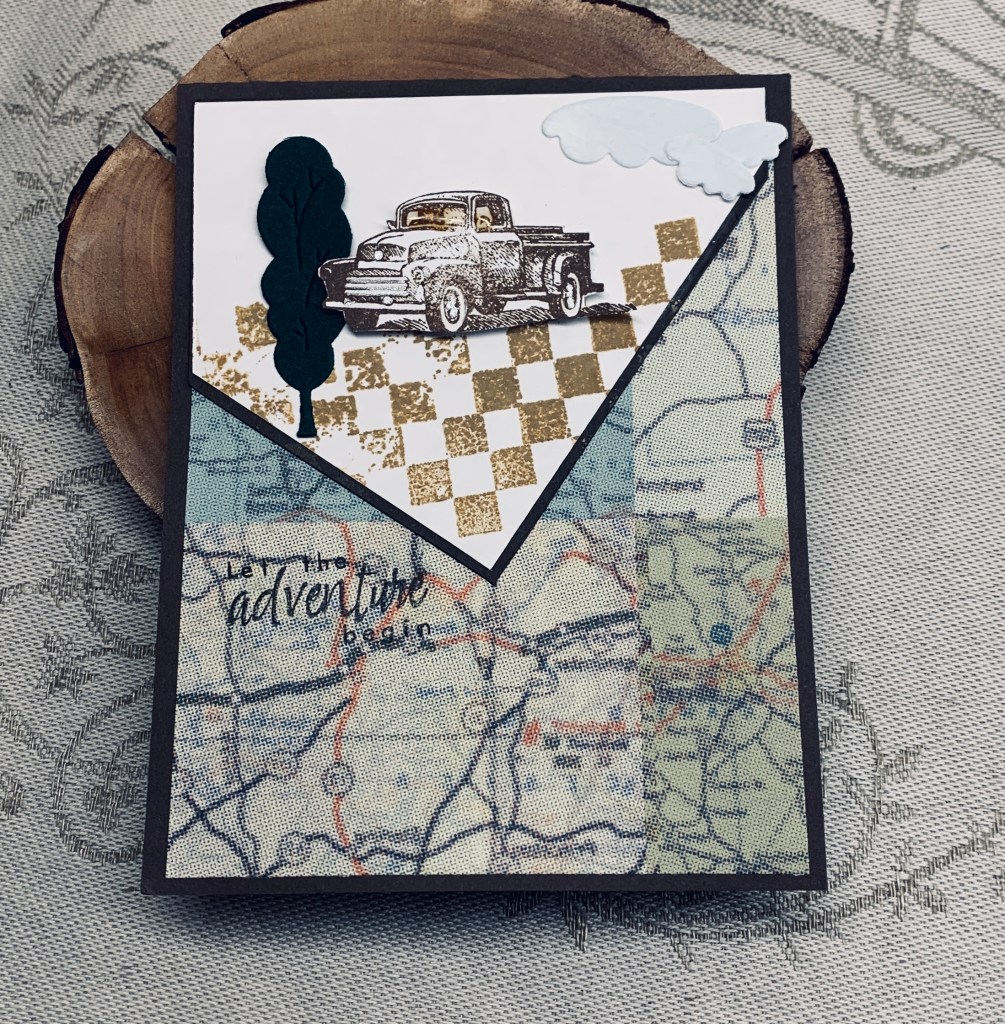
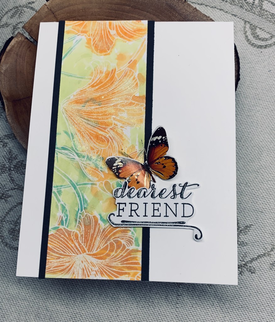
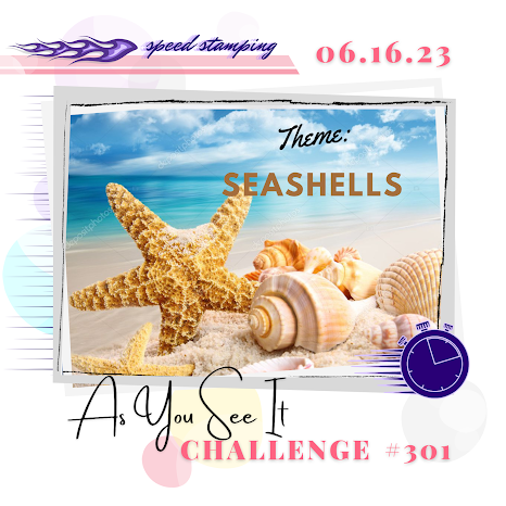
Whew! I just made it with a second to spare. These speed challenges sure get the adrenalin going. I laid out everything before starting, but it still took more time than I thought it would. Not one of my best cards but I used temporary adhesive so I can take off the shells and fix them slightly differently before actually using the card.

I knew I wanted to use the bubble EB folder and remembered that I had a piece already embossed from when I used it the first time. I found it among some prepared backgrounds and all I had to do was add a bit of ink. In the rush, slightly too much around the edges, but not so bad I couldn’t use the piece. I had decided on 2 different border stamps from sets by GKD, stamped them, added a sponged bit of colour and fussy cut them. No dies for these sets as they are old. This was what took so much of the time as I under estimated my ability to do it fast. The sentiment stamp was from one of the sets used and I stamped and fussy cut this roughly so it was quick.

This is a doctored version of the card above as I improved it after I had finished it, at least to me it is an improvement. By accident the design fits the challenge at Just Add Ink so I am entering this version there. I stamped more of the images and fussy cut a few parts out to add dimension to the other pieces. As well I stamped a small shell from a Hero Arts (ancient set) to add to the sentiment section of the card. I feel the card works better with the few additional pieces. I’m a lot happier with the changes although in 10 minutes I knew it was impossible to achieve for the version above.

Thanks for taking a look, it is appreciated.

happy birthday gnomie

Welcome to the current challenge at cardz 4 galz, which is to use die cuts or punches. The background is vellum which has alcohol inks added to it. The texture in the vellum is due to my using it initially to emboss some CS and vellum will often help to avoid the CS from breaking. I really liked the texture left behind so I kept it figuring it would get used eventually. Then I decided to play with the alcohol inks and a background was created. It sat on my desk while I did other things and now I’m using it here. The gnome is from a Taylored Expressions die set. The balloon is stamped and fussy cut from a SSS set as is the sentiment.

The gnome pieces were gifted to me by a treasured stamping buddy who was helping me out so I could make some gnomes for another friend. She was very generous in the amount of die cuts she sent me and I had 2 of them leftover after giving the others away. This is one of them. All I had to do was figure out all the pieces and glue them together giving me this cute result. I added a couple of extra hearts and the YNS Gumdrops before calling it finished.

This gnome die cut set is cute, but I didn’t want to buy it for basically one project as knew I wouldn’t use it much, so my stamping buddy really helped me out. Thanks my friend, you know who you are.

Thanks for stopping by, it is appreciated.

thinking …

I almost forgot about this challenge and suddenly realized I’m down to the wire for entering. What to do, what to make? I decided to use both a positive and negative die cut and went from there. Card front obviously red, then a white layer that is the negative of the unbranded die I used. What a pain trying to get it out of the space. It hadn’t cut through fully and in the end I hand cut a few lines to get it separated. I adhered this layer onto the card front then using the same die I cut a second piece this time turning the die around a few times to make sure it cut cleanly. Whew, it worked. This positive aqua piece was attached over the negative portion as you see. Took a while for me to find the right sentiment and this one is an old one from CTMH. I fussy cut this and added it to the aqua die cut which is from MFT. The little red bow is an unbranded die set received as gift and gems are from Trinity Stamps. Still not totally happy with the sentiment, but it is all I had in the orientation I desired.

Thanks for stopping by, it is appreciated.

shiny hello

This card took a long time to make as it was way more fiddly than I thought it would be. I’m glad I persevered though, as it is quite pretty in real life. Photo doesn’t really do it justice. I used a folder from Craft Concepts to get the blue layer and using the same colour CS I die cut some tiny flowers and leaves using dies from Spellbinders. I’m not sure which company provided the alphabet that I used, but think it might be either Sizzix or Recollections. I die cut several letters so that I could double them up for both stability and dimension and this alone took quite a long time as I was having trouble with my glue bottle. For some reason my glue is going a bit thick and won’t leave the bottle through the tiny nozzle. Very frustrating. Once the letters were together and dry I began to add the flowers and leaves which also took a long time for same reasons as stated. I added a gold sparkle pen to the flower centers and then using a thin double sided tape attached the word across the card front. I felt it needed a bit of bling so added the iridescent gems as you see.

I am pleased with the end result, but am quite tired from creating it LOL. It works for the challenge at JUG’s so I’m posting it there. Thanks for stopping by, I appreciate it.

Cheers!

This challenge required some thinking on my part as I wasn’t sure what I wanted to create. In the end I used a stencil (newly acquired) by Simple Stories and inked up a 6 x 6 piece of CS. I used mostly Sweezed lemonade Distress Oxide with a touch of Twisted Citron and while the ink was still wet added some clear embossing powder which I heat set. Usually I will do it twice to get a smooth finish but in this card the slightly bubbled effect makes the lemons more realistic so I left it as is. I cut the panel down and decided to center it onto the card front. It needed something so I added a fine border with a Sakura Glaze pen and that helped it to pop more. The stamp set used for the martini glass is from Joy Clair as is the lemon slice. I stamped and fussy cut both, added some Nuvo Crystal drops to give more dimension and shine then popped it up with foam tape. The word is a die I’ve had for a while and think is from Sizzix but I’m not certain. I cut it twice once in yellow and once in black so I could offset slightly for more definition. Before I thought about blogging and such, I never figured I would need the product names for sharing with others so some of my older products are a bit of a mystery these days.

I still have another stenciled piece to use which is nice. I’m quite pleased with how this one turned out and join my prestigious stamping buddies in entering into the same challenge. Thanks for stopping by, it is appreciated.

let your dreams …

My second post using a similar design for both masculine challenges. Actually this was my first attempt and my angled piece is on a different side to the previous post. In fact this card had to be corrected because I forgot to put a border piece underneath. To fix it I cut some thin strips and glued them carefully around the angles. I don’t have much in the way of boat stamps and this one from Hero Arts is technically a silhouette stamp. I stamped a mask first and cut it so that the hull and sails were separated. Then I stamped each section using the masks. The hull was stamped in black and the sails in blue and I went over one of the sails with a gel pen for more colour. Used a glitter pen in red for the flag and the stripe on the hull. I also used a wave stencil to add the water and the bird stamp is from Inspired by Stamping. Sentiment is Hero Arts and PP is from my stash, I think it is originally from CTMH. I’m quite pleased with both cards and they will be used quite soon as I have several masculine birthdays coming up.

Thanks for taking a look.

Let the adventure begin

As I needed some masculine style cards for upcoming birthdays, these 2 challenges helped me to get going and make some. I ended up with two different cards for both challenges and will post the 2nd one after I’ve completed this post. For this one here I used up some old supplies and stamp sets. The PP is from a pad that I was gifted by someone and never really used much from it. I did think that this particular paper would be used eventually and obviously now is the time. As well I had been wanting to try this design style for a while so the challenges helped me with that too. I glued the PP to the card front and then played with the placement of the angled piece making sure there would be room to add my images before cutting it. Stamp sets used are an old GKD set for the truck, Hero Arts for the sentiment and the patterned squares are from an ancient set acquired so long ago I have no idea of the maker. The die cuts are from 2 different sets by MFT and I fussy cut the truck. I also added some Nuvo Crystal drops to the windows of the truck. Note to self is to remember that the liquid drops pick up colour from the inks which isn’t quite what was intended. I stamped the sentiment using an acrylic block which meant I couldn’t stamp it more than once. It wasn’t as dark as I wanted so I went over the words with a fine tip black pen.

Another beautiful day with even more heat has arrived. I love the sunshine and find my mood is always better in the warmer months, but after doing some weeding yesterday I realized that the ground is so dry that even the watering we are doing isn’t enough. I have to say that many are getting nervous and the fire situation is dire in several locations. One is raging out of control here on the island and a community has been virtually cut off due to the only road being closed. It is far enough away from us that we don’t have to worry, but the question is for how long will our area be safe? From our windows we can see the smoke haze over the mainland and we know that much of Canada’s smoke is drifting down into the States. Not nice for anyone.

Thanks for stopping by. Have a good day everyone.

Peach coloured Hibiscus

Lately I seem to have been collecting bits and pieces that have been made and not used or like this panel is piece leftover from a very different project. It is quite sparkly in real life and is on the darker side of peach but the photograph makes it look a bit orange.

I added it to an A4 card front and then cut some thin strips from a dark gray CS to edge it. Black was too harsh so the gray was a nice compromise. Sentiment is from a Hampton Bay set and I fussy cut it and added a bit of sparkle here and there. The butterfly is from an ephemera package. I added some thread to give it antenna.

A very easy and quick card because most of the work was already done before I started. One of my friends is recovering from some knee surgery so I think I shall send it to her with a nice message inside. Thanks for taking a look.

Layered Periwinkle

This is my take on a card I saw on Pinterest recently. I cannot attribute it because the post doesn’t give any information. Initially I thought I would make the die cut background a soft gray and build the other bits around it, but as you can see I reversed myself and made the background purple. I found some blue CS and some light gray CS in my stash that seemed close enough to the colour swatch and die cut several flowers using a Memory Box die called Layered Periwinkles. Then I layered the gray and blue together. After which I added them to the background piece. Using a darker gray scrap I die cut some leaves which are also from Memory Box but this time called Layered Impatiens. The sentiment is stamped in Hickory Smoke ink and is from a Hampton Art set.

I was supposed to go paddling in the Angels Abreast Dragon boat this afternoon, but the wind is too strong making it unsafe. Instead I’m crafting. Although we are having a lot of sunshine along with drought conditions, the wind is keeping things quite cool. A good soaking rain day would be great right now.

Thanks for stopping by and I wish you a wonderful day.

music speaks

In many ways this card happened by accident. I had viewed a couple of tutorials about using up scraps, checked out a card that looked interesting but now I cannot locate it to acknowledge its creator, and I needed a masculine style card for someone. The small banner die is from an unbranded set and is so thin that it is not very useful. Having the idea to use it on scraps seemed to me a good way to get some use out of it. Initially I was going to glue each strip in staggered lines butting each piece up against another. But I had the strips in my hand, which is sore today and promptly dropped them onto the white piece. They looked kind of interesting the way they scattered so I glued them that way. The white piece is the inside of a frame I used a while ago, the notes are stick-on puffy shapes I’ve had forever and the sentiment comes from one of my first purchases from GKD, and is quite old now. When I went to glue the layer onto the gray card front, it also fell and rather than try to straighten it I decided to leave it as is. Then I went around the whole thing with a black fine pen and over that with a glitter pen.

One card for two challenges makes me feel pretty good about myself. As I incorporated the double dare the card also works for a 3rd challenge too.

It is an okay card and in a way I like it, in another I don’t. It is certainly different and with my hands being the way they are it is fortunate I could create anything at all. Thanks for stopping by.

Links to the challenge blogs:

Just Add Ink #655…Add Music! – music notes and sentiment fulfill the requirement here.

Challenge #139 “We Dare You” Masculine Project partnering with Festive Friday – Plaids, die cuts and possibly the shape of the layer qualify this one.

Festive Friday Card Making and Paper Crafting Challenge #FF0135