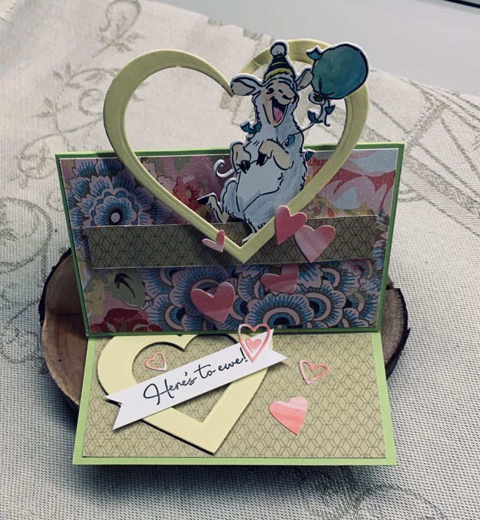
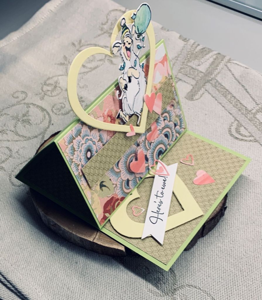
At Cardz 4 Galz the challenge is to make an easel card and this is my version. The paper I’ve used is from Close to my Heart and I’ve had it for a long time. The stamp set is from A.I., the bigger hearts were cut using Hero Arts Infinity dies and the smaller ones from a die that I have no name for, but I think it maybe Sizzix. The card stock is cut at 5″ by 11″ and then scored and folded to get what you see here. Once the PP was added it was easy to pop up various elements to get the end result. I love this stamp set as it is such a fun one. I also have a similar with Panda’s and they allow for some amusing cards. It isn’t too bulky for mailing and of course folds nice and flat.
My new stencil arrived the other day and I decided it was perfect for this new challenge. The Stencil is by Creative Expressions and is called Feathered. Having just seen a video by Bibi Cameron about using Colour bursts with a stencil I decided to give it a try. Using watercolour paper, subsequently cut down for this card and using Pixie spray to hold the stencil in place, I sprinkled various colours on top. Then I carefully misted it so it would mix. This is the result and I like it. I may do more of this as it is the easiest way to stencil for me. As the design wasn’t as positive in one area I used the butterfly to cover it. I can’t remember who makes the die but it is in 3 parts. I added some glitter to the black body section before adhering it. The sentiment is from a gifted to me set by GKD and the dots are called gum drops by Your Next Stamp.
I like the vibrancy of this card and it is really striking in reality. Thanks for stopping by.
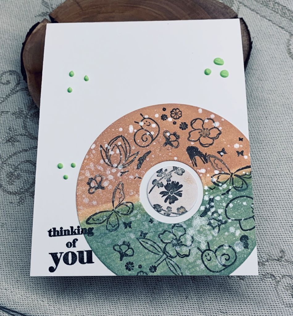
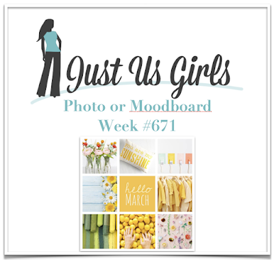
A recent wildlife magazine arrived and the envelope featured a graphic which was a circle with a ton of different species put inside sections and I immediately wondered whether I could do a card that would use the idea. This is what I came up with. Using the JUG’s chosen colours I inked half the circle with one and then the other half as you see. Then I picked out all those little stamps that so often don’t get used and stamped all over the circle till it was as full as I wanted it to be. All the stamps come from different sets which would take forever to list so you just have to trust me. When it was complete I spritzed the entire circle with Perfect Pearls and left it to dry. I had already die cut the center circle and I stamped it with a few more of the stamps added some shimmer with a rose gold sheen and adhered both pieces to the card front. I cut off the overlapping bits and then added the sentiment at a slight angle to the side. A few Pops of Color dots and I called it finished.
For a change, I think I achieved a good result with the colour match. I used Tattered Rose and Bundled Sage Oxides. I had fun making it although I’m not sure I really like it. As with many others, I reserve judgement until tomorrow as often I like the card better after stepping away from it. Hope you are all having fun and have a bit of sunshine in your lives too. Thanks for popping in to take a look.
When I look at my photograph it appears as if the ink is more orange than peach and the bow and edges seem more pink. I don’t have an exact match for a peach colour, but I did my best nevertheless. I first dry embossed the Kraft panel with a folder by Craft Concepts called in bloom. I added the peach paper behind it so just a small border is visible and then attached it to the card front. Using a die set from StampinUp I cut the daffodils and leaves out of white CS and then added inks to give some colour. The butterfly is from the same set and the bow is a new unbranded die I’ve just received. Once I was happy with the placement I adhered it all as you see and then added the sentiment which is from Itty Bitty Basics by MFT. As I write this I realize I have forgotten to add three small gems that I had ready so they will be added after the fact as I’m too busy to redo the photo.
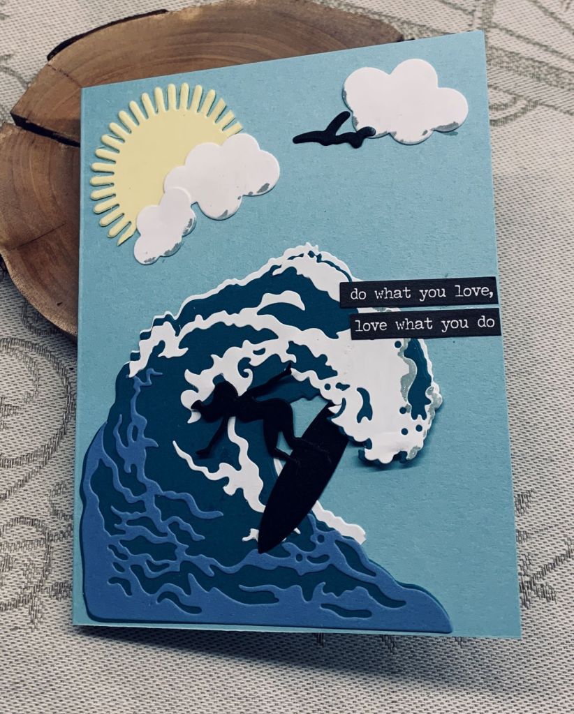
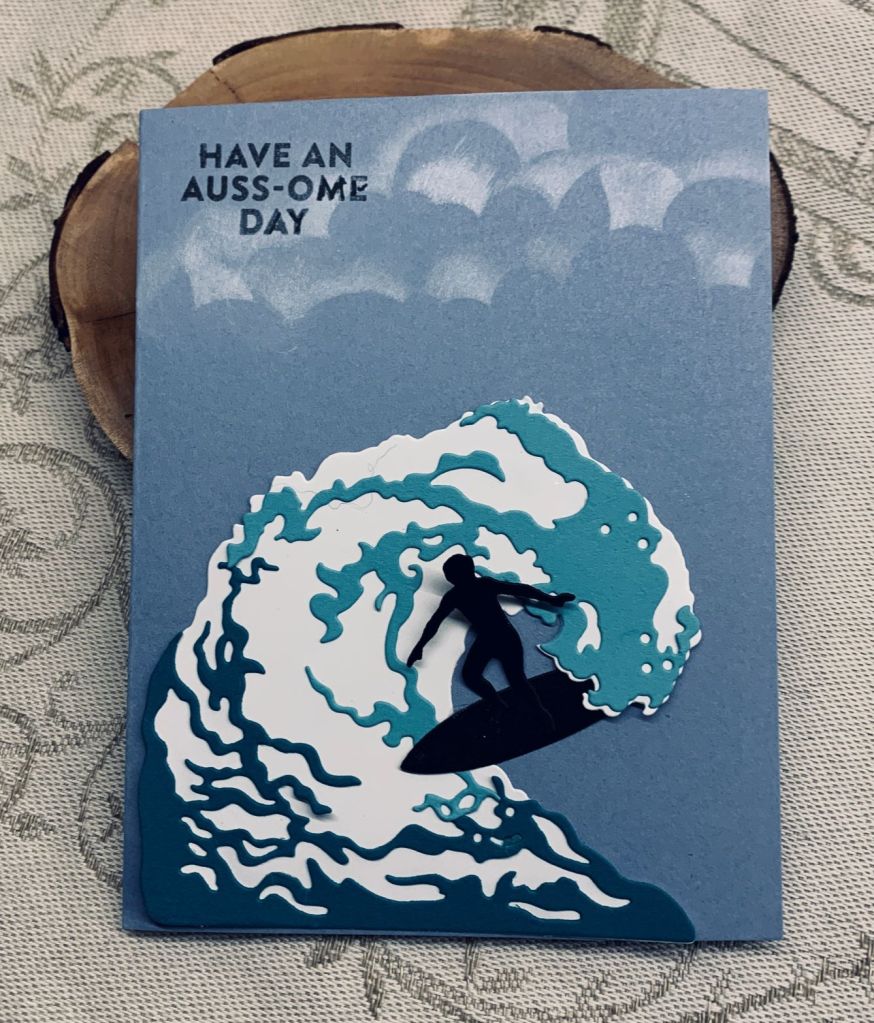
The challenge at Just Add Ink is to do a card with no stamping and if I had been thinking properly when I made the card I posted yesterday, I could have linked it. Instead I made another card using the same theme only this time I had more time to do it. I basically used the same die set from Hero Arts, but instead of a man on the surf board I used a woman. When cutting the main part of the wave I did 2, one in white and one in the darker teal. I offset the teal slightly when I added it to the white. Then I added the rest of the pieces on top. I also added some birds from this set too. As well, I added a sun which is die cut from a SSS die and clouds cut from and MFT set. I added a bit of silver sparkle to the cloud edges and a tiny bit on the wave curl. The sentiment comes from an idea-ology pad and seemed appropriate for the image. While I was die cutting I did some extra clouds and have fixed yesterdays card so it looks better, at least to me.
Thanks for looking and commenting. I appreciate it. Hope you have some sunshine too. It has been a lovely spring day for us here.
I made the time limit with 1 second to spare and its a good job that perfection isn’t expected, because my clouds are a disaster. I don’t know how other card crafters get such perfect looking clouds as mine never look good, but doing it in a hurry is a recipe for no success.
Once I had an idea in my head and had picked out the CS and dies I began by die cutting the wave along with the surfer and board. I quickly attached the surfer to the board and then went onto the wave. Of course the fallouts didn’t fall out as they should and it took a minute to pick them out. Huge sigh of relief when that worked without damaging the die cut and I added the two coloured sections to the main white wave. Another minute wasted in trying to decide where the surfer would go and I decided in the ‘pipe’. I added some glue and tucked him under the curl and over the rest. Silly me he also got glued to the card front and the wave wasn’t yet attached. A frantic couple of minutes trying to glue the wave without pulling the whole thing off the card front. The timer is ticking and I still hadn’t done the sentiment or the clouds. A bit of sponging and a quick stamp of the sentiment and it was done. I shall have to fix the clouds before giving this to someone, but on the whole it isn’t a bad effort.
Stamp set is from a Hero Arts card kit and clouds are created with a SSS stencil. Anyone with a good idea of how to repair my clouds please share. Thanks for taking a look, I appreciate your time.
I had these daisies already coloured sitting on my desk waiting for me to do something with them. I also had the organdy ribbon but it wasn’t long enough to tie into a bow so instead I folded it narrower and added it as shown. I used some gold thread to add the Easter egg tag and to shape the ribbon at the same time. Mounted the panel onto some black before adding to the embossed piece. This panel is using some StampinUp DSP which I dry embossed and added a black trim to the edges with a pen. Stamps used are all GKD but from several sets.
I’m not feeling that inspired at the moment. Probably a residual feeling from a week of toothache, but I have a few card commitments so will do my best to get them done this week.
This card uses three stamps, one from StampinUp and two from older GKD sets. The rest of it is die cutting and a bit of fussy cutting. I coloured the basket, bow and tulips with Inktense pencils. The rabbit is made from 2 small oval die cuts that I shaped a little by hand for the feet and a small circle for the rabbit body. Originally I intended to keep the basket handle but it broke so I cut off the bow and used it alone as you see in photo. I added the rabbit body to the basket and then the flowers behind. Last was the feet which are popped up on foam tape. The tail is done with Cosmic Shimmer fluffy stuff and I added the pads of the feet with Sakura glaze and some sparkle.
This card worked better than expected and I’m happy with the result. We managed a bit of garden clean up this morning but the showers started so couldn’t do as much as our original plan.
Thanks for stopping by and I hope you all have a good weekend.
Welcome to our new challenge at Cardz 4 Galz and we hope you have fun with the spring flower theme. Although roses are probably not a flower one would choose as a spring flower I have 2 in my garden that flower very early and one has a wonderful scent.
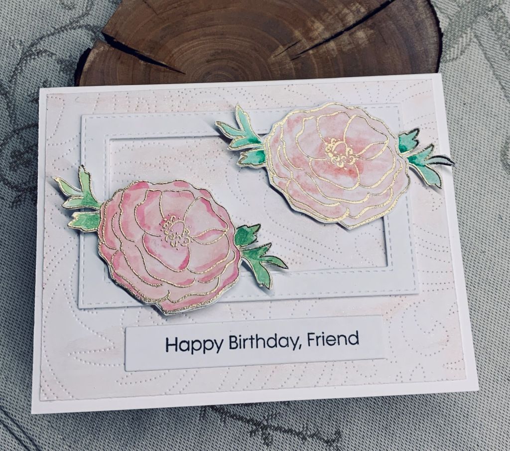
The stamps are from 2 sets, one is a Penny Black floral set and the other is an MFT sentiment set. I also used a swirls debossing die from Altenew and a stitched frame die from Paper Rose. Using Versamark I stamped the images and then heat embossed them in gold. Then I used some Distress inks as watercolour and added colour to them. I did 2 layers for each to add strength and fussy cut them before gluing together. Using a rose gold shimmer stix dauber I went over the background piece as I felt it was quite stark but didn’t want to add colour. I also added some shimmer to the roses.
It is a simple card but I think quite effective visually. Thanks for stopping by, I appreciate it.
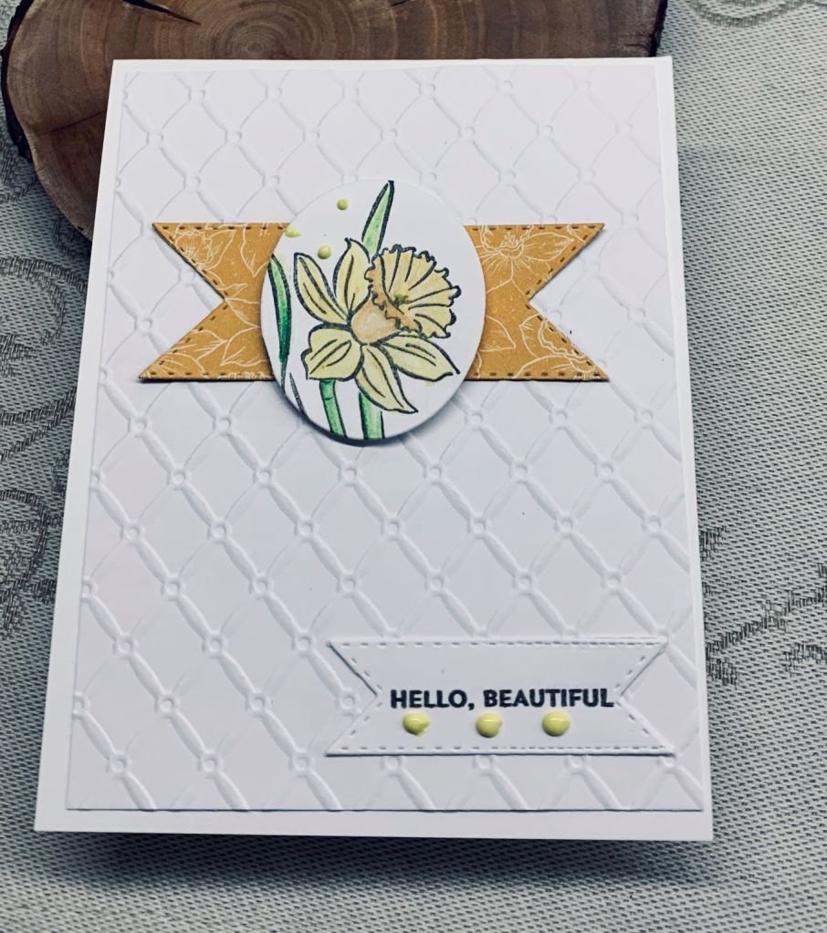
Getting one card to work for two challenges is always a bonus so I’m pleased with this one. I had seen a Pinterest post with an idea similar to this card and I loved the simplicity of it. This is my version of the idea. First I embossed the background piece with a folder from Creative Expressions and added it to the card front. Using some StampinUp PP I cut the banner pieces using an unbranded die set. Then I stamped the daffodil from Daffodil Daydream, a StampinUp set and using Inktense pencils and a bit of water I coloured it. The sentiment is from Itty Bitty Basics, MFT. I used a Hero Arts Infinity oval set to cut out the flower and popped it up onto the banner. I added a few Pops of Color dots and called it finished. It was very quick to make.