Falling Leaves

Guest Designing for the Four Seasons Challenge
https://thefourseasonschallenge.blogspot.com/

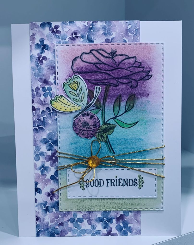
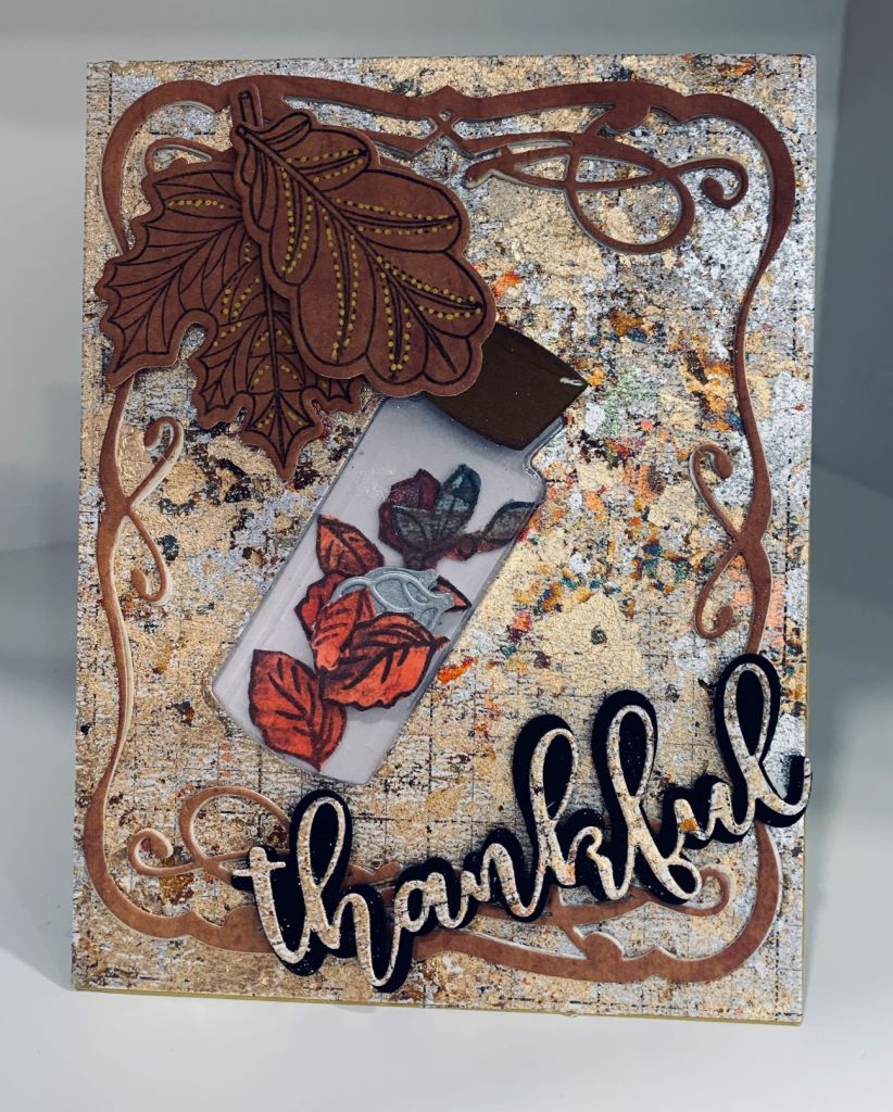
Having another opportunity to be a guest designer for a challenge is exciting and somewhat scary at the same time. Creating something that may inspire others is a challenge all on its own. Upon thinking about this I decided to use my gilding flakes to create a background because the colours in mine remind me of fall. I used a sticky sheet to add the flakes and then cut the piece down to the size I required. I also wanted to try a small shaker and used a bottle die and insert from MFT. I die cut the opening and inserted the bottle shape into the opening. It was filled with leaves stamped onto some inked CS and most of them fussy cut, and I backed it with a scrap piece of vellum so it was sealed. The bottle comes with a stopper and I die cut several layers in dark brown gluing them together before adding to the bottle. The frame was cut using an old die but which brand and model I no longer remember. I cut several and stacked them together to get a bit of dimension and stability before adding it to the card front. The two larger leaves and sentiment are from an older GKD set called stitched leaves. Sentiment was cut from the same gilded flake layer left over and added to the black shadow layer. I went over the larger leaves with a gold pen where the dots were for added interest. My shaker is a bit tight, but the leaves do move if the card is shaken. As so often happens the photo doesn’t really do the card justice as it is quite vibrant in R.L. Thanks for spending time with me today.

A Gift For You

Peace on Earth Challenge #22

For this card I used the inspiration from the cute top left image and a few of the colours from the rest. My stamp is a new one from Penny Black called Waddling By and I stamped him several times in black and then with Versamark so I could heat set with clear powder. Then I coloured it using Inktense pencils and a some grays from Prisma colour. Once it was fussy cut I added foam tape ready for popping up. Using StampinUp DSP I cut the background piece and attached to card front and then from the same package chose the blue pattern and die cut using an oval die from Hero Arts. Using some scrap white CS I cut a shape to denote snow hills and added it to the oval before adding the penguin. I stamped the sentiment onto a scrap piece of white, leftover from a cover plate die cut and added a bit of black glitter pen to the heavier sections on the words. Die cut this with a small die from Creative Expressions and also another small one from the same blue piece as the oval. I offset the two for interest. I’m quite pleased with how this turned out and got it finished just prior to our next set of guests arrival. We have them for a couple of nights which is fun. Thanks for looking and hope you all have a wonderful day.

Bear-ista

This card was intended for the challenge at Color Hues, but I ran out of time when some expected guests arrived earlier than they thought they would. I had hoped to get it finished later in the day, but that didn’t happen and I missed the deadline. I like the card enough to post it even though it isn’t intended for any challenge now. Stamps used are from 2 different sets, one by Art Impressions (bear/cup and sentiment) and the other by GKD that had coffee bean stamps. The ribbon is from my stash. die cut ovals are Hero Arts. For the coffee cup section I used some masking tape that I cut into small strips so I could mask off areas I didn’t want colour and I used a Sakura gelly roll pen to add the green. The bear was done with Sakura glaze pens and also one pen from Ohuhu. When the cup and bear were coloured I fussy cut it out and popped it up over the coffee beans using some foam tape. I hope you think he is a cute as I do and have a great day everyone.

Miss You

Challenge #30 – Emboss

When making this card I forgot to measure so I suspect it is a bit more than 1/3 in size. That said I’m uploading it anyway. I had the embossed piece left over from a trial run at using only part of the folder which is a 6″ X 6″ size. I also had the glitter foam hearts on my desk, given to me by my friends 5 year old daughter Scarlett when we saw them last. They may come for a visit this weekend so I shall give the card to her if they come. She is a very artistic and articulate little girl, and her sister is a tomboy. Although they live on the island it isn’t close so means a bit of trek to see them. Hopefully if they do come, Ellie her sister won’t destroy my fairy garden as she is a child who is likely to stomp through it just to see what happens. I’ll need to keep eyes on her for sure as her parents don’t really use decent discipline. Instead they try bribery and to me that isn’t effective. Sentiment is from a new set by Hampton Art. Thanks for looking.

Good Friends

Challenge #281 – A Recipe for Watercolour Brightness

The recipe at As You See It is to use the elements shown in the photo above. My first attempt (done yesterday) is below. I was just about ready to post it when I realized that I had forgotten the watercolour element in the recipe so this morning I started again.

For this one I began with a scrap of Mixed Media CS and some distress crayons. I scribbled the crayon colours across the paper and smoothed with my finger to blend out. It wasn’t quite what I was looking for so I spritzed it with water and blended it once more using my finger. This looked better to my eyes. This gave me the watercoloured element of the recipe. After drying it I used a Penny Black stamp and stamped the rose over the colours. I did go over the leaves with a water brush and some additional colour as I wanted them more green. I die cut the layer with an unbranded stitched rectangle set and I also used the same set for the sentiment. I found a scrap of PP in my stash which is from StampinUp and added this to the card front after which I added the floral layer. There is a touch of sparkle on the roses that isn’t evident in the photo. As you can see prior to adding the floral layer I added gold twine at the bottom of the piece and the sentiment underneath it. The gem was added to hold the twine in place as it kept moving. The butterfly was coloured and fussy cut and the additional rose was added last minute as the space there looked unbalanced and the butterfly needed grounding. I believe that this time around I managed the recipe. Below is my first attempt that missed on ingredient.

My PP frame is from GKD (old) and I die cut it with a Paper Roses frame die. Popped it up on the bright pink CS. I also used DSP from StampinUP for the flowers which are a die from Memory box. I thought the striped paper would make the brights really bright. The leaf is also from Memory box. The sentiment was fussy cut and is from a new set by Hampton Art. I got these in one of those mystery box purchases. Kind of fun to receive as you have no idea what is inside. Mine included a couple of metal stencils and a lot of stickers as well as the stamp sets. Not a bad deal although I don’t use a lot of stickers.

Forgot one element of the recipe

Thanks for spending time with me today. Have a great week.

Celebrate!

Just Us Girls #646 – Color Week & Anything Goes With A Twist of Pets/Dogs/Cats

With the colour choices at JUG’s and the embossing folder requirement at CYHTP, I figured out how to make a card that would work for both challenges. All CS is from my stash mostly by GKD. Although in the photo the teal embossed background looks quite blue – it is actually a beautiful darker shade of teal and was embossed with a new folder by Gemini. This folder also came with the stamp curved to work with the curve in the folder and a die also curved for use to add together to the other piece. In fact they almost click together as the raised portion border fits into the small holes of the die cut. The little pug is from a dollar store set as is his hat. I coloured him with Inktense pencils and Sakura gel pens, then popped him up on top of the border piece. Gems from my stash and some fallouts from another project completed the card.

Northern Lights

Lighthouse Challenge

This particular challenge reminded me of a Hero Arts Kit I have, so I pulled it out and decided it was perfect for meeting the challenge. I love the background stamp and there are several dies that go with the theme. In this case I just used the lighthouse one. The background was stamped with chipped sapphire first and then I took some sponges and added in the colour for the light show and the sea. I added some white paint to the ocean part and then some additional colour. Once the colours were dry I added some sparkle using a Spectrum Noir shimmer pen. It adds just enough sparkle for interest without being over the top. Unfortunately as always, I can’t get it to show in a photograph. The sentiment is from the same set and once stamped I added some sparkle to it, fussy cut and popped it up. It is a very dramatic background so using only the silhouetted die cut was the perfect addition without detracting from the sky. Thanks for sharing time with me and I wish you a joyful day.

Sweet Friend Hello

Color Hues #46- Special Tribute

Although I didn’t know Lindsey, having gone through my own cancer experience I understand the loss of a colleague and friend. As I also love purple, I thought making a card using the colours would be a nice thing to do. Supplies used are: butterfly stamp from Penny Black, PP from CTMH, purple paper from a kit many years ago, Verdant Arch leaf from Memory Box, flat back pearls from my stash, Hello die and stamp is Creative Expressions, and finally the labels are a set from Spellbinders. I scored the panel first and then added the labels as you see in the photo. I backed the panel with the same paper as the leaf die cut and then added the leaf to the other stacked labels. The offset label was stamped and the hello die cut added just above. After stamping and colouring the butterfly I fussy cut it and popped it up on top of the leaf. I added a bit of sparkle to it as well but photo never shows the sparkle. Inspiration was something seen on Pinterest but mine is very different than the one I looked at. The original was a square while I kept mine the usual A2 size. I quite like the result and kept it fairly clean and simple. Thanks for stopping by and have a great day.

WTHeck Embellishments

SOS475 – WTHeck Embellishments

Most likely I bought these sparkly things because I like sparkly, but I’ve never really done anything with them and they get forgotten about as well. I had this slimline card cut, but hadn’t used it, I also had the die piece cut and had set it aside since earlier this year. When I found the sparkly leaves I thought they would look okay underneath the word window and I added a paper bow, also from my stash, to the offset leaves. The pearls are a strip set that I added to the circle center to give some interest and I added a few more at the bottom of the slimline piece. A very simple and somewhat plain card in spite of the sparkle’s, but it uses up some items that were sitting around as well as forcing me to use the embellishments.

Best Escape Anyone Can Have

Anything Goes Embossing With A Twist of the BEACH & FUSION – Beach Tiers

Well I’m certainly lucky today as I managed another card that fits 2 challenges. The one at CYHTP has a twist of using a beach theme along with an EB folder and the Fusion challenge is also beach related. I chose to use the inspiration photo only rather than the sketch. My folder is an old one by Couture Creations called Deep Sea Diver, and I added a wash of colour to the embossing before adding the scene. The little die cuts are all from a Hero Arts set and I went over them with a black glitter pen before adding them to the sea and sand. I also die cut some paddle boards and another small image of a surfer carrying his board. The sentiment is from another older set by Inspired by Stamping. I added the layer to a Navy card front and decided I liked it well enough to post. Have a great day everyone and thanks for looking.