Silhouette and Circles

http://just-add-ink.blogspot.com/

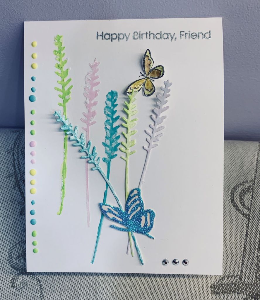
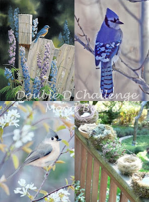
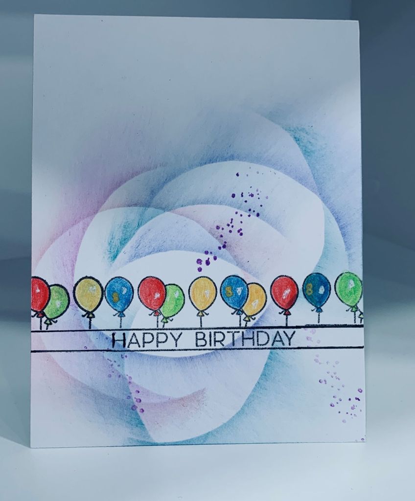
The closest I could come to these particular colours are using Distress Ink colours Seedless Preserves, Spun Sugar and Bundled Sage and I chose to do inked circles using a homemade stencil. Once happy with the inking and making sure it was dry I stamped the floral silhouette on top. Stamp set is a very old one that I know I got at Michaels, but have no idea of the brand. The sentiment is from Joy Clair and the pink dots were made using my new pops of color from Scrapbook.com. My hands are not that great at the moment so getting the dots right was challenging and obviously they aren’t perfect. Still I like how they look and decided to keep them. I shall space them better another time I’m sure. Thanks for looking.

Pretty Pastels

https://shoppingourstash.blogspot.com/ & http://www.global-design-project.com/

When I began this card yesterday afternoon, I had every intention of using it solely for the Shopping our Stash challenge but this morning when finishing it, I realized that it also works for the sketch challenge at Global Design so it will be my second entry there.

I had purchased some Pops of Color from Scrapbook.com all 4 in pastel colors and I was looking for a project to use them and this was it. Initially I created my own stencil out of some scrap CS and I die cut three lavender flowers using a Memory Box die just received. Instead of keeping it as lavender I made it more like leaves and I added the pops of color to the stencil and also on the die cuts. The idea for using the lavender die cuts this way came from Jean Okimoto and can be seen HERE. In future if I do something similar to this I will make sure the stencil is from acetate or actual stencil medium as when removing the card stencil some paper was left behind. The actual die cuts I placed together like a bouquet and using a die cut butterfly (Gemini) I adhered them as you see. The tiny flying butterfly is from a SU set and I fussy cut this out after I coloured it. Again a little of the pop of color was used but this time slightly watered down so I could paint with it. Then I added all the tiny dots down the side of the card intentionally not worrying if the sizes and line were slighty uneven. A few more embellishments and a heat embossed in silver sentiment from MFT finished the card. Stay safe and healthy everyone and thanks for looking.

Flutter By

http://www.global-design-project.com/

For this sketch I chose to use some leftover glitter strips with a metallic one. The butterfly is from MFT, more brilliant butterflies with a matching die. I inked up the butterfly then using versamark I added the pattern portion. Using gold powder I heat embossed it, but I noticed I had forgotten to dry the ink so quite a bit of powder was stuck to the body. Instead of throwing it away I went ahead and then die cut it. Once cut I decided that I liked my accident enough to use it. I also stamped another small butterfly (from a StampinUp set) at the top right using a gray ink so it wasn’t too vivid. The sentiment is from a GKD set and the embellishments are Trinity stamps.

Mermaid Hello

https://paperdragonflycreativechallenges.blogspot.com/

A sleepless night brought me back to my craft room in an effort to get my mind onto something other than frustration with not sleeping. New dies from Memory Box, a free digi from MFT, found on Pinterest, a Cheapo bull rush die, a few scrap pieces of CS and a stamp set called Vertical Greetings from GKD and I was all set to create this card for the Paper Dragonfly challenge. Firstly I stenciled some waves using various shades of blue inks to make the background. Then I die cut the 2 frames and using some foam tape put them together. After printing and colouring the digi stamp I fussy cut the mermaid and added her to the scene. For her colouring I used Prisma pencils and Gamsol. I added the layers to the card front and used a few of the fallouts to add extra bubbles. I die cut the rushes and used Tombow markers to colour. After stamping one of the small dragonflies included in the set I used some Sakura glitter to add a bit of colour before fussy cutting. When I make a card like this, I always wish I had a little girl to give it to. Thanks for spending some time with me today.

Music Speaks

Challenge #26 – Gold

Firstly I made the gold strips for the top and bottom of the section I was planning to use. Then I masked off the area and using an old stamp set from GKD I took the musical notes, stamped with versamark then heat embossed in gold. I had a few die cut pieces from an unbranded die and one of these was the word love with a heart on the end. I cut off the heart so the word would fit and glued it along the bottom strip then I took the heart and added it to one side of the music and another one to the other side.

Thanks for looking.

Feel Better Flowers

Just Us Girls Challenge #631 – Word Week

Seeing as I needed a get well card, JUG’s challenge is flowers, the banners were already cut with a new unbranded die set and my Memory Box flower dies arrived today, this card was almost a no brainer. The PP is from StampinUp and the small sentiment is from Itty Bitty basics by MFT stamped and heat embossed in white. I used PP for the leaves as well although the slightly darker leaf is not from StampinUp but was left over from something else. Embellishments are from Trinity Stamps. An easy card to make even with the finicky bits of the flowers and I like the end result, I hope you do too.

Whimsical Fantasy

https://colorfuloptions.blogspot.com/ & https://doubletroublechallenge.blogspot.com/

Recently I tried a new technique that I had seen on Pinterest and guessed at had at how it was done. The piece here uses the same technique and was in fact the test piece for my previous card. I added more to it and cut it down for use on this effort. With a collaboration challenge between two very different blogs the requirements are quite different and as my stamping buddy – Gayle – mentioned needed a lot of thought. The pink part was relatively easy as was the use of something to denote fantasy, but the rainbow was much more challenging. The reason I used the test piece is because all the curves reminded me of a rainbow, even though, strictly speaking there isn’t one. I added more curves using various shades of pink before continuing with the rest. For the stamps I used a set from GKD called Framescapes Enchanted Forest. I stamped the larger fairy in pink and outlined her wings in a darker pink Sakura Glaze pen before fussy cutting her after which I used some foam tape to pop her up in the corner. The spatter was also part of my test piece so I decided to keep it and make it look part of the fairy scene. I also used the smallest fairy stamp in Iced spruce so it would appear the two were meeting. The butterflies were added and a couple of tiny seed heads in the right corner after which I added this panel to the other layers. I put the card to one side as it was close to dinnertime and I wasn’t quite satisfied with it either. This morning I was about to photograph it when I realized that it still needed something and I had the bright idea of adding some pink buttons (from GKD). Adding the buttons alone still didn’t seem to work once I laid them out and I remembered I had some multicoloured (rainbow) fine thread that I thought may be just right. It took a while but I managed to thread three buttons for one side and three for the other and using some glue dots I added them to the card front as you see. The thread looks a lot darker than it is and although it may be hard to discern it truly is a rainbow of colours with a bit of gold sparkle to it. I like that the buttons also reflect one of the mood board pictures and the bonus was my hubby noticed it as I was doing the photo and said how much he liked it. Thanks for spending some time with me and I hope you like it.

How Fabulous

Color Hues #40- Blue and Tan

Having been playing with this idea on a different creation, it seemed natural to continue to make a 2nd card that would fit this challenge. The border die is a Gemini one called Blossoming Borders, the Hexagon dies are also from Gemini, the flourish is an old die but I don’t know the maker, the stamps used are from a GKD set called Fabulous Flowers and I fussy cut the small flowers once they were coloured. The tan PP is from a paper pad I’ve had forever and is made by Momento. I used scrap pieces of blue CS for the hexagons as well as the tan PP which I paper pieced into the white frame. I cut the border on the initial layer and then added the flourish as well as the two blue hexagon shapes. Then I added the larger hexagon which I inked using Blueprint Sketch. I liked the idea of several different blues so the frame, bow and hexagons are all different. The flowers were coloured with Inktense pencils and a bit of old gold pen for the centers. Embellishments are from Trinity Stamps.

Here is the first card I made using a similar design …

Keep in Touch

Birds~Bird Nests~Bird Cages~Birdhouses Challenges

For this challenge I chose to use an older stamp set that I won in a Mod Squad challenge a long time ago. It is by Inspired by Stamping and is called Sweet Aviary. As well I used a bird from a set called Birdhouses by the Cats Pajama’s and the sentiment is from Joy Clair. The gold CS is from my stash and the border die is a Gemini one, called blossoming borders. Initially I had a different idea, but the border piece was already cut and was laying on the gold CS so I decided to use them and my idea morphed. Once I had stamped, heat embossed and fussy cut the cages I laid them as you see on the card and with some foam tape on the top 2, glued them down. I stamped the little bird and die cut him twice so I could glue the two together for extra stability and then I added him to the card front. After adding a few of my new gems that I received from Trinity stamps I called it complete. Have a great day all.

Happy 8th Birthday

Game #214: Moodboard + Birthday & Challenge #463 – One Layer Card

With AAA celebrating an 8th birthday and Less is More requiring a one layer only I decided to combine the 2 challenges with this card. I began with a stamp from a collaborative set from The Stamping Village, designed by Avery Elle, and stamped a little up from the bottom of the card. I extended the lines and balloons by masking and used a ruler to get a better impression of the line. The balloons were coloured using Inktense pencils. I also used a white gel pen to get the balloons to look more realistic and added a tiny hand done #8 in gold on 3 of the balloons. To minimize the starkness of the card I tried something I have viewed on Pinterest and really liked, but with no instructions available it was a bit of guess work on my part. My feeling is that the person who is doing these type of cards is using a Retiform technique that she developed and instead of using straight lines she uses curves. I made a plastic circle, and tested it on a scrap piece with some inks and a brush – liked the result – so used it on my card. For what is basically a first attempt I don’t think it is bad, but I shall try it again to see if I can improve on the technique. I also added a tiny bit of spatter using part of a StampinUp stamp from the Daffodil Daydream collection. The stamp was used because I wanted to control where I placed the spatter. Thanks for spending time with me today.