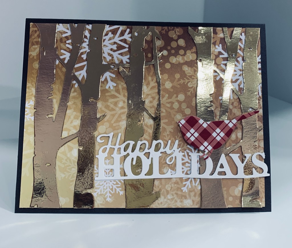
With Sympathy

Challenge #257

The recipe for this challenge was easy to follow, but it always surprises me how my brain can get stuck on something. Once I got it unstuck the card evolved easily. Supplies used include a piece of CS from the Craft Core – shattered collection (close to crumb cake in colour), an EB folder from Sissex Tim Holtz called Bricked, gingham ribbon from my stash and twine also from my stash, an old stamp set purchased years ago from Michaels but the actual brand I don’t know, all various silhouettes with the wheat being one, and a sentiment from a GKD set called Frames and Flowers. The little embellishments are also from my stash. Sadly I needed a sympathy card. I started by embossing the background and then added both the ribbon and the twine before adhering to card front. I stamped the wheat and heat embossed before fussy cutting it as you see here. Heat embossed the sentiment before fussy cutting around that too. The embellishments had to be searched for but work great once I found them. It is a fairly simple card but I’m happy with the result.

UnFrogettable!

Make the Cards Challenge #30

My new SSS stamp kit arrived today and I couldn’t resist using part of it to make a card. I liked the sketch idea at Make the Cards, (a new to me challenge site) and this is what I came up with. I cut some strips out of the plaid paper and added them to the card front. Using a Hero Arts Infinity die I cut the circle and stamped the frog. He was coloured using InkTense pencils and some Sakura glaze. I added the googly eyes and stenciled a small lily pad underneath him. This is partially covered by the sentiment strip also from the kit. Stamped the butterfly and made a booboo so covered that with a small bee button that I cut the back off to make flat. This is a fun kit and I shall have lots of time to play with it more fully soon.

Home Houses

Challenge #91

Recently the Cats Pajamas decided to go fully digital and consequently they had a sale of existing inventory. I took advantage of the sale and bought the stamp set and matching dies. These stamps were perfect for the Double Trouble challenge this week where they want a mix and match of dots, stripes and plaid. I used Distress inks in Rusty Hinge, Aged Mahogany and Lucky clover to stamp the bird houses. Then I used the dies to cut them out. What I didn’t realize until using them was that the die cut everything separately so I had to piece it all together which was a pain and very fiddly especially when I was trying to pop them up. Also I stamped first and then cut which meant I had trouble lining up the dies and I wasn’t happy with the cuts. Note to self is to use my Misti to cut them first and then stamp through the space. I used Sakura Glaze pens to colour in some of the uneven white edges. Instead of stamping the bird, I used the die alone on some gingham paper. Background piece is from an old paper pad and I added some raffia twine underneath the houses. Sentiment done in Aged Mahogany then clear heat embossed. In spite of the frustration with the fiddly parts I quite like the end result.

Puzzle Cards

First one
second one

As mentioned I am finally uploading a couple more puzzle cards using my new Hero Arts puzzle die . Inspiration came from both the Hero Arts blog and from Pinterest. The first one I made into a heart shape by building up the layers of pieces. I used some StampinUp pp for the design on both. How I used the brads on the first one is shown here. Added the layers to the card front and then added some ribbon as explained in the link. A few gems just for a bit of sparkle.

On the second one, I took out a few of the puzzle pieces leaving an empty space and then I adhered the whole thing to a scrap of black cs. Taking some of the PP I cut out a couple of butterflies and added them almost into the empty space. Used a heat embossed sentiment strip by MFT. These were fun to do and have a nice effect too.

Colour Hue Florals

Color Hues #24-Turquoise and Coral

This card started out as something entirely different in my head, but as I was playing with the flowers I realized my idea wasn’t going to work because the flowers were bigger than I needed. I’ve had these paper flowers forever and only used one or two of them. With limited access to my supplies when these popped into my hands I thought colouring them would work for the challenge. Had I been able to find the stamp set and matching die I was looking for I would have been able to do the wreath idea which is what was in my head.

I pulled out the distress inks Abandoned Coral and Broken China and brushed the colours onto the petals. I had 3 of the larger flowers and 3 of the smaller so I put them together to get some dimension. I also added the brad centers which I enhanced with some Sakura glaze. The PP is from StampinUp and was gifted to me by a good friend who also crafts. I cut a strip to add behind the flowers and then popped up the flowers on top. Using a sentiment strip from a new set by MFT I stamped in the same colours and then clear heat embossed it. I cut it up into pieces and glued as shown. This stamp was designed for a slimline design but works great cut up. The gems were added for some sparkle.

The Big Picture

#598 Colour Week

As I wasn’t totally happy with my challenge entry at JUG’s yesterday, I decided to have another go and this is the result. In fact I’ve been playing quite a bit with various ideas using the puzzle die I’ve just acquired. It is from Hero Arts and I’ve had some fun with it. I’ll add some of the others I’ve made later this week. This particular idea came from something seen on Pinterest, but I can’t tell you who did it originally as the photo doesn’t follow any links. Whoever you are thanks for the inspiration.

I liked the sentiment a lot so I recreated it on my computer and printed it. As you can see I used the challenge colours on the puzzle die and cut them out. Then I used a die set I’ve had for a while, but cannot remember the brand, to cut a small frame. Added some plastic to that and using foam tape mounted it onto the background piece leaving an opening to add the puzzle pieces. Once the pieces were inside I sealed the opening and added this to a card front. It is like a shaker except that I stuffed it so full of the pieces they don’t actually move about which, in a way, was what I wanted. The PP background is an old scrap I’ve had forever and it fit the colours so was perfect here. Added a few gems and considered it finished. I’m much happier with this entry than with the other one. The only annoyance is I can’t seem to get good photos yet. I don’t have the set up I used in my last craft room and until this one is completed photos are a bit hit and miss. All the cabinets and hardware were delivered today so we are getting close to having it installed and finished! Can hardly wait.

Butterfly Colours

#598 Color Week & Sketch Challenge PP555

With new two challenges and my need for a get well card I came up with this effort. I’m not sure I like it but it is colourful and looks better in R.L. than in the photo. I tried two different techniques for these butterflies, one was something I had seen Mindy Eggen do a while back where she used Perfect Pearls and the other used a combination of some heat embossing and Sakura Glaze pens. I used a yellow glitter powder for the lower wings. I think I prefer that butterfly myself. The glaze pens made the paper curl so I didn’t have to do anything to make it look as if it is flying. The lower butterfly is on a heavy card stock which wouldn’t bend but I did manage to get it to lift a little bit. Stamp set is from MFT called More Brilliant Butterflies and the sentiment is also MFT but called Itty Bitty Basics. The PP is something left over from a long ago purchase, I think from a Tattered Lace magazine, but can’t remember for sure. I added a few gems for interest.

In Focus Floral Frames

http://justusgirlschallenge.blogspot.com

just-us-girls-challenge-597-trend-week.html has a black and white challenge this week and I decided to try my hand at a black and white card slimline. Using my new dies from MFT I cut the circular floral pieces and after measuring the placements glued them to a white scrap piece. Added this to the same black CS and then onto the white card front. I then used the stamp set from the MFT kit called Friends Like You, to create the sentiment. Heat embossed in white and I added some black gems here and there to finish it off. This will be going to a good friend who is struggling with her hubby’s declining health. He has dementia and it is very challenging for her lately, although she never complains.

Masculine Christmas

http://thepaperplayers.blogspot.com/2021/07/pp554-clean-and-simple-challenge-from.html

I figured making a card for a challenge was the best way to get back into creating on a regular basis. Using a new die set by Recollections (found on sale at Michaels) and a new stamp set from The Cat’s Pajamas I first cut the border piece and used the center shape to stamp the image. I coloured the water, the gift and the scarf with InkTense pencils then added some Nuvo Crystal drops to the bears nose, eye and water hole. I also added some snow lines, to ground the bear, with a Sakura pen and went over that with the drops too. The bear himself has been done with a white Sakura glaze pen so he has dimension but the camera didn’t pick up on that texture. I added the die cut and image pieces to the blue background piece and then added that to the white CS. Using a scrap piece of the same blue I stamped the sentiment and heat embossed in white.

Happy Anniversary

It is hard to believe that the last card I made was in March and when I sat down yesterday to try to create something, I almost couldn’t remember what to do. My craft room is not ready, but my hubby set up my work tables for me and placed boxes so I could open and get into them giving me the opportunity to get back into my hobby. I can’t find everything but at least managed to set up some basic items for cutting, scoring and inking. I feel happier knowing I can sit and play even if the set up isn’t perfect.

bubbles

This card came about from items I had been saving from other store bought cards. The colours aren’t showing as well as I wanted as the card looks blue in the photograph when in actual fact it is a purple stripe on a purple card front. This striped piece was part of a thank you card that I cut up because I liked the stripe. The images are from a Papyrus card that was set up for a crafter to reuse. They even provided a piece that would scrape off the tiny gems from the card front. I used some of the tiny gems here but still have a few others for another design. I used a sentiment from a new set received, but not opened since it arrived, by MFT. Stamped in VersaMark and white heat embossed. The card is slightly bigger than normal so I shall make an envelope when sending it later on,

I also repaired the two cards I posted that had spelling mistakes so I can now use them later.