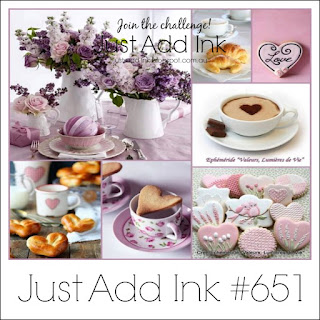
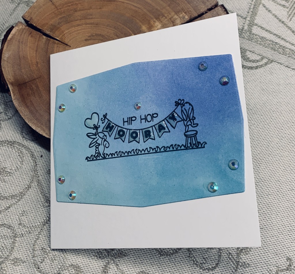
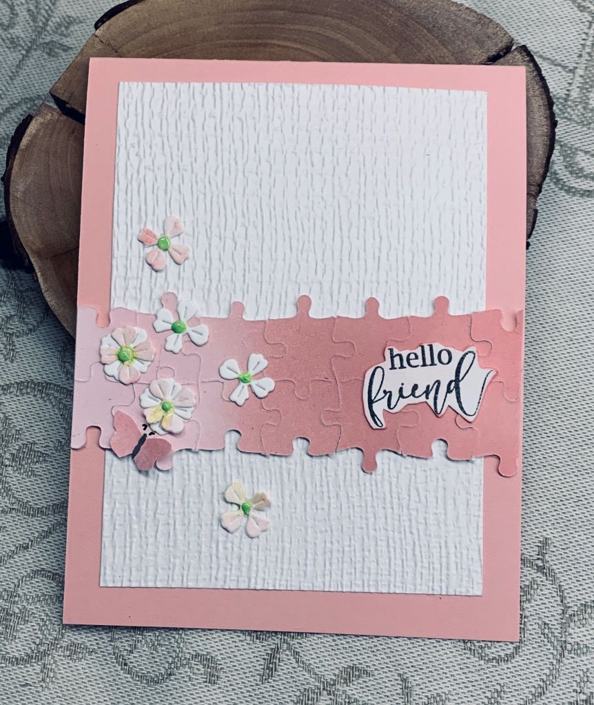
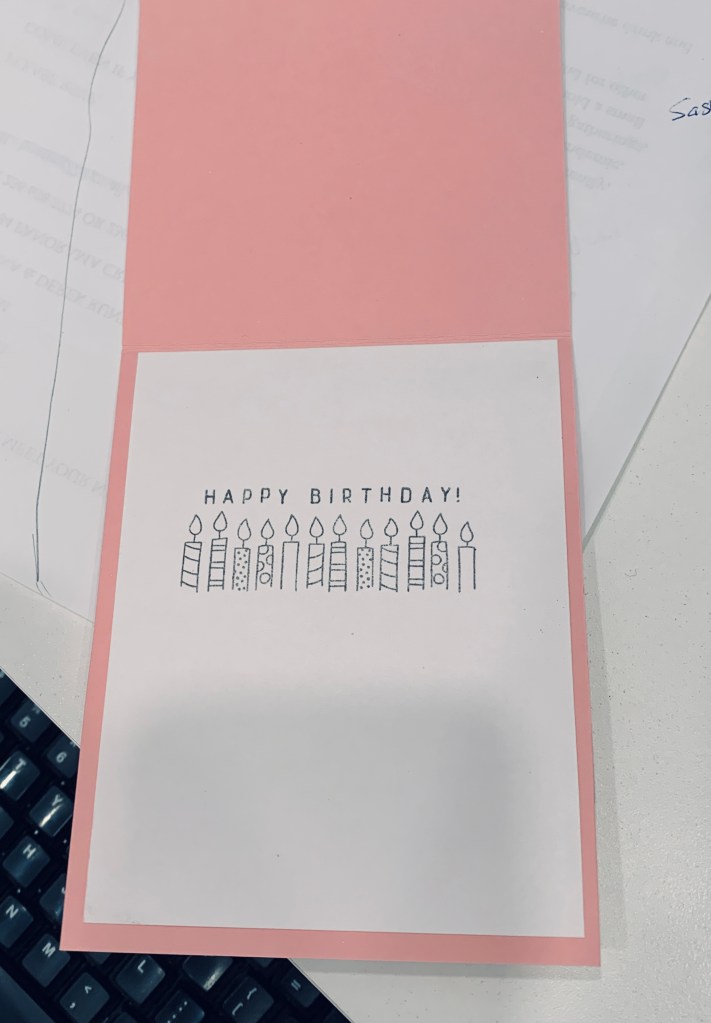
Just Add Ink has a Choose Two challenge and as I had this sponged piece left over from my frame card I decided to use it here. I also had the stamp set out and this little banner stamp spoke to me. Set is from The Stamping Village and is by LDRS Creative. Embellishments are Studio Katya I think. I kept it really simple and only added some Nuvo Crystal drops to the banner and the balloon.
For me this card is unusually bare and it is quite small too, but I like it. A good way to use up an inked piece.
When I started this card yesterday I had something slightly different in mind – then I messed up the entire thing because I forgot that the flower centers hadn’t dried and I smeared it everywhere. The air was colourful around here – LOL. At first I wasn’t sure if I could fix it so I left it overnight and sure enough this morning I figured out how to rescue it.
The puzzle strip hadn’t been fully glued down around the edges so I carefully cut off the messed up top and bottom part and basically started over. The two small flowers floating above and below the puzzle piece were easy to remove from the messed up panel so I was able to use them again as shown here. I also used a tiny fussy cut butterfly to cover up another area. Flowers are a die from Memory Box called Layered Impatiens. Sentiment is from a GKD incentive set and was fussy cut so it would be small. I doubled up a few of the flowers after adding a hint of pink to them. I hadn’t intended to use any dry embossing in my original idea but decided to add it to this version and the folder is from Tim Holtz. I can’t remember where the puzzle die is from and I sponged 3 different pinks over a panel before die cutting. Inks are Distress Oxides, Spun Sugar, Victorian Velvet and Worn Lipstick.
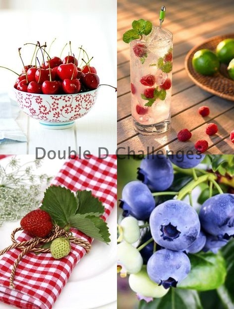
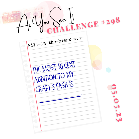
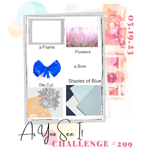
I think this card works for three challenges which I will list at the end, but I followed the recipe at As You See It for the general idea. I also CASE’d a frame done by one of the DT’s (Deborah Wheeler) as I liked it a lot. She used a different die and colours but the idea came from hers. The challenge at JUG’s is a mood board and I obviously used the colours from one of the images and the one at Double D is flowers. The main stamp set is from GKD and was gifted to me by a treasured stamp buddy. There are a couple of images that are from other sets. I took my photo and then realized I had forgotten one of the ingredients so I quickly added a sequin bow and took another photo. The die cut butterfly is from Crafters Companion and the fussy cut smaller one is from some DSP by StampinUp and I added a tiny bit of sparkle to both. The frame die is unbranded and I had issues with the last cut piece. Why a die cuts beautifully for a few and then terribly for one boggles my mind. Anyway suffice to say that I was able to hand cut the spots that weren’t’ cut through and then stacked the die cuts together to get a bit of dimension. The sentiment was initially stamped onto the layer but I didn’t check it carefully enough and the frame ended up covering the top word. I was going to float another piece over the top but I didn’t like it so in the end I cut off the missing word and added it alone. All in all I like the card which always a bonus.
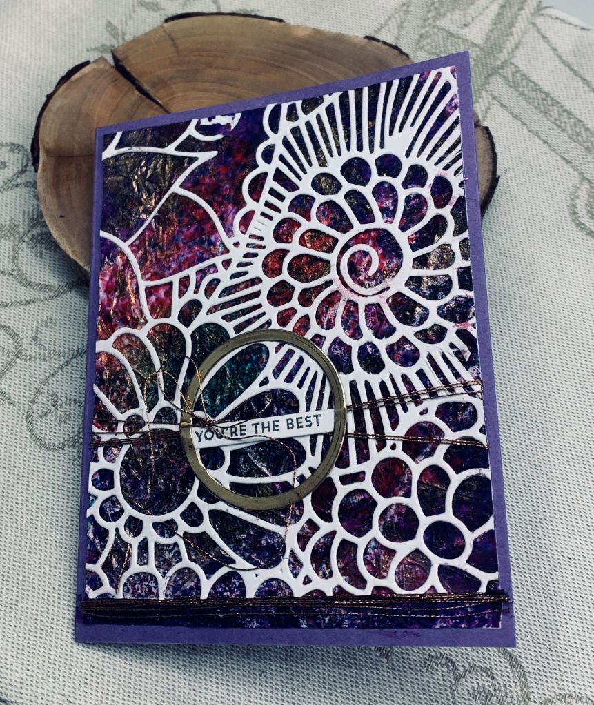
For a long time I have been wanting to try the tissue paper background technique and I finally found time to play. I made quite few backgrounds with this technique but haven’t used them all as yet. I decided on this one for the Cardz 4 Galz inspiration idea card. It is a very strong coloured background but so pretty with the white die cut added on top.
To do the technique I crumpled up tissue paper and without smoothing it too much, (I wanted the wrinkles). I glued it to some scrap card stock. As I glued it down I kept wrinkling the tissue so a few small ridges occurred. When the glue was dry I used Colour Burst powders and a spritz of water to blend them with this result. After the colour had dried I took some gold paste on my finger and gently added it to the ridges here and there.
The die cut was cut down to fit and then glued on top of the background. Die is from Stamplorations. I had the gold frame circle leftover and added a thin sentiment strip behind it. Sentiment from Itty bitty Basics by MFT. Using some fine thread I added some to the layer winding it round and round until I felt there was enough and then I tied a small bow. Also added some thread to the bottom of the card for more interest. I kept the sentiment very simple and small because this is a busy card. For the same reason I’ve not added any additional embellishments.
Thanks for dropping in to take a look and I wish you a beautiful day. Your comments are appreciated and welcome.
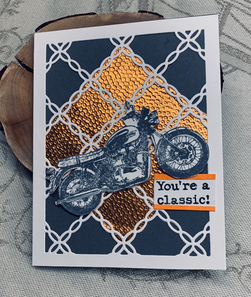
Although orange isn’t a colour I use very often it can be quite good at times. I needed a card for my BIL who loves motor bikes so I decided these colours would work for him as they are not too girly. The white die cut is from an unbranded die and the orange coppery embossed paper in the background is a leftover piece from so long ago I’m surprised it was still intact. I used a slate gray card base and Hickory Smoke ink to stamp the bike. I added a bit of silver pen here and there. Stamp set is classic motorcycles by Darkroom Door. Once it was dry I fussy cut around it before popping it on top using foam tape. Believe it or not the hardest part of this card was making the coppery paper fit the center of the die cut piece. It was awkward because the paper was a weird shape from use in a previous project.
I quite like the end result and think it is a decent masculine style card. Thanks for stopping by and enjoy your day.
I was supposed to go paddling in the Angel’s Abreast dragon boat today, but I’m not allowed and I can’t go to yoga tomorrow either. I woke up this morning with some issues at the tooth socket and after a visit to the dentist am now stuck at home instead of enjoying the outdoors. Fortunately the issue isn’t serious and the area is healing but my stitches aren’t holding as well as they should so I now have to be extra careful. Hopefully by the end of the week they can come out and I can go back to normal.
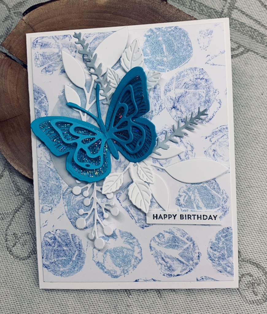
In the meantime I’m watching how to videos and making a card or two. I really like watching Natasha Foote and my post today features one of her techniques using bubble wrap. The challenge at Colorful Options called for blue and this is my take on both Natasha’s card and the challenge colours. I found a piece of the larger sized bubble wrap and followed along with the tutorial getting this background. I added a bit of blue embossing powder to the wet areas so a couple of my bubbles change colour slightly but the main colour used was Blueprint Sketch. I cheated a little bit as the butterfly is from a deconstructed card, received from a stamping buddy, as it was too pretty to discard. Thanks Gayle – it really is a lovely butterfly. Various dies were used for the foliage all cut from scraps of white CS and I added the pale gray blue Lavender stems as well. The sentiment is from an MFT set called Itty Bitty Basics and is one I go back to a lot because sometimes a tiny sentiment works best. The texture one gets from using bubble wrap creates a lovely and different background and it is fun to play with too. I really like how this card turned out and plan on doing more backgrounds using the technique.
Thanks for taking a look, it is appreciated. Hubby wants me to make a larger background for him to photograph. He turns them into textures for his photography projects. Maybe I’ll do that next and he can have fun too.
Since having my tooth extracted I haven’t felt in a creative mood, but I really did want to enter a few challenges if I could so yesterday this is what I came up with. It works for four challenges which I’ll link to at the end.
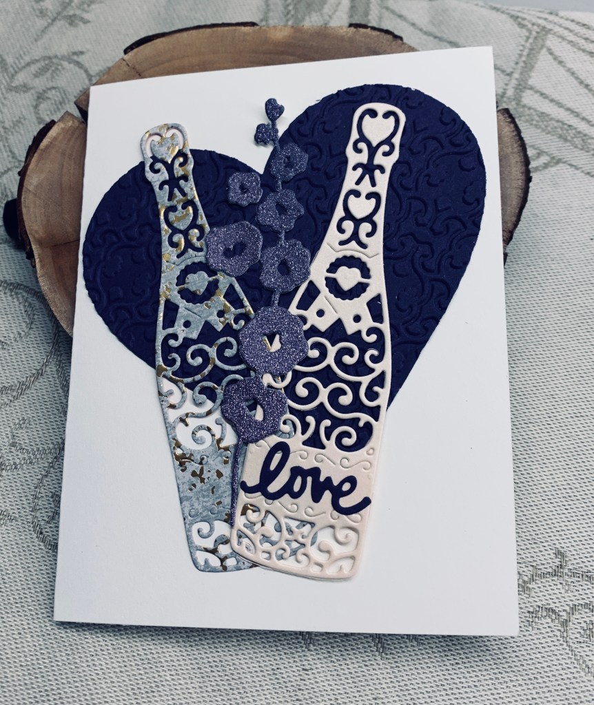
Although it is hard to see in the photo the background heart is embossed with a folder called Brocade by Craft Concepts. Die used is from Hero Arts infinity dies. The champagne bottles were cut using a die from Tattered Lace and some scrap CS. The word is from a set I got in Hobby Lobby when visiting a friend in the USA and the flowers are an unbranded die cut with a scrap piece of glitter paper.
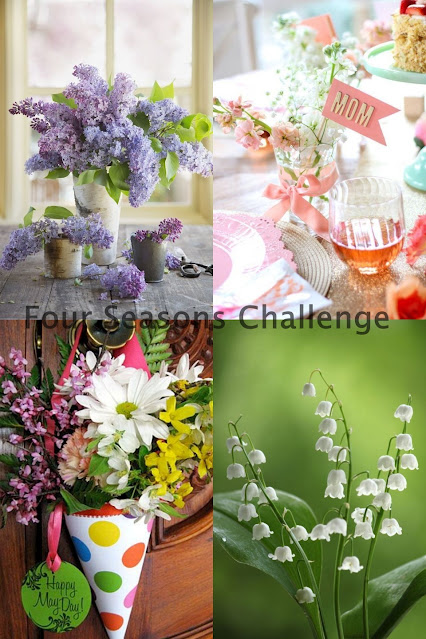
It took me a while to decide on how to use the champagne bottles, but when I thought of the heart it all fell into place very easily. Lately I don’t seem to need wedding cards but the theme at JUG’s is weddings so I kept my card with the theme, but ensured it could be used for other events rather than have a specific wedding sentiment. The purple the Fourseasons challenge inspired the colour, A twist of floral on top of the embossed heart works for CYHTP and anything goes works for Crafting Happiness.
Considering my mood yesterday, I’m surprised at how this card turned out as I actually like it. Sometimes I don’t as you know.
Thanks for stopping by and I hope your Sunday is lovely. Our weather has turned hot and sunny and my garden is beginning to look beautiful.
The other day I was digging around for a specific stamp and came across this one which I’ve had forever and only used a few times. I’ve been told that it is depiction of a famous Japanese painting. I remembered that the challenge at Shopping our Stash called for a woman, so with these 3 I guess I meet the criteria of the challenge.
My initial impression was so off that I canned it and began again. It has been so long since I used a larger wood block stamp that getting a good impression was a challenge on its own. In the end I went over the stamped image with a black fine tip pen because I couldn’t get the hair dark enough. It was stamped onto Bristol CS and then I coloured it. For the skin I used Ohuhu pens but the rest is done with pencils. Because my stamping wasn’t perfect I decided to make a black frame to cover up the poor frame lines of the stamp. The focal panel was added to the PP which is from StampinUP, and then onto the card front. Stamps are from Hampton Art and Stamps in Motion, (I don’t think they are in business anymore).
I had this card partially done on my desk for a few days, but got busy with other things. Having had my tooth extracted yesterday, I’m not allowed to do any gardening or vigorous exercise for a few days so today was the day to finish it. My pots are ready for plants finally, but as putting in the plants involves some bending I’ve decided to wait until Sunday to plant. It is also becoming very hot outside and the forecast is that the heat will continue, so I guess summer is here unofficially.
Thanks for stopping by and have a great weekend everyone.
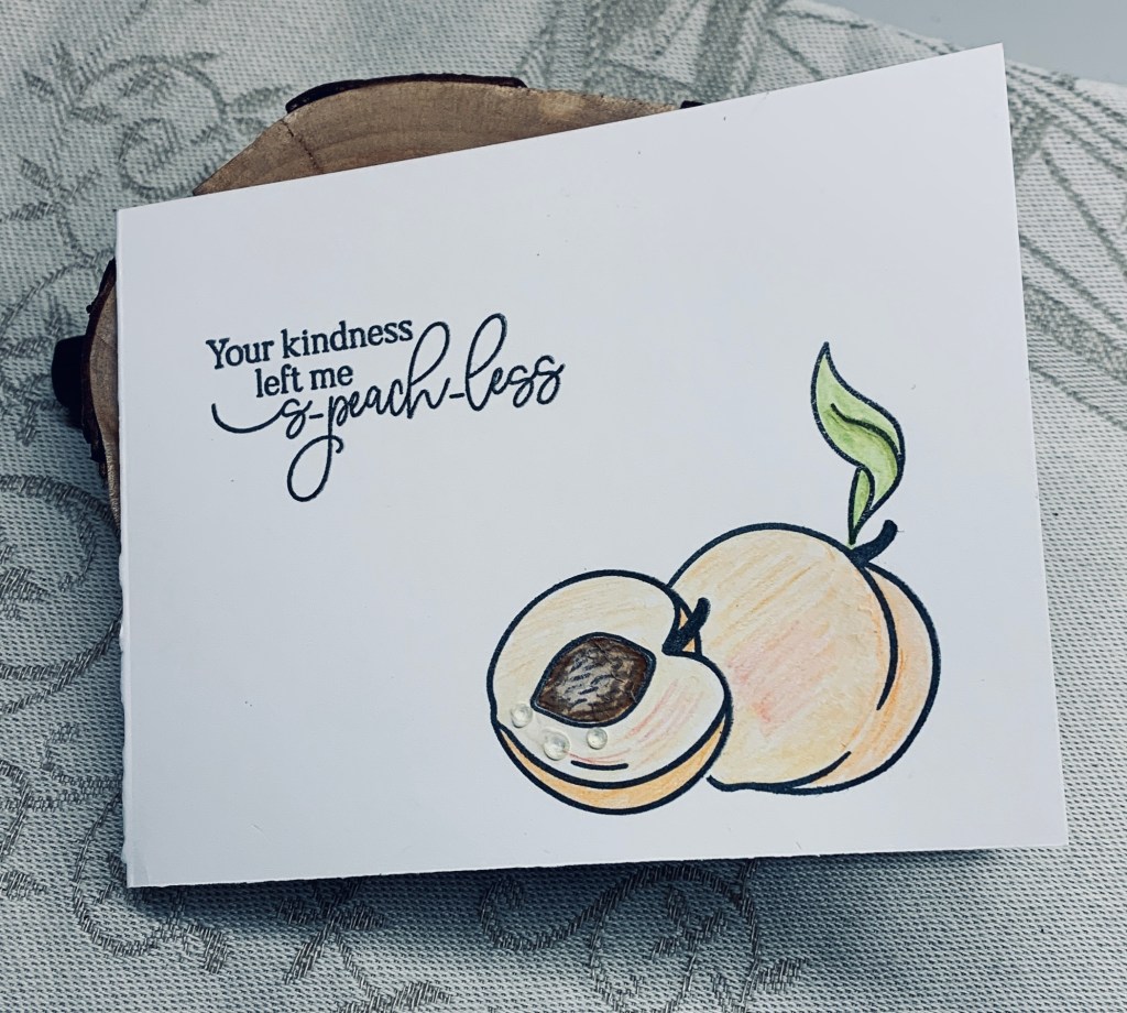
Its a bit early for peaches in my region, but I am looking forward to the fresh produce that will be starting to arrive, and peaches are one of the fruits I love.
I used a MayMay Made It stamp set called Just Peachy for my simple and very easy card. Some stamping using my Misti masking off the half peach to add the whole one, a bit of colouring, a sentiment and it was done. I used watercolour pencils and then added some tiny water drop embellishments for some dimension. I thought they made the peach look juicy. Its a good set for a thank you card and I like the play on word sentiment.
Our weather is becoming warmer by the day and the forecast is for some very hot days coming up. I’m glad we got our tanks filled as I suspect we shall be needing the water. My pot painting is complete and successful so we shall be setting them up with plants over the weekend. I guess my crafting will slow down so I can get out into the garden. Its a good thing I have a stash made so I can send birthdays as they come up.
Thanks for popping in, I appreciate it more than words can express.
Two challenges with one card is always a huge bonus for me. At As You See It: Challenge #298 – New Stuff, and at Just Add Ink it was a mood board in colours that I love. Combining the two was fun.
My new stuff incorporates several items, one is the border die used on the glitter piece, two is the shape of the PP behind the birds, and three is the birds themselves. Its a new stamp set and only one bird had been inked until now. They came from Your Next Stamp as did the shaped die, and the border die is from Heffy Doodle. I had the PP in my stash and thought it would look good behind the birds. The little birds were stamped, heat embossed and coloured with watercolour pencils. I die cut them with Hero Arts infinity circles and added the scalloped circles underneath, cut with a Sissix set. Sentiment is from the same set as the birds and I heat embossed in white onto the purple paper. The little birds were initially stamped with Versamark and then clear embossed but they didn’t stand out enough so I went over them with a fine line pen. I’m surprised that I didn’t mess them up. The purple paper is a very rich colour but looks more black in the photo. Embellishments are from my stash.
I kind of like the end result, but it isn’t quite what I had in my head when I started. Thanks for popping in to look, it is appreciated.


.png)