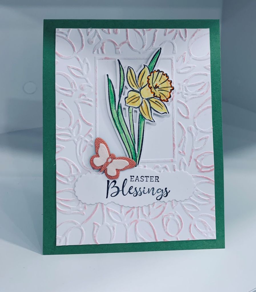
Two challenges, one using blooms and keeping it fairly CAS and the other to use an embossing folder and this is the card I came up with that works for both. Perhaps the embossing makes it more busy than Paper Players would like, but when I look at the DT images most have layers of some kind.
The embossing folder is from Crafts Too called Tulip frame and after embossing I cut it down a bit and went over the high points very gently with spun sugar ink. The daffodil and sentiment comes from a new StampinUP set that I coloured and die cut as does the butterfly. It is made just from the tiny dies that came in the set. I added it to a green GKD card front. The sentiment was die cut with an old label die that I got in one of those reseller stores like HomeSense but I don’t know who made it. I’m happy with this card and it wasn’t difficult to make.
In looking through some challenge blogs I realized that the Sisterhood of crafters challenge was another I could enter into with this card. My Hero Arts stamp set is approximately 12 years old and the GKD set is at least 5 years if not more, so I am able to use this card for two challenges.
When playing yesterday, I couldn’t resist making a background that I thought I would use for this challenge. My mind went in a different direction while I was waiting for it to dry and I ended up making the generic one, and although I used a small piece for the balloons I still had this lovely background left. After adding it to a square card front I thought it would make a nice ocean look card so I dug out my Newtons Nook set, a very old set from Hero Arts, and one from GKD. I stamped the octopus and fish on coloured card stock scraps and used a Sakura glaze pen to colour in certain sections. Of course the colour unexpectedly changed on contact with the yellow and became a green and on the teal fish it changed again to a different green. But the predominant colours are still pale teal and yellow so I think it fits the colour challenge. I stamped the shells (Hero Arts at least 12 years since purchase) masking and fussy cutting and added the smaller one as a separate piece. The sea fronds are from GKD and I stamped and fussy cut those along with the sentiment from the same set. I used a fairly thick foam behind the shells so I would have room to add things behind them. I tucked in the octopus as you see it and then added the fronds mostly flat behind and on the edge. Added the fishes and some tiny gems for bubbles. This mineral paper makes wonderful backgrounds and I’m going to try some of my color burst powders next.
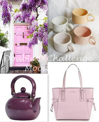
Pale teal and yellow go well together and can be either masculine or feminine depending on the image used. My card uses a layered birthday greeting and balloons so definitely for either gender. Die set used is by Spellbinders and I cut the bottom layer in the teal, a second in some gray DSP and a couple of extra balloons in both teal and some scrap from a background I made. Its funny how the colour darkens a bit in the photograph when in reality it is fairly light. Once I had all the layers on the card front I added a few tiny embellishments from my stash.
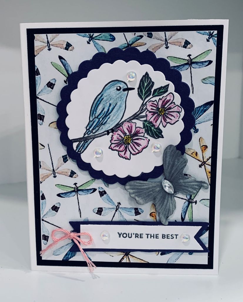
A new stamp set from StampinUP and some pretty paper found online set the stage for this card. I have wings all over this card so it is perfect for this challenge. Once I had stamped the bird image, I coloured it using Inktense pencils and a little Sakura Glaze for eyes, feet and beak. I used a nesting die set by Sizzix to cut the circles. Using foam to pop it up I set it aside until the rest was ready. In a search for some dragonfly paper a while ago I came across this pretty design and thought it would make a good background here. I added it to a black layer and then to the card front. Added the Circle layer, some embellishments and a small paper butterfly. Using a label die from MFT I cut the background piece for the sentiment and added the white layer to that after stamping. Sentiment is from Itty Bitty Basics by MFT. I added more embellishments and a tiny bow before I called it finished.
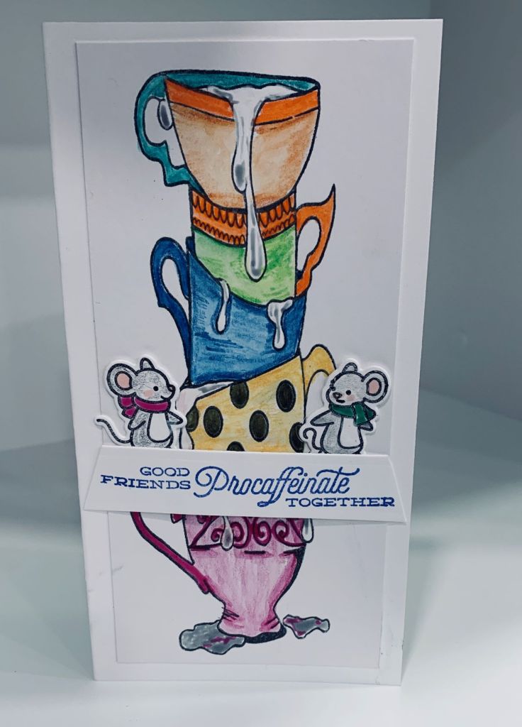
This stamp was purchased from Joy Clair a while back and this is the first time I’m using it. It works beautifully for this weeks challenge and I made a mini slimline using the image. The sentiment comes from a GKD set and the little mice are LawnFawn. The images were coloured with a combination of Inktense pencils, Sakura Glaze and Prisma pencils for the mice. I kept this very simple but felt I needed the little mice to denote friends.
Remember my comment about mineral paper and die cutting? Well here is what is left of the background I created for my Mardi Gras post that didn’t work for that particular card. Only one feather actually die cut the rest just left embossed impressions. Personally I like the way the Inka Golds worked on this paper and it looks nice embossed too. Anyway I had few feathers left from that project so I coloured them and I paper pieced one back into the space that had been die cut. I added the feathers to the mineral paper and then added all to the card front. Dressed it up with a blue ribbon and some pearls. As the Sunday stamp challenge is any shape, the feathers work for this and the colours work for Make my Monday so I managed a twofer. The sentiment came from an MFT set.
Having checked out the Less is More blog, I decided to enter a card into the current challenge. It gives me an opportunity to practice doing CAS cards, which are not my forte. As well because I used masking it also fits the challenge at Just Add Ink.
A book I’ve just read had an interesting image on the cover as well as at the beginning of each chapter and I’ve been wanting to try something similar ever since. Instead of a boat I chose the tail of a whale from a Hero Arts kit I’ve had for a while. First I made a mask so I could do the circle only then I stamped the tail. Then I added some masking tape across the middle after I had masked off the tail, for the sunshine, which I sponged on using Scattered Straw Distress Ink. Using the Kitchen Sink multi step By the Bay stamp set I added the water effect. The sentiment comes from a SSS set called Be Kind. The tiny drops denote water droplets and are from my stash. They are Swarovski crystals and really sparkle in the light. I used mineral paper for my images and I got very good results using it.
Anything Goes Embossing With A Twist of Plaid – Honestly I think I should have called this card the forgotten element. Yesterday I did a card for another challenge that when I began, I thought would also work for this one too. When it was ready to post I realized that I had forgotten an element necessary to include it for this challenge. This morning I began this card and was ready to upload when I realized once again I had forgotten the same element. Not wishing to begin again I searched for a solution that I could make work and while it wasn’t quite what I planned it at least fits the challenge now.
I started with the Kraft card front to which I added the debossed side layer of gold. Folder used was Tulip frame by Crafts Too. Then I took a scrap piece of DSP and embossed that with the folder called Brocade by Craft Concepts and added it over the gold piece. Using a new die from MFT called piece of my heart, and some striped paper I had created using scraps a while ago, I die cut the heart and embossed it with the same folder as the DSP layer. I glued this to a piece of white CS and added that to a small piece of the mat gold. Offsetting it slightly I glued it on top of the rest. I added a ribbon and some flat back pearls to the heart layer. Then I came to the sentiment which I initially stamped onto white CS and added at the bottom. It was at that point that I realized I’d forgotten the plaid. To find something that would work and not clash or detract from the rest took me some time. I went through all my DSP and all my scraps before coming up with what you see here. I stamped the sentiment from Friendly Hello by StampinUP using Vintage Photo ink onto the plaid and then carefully cut around it so it would fit at the bottom without covering up too much of the rest. Plaid isn’t my go to in any design although I do use it once in a while. Don’t know where my head was at yesterday or this morning – lol.
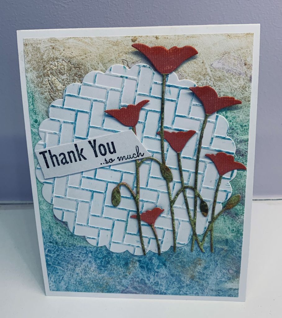
As I mentioned in my Mardi Gras post I had made a background from which I intended to die cut feathers, but the mineral paper wouldn’t cut. I decided to use it as a background here and in a couple of places you may see the edges of some embossed feathers, although the embossed circle does cover up a lot of it. For the embossed circle I used a folder called patio brick walk by Lifestyle Crafts. I used an ink pad directly over it very carefully to add a bit of colour. The sentiment is from an MFT set I’ve only had for a short time. And the poppies are an unbranded die. What I did was cut it twice, once in the orange PP and again in the green. Then I trimmed off the flowers from the green piece and carefully glued the 2 pieces together. I really like how it turned out doing it this way. I added a touch of ink to the buds before attaching it all to the card front. I meant to have this card work for two challenges but forgot an important element for the 2nd challenge so I shall have to do another for that one.
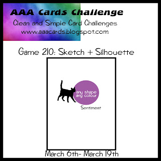
This card isn’t an exact interpretation of the sketch, but I’m going with it regardless. Using a new StampinUp stamp set called Kite Delight I picked one of the smaller kites and stamped it in dark red. I masked off the kite and then stamped the cloud from the same set. Then I stamped one of the trailing strings on a separate piece so I could fussy cut and only use a portion of the string. As I wanted my orientation to be slightly different after I fussy cut I turned it over and coloured the back side before adhering it flat. The little silhouette is from an old GKD set and I did some stamp surgery so she could hold the end of the string. Then from that same set I used the sentiment stamp that seemed most appropriate for the mood of this card. The kite flower centers were coloured in a sparkle gold using a Sakura pen and I also added some sparkle to the trailing string bows. To cut this panel I used a die from the mixed edge rectangles from Essentials after which I added it to the card front.