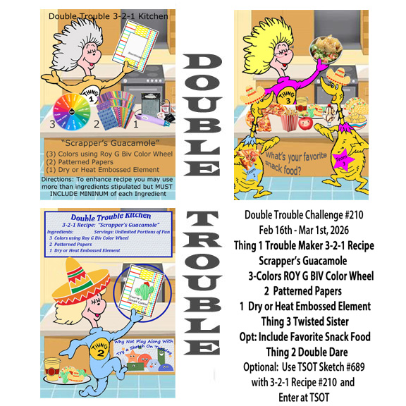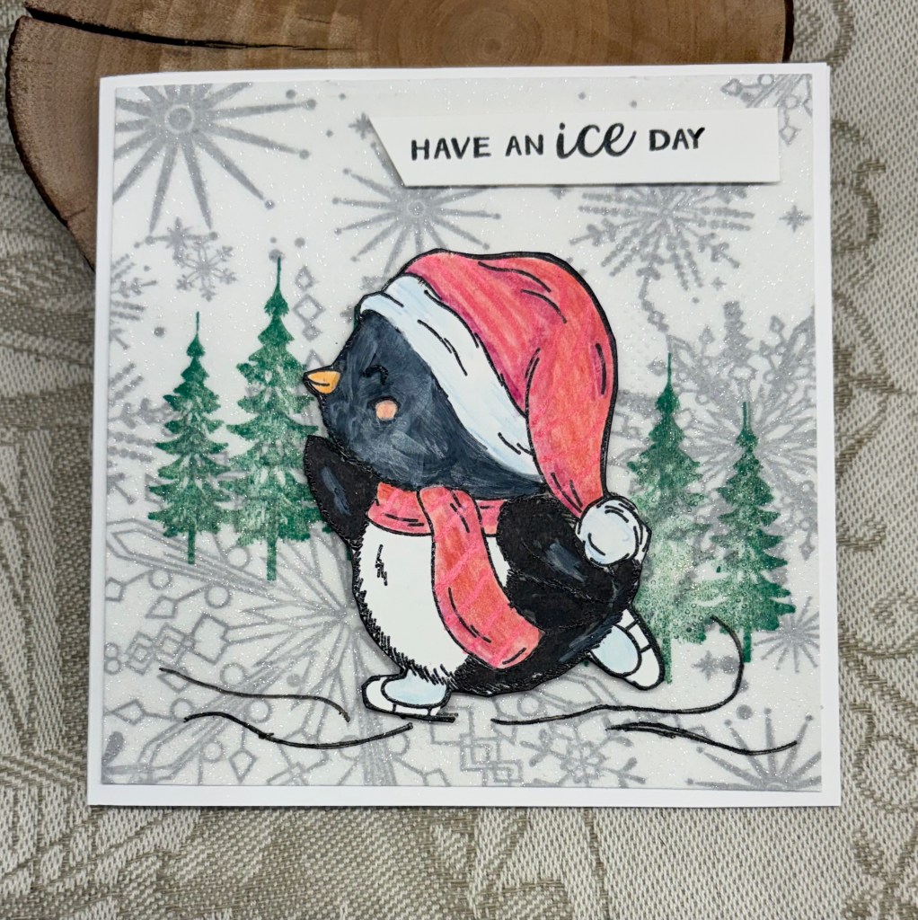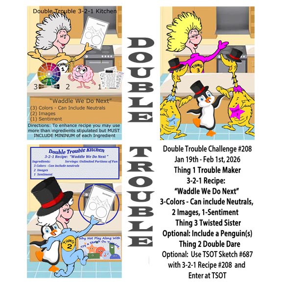
Welcome to another challenge here at Double Trouble. Our theme this time called Scrapper’s Guacamole and you should use 3 colours from the ROYG BIV colour wheel, 2 pattern papers and a dry or heat embossed element. To earn another chance to win you can enter TSOT with something that works for the sketch. Just be sure you are entering without accidentally back linking.
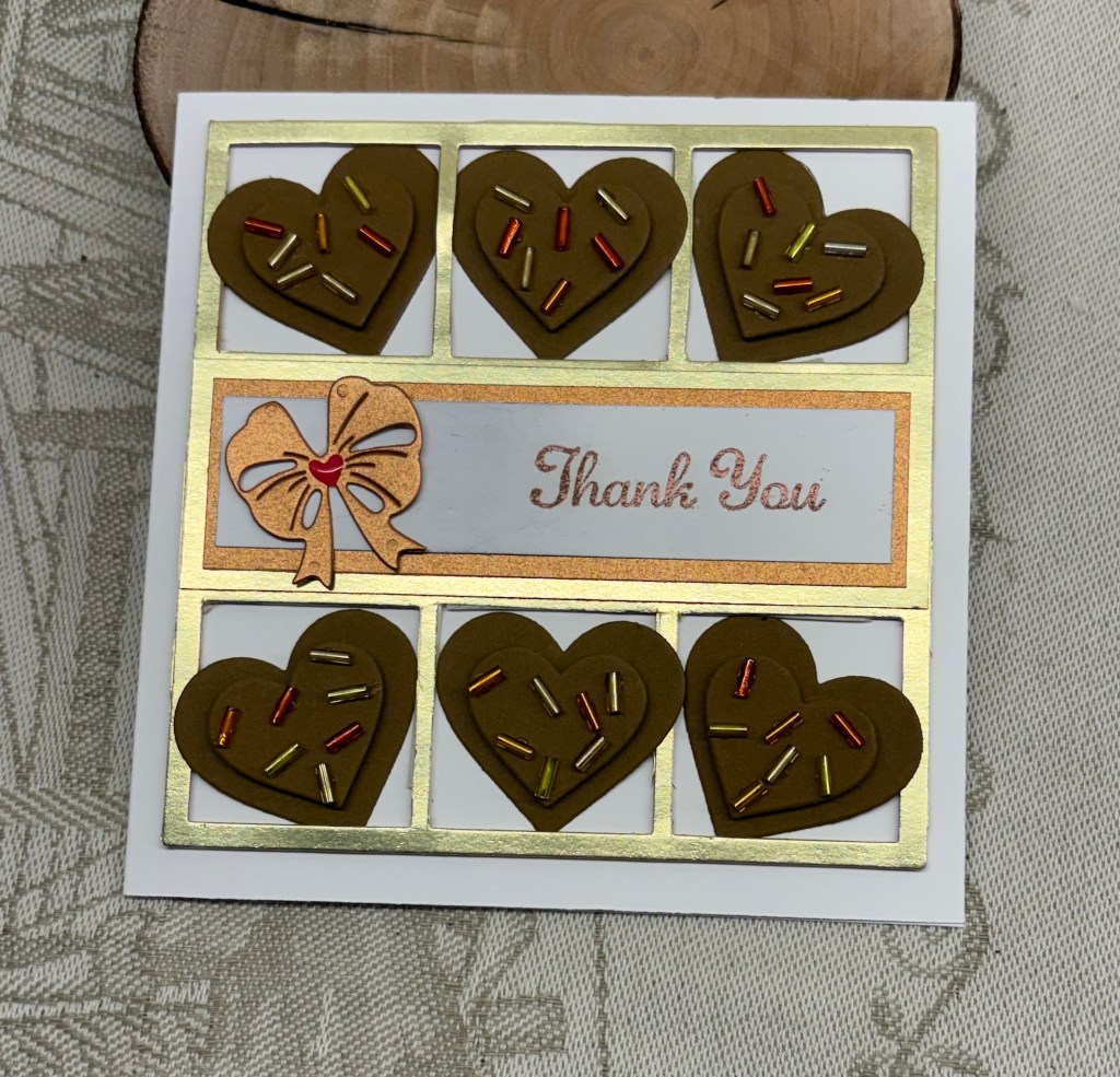
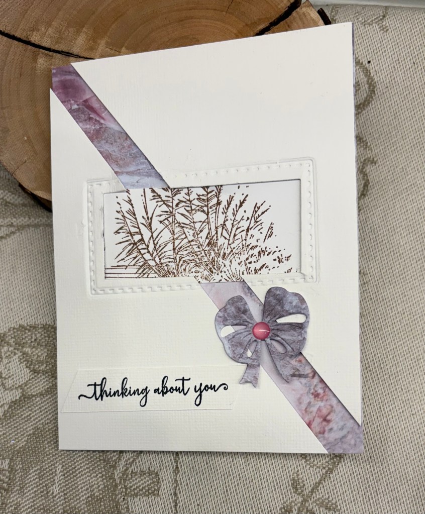
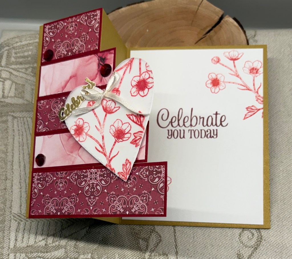
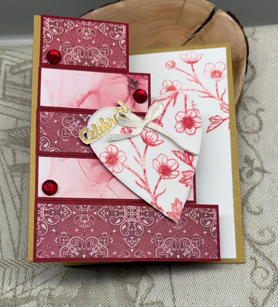
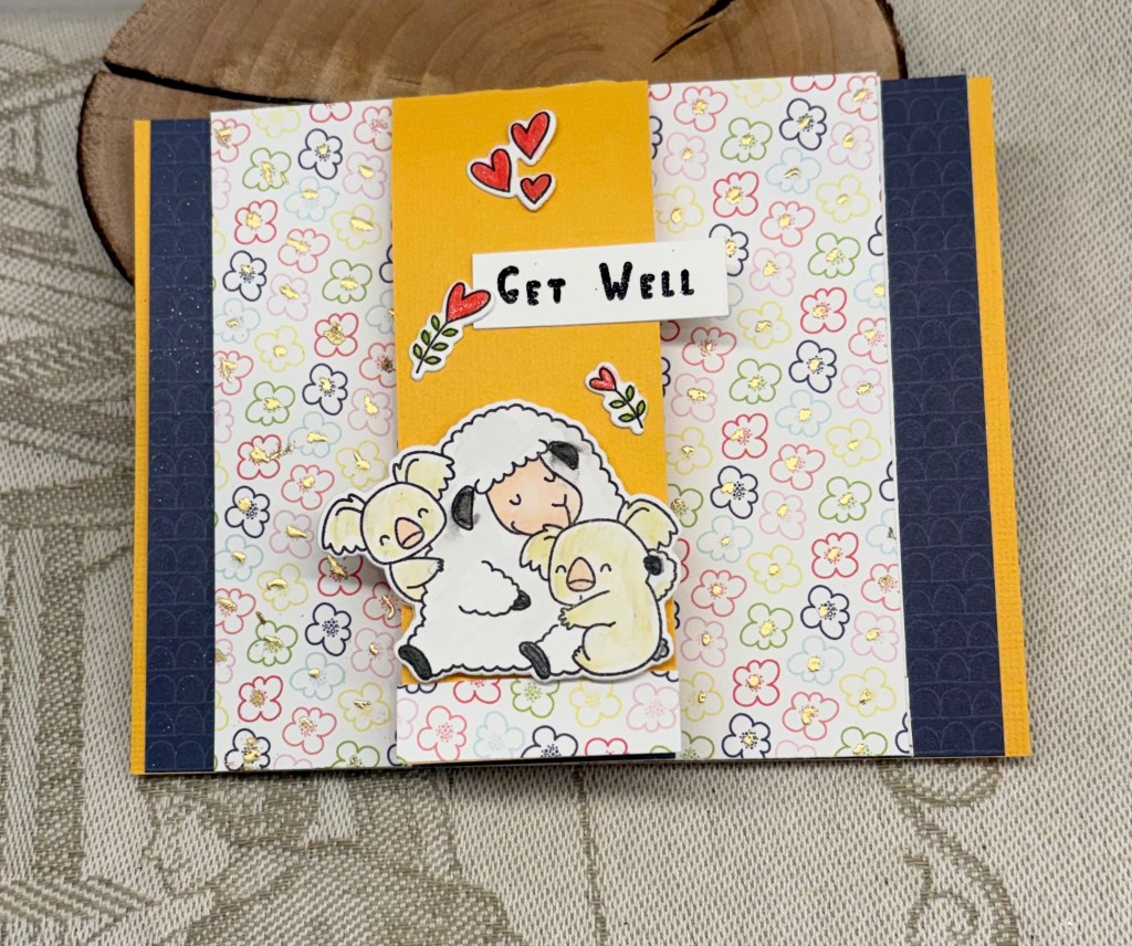
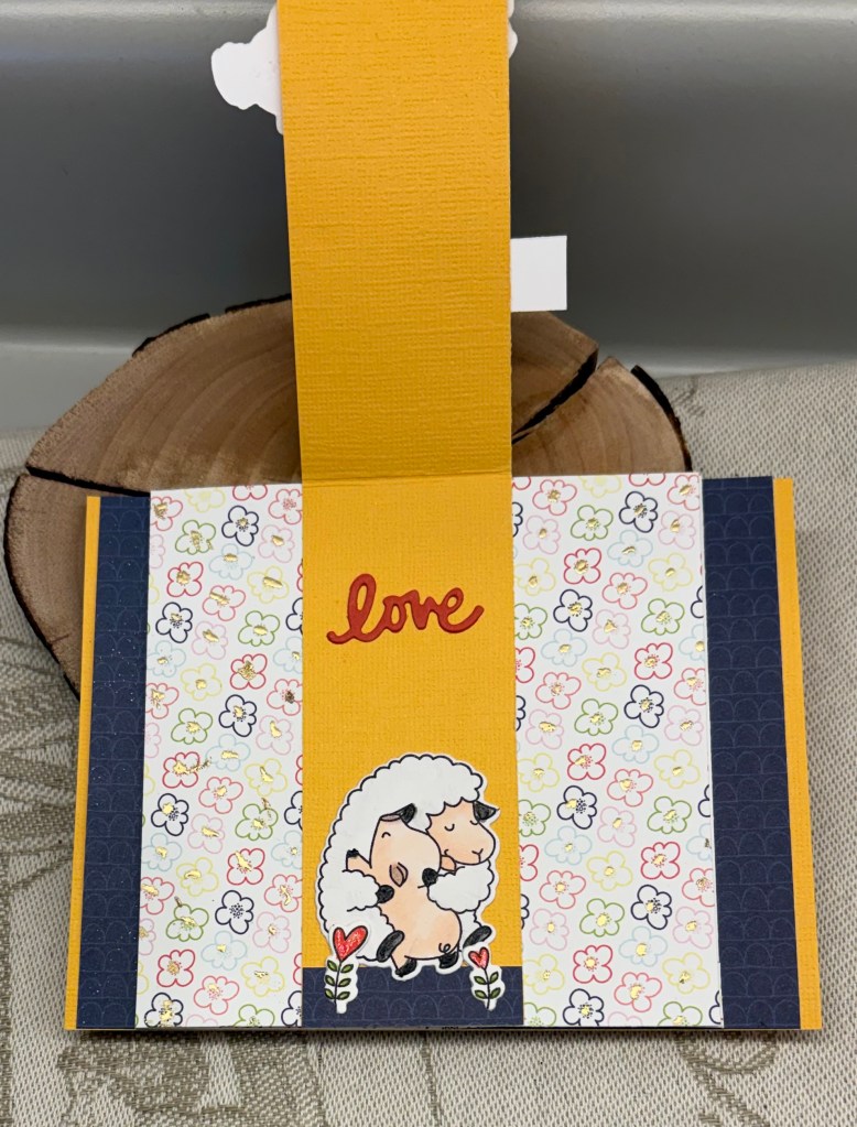
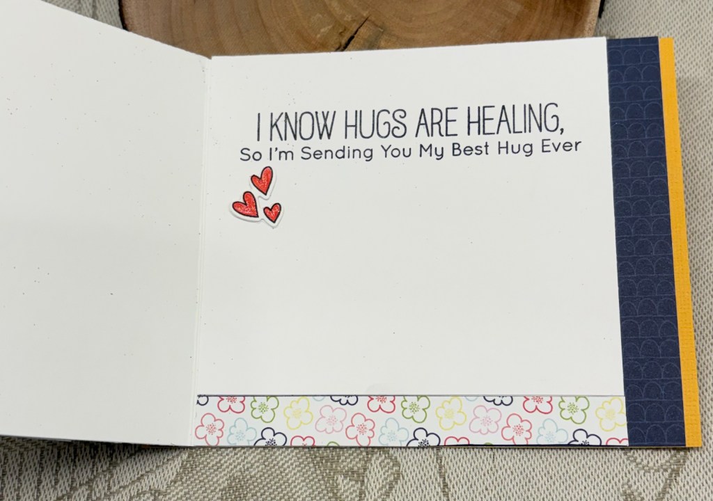
I chose to do a get well theme because I have a friend who is not well at the moment and this should cheer her up. My patterned papers are from SSS, my stamps and dies are from MFT with one from Catherine Pooler. I’ve had this MFT set since Covid and have only used one or two stamps from it until now. My colours are reflected in the card stock – yellow, PP has various colours, red, green and pink pencils and alcohol ink pens for colouring the images and my embossing style uses heat with gold flower centers and an embossed Get Well sentiment. To be honest, I almost forgot the embossed element and had to scramble to add it so I used a Wow embossing pen on the flower centers and heat embossed them as best I could considering the card was already assembled at that point. The get well sentiment was also a last minute addition.
For anyone wishing to make this style card, I used a tutorial found at Lisa Curcio. She gives several samples and her printed project sheet makes it easy to do.
Thanks for spending time with me today, I appreciate you and any comments you may leave.
We look forward to seeing your cards in our gallery, have fun and good luck.