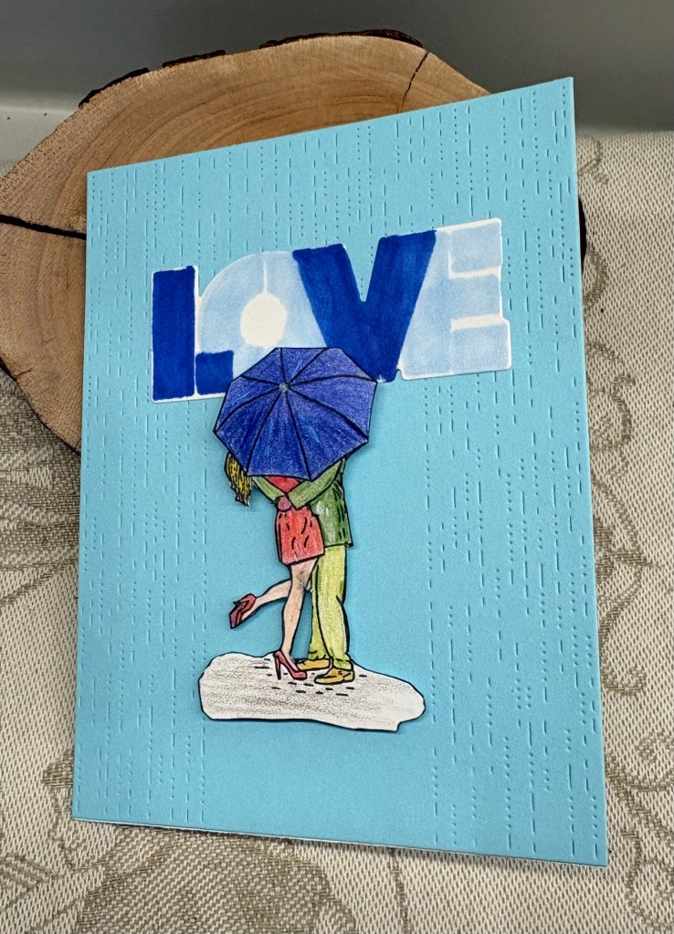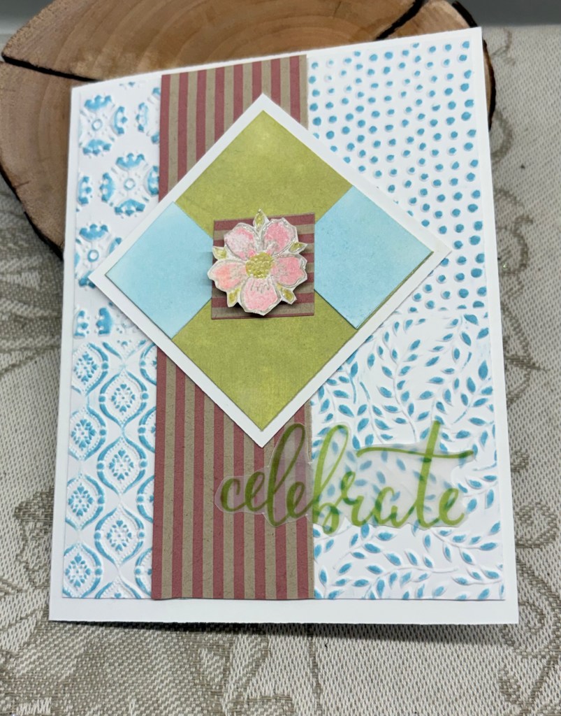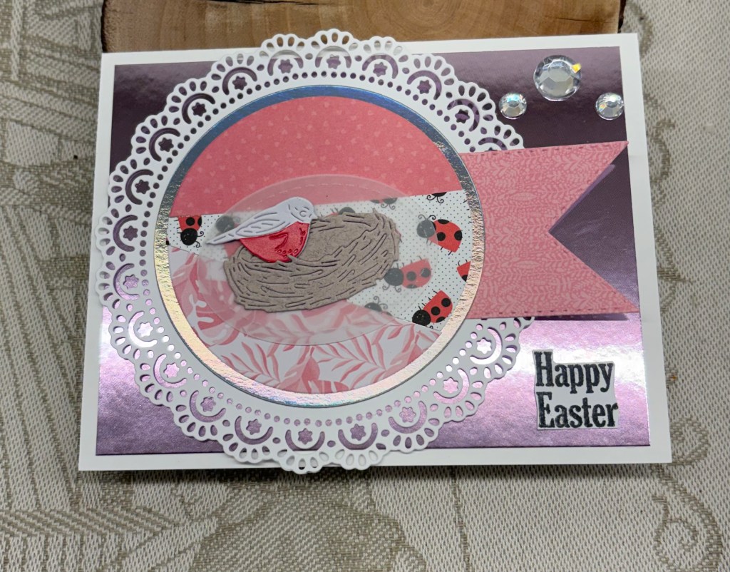
I’m fortunate in that this card works for two challenges so it will be entered into the current As You See It and at CYHTP challenges. At AYSI, it is a kind of a recipe challenge where 5 elements have to be used but how you use them is your choice and at CYHTP it is the usual embossing but with a twist of flowers and my folder (unbranded) is all about roses.
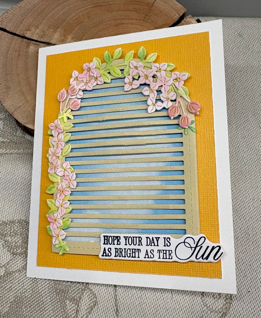
I started with the embossing after testing the folder on some craft CS. I couldn’t remember which side was the debossed side and my initial thought was to ink the folder. However, my test piece looked quite nice (to be used later) and I decided to emboss a pink piece of CS and then used a darker ink from Hero Arts and swiped over the raised parts. Once this was dry I added this layer to the white card front. It took some thinking to decide how I would do the frame requirement and I played around for a bit before deciding on a StampinUP circle set. I found a darker pink paper and die cut the circle leaving me with this empty square frame. This was cut down a bit more to narrow the edges and then I added it to frame one of the roses. Using the same paper and an MFT word die I cut two layers of the word, glued them together and added it underneath.
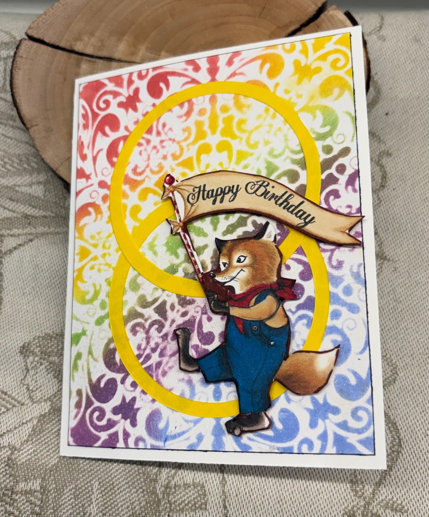
Being completely truthful, I am not feeling very creative at the moment so I’m just pleased that I got something made that is decent if not inspired. We’ve been dealing with accountants and taxes, which I find emotionally draining, as messing with numbers is something that often upsets me. Our accountant is transitioning into retirement after more than 20 years of looking after us, and has passed our file to another person who doesn’t understand my number phobia at all. Once this tax season is over we shall be looking for someone closer to where we now live and whom we hopefully will like. As my hubby has had cataract surgery and the second eye isn’t settling well yet, it has been challenging for him to check the documents before they get officially filed. It meant I’ve been more involved than I normally would be. Stress levels for both of us were pretty high, but this morning we signed it all, and went to the bank to make the payments. I hate tax season, sigh!
Thanks for stopping by, your time and your comments are appreciated.