Three Wishes

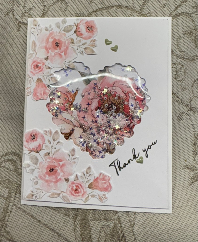
It always interests me to see where inspiration, especially my own, comes from. We were getting coffee at a local coffee shop and they had some thank you cards from customers displayed. One of them made me look twice and this is my idea based on that design. Seize the Birthday #330-One or More Numbers is the challenge it is intended for.

I have several new and unused products laying around and the trees on this card was one of them. It is an MFT die set that I got on sale. The cloud die is from a new unbranded set and the faces on the trees are from a MayMay Made It set, which I’ve had for ages and only used once or twice. I tried several ways to stamp a sentiment using a combination of different stamps and disliked them all. In the end I created it on my computer. All the paper and card stock is from my stash and I tried to keep the same colour tones in the shaded part of the trees as is on the gingham paper. I added two Waffle Flower, similar in tone green, enamel dots to the sentiment.

While searching for ideas on the Internet regarding wishes and trees I came across a book, intended for children, and it is a Traditional Folklore story about three trees. I tried to incorporate this into my sentiment but it would have been too long and too big, so I opted for what you see here. There are times when I wonder how we managed without the Internet?

Considering that I figured this design out without resorting to tutorials, I’m quite pleased with myself and I also like the end result. Thanks so much for stopping by, I appreciate you, your time and your comments.

Friendship Card

folded front of card
opened card

Welcome to another challenge, #280 chosen by Debbie here at cardz4galz. This week we would like to see cards relating to friends/friendship and I used a pre-folder card that I have had forever and only used one or two of.

I’m not sure of the name for this fold but think it is a swing fold. Normally it would be usual to add pretty paper using the template that came with the cards, but I opted to something different. I had these gold squares already cut as they were left over from another project and I decided to lay them out in this design. I did play around with the placement a lot before deciding on this. Using two stamps from a Hampton Arts set I stamped the sentiments and heat set them, one in gold and one clear. The using a flower from the same set I stamped the rose on the front part and coloured it and the one on the inside with Prisma pencils. I had the thin paper strips leftover as well so I added them as you see. Then taking the paper that matched the strips I turned it to the 2nd side and hand cut the roses and the butterflies from it. These were then popped up with some foam tape. I used a Sakura glitter pen to make tiny hearts and to add a bit of sparkle to the roses. Then I added the pearl embellishments.

I didn’t have a specific plan when I began this card, but it evolved as I worked. In the end I’m happy with the result. It wasn’t too challenging to make, which is a good thing as my hands are not great today.

Thanks for stopping by, I appreciate you and your time.

Blooming

The current challenge at As You See It is a fill in the blank on embossing folders and although I use them and like them, they also frustrate me due to never having exactly the right sandwich to go through my machine easily. It takes me forever to figure out the right amount of pressure to get the impression without hurting myself or the machine. Because of this I don’t use them anywhere near as much as I ought to.

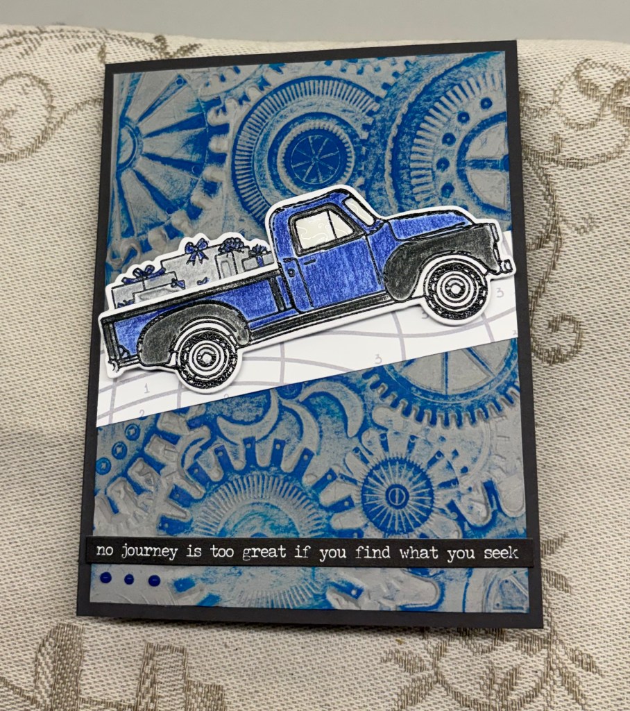
My fill in the blank favourite is a 3D StampinUp folder called Soft Waves and I have actually used this one quite a lot. However the folder I’ve actually used for this card is a new 3D folder from Spellbinders and I backed it with some black CS to give a border before adding it to the card front. The arched die cuts are from Craft Addiction UK and I used some scrap CS to cut a medium size one and a smaller one. They were added with some foam tape and I turned the yellow piece upside down before attaching. The floral image is from Inkadinkadoo. I coloured it with watercolour pencils, then fussy cut before attaching on top of the yellow arch. The sentiment is from GKD which I inked using Dusty Concord and then heat set clear before fussy cutting around it. A few small gems finished the card. I thought I had some purple twine or very thin ribbon, but I don’t and what I do have on hand doesn’t look right on this design so the gems have to be enough.

My camera seems to have changed the lighting somehow as the photo looks cream instead of the actual bright white card stock I’ve used. The challenge at CYHTP has an optional twist of using purple. I have already added a card here but it doesn’t use the twist, which surprised my stamping buddies, who know its my favourite colour in any shade. So here is a second card for this challenge using the colour purple.

Thanks for stopping by, your time and of course you are appreciated.

CAS – You’re a Classic

Challenge #279 here at cardz 4 galz, as chosen by Helen is to make your card Clean and Simple.

Having seen a tutorial a while back on Splitcoast Stampers, Faux Cyanotypes – SCS Weekly Inkling #1008, I had long been wanting to try this particular style card. You can’t get more CAS than the way this one is done in my opinion.

My biggest challenge was that I don’t have any square die sets, and the odd square dies I do have weren’t the right size. The punch I have wouldn’t cut properly so it is now in the trash. I chose and adapted a die that wasn’t right and fixed it so that it was okay. It was a bit fiddly but I made it work and I was only cutting the mask so not wasting card stock in the process. I did try it on scrap paper first though.

Once the mask was on the rest was very easy and fairly quick too. I used Blueprint Sketch ink and a brush to get the background, inking only lightly until I deemed it enough. Then using and old rubber stamp set by Darkroom Door I stamped one of the smaller bikes using the same ink but more coverage so it stamped darker. Using another stamp from the set I stamped the sentiment. You can imagine my annoyance when I realized that the stamp edge had created a nice blue line that was totally unintentional. Serves me right for not checking the stamp as I normally do.

What to do about it was my next question, particularly as this is a CAS design. I created another sentiment on a scrap piece and tried adding it, but it didn’t look right. I also considered adding a frame over the entire card, but without the right dies this was even more problematic and didn’t look good either. I actually set it aside overnight because my brain wasn’t giving me good solutions, other than starting again on a new card front. During the night I decided to try some bling to cover it up and this seemed to work and looks okay. Had it not been okay I would have made another one. Even though adding bling isn’t generally done with a CAS design, I don’t think it detracts from the design here. You’ll be pleased to know that I have now purchased a square die set and it is on its way to me as I type.

Now it is your turn to create and we look forward to seeing what you do. Have fun while you play. Thanks for joining me today, you and your time are appreciated.

3-2-1 Recipe – “Its going to be a long day”

It is once again time for our Double Trouble Challenge #219 and your challenge is to make a slimline card, regular or mini. Recipe is: 3 – layers and the card base can be included, 2 images and 1 slimline. Thing 3, twisted sister is to add some sparkle or glitter and thing 2 is for you to use the sketch and enter it at TSOT #698. Be careful not to back link.

Quite some time ago and I can’t quite remember where, I saw an artist colour some images just using brush strokes with different colours. I decided I would give this a go myself and I created the cup panel where it languished on my desk as I couldn’t decide, first whether I liked it, and second how I might use it. The cup stamp is from Joy Clair. My effort isn’t terrible, but I now realize that the artist was using a special shaped brush which I don’t have. Funnily enough my hubby saw this and said he liked it, which helped me to use it.

Anyway because this panel was already done, I decided it would make a decent slimline card. After cutting my card base I took some glitter CS and cut a piece for the front. Then I added the cup panel on top. Right there that gave me 3 layers plus the sparkle requirement. Then I cut another piece of white CS to the size I required for the bottom and stamped the sentiment heat embossing it for a bit more definition. Stamp set is from a dollar store brand Forever in Time and the cake image is from the same set. I stamped it, coloured with pencils and some Sakura glitter pens and then fussy cut, giving me my second image. If I don’t count the card front there are three layers but with the card front I now have four. Once this was added to the card front I called the card finished.

In the end I quite like the result, but without this challenge, I’m not sure I would have used the cup layer at all. Now it is your turn and we look forward to seeing your ideas and cards in our gallery. Have fun creating.

Thanks for stopping by, your time and comments are always appreciated.

Yellow and Black

It isn’t often that I really like a card I make, but this one I am truly happy with. So how did it come about and why I had to get really creative to make it?

Firstly it has been made for the latest challenge at Color Hues Challenge #135 – Yellow and Black. It uses dies from a StampinUp set, along with a larger die that I’ve had forever and think is from either Spellbinders or Sizzix. Acquired in the days when I didn’t think to keep the information. And it uses a sentiment from a Hero Arts set that was an included set in my latest Weekender kit.

I wanted to create a butterfly border, but didn’t have the right dies to do what I saw in my head. So instead I die cut the butterflies separately and added them as you see to the narrow yellow strips. To make them look as if they were die cut into the strip I coloured in the pattern attaching them to it. The hanging off piece picks up the black card front underneath. I used some black 1mm foam underneath and once they were attached to the card front, I started on the larger more ornate butterfly. Reversing the two colours I cut the background piece out of the yellow and the open frame piece from the black and attached them together. Taking the body die and some glossy gold CS I die cut the body and attached as you see. It was also popped up on a double up piece of foam so it floats above the others. The black embellishments are really old and from my stash. Once I had stamped the sentiment I embossed and heat set clear then I cut it into two so I could add it between the strips.

Yellow and black look pretty good together and I have to remember to use the combination more often. I guess using a strong yellow helps the visual impact a lot. Thanks so much for stopping by to take a look, I appreciate you and your time.

Huey Chameleon

I started this card mainly with Seize the Birthday in mind, but it sat on my desk for a couple of days because I didn’t have enough time to continue with it. In the meantime a second challenge began at CYHTP and I realized it would work for that too.

The printed acetate sheet is the last of a bunch I purchased many years ago because I thought they were pretty. Then I couldn’t think how to use them due to my lack of knowledge and skill. These days I wouldn’t have kept them so long unused.

The challenge at Seize the Birthday is to use acetate or vellum and the one at CYHTP is always an Embossing Folder, but with an optional twist. The twist this time is Boys to Men. My card fits both challenges, although I acknowledge that Huey would work for a woman as well.

Using my latest folder from Spellbinders and some watercolour CS I embossed the background and then used ink in two shades to add colour. I like the texture on the watercolour, it takes ink well and it seems to work great for these leaves. I wondered about adding dimension around the sides of the acetate, but it showed through too much so that idea was clearly not going to work. I already knew I was going to use the chameleon die set, and I set the acetate to one side giving me time to think about it and proceeded to cut and build Huey. Once he was built I took another 2 dies from a different set in this kit and cut the branch and the vine fronds.

I added Huey and the fronds to the branch and then placed him on the card front laying the acetate piece on top. Deciding this would work I glued him down and added a strip of scortape to the acetate at the top only. Using the sentiment and matching dies from the kit, I stamped the sentiment and heat set it clear. The It’s your Day was placed underneath the acetate at the top and the other part was added on top of the acetate at the bottom.

The card size is slightly larger than I would normally do, but I wanted to be sure the acetate would fit nicely and making an envelope for it is pretty easy. Although making Huey was time consuming, it wasn’t difficult and I was smart enough to print out the explanation for each piece which I’m keeping with the set. The hardest part of this card was taking the photo and it took several tries to get this one, which is still not that great. No matter where I put the card there was a light source that glared on the acetate, which is why you can’t see the entire sentiment at the top. All in all, I’m pleased with how this turned out and I have a few coloured stripes left to have the next Huey partially prepared.

Chellenges entered:

Thanks for stopping by, I appreciate both your time and any comments you may leave.

Seaside Fun

Lynda has chosen the current challenge theme here at cardz 4 galz, and she wants to see seaside/coast style cards for challenge #278.

I decided to let some of my paper do the work on this card and used a patterned paper that looks like water. I also used some old fine sandpaper to create the beach sand look. Using some Kokorosa dies I added the foamy water at the join of the two papers. Then with another die set I cut the umbrella tops and coloured them as you see, adding a couple of striped beach towels among them. The die set has tiny people so I cut three, two as sunbathers and one who is body surfing.

This umbrella scene was inspired by a graphic in a TV show which is set in Mallorca. To give the umbrellas some dimension I shaped them a bit and added foam tape in the centers so they pop up. My hubby commented that this looks like an arial scene taken by a Drone.

As I’m not certain how I shall use this card, I’m leaving the sentiment off for now. Many thanks for stopping by, I do appreciate you and your time. We look forward to seeing your cards in our gallery and hope you have a lot of fun creating.

3-2-1 Recipe My Guy

Welcome to challenge #218, here at Double Trouble. The current recipe is as follows: 3 – Washi Tape or paper scraps, 2- die cut elements, 1- Masculine project, Thing 3 is the option to use any element pertaining to your guy and Thing 2 is the usual Double Dare to use the sketch and enter into TSOT. Note that entering here means you need to take care not to back link your project.

As you can see I used a combination of inked paper scraps and Washi tape for my background. My Washi tapes are really old and why they are still around, is because I find they don’t stick well and often peel. As I type I can see some of it is lifting so I shall have to glue the ends in a minute. My die cut tool elements double as both masculine and the my guy option, because this card is intended for a friend who is always playing with tools and handyman work. As well there are 2 other die cuts with the glitter circle and speech bubble.

The tools come from a die set from MFT, and I cut them twice to have enough to glue around the circle. The sentiment is from GKD and the heart stamp is from Simple Stories. I used a scrap piece of gray CS and some silver scrap to cut the tools. I used Black Soot ink for the sentiment and then heat embossed it and the hearts were added almost as an after thought.

Now it is your turn and we look forward to seeing your makes in the gallery. Above all have fun. Many thanks for stopping by, your time and comments are greatly appreciated.

Jungle Blooms

If I am honest, I’m not at all sure I like this card although as often happens it may grow on me. I’m not sure why I feel this way about it, maybe it’s the splatter or my less than stellar stenciling? Oh well, it’s an entry into a colour challenge – Color Hues # 134 Pink and Turquoise and I did my best.

To make it, I used a few dies from my Spellbinders Weekender kit, most of them coming from the Tiki Toucan set. The slatted arch is from Craft Addiction and the sentiment is another Spellbinders as is the die that cut it.

I used the stencil set from the kit, first time I’ve done any layering stenciling and although far from perfect, it’s not a bad effort. When the piece was dry I cut it a little smaller and then added to the pink card front. Before I added it I used a little of the Picket Fence splatter paint but I think I went a bit mad. The flowers and leaves were cut from bits and pieces of scrap CS in close tones of the colours after which I inked each of them to give more impact. I played around with placement before adhering anything and managed to wind the little hanging vine pieces in between the flowers without messing it all up. I stamped the Hello with VersaMark ink and heat embossed white, but now I think I should have done it in black as it would show a little better. Using some embellishments from my stash I added a few here and there.

Now that I have opened up all the different die and stamp sets, I am about to put them away properly. Already I found a die I used yesterday underneath my machine instead of with the set and if I delay any of this I could lose some of the small pieces. Thankfully I have magnets and envelopes to put them in so I can label and add the graphics that show what each set contains and how they layer.

Thanks for stopping by, I appreciate you and your time.