
This card is for the Global Design Project for this week. I CASED the sketch as suggested and came up with this …
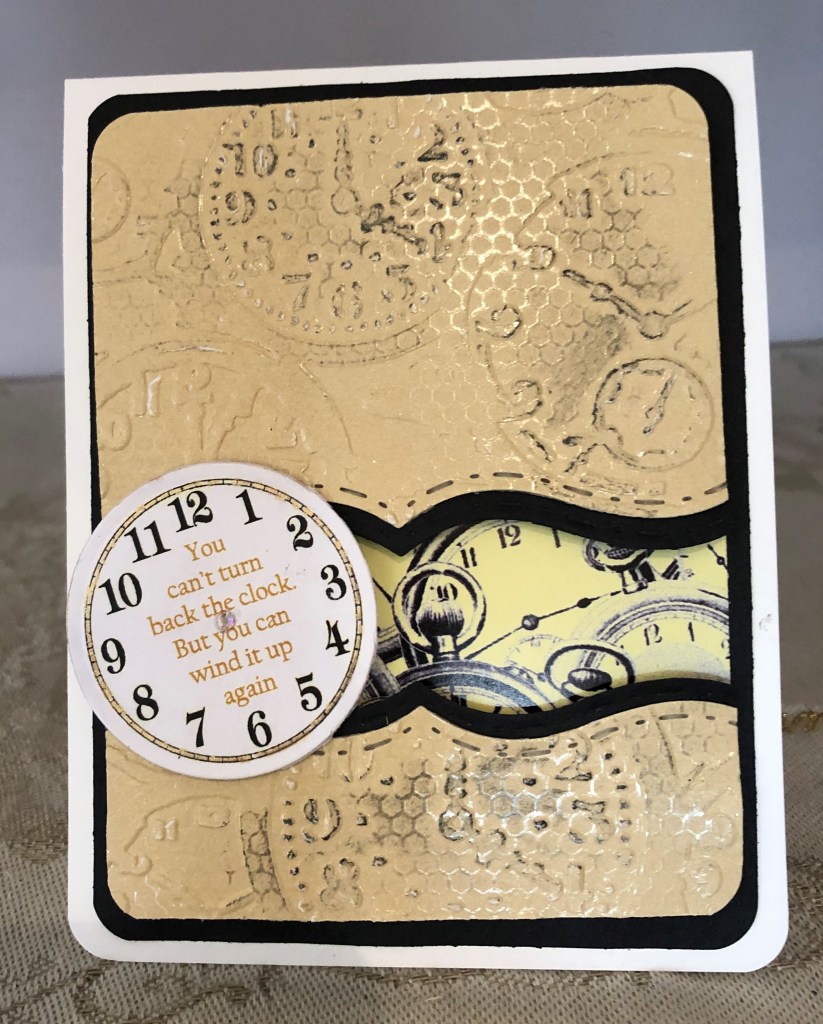
In one way it is a CASE of another card as well because I had an image saved on my computer from a long time ago. Starting with the pp I dry embossed it using a Tim Holtz texture fades folder. It was then die cut using a SpellBinder A2 Bracket die. I rounded the corners with a punch. I did the same thing on some black paper so I could create a small border. In the past I have done some Iris folding and had some special papers left over in my stash. One of these strips was perfect for this card so it was glued on to the black background piece and the other bits were popped up on top. Not having any clock faces I went on line and found a free one I could play with. Made it the right size and added the sentiment to the face using CorelDraw. Printed it and used a circle die to cut it out. I went around the edge of the clock face with a gold pen and added a tiny gem to the center. I also added, using my finger a small amount of black soot ink over sections of the dry embossing. Not sure if this was a mistake but too late to fix now. I think this card looks better in RL than on the photo.

Beautiful card, Johanna! The black soot definitely wasn’t a mistake. Think it was the perfect finishing touch. Love the sentiment!
LikeLiked by 1 person
Oh, thanks Jan – you have just reassured me about the ink. I found the sentiment on line and thought it perfect for this particular creation. I’m hoping to use this for a masculine Birthday card next month.
LikeLike
I am afraid that the photo looks great, it must be over the top at your place. Now just exactly how will your friend wind it up? You have gotten very adventuresome at finding what you want and then adapting it to work.
LikeLiked by 1 person
Glad you think so. The friend for whom it is intended has had a stroke recently but he is improving daily. I thought something like this was a bit more motivational than a conventional B’day card and it acknowledges recent events indirectly.
LikeLiked by 1 person
Great masculine card. I’m sure your friend will love it. I like the addition of the black soot. It gives a nice pop to the embossing.
LikeLiked by 1 person
Thanks Judy – I may make another of these and keep it ready for masculine B’days coming up in the New year. I have the pp strips in several colours with clocks so can create quite easily.
LikeLike
Great card, Johanna; I’m loving the theme and the clocks especially that insert.
LikeLiked by 1 person
Thanks Gayle. I am already considering how to make a few more using the same theme. I never have enough Masculine cards so getting a few done would help during next years birthdays.
LikeLike
I think the black soot was needed to enhance the texture. Great take on the sketch. Super masculine card.
LikeLiked by 1 person
Glad you like it Lisa. I’m happy with it now that the ink is fully dry as it has faded just a little but there is enough there for texture.
LikeLike
Beautiful masculine card. The black soot is the absolute perfect touch.
LikeLiked by 1 person
Thanks Gerry. I was looking for a snarky time comment but didn’t find what I wanted although the one I did choose is fine. Don’t know where you get yours from as you always have some good ones.
LikeLike
Oh, this is lovely! I love those clocks and the fun recessed area.
LikeLiked by 1 person
great that you like it Golda
LikeLike