

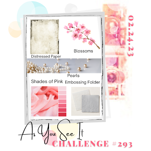
When I saw this challenge yesterday, I started to think about what I might do to participate. There were several ideas in my head, but none of them truly grabbed me. Then this morning I saw our stamp buddy, Angie’s post, and a light bulb went off in my head. So here is my take on both the challenge and her card.
I started with some watercolour CS which I embossed using a SSS folder. Taking one of those (old) distress wheels, I distressed the edges and added some pink to the edges, heavier along those, and lightly to the raised sections. Then I cut a black piece and distressed that too. Glued them together and while they were drying I looked through my dies to find a flower I thought would look nice and chose a Memory Box die called layered daisies. I had a small inked background piece left from a while back and it was mostly pinks so I die cut the flower using this. As it was a thin paper it needed a bit of support so I cut it again from black CS and layered as you see. The stem of the flower is made from Mizuhiki cord (from Japan) and the leaves are die cut from DSP using a very old die that I have no information on. The word is from a Hampton Art sentiment set and I stamped it twice. Glued the 2 pieces together and then cut around the letters. Because it is only an outline I had the bright idea of filling it with small pearls from my stash. Added a few more pearls, glued it to the card front and called it finished.
My hubby really liked it and I have to say I’m quite pleased with it myself. Thanks for taking a peek, it is appreciated that you share your time with me.

Very pretty. The pearls in the sentiment was really inspired.
LikeLiked by 1 person
Thanks Judy – I thought it a good idea myself and was so pleased that I had small enough pearls to do it with.
LikeLike
Pretty card! Lovely flower and the pearls are the show stopper.
LikeLiked by 1 person
Thanks – I have to get more flat back pearls as what I have left are much bigger and wouldn’t work for the word.
LikeLike
LOVE your flower, and you created a great background for it!
LikeLike
I have Angie to thank for the background as it was her card that inspired mine. Glad you like this thanks.
LikeLike
Awesome background and gorgeous die cut layered flower completed with that cute HI!, made a really gorgeous card.
LikeLiked by 1 person
Thanks Gayle. It was fun playing with the recipe, but I took a leaf out of your book and wrote down what was needed so I wouldn’t forget anything.
LikeLike
Love this! The subtle background looks so good and offsets your flower beautifully. Inspired idea with the pearls in your die cut letters! Thanks for joining us at As You See It challenge
LikeLiked by 1 person
Many thanks. It is fun to participate and I thank you for all the inspiration.
LikeLiked by 1 person
The distressed edges and the subtle shading add a lovely shabby vibe to your design. The way you’ve added the pearls makes your ‘hi’ shine out like those show names written in lights back in the day – nice touch. Thanks for joining in with us again at As You See It Challenge.
LikeLiked by 1 person
Thanks Jan. I was glad I had the right size pearls for the word. I enjoy the challenges.
LikeLike
So nice to have you entering again, Johanna! We really missed your lovely creations! The edges as well as the embossing folder really add to the distressed feel of the paper! I like the way the black cardstock highlights the pink so well! Thanks for “cooking up our recipe” at As You See It Challenges!
LikeLiked by 1 person
Thanks a lot. Your challenges are always just that bit different than others and I enjoy participating when I can.
LikeLike
This is so pretty Johanna and I love the detailing of the background. Such a creative use of the pearls on the sentiment too – so unusual, it reminds me of retro neon signs. Thanks for playing along with us over at As You See It!
LikeLiked by 1 person
Thanks Joanne. I appreciate the comments and the challenges.
LikeLike
Lol, genius! Great job with your interpretation – we didn’t actually say the FLOWER had to be pink! So clever! and what a subtle way to slip some pink in there! Very creative use of your pearls, too! Thanks so much for playing at As You See It!
LikeLike
I shall have a swelled head from these comments. Thanks so much.
LikeLike
Johanna, this is lovely. I really like how you used the pearls on the sentiment.
LikeLike
Yes that was a good idea and worked well in the end. Thanks
LikeLike