fall is coming

The main summer heat is over and we see signs of fall everywhere we look at the moment. Nights are cooler although sunshine is back after a week of much needed rain. We also have guests again this week, so it has been very busy around our home. The challenge at CAS is: Challenge #543 – Sketch and I created this card. Stamp and die set is from YNS, sadly now closed, and the heat embossed sentiment is from Vertical Greetings by GKD. I used pencils to colour my tiny images and sprayed some sheer shimmer on top to give some shine. The foil circles were patiently hand cut from a Hunkydory collection that I have only just begun to pull apart. Got them as a freebie and I couldn’t waste the scraps so used them this way.

It is a very simple card, but thank you cards are always required so it will be used eventually.

We are planning a neighborhood BBQ again this year so I’ve done some prepping for that in between everything else.

Thanks for checking in and any comments you leave are always appreciated.

beep – clang!

AAA Card Challenge #272: Sketch here is my take on this challenge although I’m not sure I’ve gotten the sketch quite right. Stamp set used is a new to me set by Brutus Munroe, acquired in a recent sale at Scrapbook.com. I had been looking for something with a scientific aspect and this set seemed to fit the bill. It had been on my desk since purchase and I figured it was time to actually use it. My stencil is from Hero Arts.

Using my Misti I placed the stamps and using Versamark ink I stamped them and then heat embossed in black. Once dry I used a masking fluid over the top so I could add the stencil background. It was easier than using a sticky note and fussy cutting. After removing the mask I then coloured them with Inktense pencils and a bit of water. Once dry I added a little shine with a Sakura glitter pen. I think the card turned out better than I expected and the bots are certainly fun images.

Thanks for stopping by, I appreciate you and your time.

retro music style

Seize the Birthday #290-Retro is the current challenge and after some thought and a bit of online research, I came up with this. I took a leaf out of a stamping buddy’s book and used the Internet as I have nothing like this in my stash.

I found a site that has freebies of various designs and this cassette tape was one of them. It was designed to be a small opening card. Playing on the computer trying to resize or change something wasn’t in my horizon today, so I printed it up and then took it to my lightbox so I could trace it onto card stock. I coloured and fussy cut it out, did the same for the label and adhered it. a little hand printing and some silver for the tiny corner screws, along with a small sentiment from a very old SSS set and I had the cassette done. Using a small circle die from Hero Arts I die cut the 2 discs and added some silver lines before placing them onto the rectangle piece. After adding foam to the cassette I popped it on top. The music paper is from an old music book, cut to what I wanted in size, and then added some ink to age it a little more. My original intention was to put it all onto a black card front, but I accidentally put it on the wrong side of the folded card. Grrr! Anyway I cut the panel down a bit more and then added it as you see it in the photo. I guess you could say that my creativity today is all about doing it myself instead of stamping and/or die cutting.

One of the design team at Word Art Wednesday suggested that I enter this into their current anything goes challenge so here goes.

Thanks for checking in, it is appreciated.

shapes

The current challenge at DD is all about shapes and I came up with this card. Inkspirational has a CAS challenge with the optional twist of animal – twist not taken. The stamp set is an older one from GKD and I haven’t used it that much. It kind of called to me when I saw the title of the challenge. The sentiment strip is from MFT and the background layer is actually a piece of photography art canvas. I used a Spectrum marker close to the ink colour used on the rest to create a border. Inks used are Seedless Preserves and Peeled Paint Oxides.

A very simple card to put together and I am happy with the end result. I shall need to make an envelope for this one as it is a weird size.

Thanks for stopping by and I hope your Sunday is going well for you.

retro Christmas scene

The challenge at As You See It, is all about vintage or shabby chic. As well the current Peace on Earth challenge has an old time feel to the mood board so this card should fit nicely there as well. This stamp set from MFT reminds me of old style Christmas cards so I decided to use one of the stamps as shown. The image was stamped in Black Soot and heat embossed clear. I used a scrap piece of blue CS for my background layer, frame and the band across the bottom. Circle and frame cut using Hero Arts infinity dies. And my sentiment is from the same set as the image. My snowflakes are from an old GKD set and I used Blueprint sketch ink and a Sakura glitter pen. I used the pen on the image as well so when card is held a certain way you can see it sparkle.

After a very busy week with guests and meetings being back in my craft room is soothing. However, my hands are a bit shaky today so I had trouble with stamping properly and I got ink in places I didn’t want it. I quite like the card though and it is good to have another Christmas one done. I am very behind in making them and will have to get cracking soon else I will be scrambling last minute.

Thanks for stopping by, your time is appreciated as are any comments you may leave for me.

boo!

Color Hues #93 – Orange and Yellow is the challenge that inspired this card as well as one at one at the Alphabet Challenge – K is for Kittens or Cats. This challenge is a newer one for me to enter, but it appealed to me this week.

In my head I saw orange and yellow bubbles and I knew I wanted to use this little cat die cut that has been on my desk for months. It is from Kokorosa. I cut it using some orange toned marbled paper and it works beautifully here. I took a homemade stencil and brushed the colours through various circles moving the stencil around so I could fill in space. My original idea was to curve the circles in a wavy line, but it didn’t work. I also needed to fill in a bit more space so I took a stamp from a GKD Halloween set and randomly stamped the stars so they curved up to the top corner. I wanted my cat to drape over a bubble, but I’m not sure I achieved it exactly, as my bubble is small and it gets a bit lost. Using an alphabet die from Scrapbook.com I die cut my letters out of black scrap CS and using some tape to ensure they stayed in place I added glue to the back and positioned as you see. I did go over the letters and three of the stars with clear sparkle using a Sakura pen and before adding my cat I attached a small piece of black CS behind its head so the eyes and nose show better. Inks used were Distress Oxides in scattered straw, spiced marmalade and squeezed lemonade. The panel was cut down so I could add a black piece behind for a thin border.

As most of you know, I’m not a Halloween fan and don’t make many cards in this genre. I am, however, quite pleased with this one and hope you like it too. Thanks for stopping by, it is appreciated as are any comments you may leave.

Not Quite the floating technique

Pretty in Pink is the challenge at Cardz4galz this time around. I decided to use a technique I’ve done before, but silly me forgot a couple of things, so it isn’t exactly as I planned. I rarely waste things and figured that it is nice enough to use despite my error. It is funny how the photo distorts the colours a bit. My strips are a combination of pinks but look more purple than pink. The strips are from misprinted photos that are good enough to use this way, although not as a framed piece which is what they were intended for. As well I notice that the die cutting plates have left their own impression so the end result makes them look embossed. To me it makes them look more interesting. The die cut holly hocks are an unbranded die and the sentiment, stamped with Stazon is from a Kokorosa set. Circle die cuts are both Hero Arts.

We hope to see your creations in our gallery soon. The DT’s all have some great inspiration for you. Thanks for sharing your time with me, it is appreciated.

You’re the best

SSC342 Sketch Time is the current challenge at Sunday Stamps. My little heart was made ages ago and was in my ‘keep it for a while’ box. When I saw the sketch I realized that this heart would work beautifully for it. It also used up a couple of scraps I had sitting around one, conveniently, already a thin strip that I cut banner ends into. The photo has made the heart look blue, but it is actually more purple and works with the plum background which looks much darker than it really is. My PP is a cut up photo as is the strip used. I backed it with some gold CS so it tied in with the heart. I honestly can’t remember which company this die comes from and am too tired to go and search it out. I think it is most likely MFT and the sentiment is also MFT from an Itty Bitty basics set. Embellishments are from my stash but are by Studio g.

I wouldn’t call this my most inspired creation, but it isn’t a terrible one either. The doctor changed some medications recently and I am struggling with fatigue since. I shall have to discuss with him if it continues as I’m already fed up with dragging my **** around. Being tired means no inspiration in my head – SIGH! And my friend with cancer has experienced a bad reaction to chemo and spent a night in the hospital which certainly doesn’t help with my mood. I’m worried about her.

Thanks for taking a look, I appreciate your time.

i’m here for you

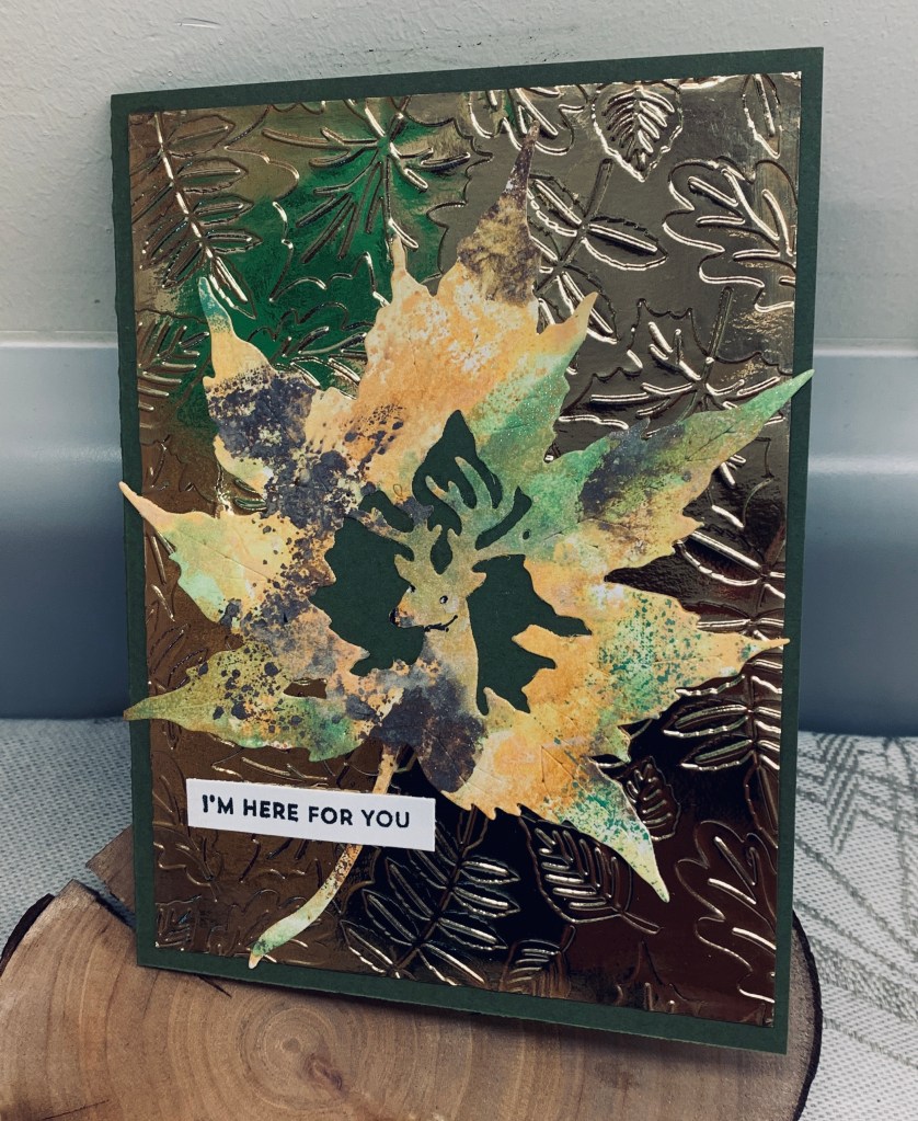
Although the weather is certainly turning more fall like, I am not yet ready for making fall style cards. The moodboard at DD is all about fall or harvest, but I was more inspired by the colours rather than the images. The die used here is new from Kokorosa and I had been wanting to try it out for a while.

To begin with I took some CS and using a plastic sheet, I added my first colour, spritzed it and then applied to the CS. I dried between each ink. I was puzzled at first because I couldn’t understand why the paper was showing shimmer. I thought perhaps it was some residue from the plastic sheet but by the final application of colour I realized that I had grabbed the shimmer spray instead of my water. I guess its what you would call a happy accident as it looks pretty good in RL, although the photo doesn’t show it much. I also hadn’t realized that the die had a deer image cut into the centre so I backed it with a small piece of CS so it shows up more. I used some shiny gold CS and a Spellbinders EF for the background piece. Another accident as I had the folder the wrong way so it is the debossed side that shows up. Once the layer was added to the card front I added the leaf on top. I think perhaps I should have chosen a more muted background as the gold shine overpowers the die cut image a bit, especially if held under strong lights. The photo shows some green on the gold piece. It isn’t there in reality, but I guess there was some shadow or reflection during the taking of the photo that affected it in some way. The sentiment is from an MFT set.

The card is intended for my friend as she goes through her cancer journey. Chemo began on Monday and I’m sending one card per week as she moves ahead with the treatments. Mistakes or not, she will love it and she also loves the fact that I am in constant contact. Fortunately her two adult sons are very much involved in the journey so she is not alone and is supported with love. We cannot do the journey for her, but we can be present along the way.

Thanks for stopping by, it is appreciated.

explore

AAA has an anything goes CAS challenge with a twist of travel. Seize the Birthday has a cute critter challenge. I decided to combine the two and came up with this card.

Using a negative circle as my mask I sponged some colour into the circle using Tumbled Glass and Bundled Sage inks. Because I wanted to use this cute little Panda image from AI, I used a very old wooden block stamp that has an oriental image. This gave me the look and idea of China for my Panda. I stamped through the mask to get a light impression over the sponging. Once I had my Panda stamped I added some bamboo along one side of the circle and the word explore comes from an old hot air balloon set from GKD. I coloured my Panda with pencils and some Sakura Glaze for nose eyes and ears. The inside carries the birthday message.

I’m happy with the end result and had fun making it. Thanks for stopping by, I appreciate it.