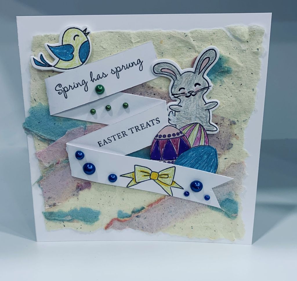
Its an anything goes challenge for Krafty Chicks so I am entering this card which I made a while ago but hadn’t yet posted. During organizing my new craft room I came across this piece of paper, which I made a long time ago when I was into making my own paper. I figured it would make a good background for Easter so here it is. The images are from a couple of sets, one by Claire Brennan (GKD) and the other by GKD. Some were die cut and others fussy cut. I folded the sentiment strip as you see and stamped the 2 sentiments and the bow before gluing to the square background layer. I was careful to leave some looseness so I could tuck in the other images. These were coloured with a combination of pencils and Sakura gelly roll pens. I added the embellishments and then added the entire piece to the card front. Thanks for spending time with me today.
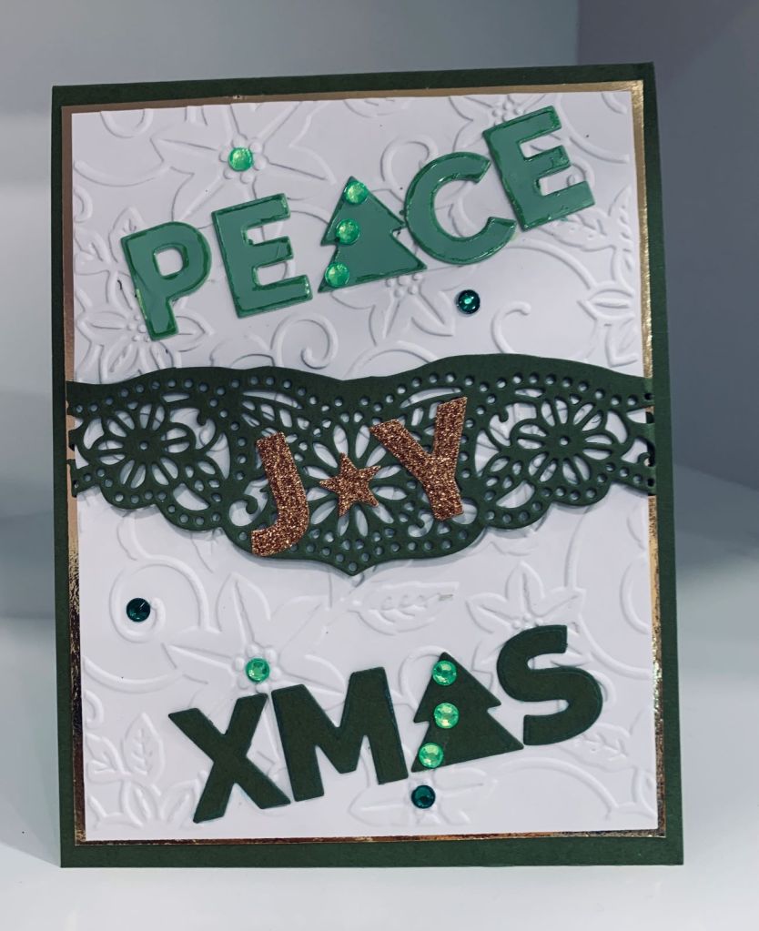
With these two challenges I managed a twofer, although the only true commonality is in the colour green. After dry embossing the panel using a Craft Concepts folder I die cut the band piece using a die I received with my Gemini machine. It is really a border die but I wanted something a bit different for my band so after die cutting I trimmed the top with scissors and added it to the panel. Using a new die set of words from MFT, I die cut three of them and added them as shown. As I used a paint swatch for the word piece I noticed that the edges lost a bit of their colour so I went around the edges with a Sakura pen. Once the panel was added to the card front it looked a bit blah, so I added the green bling to liven it up.
For this card I used a new stamp set that I just received by Catherine Pooler. Its been around for a while and I’ve admired it in the past, so decided to purchase it. The challenge is for pink and gold and I’ve seen Koi that are not just orange so I watercoloured mine pink after gold heat embossing. The bubbles are also gold but look green in the photo for some reason. As well I used a gold mirror scrap piece and a lattice die from Paperrose.com. This I die cut twice, once in the gold and once in a marbled pink paper which I then offset slightly when gluing to the card front. In R.L. the gold really shines especially the mirror piece but I can’t get a photo to show that and I tried several times. I have deliberately left off a sentiment as I’m not sure what I want at the moment. I quite like the end result for this card.
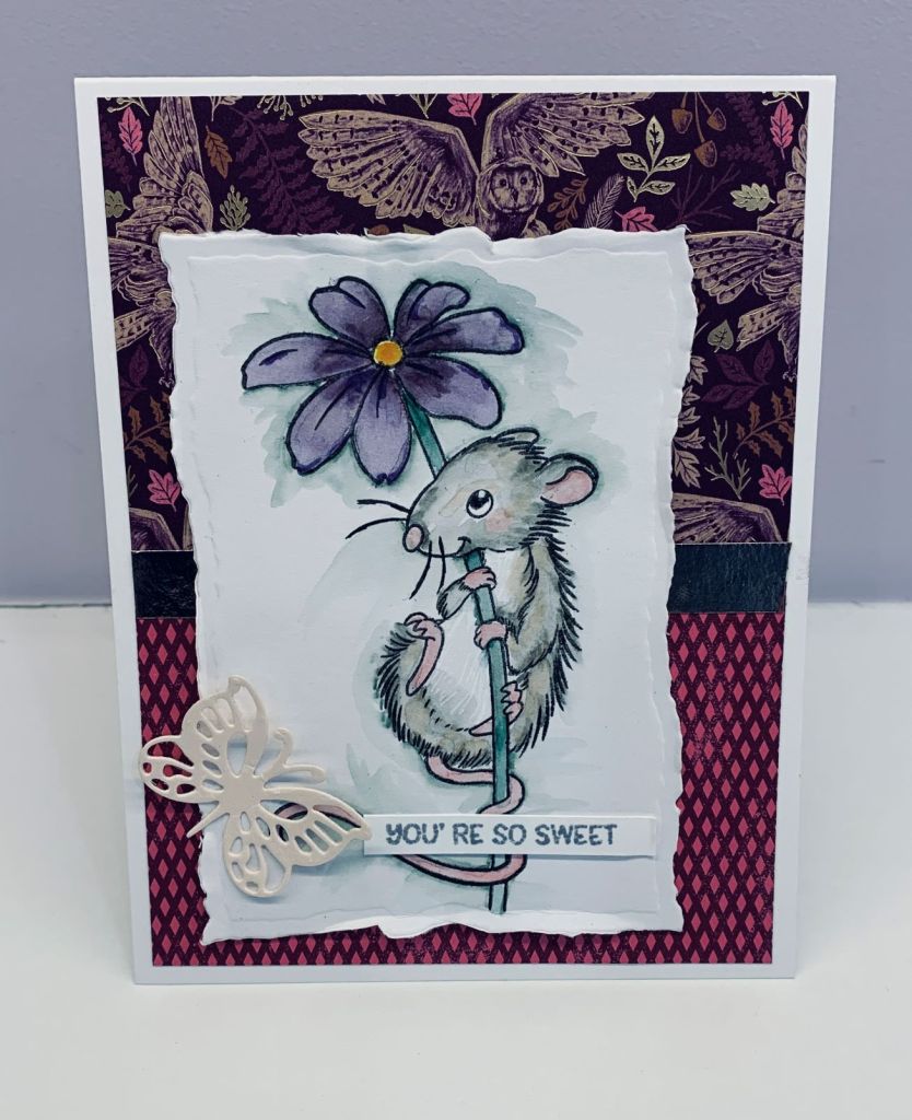
The sketch challenge at Make the Cards looked fairly straight forward and this card is what I came up with. I just love the DSP from StampinUP, and those owls are gorgeous. Once I had my paper layers added I realized that I hadn’t come up with an image to go with them – honestly – I think really weirdly sometimes and do some things backwards or without thinking it through. Fortunately I remembered this little mouse stamp from Wild Rose Studios and as owls catch mice at least the images kind of go together. Mind you that mouse is so cute perhaps an owl might leave him alone? I stamped him on a mixed media piece and used Tombow markers to add colour. I’ve only done this kind of water colouring once before as I usually use pencils, but I’m really happy with how he turned out. The butterfly die cut is from Crafters Companion and the sentiment is from Divinity Designs. The sentiment was stamped with Hickory smoke as I wanted a softer look for this card. The image panel was die cut using a deckle edge Spellbinder set and I bent the edges a bit more by rubbing against my desk edge, for some dimension. That tip came from Tim Holtz by the way. Thanks for spending time with me today.
With Easter coming up soon, a lot of cards are featuring bunnies and eggs and in the Inkspirational challenge we require a critter that hops. Instead of using a bunny I decided to use frogs and the stamp set from SSS that features a kit with several frog stamps. Deciding on a slimline I stamped the 3 frogs and masked them off so I could stencil clouds and a few water lilies. Before removing the masks I also added the green section at the bottom using distress inks. The reeds were added and coloured with inks but I added some Inktense pencils to them after they dried. I also used some Sakura glaze pens to add details or some darker colour to the frogs. The frogs were mostly done with Inktense pencils, but I used different greens so they aren’t all exactly the same. My hubby liked the result. I cut the panel down slightly before adding it to the card front, but the panel is the only layer. Everything else is one dimensional. Hope you like it.
One of my friends helped me with something the other week and as a thank you I bought a small gift to give her when we go over next weekend. I needed a small bag for the gift and didn’t have any in my stash so I made this one. Once it was completed I realized that it fits the challenge at Double D, so I’m entering it as my 2nd entry. I’ve never made one of these before and I had some slight difficulty adding handles. Now I know more about the how, I can make others with less issues. DSP is from Stampin Up and I made a thick base inside so it won’t tear with the weight of the item. As the Mod Squad challenge is anything but a card this bag fits their challenge as well. Thanks for spending time with me today.
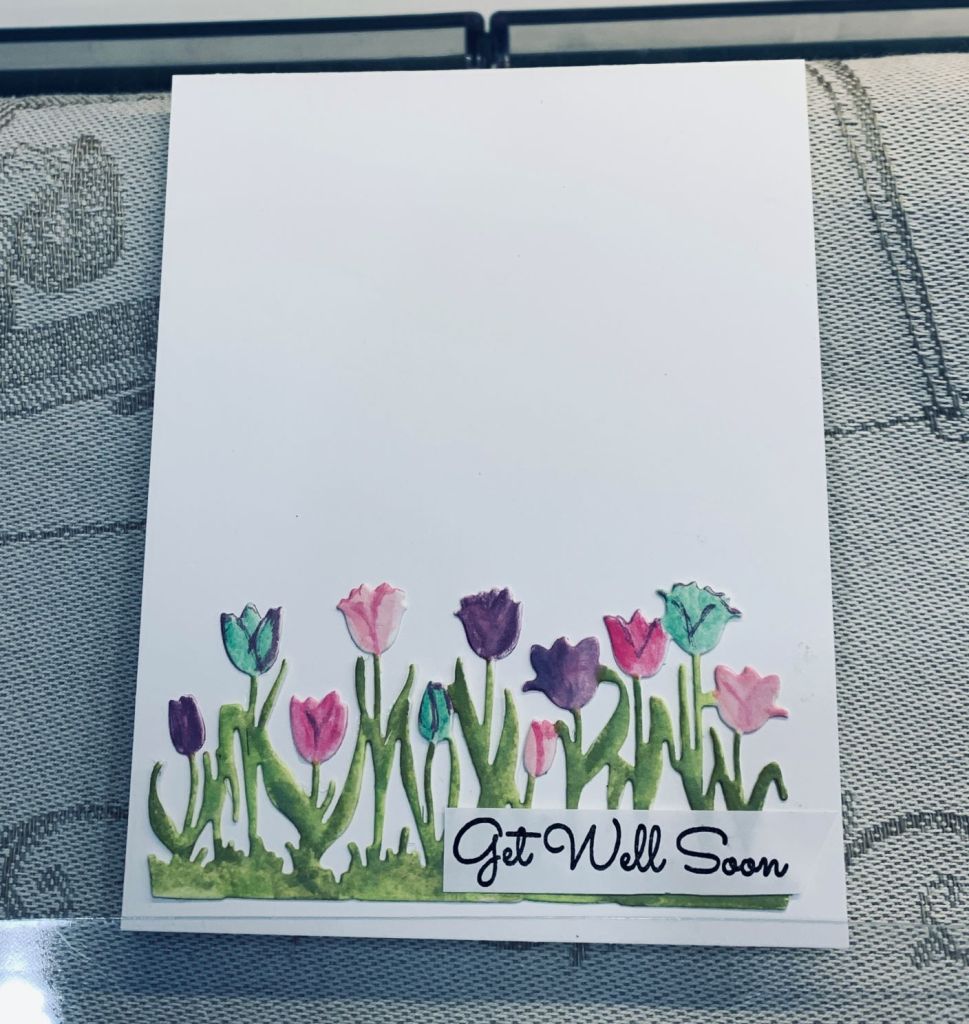
As I needed a quick get well card, I thought I may as well do one that will work for a challenge and this tulip die works so well for a card using 1/3 or less. The die came from the Netherlands and somewhere I have the name and brand, but I can’t find the magnet it lives on at the moment. I used a heavy white CS to cut the piece and then added Distress Oxides with a brush to give it colour after which I used some Distress glaze to add a small bit of polish. On the photo the colouring doesn’t look that good but in reality it is soft and pretty. I think the light in my craft room today isn’t very good for photography and it is a very dull rainy afternoon so poor light outside as well. I may get our electrician to add a small strip light for the shelf I use to do photographs. The sentiment is from an MFT set which has some lovely fonts for a few of the stamps. I may add a few embellishments to it prior to mailing but for the challenge I’ve left as is.
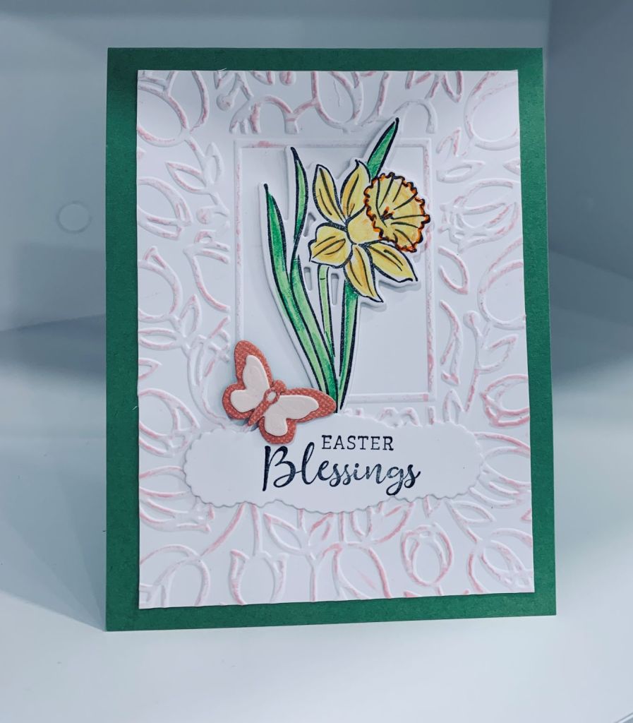
Two challenges, one using blooms and keeping it fairly CAS and the other to use an embossing folder and this is the card I came up with that works for both. Perhaps the embossing makes it more busy than Paper Players would like, but when I look at the DT images most have layers of some kind.
The embossing folder is from Crafts Too called Tulip frame and after embossing I cut it down a bit and went over the high points very gently with spun sugar ink. The daffodil and sentiment comes from a new StampinUP set that I coloured and die cut as does the butterfly. It is made just from the tiny dies that came in the set. I added it to a green GKD card front. The sentiment was die cut with an old label die that I got in one of those reseller stores like HomeSense but I don’t know who made it. I’m happy with this card and it wasn’t difficult to make.
In looking through some challenge blogs I realized that the Sisterhood of crafters challenge was another I could enter into with this card. My Hero Arts stamp set is approximately 12 years old and the GKD set is at least 5 years if not more, so I am able to use this card for two challenges.
When playing yesterday, I couldn’t resist making a background that I thought I would use for this challenge. My mind went in a different direction while I was waiting for it to dry and I ended up making the generic one, and although I used a small piece for the balloons I still had this lovely background left. After adding it to a square card front I thought it would make a nice ocean look card so I dug out my Newtons Nook set, a very old set from Hero Arts, and one from GKD. I stamped the octopus and fish on coloured card stock scraps and used a Sakura glaze pen to colour in certain sections. Of course the colour unexpectedly changed on contact with the yellow and became a green and on the teal fish it changed again to a different green. But the predominant colours are still pale teal and yellow so I think it fits the colour challenge. I stamped the shells (Hero Arts at least 12 years since purchase) masking and fussy cutting and added the smaller one as a separate piece. The sea fronds are from GKD and I stamped and fussy cut those along with the sentiment from the same set. I used a fairly thick foam behind the shells so I would have room to add things behind them. I tucked in the octopus as you see it and then added the fronds mostly flat behind and on the edge. Added the fishes and some tiny gems for bubbles. This mineral paper makes wonderful backgrounds and I’m going to try some of my color burst powders next.
Pale teal and yellow go well together and can be either masculine or feminine depending on the image used. My card uses a layered birthday greeting and balloons so definitely for either gender. Die set used is by Spellbinders and I cut the bottom layer in the teal, a second in some gray DSP and a couple of extra balloons in both teal and some scrap from a background I made. Its funny how the colour darkens a bit in the photograph when in reality it is fairly light. Once I had all the layers on the card front I added a few tiny embellishments from my stash.