cottage path

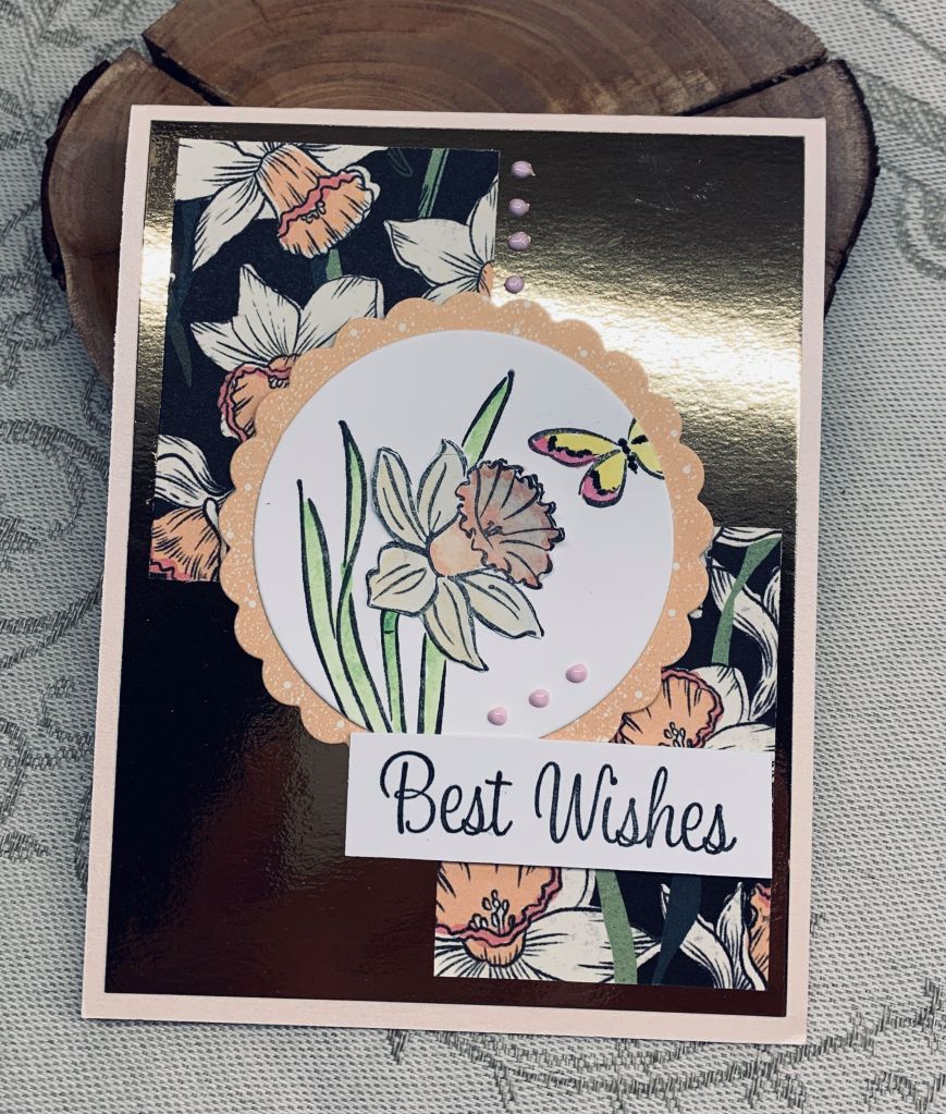
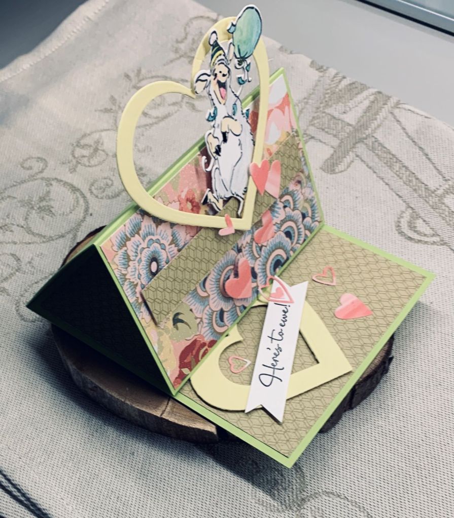
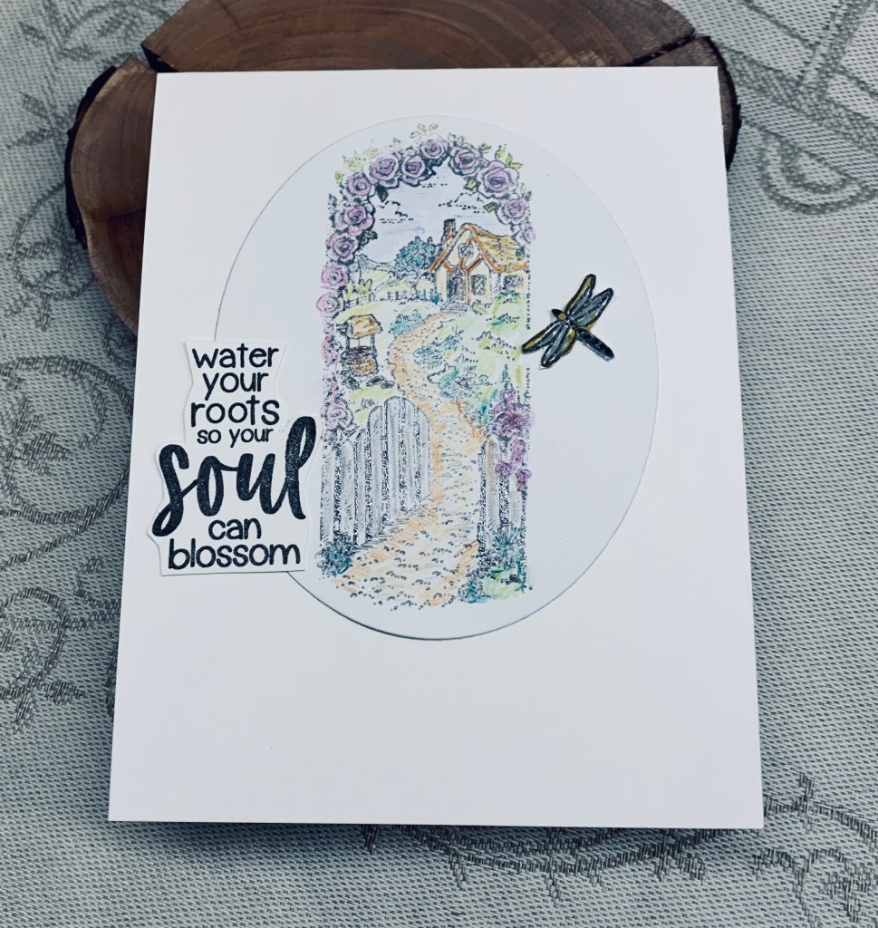
The mood board at JUG’s, features gardens and pastel colours and I remembered this old wooden block stamp that I thought would be perfect for it. Stamp is by Stampendous and is called Cottage Path, so I titled my post the same. The idea also fits the Paper Dragonfly challenge too.

The sentiment and dragonfly are from a Catherine Pooler set that are perfect for this garden card. I fussy cut both as the sentiment is quite big.

I am so used to using my Misti and clear stamps that it took 2 tries to get a good image. I used Hickory Smoke so I wouldn’t have harsh lines and added a bit of clear embossing so I could watercolour it. All coloured with watercolour pencils keeping it very soft looking. Perhaps I should have used Hickory Smoke for the sentiment so it would be softer, but it is too late to change it now.

Thanks for popping in and for any comments too.

torn edge rainbow heart

This challenge intrigued me enough that I put my thinking cap on until I came up with this idea. I thought doing a rainbow effect with actual torn strips would be a bit different and then that the idea of adding them behind a negative opening would also work. I actually like the look and it worked better than I thought it would.

After going through my scraps, picking out those that would give a rainbow effect, I tore them roughly. Using a Hero Arts infinity heart die I cut the heart shape out of the same CS as the card front and lay the aperture over the now glued scraps. Although it isn’t showing in the photo, there is a slight shimmer to both the CS and the rainbow bits. Once it was added to the card front I thought about the sentiment, which in retrospect I should have decided on prior to gluing the focal image down. Fortunately the focal image wasn’t so dimensional that I couldn’t add the sentiment underneath.

It took me a while to find the right sentiment but in the end I chose this one from Hampton Arts as it seemed the best one. I added some tiny pops of color around the frame for added interest without detracting from the CAS look. I’m quite happy with how this one turned out, which is always a bonus to my mind. Thanks for taking a look.

embossed flowers

With purple in any shade being a favourite colour, it was a given that I would enter into this challenge. Recently I had been playing with a new unbranded 3D folder and I already had this card front embossed just waiting for me to decide what I wanted to do with it. I decided to colour the raised areas using purple inks and a pretty green. When I was happy with the amount of colour I let it dry and then added some shaded lilac to the background just to take away the bright white. With some purple Perfect Pearl powder I went over the flowers and the result was that the inks darkened and shimmered, as you can see on the photo. I really liked the result.

In my stash I found a piece of ribbon in a shade of purple and added it to the panel before I glued it to the green background. I wasn’t too sure about a sentiment, but in the end decided on the word Hi which I coloured with a Sakura gel pen and added Nuvo Chrystal on top for some shine and dimension. I let the word hang off the ribbon so it wouldn’t hide the flowers. The entire panel was then added to the card front. I thought about adding some other embellishments, but decided against it as the flowers are strong enough to stand on their own.

I have to say I’m quite pleased with this card. As this card works for the challenge at CYHTP as well as Color Hues, I’m adding it to both sites. Thanks for stopping by and have a great day.

Framed Christmas village

Managed a twofer with this card as it fits both Krafty Chicks and Make my Monday.

I used up some scraps that were already die cut such as the oval and the gold frame. Initially I inked the oval very lightly so I could then create the village. This was done using an unbranded Christmas die set I’ve just acquired as a gift from a friend. It has many tiny dies and I chose just a few for my card. I did use the snow drift dies to make the hillside for the houses and trees and because I only glued the snow bank at the bottom I could easily tuck in the houses where I wanted to. My little snowman at the bottom looks as if he has black spots but he was cut using a small scrap of gold dotted PP. I thought it would stand out more using something that wasn’t totally white but on the photo it looks a bit odd. The houses were cut using an inked piece I made ages ago and I backed them with some gold CS so the windows have a glow. Trees were done with a scrap of PP. Once I had the pieces attached I added the oval to the background PP. Sentiment is from an older Kaiser set. Hubby thought this was an interesting card. Personally I don’t dislike it, but am slightly underwhelmed about it. It is kind of hard to work on an oval in my opinion and to me none of this looks straight. I guess with the houses on a slope it doesn’t matter too much.

Thanks for stopping by and have a great week everyone.

balanced Daffodils

It took me ages to decide on what to do for this challenge and several ideas didn’t pan out at all. Not really in the right frame of mind for this particular one I guess. Anyway I eventually settled on using up some of my daffodil PP and added two pieces to the gold foil background. I had the die cut circle from other projects so using the daffodil daydream set from StampinUP I stamped the smaller of the two daffodil stamps along with a partial butterfly. I coloured in the flower and butterfly with Oxide inks and then messed up the center of the flower. After some colourful language I decided to re-stamp the flower, colour it and fussy cut it so I could add it over the top of the other one. I actually like it better so the error was, in a way, a good thing to do. To give the circle a bit of pizzazz I added some scalloped PP behind it that coordinates with the other PP. Once it was added to the card front I finished it with a few Pops of Color dots and a nice sentiment (from Hampton Art).

Thanks for taking a look and have a great day everyone.

My wingwoman

The dark background piece is embossed but due to the tone of the CS hardly shows up on the photo. I did another one of the corner which hopefully shows the embossing a bit more, otherwise you have to take my word that it is embossed. I used a folder that I call leaf pattern but I don’t know who makes the folder unfortunately. I had thought I would use this card in a different challenge as well, but I don’t have the theme quite right so for now it is only for the challenge at CYHTP. The PP is from a pack that came in a SSS kit and I’ve not used very much of it. The oval is a leftover precut piece that I inked and then stamped the silhouette image on top. It came from my new MFT set as did the sentiment. I used some MFT cloud dies and added them to the oval.

I hope you are all enjoying a nice day and that the weather is being kind to you too. Thanks for stopping by.

great friendships

Wow, I’m on a roll today as I’ve managed another card that works for more than one challenge. This one was a very easy card to create and typing the post is going to take longer than the making of it was.

The sun stencil is one I’ve had forever and dates back to a kit I acquired from Readers Digest. This is the first time I’ve used it but I like that the sunshine is not the usual rays and the new MFT stamp kit I’ve just received had both the image and sentiment in it. I used two different yellow inks for the sun and then basic black for the rest. I am really pleased with how it turned out and having it work for two challenges is a bonus.

Thanks for stopping by.

hot chocolate anyone?

I almost titled this post marshmallow suicide – lol

Getting a card that will work for more than one challenge is a challenge on its own, but I managed it and mine works for three challenges. The card will be entered into the Peace On Earth, Caffeinated and Just Add Ink challenges this week. As you can see the mood board and the coffee challenges feature rainbows and Just Add Ink is a sketch challenge.

Using a printed rainbow striped Vellum purchased at a local dollar store I added a piece to cover the card front. I also added the last inked piece leftover from a stencil challenge near the bottom so the focal image would be grounded. The stamp/die set used is one from Your Next Stamp and I basically stamped, coloured and die cut the pieces including sentiment and then figured out placement of same. Once I had things stuck down I added the embellishments from my stash. I did die cut a few extra marshmallows and added them as if they were ready to jump into the cup, because the top seemed a bit empty.

This is a fun and cute stamp set and I’m glad I purchased it when YNS had a sale recently. Thanks for coming by to look and thanks for all comments.

Spring showers

I acquired a few new dies recently and this card features one of them. Most are unbranded but this particular one is by Kokorosa. I cut it twice, once in white CS and then with some alcohol inked background that I made a while ago. Layered the 2 together and then placed them so I could figure out the raindrops placement. Once the raindrops were stamped using a Designs by Rynn set and Lost Shadow ink I glued the die cut on top. Then I glued the panel to the card front. Using some Nuvo Chrystal drops I added it to the rain drops to give them dimension. An umbrella die I’ve had forever but cannot remember who by, was what I used next. Cutting 2 one in dark CS and then one using a scrap of leftover stenciled CS. I cut off the parts I didn’t require and added the colourful part to the dark one. Using a doubled piece of foam tape in the middle I popped it up onto the die cut. The frog image is from a SSS set and I coloured him using Inktense pencils and Sakura glaze pens before fussy cutting and then adding to the card front. The sentiment at the side is from a vertical greeting set from GKD. I also added a Hoppy Birthday greeting to the inside of the card.

Thanks for popping in to take a look and I wish you all a Happy Easter weekend.

here’s to you

Easel card front.
Side View

At Cardz 4 Galz the challenge is to make an easel card and this is my version. The paper I’ve used is from Close to my Heart and I’ve had it for a long time. The stamp set is from A.I., the bigger hearts were cut using Hero Arts Infinity dies and the smaller ones from a die that I have no name for, but I think it maybe Sizzix. The card stock is cut at 5″ by 11″ and then scored and folded to get what you see here. Once the PP was added it was easy to pop up various elements to get the end result. I love this stamp set as it is such a fun one. I also have a similar with Panda’s and they allow for some amusing cards. It isn’t too bulky for mailing and of course folds nice and flat.

Thanks for stopping by and have a great day.