Never Forget …

SSC274 SPLIT IN TWO

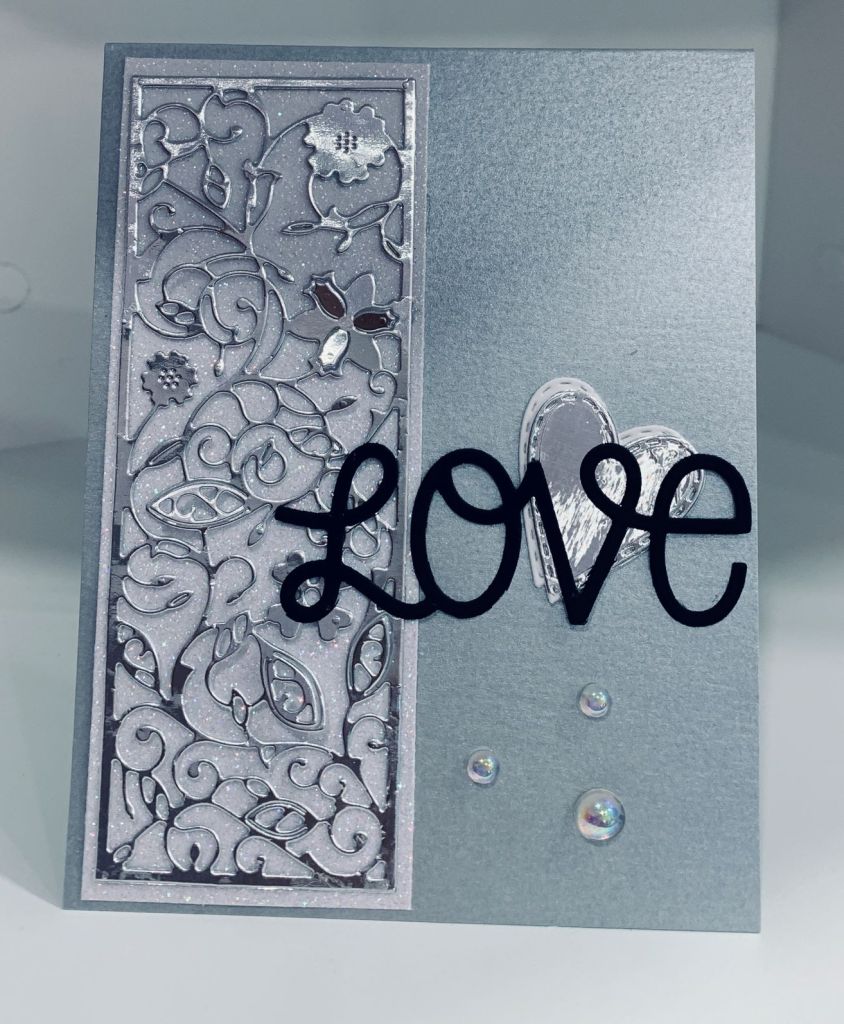
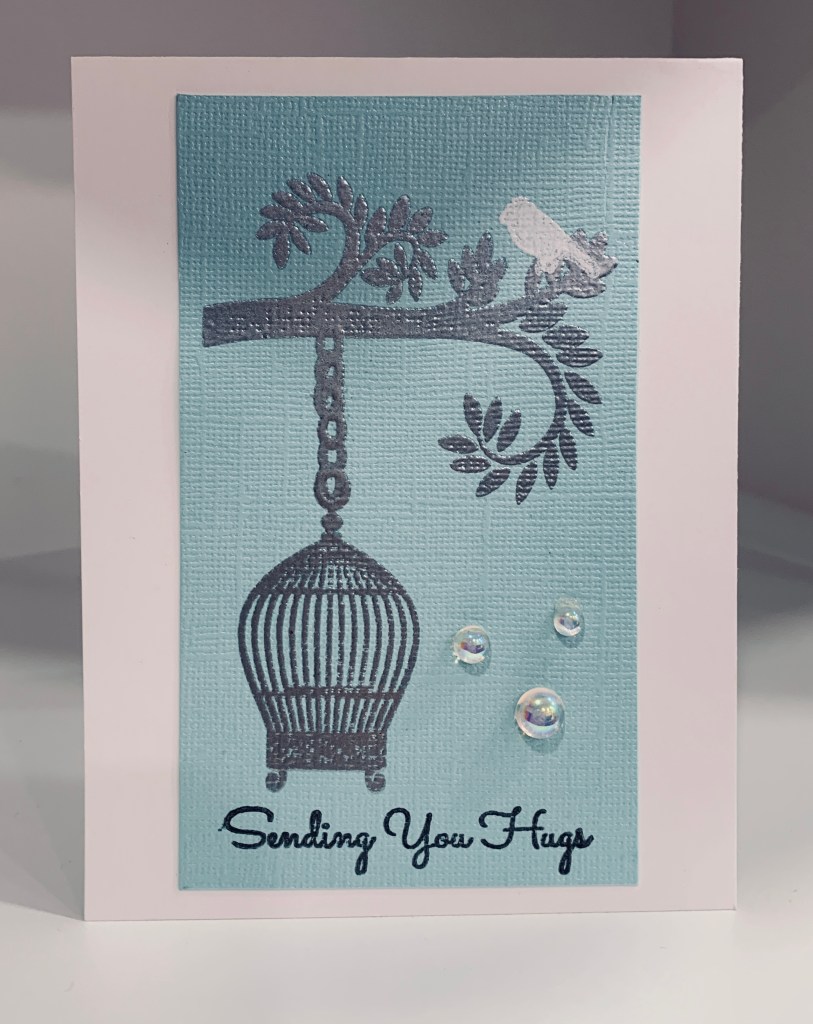
When searching for a die in one of my drawers I came across two small decorative dies that I haven’t used for a long time. Both have a slight oriental feel to them. I can’t remember who the manufacturer is, sorry. Using some papers gifted to me recently I cut some and using a landscape orientation, I added them to the card front with the split as per the sketch. After die cutting the small circle I added it to a slightly larger white circle and then with foam tape added it to the card front. I cut a small heart out of a scrap sparkly piece and I stamped the sentiment onto a black strip and heat embossed it. The sentiment comes from a newish set by MFT called Friends like you. These are all fairly long sentiments and are good for slimline cards. I chose one of the shorter ones for this card. After adding the sentiment I tucked the heart slightly underneath then I added some tiny gems on the printed dots that were part of the pattern on the top piece. This will probably go to a friend who is struggling a bit at the moment. She needs a paper hug as I can’t give her a real one. Even without Covid it would be hard as she lives in another country.

More Silver and White

Color Hues #33-Silver and White

This card uses a background die that I’ve had for a while and believe I purchased as an unbranded die. I decided the last piece of white sparkle CS from LawnFawn would be a good one to use for this. I added it to the card base and in the process dropped it with the glue side down so it messed up the card front. I’ve no idea what is going on with me and glue but I’ve had several mishaps recently. Anyway I cleaned it up and got it glued down after which I realized that the card front was still slightly marked in a few places. Having these stitched hearts already cut meant that I could use them to cover up the marks and still keep the card. The word die is from MFT and I added it at an angle as you can see. A few iridescent gems finished the card. I like that this card, as well as my previous post, can be used as Wedding, Valentine or Anniversary cards so I’ve left the inside blank until I decide.

Silver and White Love

Color Hues #33-Silver and White

Doing a card in silver and white has been on my mind since Monday and I had several ideas on the go. Of course as I began things evolved a whole lot differently than what was in my head and I ended up making two cards that work for the challenge. The other one will follow this post later. I had initially cut out some small stitched hearts in silver and white from a set by Memory box, but they looked a bit blah so I had to think a little bit. Having a roll of silver plumbers tape on my desk I had the bright idea of adding it to some CS and either embossing it or die cutting. I opted for die cutting and used the panel die by Tattered Lace for this. Once it was cut I added it to some white sparkly CS from LawnFawn. (note to self – need to buy more). Using a metallic silver CS I cut two card bases and added this panel to the front of one. Then I added a white heart with a silver one offset on top to the side of the panel. The word die is from MFT and is called Loopy Love and as you can see I used black CS to cut it. The embellishments are Studio Katia iridescent bubbles and I found them when cleaning a drawer and they work perfectly for this card. As you know I am fond of elegant looking cards so I’m happy with this one.

Hubby’s Birthday

Hero Arts Kit

It is my hubby’s birthday soon and I made this card for him. I followed a post from Jennifer McGuire to get the look I wanted. I’ve had the set for a long time and only used a small portion of it, but I remembered seeing the post and decided to give it a go. Initially I had begun another card altogether but although the colouring of the digi stamp worked how I wanted to add it to a card didn’t so I’ve set it aside and will likely use it differently down the road. As my hubby is an Aussie I thought surfing was a good idea and I’m really happy with how this turned out. Every thing used is from the kit except for the birds. They came from a different set but I can’t remember the name. I added some opal blaze to the surfer and the sun which you can just see on the photo. The surfer really shines in R.L. Once in a while I make a card I’m really proud of and this is one of those times.

Another for the Sketch Challenge

Global Design Project # 326 | Sketch

I have some new stencil pastes called stencil butter in both gold and copper and I wanted to try one of them out. As well I have this new stencil called Doodle genie by Chatter Box so I thought using the butter would be a good idea. I did the stencil and set it aside to dry. After going through my PP I found the piece I used here from StampinUp and thought it would look good as a background. Once the paste was dry I used some inks to add a bit more to the top layer and I also used an outline stamp that came with another set I bought in Holland. After adding the twine I popped up the layer onto the card front. The sentiment comes from a Joy Clair set called everyday sentiments.

Love Every Fin

Global Design Project # 326 | Sketch

So the other day when making a similar card I stamped this little whale and then messed up the colouring process. On that project I simply started again and set this image aside for a while. After playing a little bit I managed to fix the image enough that it could be used and this is how I used him. I had the textured blue scrap and added him to this piece after I had cut the corners off the scrap. Then I cut a couple of other hearts (slightly distressed look to these) and added them before popping the whole piece up with foam tape. The PP was a gift from a friend who didn’t want to use any more of it herself and it works beautifully with the rest. Stamp set is Newtons Nook and sentiment is from the same set. I added a few gems and a bow and he fits the sketch I hope. Its a simple card but I like it and hope you do too.

CAS Mini Scene

PP574 – A Clean-and-Simple Challenge from Claire

This is my last card for today and was designed for the Paper Players challenge which requires a critter of some kind. Considering I have deer in my garden daily it seems appropriate to use a deer stamp. I’m not the best at scene cards or CAS cards but I enjoy trying to make them. For this one I used a fallout circle from an MFT die cut and a multi step stamp set (very small set) from Kitchen Sink Stamps. I’ve had it for a while and never got around to inking it till today. I began by stamping the grass and then the deer. I added the stone wall at the top and the bench in between. When placing the circle on the card front I played with what to put behind it. I thought about some sky or clouds but wasn’t sure. In going through my stencils I found the tree which is by Designs by Ryn and decided this would work. After adding the tree I adhered the circle over the top and then stamped the sentiment which is from my Spellbinders new set. I decided not to add any bling to this card although I may change my mind prior to using it.

Slimline

Just Us Girls #615 – Color Week & The Color BLUE

When doing the first card for the JUG’s challenge the idea for another popped into my mind. Then I also noticed the challenge at the Sisterhood of Crafters was a blue challenge so I created this card for both. Using the last piece of the shimmery blue CS I die cut the floral elements using a set from MFT called In Focus Floral frames as well as a slimline circle die from the same kit. In my scrap stash I found another piece of pale blue mulberry paper that has a slight silver tone to it so I used it for behind the circles die cut from the silver CS. I pieced in the floral elements. The silver CS is quite thick and I didn’t notice that the die had left marks in it until I had everything together so to cover the marks I added the silver chain border using stickers. I added the layer onto a white card front and then added some flat back pearls here and there. I also found silver happy birthday stickers so I used those on the top layer. This is a very soft pastel looking card and it looks better in R.L. than on the photo.

Sending Hugs

Just Us Girls #615 – Color Week

The pale blue layer is a leftover piece of CS that I’ve had for a while. It has a slight shimmer to it in R.L. and I’m a fan of subtle shimmer. I wondered if I could stamp on it and get a good impression so I tried using Versamark and it worked beautifully. Heat embossed in silver and the set I used is an old one I won, by Impressions by Stamping, called Sweet Aviary. I haven’t use this set much so figured it was about time I inked it more. I heat embossed a bird in white at the top and added the sentiment in black at the bottom. Sentiment is another one from my new Spellbinders set and again I like the font a lot. I cut the piece down and centered it on the card front. Added a few gems and avoided the temptation to add more to the card.

Just a Note …

WINTER BLUE

When making my previous post for a winter challenge I also had an idea for another card and this card is the result. It seems to be perfect for this, new to me, challenge too so I’m entering it. In going through my paper scraps file I found some precut pieces of cs that I had forgotten about. The cs is blue and I wondered what would happen if I stenciled different blues using a circle stencil directly on top of the blue card stock. This is what I ended up with and I quite like the look. At first I wasn’t sure what I was going to do with it and set it aside so I could finish up my other project. After searching through my stamp sets I found the windmill stamp, by Marianne Design, that I bought during a visit to my sister in the Netherlands. Windmills, Holland and blue fit together in my mind so I stamped the windmill, fussy cut it and popped it up on the bokeh layer. By the way, the bokeh layer worked out because I used Distress Oxides. Any other ink probably wouldn’t have worked over the top of the blue cs and I used several different blues as well. It took me a while to figure out which sentiment I wanted to use and in the end I used a new Spellbinders set, I got on sale at SSS, called Just a note sentiments and tag. In this case the sentiment wouldn’t work in the die and I didn’t want to do stamp surgery, so I used another Spellbinders die set called labels. I really like the font used for this stamp too I also stamped thank you from the same set on the inside. After adding this to the layer and then adding it to the card front, I set it aside as it needed something else and I wasn’t sure what until this morning. I remembered that I had some coloured flat back embellishments and the blue ones were perfect for finishing this card. I am happy with how this turned out and using coloured inks on coloured cs is a good idea too.