
Somehow I forgot to post this on the weekend but I had made it a few days ago continuing on my CAS kick. As it fits into a Paper Player CAS challenge I am entering it there. Using a Gina K. stamp set called Daisy Delight I stamped the daisy image using amalgam ink.
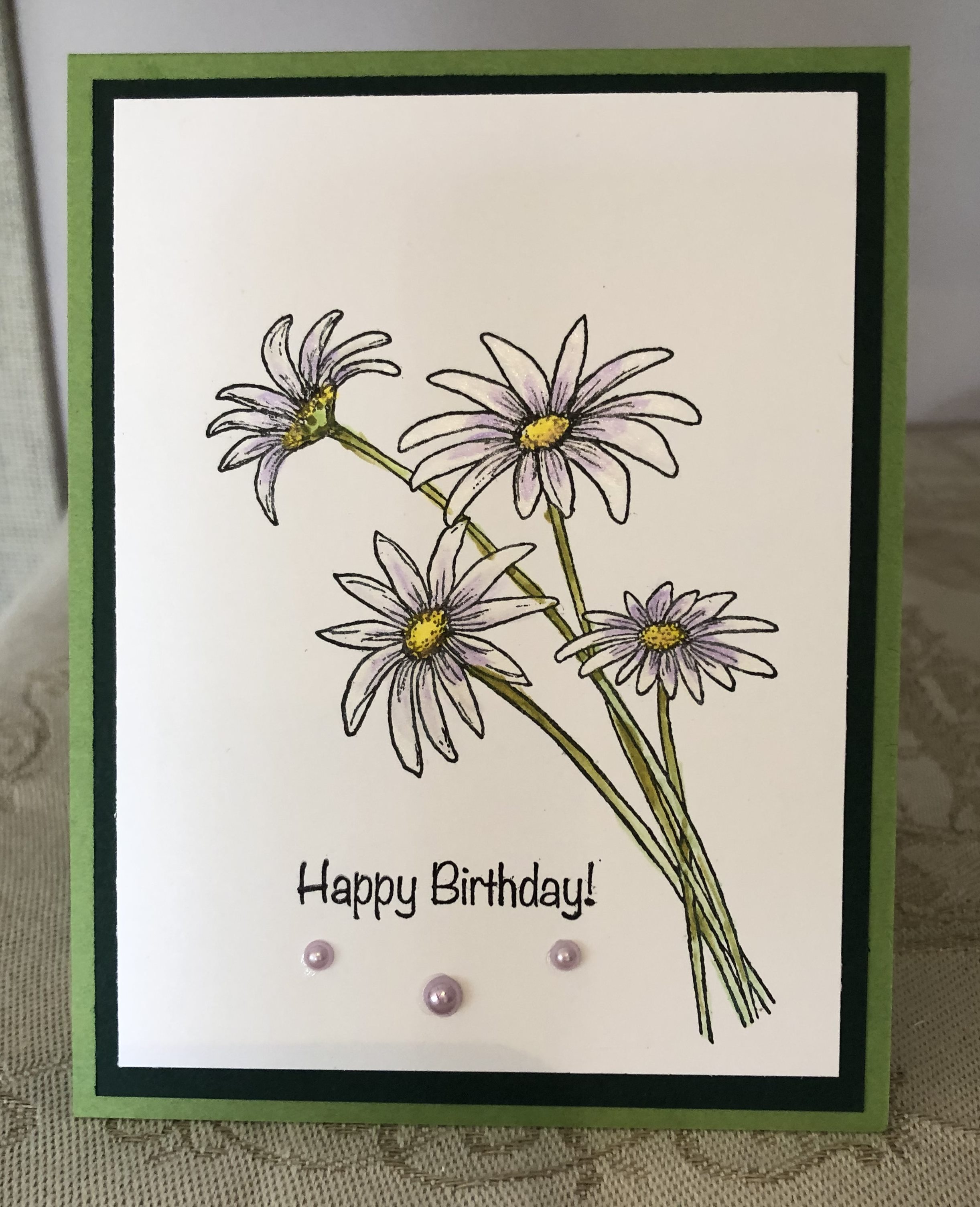
I then used my little metallic paint pots to colour in the flowers. I used a white ink first – let it dry and then added the faint violet to the center of the petals to give some definition. I added three different yellows to the middle of the flowers and some greens to the stems. It has subtle sheen to it and is very pretty in R.L. After adding the sentiment and some tiny pearls I mounted it to the black paper and then to the card base.

This is beautiful! I love daisies.
LikeLiked by 1 person
So pleased you like this. When I first conceived the idea I wasn’t sure I could pull it off as painting is not my forte.
LikeLike
What do you mean, it is pretty right here. Love the white with soft lilac.
LikeLiked by 1 person
Those daisies came out pretty much as I envisioned them but when I first started I wasn’t sure I could translate what was in my head to the paper. For once I let things dry in between each colour. Thanks for looking.
LikeLike
A lovely CAS design! So happy that you were able to play along with the Paper Players this week!
LikeLiked by 1 person
Thanks so much for taking the time to comment and also for the challenge.
LikeLike
These are lovely. I really like the definition you got with the faint violet color on the petals. Okay, why did you use white paint on the petals? I’m wondering, as your paper is white. Did it make a big difference? Did it give it texture? Don’t let these questions sound bad, I really want to learn from you.
LikeLiked by 1 person
Questions are good and yes it made a big difference because the watercolour paints have a metallic finish – a bit like perfect pearls – so the effect is satiny shiny look especially when the card is tilted in the light. In my head I kept seeing a bit of violet in the petal so I tried to get this effect with a paint brush. It is pretty close to what I thought it would look like in my head which for me is amazing as so often I can’t create what I imagine. The watercolours give it a bit of texture too so from a distance it looks like a real flower. As well, I had seen a colour throwdown challenge I meant to enter, but because I forgot to post it I was too late. These colours were in that challenge. Generally I don’t do many CAS cards as they are a real challenge to me, but this past week I was looking for a way to make multiple cards really quickly and CAS works well in that scenario.
LikeLiked by 1 person
I bet those metallic paints are even more stunning in person! This is just gorgeous and the little trio of pearls is the perfect finishing touch. Thanks so much for joining us this week over at The Paper Players!
LikeLiked by 1 person
Thanks so much – you just brightened my day, it is pouring with rain here.
LikeLike