Using Vellum

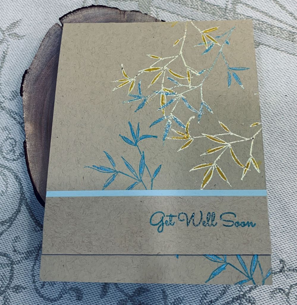
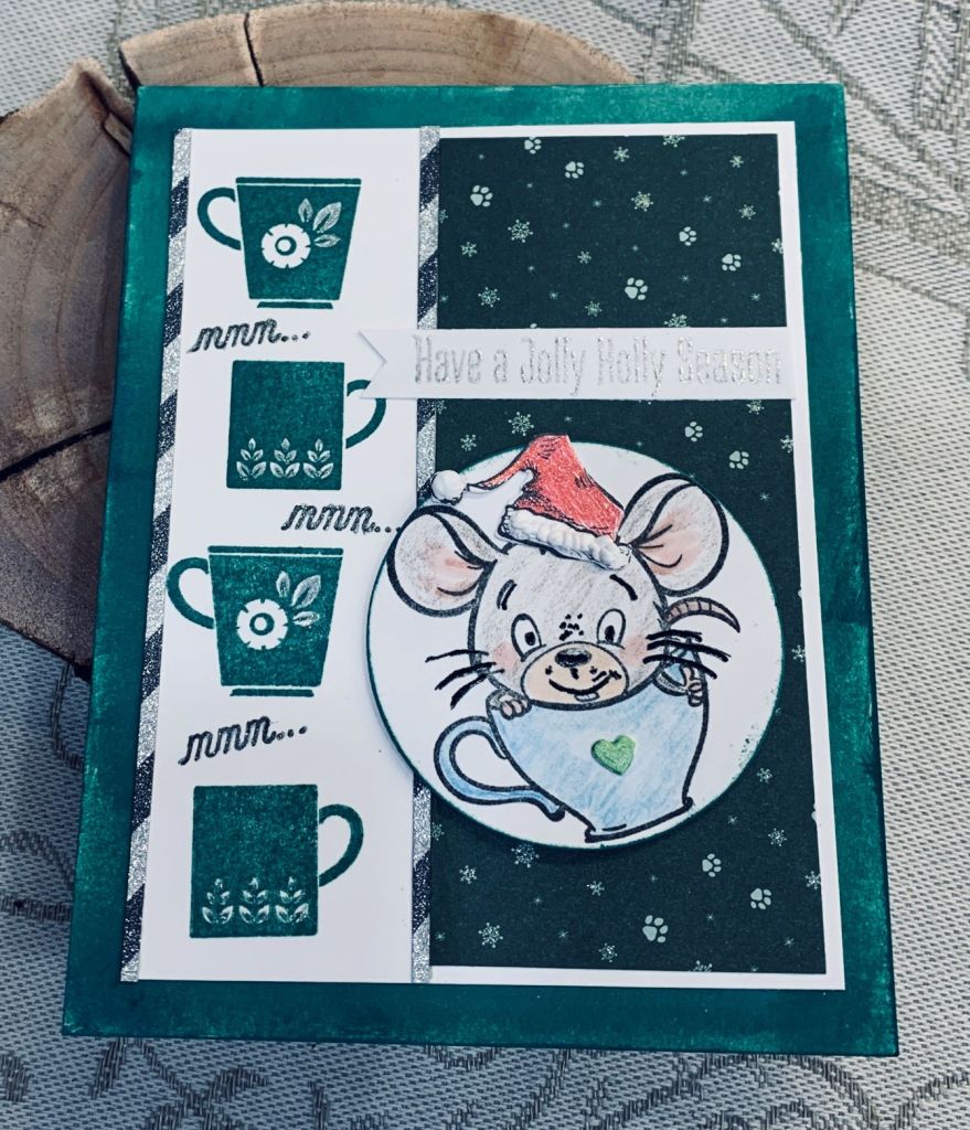
Welcome to challenge #194 at cardz4galz where you are challenged to use vellum in your project. My card uses a 3D folder by Crafter’s Companion called Ornate Lace. Even though I used a heavy weight vellum some cracking still occurred but I was able to cut off the worst of it when making the panel a bit smaller. I was curious to see if I could add some shine and colour to this using a mica spray and I tried with Lindy’s Starburst in Wild Honeysuckle Coral. I wasn’t sure it would dry or even stick but it did and I liked the result. The vellum did curl a bit so once it was dry I placed it underneath some heavy books and left it for 48 hours. That worked well and I was able to attach it the gold panel without difficulty.

Initially I had to do a bit of thinking on how to finish this card, as I didn’t really have a plan in my head, mainly because I was basically seeing what would work. The dies I used are unbranded heart flowers and I cut them from some marbled paper and again from the gold CS offsetting the flowers slightly. Its kind of hard to see in the photo. Then using another scrap piece of vellum I heat embossed the sentiment in gold. This is from a GKD wreath builder set. The panels were mounted onto a pale peach shimmer card front. It is slightly larger than normal and I shall probably make an envelope for it.

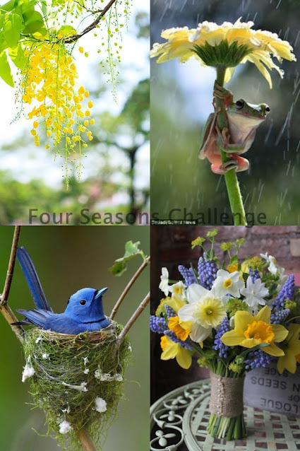
Small spears are beginning to poke up in the garden. Lovely to see that we’ll have flowers soon. Thanks for stopping by and have a good day.

Flip, Flop Fun Fold

Front of card
inside flap etc.
Showing the dry embossed DSP
Anything Goes Embossing with a twist of THINGS WITH WINGS

As you can see this card is designed specifically for this challenge with the twist of wings. Using StampinUp DSP throughout. I followed a tutorial from HERE and my card is in essence a CASE of the one in the tutorial. That said mine is a lot different to the one I CASEd. The demonstrator used CS as matting behind the DSP and I chose to leave that out as I didn’t want the weight or the bulk and instead attached PP directly to the card base. Then the smaller card has two label die cuts as I don’t have a stamp edge punch. Actually I have very few punches as I find them difficult to use due to arthritic hands. As well, I couldn’t figure out the measurements if I used a small die in the same was as she did using the punch. I did pop up my two image pieces and I added a bit of shimmer to them as well as to the embossed area using Perfect Pearls. My stamps are from an older GKD set and the sentiment is from a new Penny Black set that I haven’t yet really inked up. The butterfly is coloured using Inktense pencils but the leaves are inked. I masked the butterfly before stamping the leaves.

I’m quite pleased with how this one turned out and it may look difficult but in fact was quite easy to make. Have a great day and thanks for stopping by.

Get Well Soon

This is my second attempt at a card for the challenge at JUG’s and as I need a get well card this is what it became. The stamp used is a very old rubber block stamp from StampinUp and a sentiment from a set by MFT I think. I’ve misplaced the label so must look for it.

I randomly stamped the leaves in Broken China and Mustard Seed, but found the mustard seed didn’t show well so I heat embossed it with a Ranger product called Lemon Drop. It has a bit of sparkle in it. Then I added colour inside the outlines for more definition. I added the sentiment to a scrap piece to which I also added a border. As I type this I realize that I forgot to add the black so it doesn’t really fit the challenge but I’ll post it anyway.

Have a great day everyone and thanks for taking a look.

Spring has sprung

The colour week at JUG’s had a background example that I liked and tried to emulate in a small way, but with, in my opinion, disastrous results. I tried twice but didn’t like either and this card ended up as a combination of them both due to my inability to throw things away.

When I inked up the colours initially, I forgot to mask off and ended up with a green stripe down the middle where the colours blended. To hide this I added the black stripe. As I wanted to use this particular rabbit/hare stamp from Lavinia Stamps I tried stamping over the black piece and failed. I did heat emboss it and deliberately left some of the powder as it fell, but was very unhappy with the result. So back to the drawing board and I did another background, masking off each section so the colours wouldn’t blend. I then stamped the image again and still wasn’t happy. I set them both aside and made another card for the challenge which I shall post after this one. Then I left my craft room and went onto other things leaving everything until today. When I came back to my craft room I had the idea of cutting out the rabbit on the second piece and gluing him over the top of the one on the original try. I added some grasses at the bottom and using an old stamp from an Easter set by GKD/Clair Brennan I did the sentiment.

Although I wouldn’t call this one of my best efforts, I’m a lot happier with it than I was and it certainly isn’t my worst card ever either. Thanks for stopping by.

Framed Tulips

This card came about because I wanted to use a new stamp set that I’ve had for a while but not yet used. It is Penny Black set and has several floral images in it. I chose the tulips as a sign of spring although we have no sign of any as yet and with all this snow, I suspect spring is well and truly delayed. When I began the card I hadn’t checked for any challenges, but fortunately it works for the two I found today.

I stamped onto a small piece of watercolour paper, using the smoother side to do so, and using a gray Distress Oxide ink which I then heat embossed in clear. Once it was cool I picked some shimmer watercolour paints and added colour to the stems first and then to the flowers and the ribbon. My paints are from ColourArte. When everything was dry I spattered some larger drops of a green Distress Oxide and smaller ones in wilted violet. I die cut the piece using Hero Arts infinity dies and then added the frame in gold which I had cut many times and glued together for some easy dimension. The background piece is from my playing around yesterday with making backgrounds and it is a paper towel I used underneath my CS while fooling around. I kind of liked it so I cut a piece off and ran it through an embossing folder so there was even more texture before adding it to the Edible Eggplant card front. I added the focal image on top then the frame and cut a smaller oval for the sentiment, which comes from Itty Bitty Basics by MFT. I edged this with a gold pen. A few embellishments from my stash and I was a happy camper.

We are having a weird weather day today. One minute it is rain, then it becomes sleet and then onto snow before going back to sleet and rain. I’m glad I’m inside, but I would love to see the end of winter. At least we got my car out of the garage yesterday, but the roads are treacherous and it is nice that we didn’t have to go anywhere in the conditions.

Thanks for stopping by and I appreciate all the comments that you leave.

Mmm…

With green being the predominant colour choice on various challenges, I decided to try to make one card that would fit several and this is what I came up with. As well one challenge is a sketch and it fits that one too.

Stamp sets used are an old coffee set from GKD, a new set from Your Next Stamp, an old one from Tim Holtz and the sentiment is from MFT and is another fairly new set for me. These images from YNS are quite cute and this is the second one I’ve used from the set. I did add the Santa hat which I coloured with a red glitter pen and added some fluffy stuff from Cosmic Shimmer. As well I added a tiny heart to the coffee cup and coloured it green. The image has been done with various pencils and an Ohuhu alcohol ink pen. There is also some sparkle added here and there. The sentiment was heat embossed in silver.

I started with the white panel to which I added the line of coffee cups in Pine Needles Distress Ink. In between the cups I added the mmm… then I added the sparkly striped thin strips to separate them from the dark green PP. This is a scrap piece from an old 6X6 pad. I stamped the image onto the circle which was a left over from another project and edged the circle with the same green ink. This was popped up on foam tape. Before I added the panel to the card front I used the same ink and brushed a section with the colour so it would match the cups. I debated adding some additional embellishments and decided against it. I can always change my mind when the time comes to use the card.

These are the challenge links where I am entering the card:

https://colorfuloptions.blogspot.com/
http://just-add-ink.blogspot.com/

I hope you are all having a happy day. We finally got my car out of the garage so I can use it again. Poor hubby is exhausted from all the snow clearing.

Cheers

There seems to be a few challenges out there that are asking for green in some way. You would think I could come up with a design that would work for them all, but I must be tired as I couldn’t think of anything that would work. For now I’ve chosen to do this one as my entry into the Color Hues challenge which requires green and gold. If I come up with other ideas I can add another entry.

While out today, I discovered a new craft store that I hadn’t been aware of and as I needed a re-inker I went inside. Of course one item is never the result and I found this Lemon Twist stencil from Simple Stories. Lemon and limes are so similar that I made mine into lime slices to fit the challenge. I edged the panel with gold heat embossing and stamped the sentiments, from a Joy Clair set, in gold as well. I had some patterned green vellum so added that over the card front and then a strip from a very old pad that I’ve had forever. After which I added the focal panel. A few embellishments from my stash and it was complete. It turned out better than I expected and I think will make a nice masculine birthday card when I need one.

We’ve had almost 18″ of snow in some areas of our property and it is so heavy and packed that we can’t get my car out of the garage. In fact a neighbor came yesterday and dug a parking space at the top of the driveway and a section all the way down to the entrance using his tractor. He then kindly went with my hubby to the mailboxes, which is where hubby had to leave the van when it wouldn’t get up the hill. He dug it out and ensured my hubby could get up the hill so we at least have one vehicle functioning. Our neighbor may come back tomorrow to help us dig out the rest, but he didn’t have time to do it all yesterday as he went along the crescent and dug out other neighbors before going to work. Even though we purchased a small quad with a plow, the weight of this lot is too much for a small machine. More snow is predicted. I am so done with winter.

Thanks for stopping by. I am grateful for all of you.

Pinks, Pearls and a flower

When I saw this challenge yesterday, I started to think about what I might do to participate. There were several ideas in my head, but none of them truly grabbed me. Then this morning I saw our stamp buddy, Angie’s post, and a light bulb went off in my head. So here is my take on both the challenge and her card.

I started with some watercolour CS which I embossed using a SSS folder. Taking one of those (old) distress wheels, I distressed the edges and added some pink to the edges, heavier along those, and lightly to the raised sections. Then I cut a black piece and distressed that too. Glued them together and while they were drying I looked through my dies to find a flower I thought would look nice and chose a Memory Box die called layered daisies. I had a small inked background piece left from a while back and it was mostly pinks so I die cut the flower using this. As it was a thin paper it needed a bit of support so I cut it again from black CS and layered as you see. The stem of the flower is made from Mizuhiki cord (from Japan) and the leaves are die cut from DSP using a very old die that I have no information on. The word is from a Hampton Art sentiment set and I stamped it twice. Glued the 2 pieces together and then cut around the letters. Because it is only an outline I had the bright idea of filling it with small pearls from my stash. Added a few more pearls, glued it to the card front and called it finished.

My hubby really liked it and I have to say I’m quite pleased with it myself. Thanks for taking a peek, it is appreciated that you share your time with me.

Pop Up coffee card

Card Front
Inside showing pop up

Anything Goes with a Fun Fold for Creative Creases #51

I saw a version of this kind of pop up on Pinterest and I thought that I had to try one for myself. The post calls the design a Bijou Pop & Flip Card and you can find the tutorial HERE.

Funnily enough, my local coffee shop had the words I’ve included on the inside on a small plaque and I got permission to use them. I found the saying amusing and in a way this is another reason the card was made. I did this on the computer and printed it onto CS.

Basically I followed the tutorial so I won’t go into the ‘how to’ here. Suffice to say that I adapted a couple of things because I used a smaller circle so the inside pieces needed to be a bit smaller. I learned that using a scalloped edge is probably not the best idea as they stick a bit when opening it. Next time I will use a straight edge circle or oval. There will be a next time as I like the result a lot and it is a cute way to make a card. My stamps are from a new set called Coffee Characters and came with dies, purchased from Your Next Stamp here in Canada. (Thank you Lisa K. for the link). I stamped, coloured with various pencils and Sakura Glaze pens, then die cut the image. The paper is from StampinUp and I really like these marbled papers a lot. The other small change I made was adding a frame around the edge of the die cut as I didn’t like the impression the die had made during the cutting process.

This is my first entry into the Creative Creases challenge and it is fun to participate in a new to me challenge. Thanks for stopping by.

Water Your Roots ….

For this card I used a Catherine Pooler set called Koi Pond. It is still fairly new to me and I thought it would be good for a colouring session. I stamped the fish first then masked it off so I could add some colour around it and I also stamped the ripples at the same time. Ink colours used are Distress Oxides Cracked Pistachio and Twisted Citron. I liked this sentiment and used it as you see and added the bubbles as well. I added Nuvo Crystal drops to the bubbles and while they were drying I carefully coloured in my fish. I used Inktense pencils to do this and I added a tiny bit of sparkle along the fin and tail rib lines as well as to the fin along his back. I forgot that this stamp set has a tiny dragonfly stamp so have made a mental note to myself to remember it for another specific challenge I often enter.

Our predicted snow didn’t arrive until late this afternoon, so we’ll see how much arrives when we get up tomorrow morning. I’m happy with how this card turned out and it was fun to do. Your visits to my blog make me happy and I wish you all a Happy Sunday. Hopefully you are staying warm and don’t have to deal with a ton of snow.